ThatPainter is reader-supported. When you buy through links on our site, we may earn an affiliate commission. Learn More
Rustic paint colors are earthy creams, tans, browns, clay reds, muted greens, weathered blues and deep mineral accents that echo adobe, sandstone, stone and aged wood. The 25 shades below are organized by color family—not ranked—so you can build a palette that suits your existing floors, furniture and natural materials.
As an Amazon Associate I earn from qualifying purchases.
For the most reliable choice, shortlist two or three colors, order or make sample cards, and view them in the actual room beside trim, wood and stone before buying a full-size can. The collections from Sherwin-Williams Rustic Living, Rustic Comfort, the Rustic Refined palette, BEHR and Benjamin Moore provide the source names and codes used here.
Quick wins for a faster PC:
Repair Windows errors before they cause bigger problemsFix Now →Fix the driver behind crashes, sound loss and screen glitchesFind Drivers →What makes a paint color look rustic?
“Rustic” is an aesthetic description, not a standardized color category. The look usually comes from low-to-moderate saturation, warm or weathered undertones and a relationship to natural materials. Creams can resemble limewash, tans and browns suggest unfinished timber or leather, clays recall adobe and brick, and softened greens and blues bring in vegetation, patinated metal or distant sky.
Popular on Amazon

- Great Value Paint Brush Set: Soucolor 20 acrylic paint brushes come in 10 different sizes, making them ideal for fine detailing, model painting, rock painting, nail art, face painting, DIY crafts, and general art projects. The varied brush sizes give you better control for both delicate lines and broader color coverage, while the soft bristles deliver smooth, consistent results on acrylic, oil, watercolor, canvas, wood, ceramic, and more.
- Awesome Set of Paint brushes: Professional paint brushes can cover all of your needs. The multi-purposed brushes are ideal for Watercolor, Oil, Gouache, enamel, Acrylic Painting, Body, Nail, Face Painting, Miniature, Model, Wood, Glass, Cup, Ceramic, Fine work, Art class, Craft Art Painting, DIY Art Crafts etc.
- Soft and long-lasting: The bristles are soft and strong, with nickel metal ferrules and blue wooden handles. After cleaning, the bristles will become soft and fluffy again and will not fall off.
- Easy to clean: it’s very convenient to Wash well in soap and water. Retain shape after drying. the brushes hold up very well. Nice selection to beginners and professionals. Keep them clean and they last a long time.
- Perfect for All Painters & Occasions: Suitable for art beginners, hobbyists and professional artists. Great for art class, home creation, travel painting and DIY handmade projects. A practical art gift for students, teachers, family and craft lovers.
Use the list as a set of starting points rather than a universal formula. A rustic room may be monochromatic and light, high-contrast with charcoal cabinetry, or colorful with clay and green accents. Existing wood species, stone veining, daylight direction and artificial bulbs will change how any shade reads.
Which 25 rustic paint colors should you sample?
The sequence below is grouped by hue family, not ranked from best to worst. Brand codes are specific to the named manufacturer; do not transfer a code between brands.
Creams and light neutrals
- Captivating Cream — A gentle cream for walls where you want warmth without a strong yellow cast. It can connect honey-toned floors to white-painted trim.
- Marshmallow — A soft, light neutral that keeps a rustic palette airy. Try it in bedrooms, hallways or ceilings when darker beams or furniture provide contrast.
- Crisp Linen (SW 6378) — This Sherwin-Williams shade evokes natural linen. Its light value works as a whole-room backdrop or as trim against deeper clay and brown colors.
- Ivory Lace (SW 7013) — A warm ivory suited to plaster-like walls and traditional millwork. Compare it with your flooring; very orange wood can make any ivory appear more yellow.
- Westhighland White (SW 7566) — A creamy off-white that feels softer than a stark gallery white. It is useful when you want rustic texture—wood grain, stone or woven fabrics—to remain the focus.
Tans, taupes and browns
- Natural Tan (SW 7567) — A versatile tan for living areas and open plans. Pair it with creamy trim and a darker brown island or built-in to create graduated contrast.
- Moth Wing (SW 9174) — A muted, wing-like taupe that can bridge gray stone and warm wood. Sample it on more than one wall because changing daylight may reveal different undertones.
- Shiitake (SW 9173) — A mushroom taupe with an earthy, grounded character. It suits cabinets, offices and dining rooms where a quiet neutral is preferable to bright beige.
- Rookwood Dark Brown (SW 2808) — A deep brown for focal walls, built-ins, doors or furniture. Use it where you want the visual weight of timber without installing more wood.
- Homestead Brown (SW 7515) — A medium-to-deep brown that reinforces lodge, cabin and farmhouse schemes. Balance it with a light ceiling or adjacent cream so the room does not feel enclosed.
- Craft Paper (SW 6125) — A paper-bag tan that adds handmade warmth. It works well in mudrooms, studies and accent niches, especially beside blackened metal or natural oak.
- Rustic Taupe (N200-4, BEHR) — BEHR’s taupe option is a practical middle value for walls or cabinetry. Check it against both cool gray stone and warm wood before committing, since taupes can shift noticeably between materials.
Clay, brick and golden earth tones
- Cavern Clay (SW 7701) — A terracotta-inspired shade that brings adobe warmth indoors. Use it on a dining-room wall, fireplace surround or entry accent, with light neutrals to prevent visual heaviness.
- Fired Brick (SW 6335) — A brick red that feels aged rather than candy-bright. It can highlight a powder room, lower cabinetry or a single architectural wall.
- Empire Gold (SW 0012) — A burnished gold for rooms that need a sunbaked note. Keep surrounding colors restrained—cream, taupe or charcoal—so the gold remains an accent.
- Brandywine (SW 7710) — A warm, wine-leaning earth color suited to libraries, dining spaces and furniture details. Test it under evening lighting, when red and brown undertones can become more pronounced.
Greens and weathered blues
- Basque Green (SW 6426) — A deep, earthy green that pairs naturally with brown leather, oak and stone. It is a strong choice for cabinetry, a study or a sheltered porch ceiling.
- Majolica Green (SW 0013) — Inspired by glazed ceramic, this green adds color while retaining a handcrafted feel. Use it on an island or accent wall against warm white walls.
- Cascade Green (SW 0066) — A softened green that can act almost like a neutral in a nature-focused palette. Combine it with tan textiles and dark wood for a calm, layered room.
- Copen Blue (SW 0068) — A muted blue with a weathered, traditional character. It suits bedrooms, bathrooms and cabinetry, particularly where natural light is plentiful.
- Endless Sea (SW 9150) — A deeper blue-green for dramatic built-ins, doors or one feature wall. Pair it with ivory or natural tan to keep the scheme connected to rustic materials.
- Atmospheric (SW 6505) — A pale, airy blue that can lighten a rustic palette without becoming coastal-themed. It works on walls or ceilings with warm wood and clay accents.
Stone and charcoal accents
- Pewter Tankard (SW 0023) — A mineral gray that echoes weathered metal and stone. Use it to temper warm rooms or on trim and cabinetry where a less stark alternative to black is needed.
- Kendall Charcoal (HC-166, Benjamin Moore) — A substantial charcoal for doors, built-ins, kitchen islands and fireplace surrounds. Its depth creates crisp contrast with creams and natural timber.
- Night Shade (2116-10, Benjamin Moore) — A near-black, mineral-toned accent for selective use. It can outline architecture or ground a palette, but sample it carefully in small or north-facing rooms.
How do you choose among rustic paint colors?
Start with the materials that will remain in the room. Hold large samples next to flooring, exposed beams, countertops, stone, upholstery and metal hardware; a color that looks neutral alone may reveal pink, green, yellow or blue beside those surfaces.
Recommended Free Tools
Also popular on Amazon
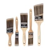
- COMPLETE 5-PIECE BRUSH SET FOR EVERY PAINTING TASK — Includes 1 Inch Flat, 1.5 Inch Angle, 2 Inch Flat, 2 Inch Angle Stubby, and 2.5 Inch Angle brush giving you every size professional painters use daily. Get all 5 for less than the price of a single brush from hardware store brands — professional grade performance at a fraction of the cost. Perfect for walls, trim, cabinets, doors, furniture, and detailed cutting-in work on any project.
- ZERO BRISTLE LOSS — GUARANTEED BY PRECISION ADHESIVE BONDING — Every bristle is locked in place with precision-set adhesive that keeps them in the brush — not in your paint job. The coated steel ferrule provides structural support while the adhesive bond ensures clean performance on every stroke. Premium SRT synthetic filaments load more paint and release it evenly for a smooth streak-free finish on walls, ceilings, and trim. Works with latex, oil-based paint, primer, sealer, and wood stain.
- INCLUDES THE ANGLE STUBBY MOST SETS LEAVE OUT — Professional painters know the 2 Inch Angle Stubby is the go-to brush for tight cabinet interiors, window sashes, inside corners, and detailed trim where standard angle brushes are too long. Combined with the 1.5 and 2.5 inch angle sash brushes you have precision cutting-in covered at every scale — baseboards, crown molding, door casings, and ceiling lines.
- FLAT BRUSHES FOR BROAD SMOOTH COVERAGE ON ANY SURFACE — The 1 and 2 inch flat brushes deliver even coverage on walls, furniture, shelving, doors, fences, decks, and wood surfaces. Ideal for applying primers, stains, varnishes, polyurethane, and specialty coatings. Solid wood handles provide all-day comfort and control for both professional contractors and weekend DIY homeowners tackling interior or exterior painting projects.
- TRUSTED BY PROFESSIONAL PAINTERS AND CONTRACTORS NATIONWIDE — Pro Grade delivers professional-grade results at a price that makes sense for crews who go through brushes on every job. Ideal for property managers, remodeling contractors, apartment turnover crews, maintenance teams, and commercial painting operations. Backed by thousands of verified reviews from working painters. Washable and reusable for multiple projects.
1. Identify the hue family
Decide whether the room needs cream, tan, brown, clay, green, blue or charcoal. Staying within one family creates a quiet scheme; crossing families adds contrast. For example, a cream wall with a clay accent feels warmer than cream with a blue accent, while a green cabinet can connect both wood and stone.
2. Compare lightness and contrast
Light colors visually expand a room and show texture softly. Mid-tones provide more definition around trim and furniture. Dark browns, charcoal and deep blue-greens are best treated as intentional anchors on an accent wall, island, door or built-in unless the space has sufficient light and volume.
3. Read the undertone beside fixed finishes
Warm wood can make a beige appear yellow; cool gray stone can make the same beige appear pink. Place samples vertically and horizontally near the largest permanent surfaces, then check them in morning, afternoon and evening light.
Also popular on Amazon
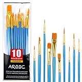
- 【All sizes of art brushes】: The 10 sizes of multi-functional brushes have various shapes, making the mixing color easier, which is very suitable for artists, students, teenagers, children and painters at all levels. Wonderful Present ideas for friends and family who like painting!
- 【general brush set】: Professional paint brush can meet all your needs. Multifunctional brush is very suitable for watercolor, oil, gouache, acrylic painting, body, nail, face painting, miniature, model, ceramics, arts and crafts painting, etc.
- 【high quality process】: It is designed with anti falling bristles, anti-rust nickel ferrule and solid wood handle. You can use the brush to focus on the painting and always be creative.
- 【easy to maintain】: After using the brush, it is very convenient to clean the brush with warm soapy water and reshape the tip of the brush. Air dry the brush and place it on top of the top for long use.
- 【100% satisfaction guarantee - buy now】1 packs of set brushes, you can also get friendly customer service, any questions feel free to contact us, within 24 hours to help you! There is no risk in buying our paint brush kit.
4. Assign the color a role
- Walls: Favor creams, light neutrals, tans and moderated greens or blues for broad coverage.
- Trim and ceilings: Use related creams or a mineral neutral rather than assuming every room needs bright white.
- Cabinetry and built-ins: Mid-tone greens, blues, browns and charcoal provide definition without adding new materials.
- Accents: Clay, brick, gold and near-black shades are effective on one wall, a door, an island or architectural details.
5. Sample before buying paint
Sherwin-Williams describes sample options for its collections; use color chips, sample sheets or small painted boards and move them around the room. Paint at least two coats on a primed, portable board when possible, and leave the board in place for a full day so you see changing light. Sampling is the only dependable way to judge a finalist in your specific conditions.
What’s actually slowing this PC down?
Pick the symptom - the matching free tool is one click away.
What rustic color combinations work well together?
There is no required rustic formula, but these combinations illustrate useful relationships shown by the source palettes:
- Soft and sunbaked: Westhighland White, Natural Tan and Cavern Clay. The first two keep the room light while clay supplies a focused burst of warmth.
- Woodland: Crisp Linen, Basque Green and Rookwood Dark Brown. Use the dark brown sparingly when the room already contains substantial timber.
- Weathered coastal-rustic: Marshmallow, Copen Blue and Pewter Tankard. Warm textiles and wood prevent the blue-gray mix from feeling sterile.
- Heritage contrast: Ivory Lace, Fired Brick and Kendall Charcoal. Reserve charcoal for a door, island or built-in, and let brick remain the colorful note.
- Quiet monochrome: Moth Wing, Shiitake and Homestead Brown. Vary texture—plaster, linen, leather and wood—so a single hue family does not look flat.
These are starting points, not guarantees. The same combination can read differently in a sunlit kitchen, a shaded hallway or a room lit mainly by warm LEDs.
Also popular on Amazon

- 【KIDS PAINT BRUSHES SET】Anezus paint brushes for kids come with 10 pcs paint brushes of 5pcs round paintbrushes and 5 flat paint brushes with colorful handles, good for the young artist to explore their creativity in painting and crafting
- 【HIGH QUALITY PAINT BRUSHES FOR KIDS】These toddler paint brushes made of soft hog bristle, bright colored handles and rust proof ferrules. The bristles are firmly fixed in the kids paint brushes and no shedding. Each children paint brush measure 6 1/4 inches (16cm) in length and ferrules 1/2"(1.3cm) diameter, large enough for the little hand to grip and control
- 【WIDE APPLICATIONS】With combination of round and flat craft paint brushes for kids, work great with washable paint, tempera paint and acrylic paint. Great for arts and craft, rock, leather, gesso and ceramic, or body, nail and face art painting.
- 【EASY TO CLEAN 】After using paint brushes for acrylic, oil or watercolor painting, it’s very convenient to clean them with warm soapy water and reshape the paint brush tips. Keep these craft paint brushes clean and they last a long time.
- 【GREAT GIFT IDEA】Perfect for students, teens, kids, children and painters of all levels. Wonderful gift idea for girls, boys and kids who love painting! These all-purpose paint brushes for kids are ideal for kids' school projects, birthday parties, painting parties, art parties, back to school supplies, classroom decoration and more.
What mistakes should you avoid with rustic paint?
- Choosing from a tiny screen swatch: Digital displays cannot reproduce every undertone accurately. Use physical samples.
- Ignoring existing finishes: New paint cannot hide an orange floor or pink stone; select a shade that relates to those fixed elements.
- Using too many dark colors: Deep brown, charcoal and blue-green all absorb visual light. Balance them with a lighter wall, ceiling or adjacent room.
- Assuming “rustic” means yellow beige: Greens, blues, mineral grays and clay reds can be equally rustic when their saturation and pairings suit the materials.
- Painting before confirming sheen and surface condition: Gloss level changes perceived depth and can emphasize wall imperfections. Prepare and prime the surface according to the paint manufacturer’s instructions.
- Buying a full-size can too soon: Confirm the color in the actual lighting and beside furnishings first; collection names and sample offerings can change, so verify current details with the manufacturer.
How we selected these 25 colors
The list draws from the named rustic collections and whole-house palettes supplied by Sherwin-Williams, HGTV HOME by Sherwin-Williams, BEHR and Benjamin Moore. Selection criteria were coverage of the main rustic hue families, inclusion of the exact published names and codes, and practical range from light wall neutrals to dark accents. The colors are inspiration candidates, not an independent ranking or a claim that any shade performs better than another.
Where can you verify a color or get a sample?
Check the manufacturer collection page for the current name, code and available sample format before purchasing. Sherwin-Williams provides collection and sample information through its Designer Color Collection: Rustic + Refined page; its Rustic Living, Rustic Comfort and Rustic Refined pages show additional palette context. BEHR’s Interior Colors Collection and Benjamin Moore’s Whole House Color Schemes are the appropriate references for their respective colors.
Frequently Asked Questions
Can rustic paint colors work in a modern house?
Yes. Pair one earthy shade with simple profiles, restrained hardware and uncluttered furnishings. A modern room often needs only a clay, green, taupe or charcoal accent to gain rustic warmth without looking traditionally styled.
Also popular on Amazon

- 【162-Piece Bulk Set | Dual Brush System】Maximize versatility with 81 flat brushes (0.59 inch edge for bold strokes) and 81 round brushes (0.39 inch tips for details) – 3X more tools than standard kits! Pre-sorted in labeled compartments for instant access during painting sessions. Ideal for art classrooms, mural projects, and multi-artist households.
- 【Pro-Grade Durability | Zero Shedding Guarantee】 "Engineered with triple-crimped nylon bristles (43% higher resilience vs. standard) and aerospace aluminum ferrules tested for 10,000+ flex cycles. Lab-verified 0.01% shedding rate even with heavy impasto techniques – outperforms flimsy bristles in budget brushes."
- 【Multi-Scenario Readiness | Event & Daily Use】 Optimized for: Thanksgiving/Christmas face designs classroom projects ceramic decorating fabric printing and model painting; Lightweight plastic handles each reduce hand fatigue during prolonged sessions
- 【Effortless Maintenance | Long-Term Durability】 Clean with warm soapy water in 10 seconds; Reshape tips and air-dry vertically to preserve bristle integrity,After use, air-dry brushes thoroughly and store upright in the provided case to preserve bristle shape. The premium nylon filaments naturally regain their original form after each stroke. For cleaning, simply rinse in warm soapy water and gently reshape bristles with fingertips."
- 【Multiple Application】These acrylic paint brushes can be applied for most occasions,such as:watercolor,oil, gouache paint,face paint, acrylic paint, suitable for Thanks Giving Day, Christimas, Halloween face and body painting, canvas painting, fabric, rock, miniature, model, ceramics, arts and crafts painting, etc.
Should trim be white with rustic wall colors?
Not necessarily. A related cream can look more cohesive with warm walls, while a mineral gray or charcoal can create deliberate contrast. Compare trim samples beside the wall color and flooring rather than choosing by habit.
How many rustic colors should an open-plan home use?
A practical starting point is one principal wall neutral, one secondary color for cabinetry or a connected room, and one accent used sparingly. Repeat undertones or materials so transitions feel intentional instead of assigning a new unrelated color to every space.
Do rustic colors make a small room look smaller?
Dark shades can reduce perceived brightness, but they do not automatically make a room feel cramped. Use a deep color on one wall or built-in, keep ceilings and adjacent surfaces lighter, and evaluate a large sample in the room’s actual light.
Quick Recap


