Do these 3 things before closing this tab:
What’s actually slowing this PC down?
Pick the symptom - the matching free tool is one click away.
1Scan for outdated or missing drivers - takes under a minute2Clear out junk files and repair common Windows errors3Fix the driver behind crashes, sound loss and screen glitches
ThatPainter is reader-supported. When you buy through links on our site, we may earn an affiliate commission. Learn More
There is no single best living-room paint color. The right choice depends on your room’s natural light, fixed finishes, furniture, desired mood, wall condition, and how much cleaning the space needs. The 50 colors below are curated starting points—not a universal ranking. Use them to narrow your options to two or three real samples, then judge those samples in your own room.
The shortlist covers warm and cool whites, beige and greige, blue-green, sage, olive, clay, pink, charcoal, brown, navy, and black. Each entry includes its brand and code, likely light response, undertone to watch, useful pairings, suggested application, finish, and a practical caution.

As an Amazon Associate I earn from qualifying purchases.
Quick picks from the list
- Soft white: White Dove OC-17 by Benjamin Moore.
- Warm white for a dim room: Alabaster SW 7008 by Sherwin-Williams.
- Flexible greige: Agreeable Gray SW 7029 by Sherwin-Williams.
- Classic mid-tone neutral: Revere Pewter HC-172 by Benjamin Moore.
- Quiet blue-green: Sea Salt SW 6204 by Sherwin-Williams.
- Adaptable sage: October Mist 1495 by Benjamin Moore.
- Current 2026 warm-neutral signal: Universal Khaki SW 6150 by Sherwin-Williams.
- Current 2026 brown-charcoal signal: Silhouette AF-655 by Benjamin Moore.
- Deep accent or built-in color: Hale Navy HC-154 by Benjamin Moore.
- Near-black architectural accent: Iron Ore SW 7069 by Sherwin-Williams.
How to use this list
Start with the room rather than the trend. Before choosing a color, work through this sequence:
- Identify the light: note the room’s direction and when it receives its strongest daylight.
- Inventory what is staying: look at the floor, fireplace stone, cabinetry, woodwork, sofa, rug, curtains, countertops, and large artwork.
- Decide on the job of the walls: should they recede, brighten the room, connect an open plan, create a cozy envelope, or become an architectural feature?
- Choose a family: select two or three colors from the section that addresses the room’s needs.
- Compare intensity: decide whether you want a pale backdrop, a mid-tone color, or a high-commitment dark shade.
- Sample real paint: test the actual product in several places and under changing daylight and artificial light before buying full-size quantities.
Color names and codes identify a manufacturer’s formula; they are not universal color standards. Availability can vary by country, retailer, product line, and time. Confirm the current color page, code, paint line, finish, and local availability before ordering. A retailer’s color match is not automatically identical to the original brand color.
#1 Best Overall
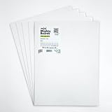
- PERFECT SAMPLES: These 12" x 9" white, styrene panels provide a smooth, warp-free surface for testing up to 5 color samples with paint, stain or other coatings.
- DURABLE MATERIAL: Made of sturdy styrene, these panels can withstand multiple coats and are non-absorbent so colors will stay true.
- CONVENIENT SIZING: At 12" x 9", the panels are just the right size for testing many common paint colors side by side before committing to a full project.
- PACKAGE INCLUDES: This value pack contains 5 white panels, enough for testing several color options on one purchase.
- VERY FLEXIBLE: Mighty Boards do not warp like foam core and you can bend them without breaking.
1. Whites and off-whites
White walls are not automatically neutral. A white can contain yellow, beige, pink, gray, blue, or green influence, and bright white trim can make a creamy wall look more yellow by comparison. For current manufacturer collections and examples, compare the Benjamin Moore neutral living-room guide with the Sherwin-Williams Top 50 collection.
1. White Dove OC-17 — Benjamin Moore
Best for: Traditional, transitional, and low-contrast living rooms. Light response: High; the manufacturer lists an LRV of 83.16 on its current color page. Undertone to watch: Soft gray-beige warmth rather than a stark blue white. Works with: Natural wood, stone, linen, brass, and colorful upholstery. Use it on: All walls, trim, or a quiet color-drenched room. Best finish: Matte or eggshell on walls; use the appropriate trim finish separately. Potential problem: It can look creamier beside a very cool white or in warm artificial light. See the current White Dove page.
Quick wins for a faster PC:
Fix the driver behind crashes, sound loss and screen glitchesFind Drivers →Repair Windows errors before they cause bigger problemsFix Now →2. Simply White OC-117 — Benjamin Moore
Best for: Bright rooms, open plans, and contemporary interiors that need a clean but not icy backdrop. Light response: High. Undertone to watch: Warm yellow or creamy influence can become clearer beside blue-gray furnishings. Works with: Pale woods, white upholstery, black accents, and mixed finishes. Use it on: All walls, ceiling, or trim where a warm clean white is wanted. Best finish: Matte or eggshell walls. Potential problem: Strong west light and warm bulbs may push it toward yellow.
3. Cloud White OC-130 — Benjamin Moore
Best for: Creamier trim, traditional rooms, and furnishings with warm wood or ivory textiles. Light response: High to medium-high. Undertone to watch: Noticeable warm cream. Works with: Oak, walnut, leather, beige upholstery, and aged metals. Use it on: Walls, trim, or both for a soft layered scheme. Best finish: Matte or eggshell walls, satin or semi-gloss trim. Potential problem: It may look yellow against a crisp, neutral white elsewhere in an open plan.
4. Swiss Coffee OC-45 — Benjamin Moore
Best for: Relaxed rooms where bright white feels too sharp. Light response: High, but visually softer than a cleaner white. Undertone to watch: Warm beige-yellow. Works with: Rattan, natural stone, warm wood, tan upholstery, and muted greens. Use it on: All walls or a low-contrast ceiling and trim scheme. Best finish: Matte or eggshell. Potential problem: The warmth can become more obvious beside brilliant white doors or cool gray flooring.
5. Alabaster SW 7008 — Sherwin-Williams
Best for: A calm, lightly warm backdrop, especially where a room feels cool or underlit. Light response: High. Undertone to watch: Beige-yellow warmth. Works with: Wood, woven textures, black accents, warm metals, and muted color. Use it on: All walls, ceiling, or trim. Best finish: Matte or eggshell walls. Potential problem: In abundant southern light it may appear more creamy than expected.
Free tools Windows power users keep installed
One-click scans. No signup required.
6. Pure White SW 7005 — Sherwin-Williams
Best for: Contemporary rooms and crisp trim where a cleaner white is preferred. Light response: High. Undertone to watch: Subtle gray or blue influence can show beside warm beige. Works with: Cool upholstery, pale floors, black hardware, and modern art. Use it on: All walls, trim, built-ins, or ceilings. Best finish: Matte or eggshell walls; satin trim. Potential problem: It can feel cool in north-facing daylight or beside blue-gray furnishings.
7. Snowbound SW 7004 — Sherwin-Williams
Best for: Soft off-white walls that need less brightness and more quietness. Light response: High to medium-high. Undertone to watch: Gray with a possible pink or beige cast. Works with: Blush, taupe, warm wood, soft black, and transitional furniture. Use it on: Walls or trim when a muted white is desired. Best finish: Matte or eggshell. Potential problem: Compare it with existing trim; adjacent creamy whites can make it look pinker or grayer.
8. Dover White SW 6385 — Sherwin-Williams
Best for: Dimmer rooms and interiors with warm furnishings. Light response: High. Undertone to watch: Stronger cream or yellow warmth than a neutral white. Works with: Honey oak, leather, tan rugs, brass, and traditional upholstery. Use it on: Walls, trim, or a traditional ceiling. Best finish: Matte or eggshell walls. Potential problem: It can look distinctly yellow next to cool white trim or blue-gray furniture.
9. Shoji White SW 7042 — Sherwin-Williams
Best for: Relaxed interiors with natural materials and a greige-leaning white backdrop. Light response: High to medium-high. Undertone to watch: Warm gray-beige, sometimes with a muted pink or taupe reading. Works with: Oak, rattan, stone, linen, and olive accents. Use it on: All walls, trim, or built-ins. Best finish: Matte or eggshell. Potential problem: It may seem too beige if you want a bright gallery-white effect.
Outdated Drivers Are Slowing You Down
One free scan finds every outdated or missing driver and matches the right update for your exact hardware.Free scan · exact hardware matchWindows Errors? Fix Them Before They Spread
Repair common Windows errors and clear accumulated junk for a smoother, more stable PC - no reinstall needed.Free scan · no reinstall10. Drift of Mist SW 9166 — Sherwin-Williams
Best for: A light, understated living room that needs more nuance than plain white. Light response: High to medium-high. Undertone to watch: Gray with a possible green cast beside warm wood or greenery. Works with: Pale neutrals, natural wood, blue-green accents, and modern furniture. Use it on: All walls or an open-plan backdrop. Best finish: Matte or eggshell. Potential problem: Sample it beside flooring and trim because surrounding colors can make its green-gray quality more visible.
2. Beige, greige, taupe, and warm neutrals
These colors are useful when white feels too stark but a stronger hue would compete with the furniture. Greige is not automatically balanced: it may lean green, violet, pink, beige, or blue depending on the room. Benjamin Moore describes Revere Pewter as a bridge between warm and cool tones and lists its LRV as 55.05 on the current color page.
11. Pale Oak OC-20 — Benjamin Moore
Best for: Soft, pale rooms that need more warmth than a cool gray. Light response: High to medium-high. Undertone to watch: Warm gray with pink, mauve, or beige influence in some light. Works with: Cream upholstery, light wood, muted blue, and natural textiles. Use it on: All walls in a low-contrast room. Best finish: Matte or eggshell. Potential problem: Bright white trim can emphasize its rosy warmth.
12. Classic Gray OC-23 — Benjamin Moore
Best for: A very light neutral backdrop when pure white is too stark. Light response: High. Undertone to watch: Warm gray that can reveal violet or pink near certain fabrics. Works with: White oak, soft black, pale blue, and understated artwork. Use it on: All walls or ceiling in a light-filled room. Best finish: Matte or eggshell. Potential problem: It may look nearly white in strong light and noticeably grayer in shadow.
13. Balboa Mist OC-27 — Benjamin Moore
Best for: Calm, pale gray-beige rooms with a refined rather than rustic feel. Light response: Medium-high. Undertone to watch: Taupe and possible violet influence. Works with: Marble, warm wood, linen, charcoal, and dusty colors. Use it on: All walls, especially in transitional interiors. Best finish: Matte or eggshell. Potential problem: Test it with stone and upholstery; purple-gray undertones can appear unexpectedly.
14. Edgecomb Gray HC-173 — Benjamin Moore
Best for: Traditional and transitional rooms needing a warm gray-beige. Light response: Medium-high. Undertone to watch: Beige with muted gray and occasional green influence. Works with: Wood floors, leather, cream, brass, and muted blue. Use it on: All walls or an open-plan connector. Best finish: Eggshell for a practical family room. Potential problem: It can look more beige than gray beside cool whites.
15. Revere Pewter HC-172 — Benjamin Moore
Best for: A mid-tone neutral that bridges warm and cool furnishings. Light response: Medium; the current manufacturer page lists an LRV of 55.05. Undertone to watch: Warm gray-beige with a possible green cast. Works with: Stone, wood, leather, cream, navy, and mixed metals. Use it on: All walls in a connected home or a feature wall in a bright room. Best finish: Eggshell or durable matte. Potential problem: It can look muddy in a poorly lit room or green beside certain flooring.
16. Manchester Tan HC-81 — Benjamin Moore
Best for: Warm, natural living rooms with wood floors and leather. Light response: Medium-high. Undertone to watch: Yellow-beige with possible green influence. Works with: Oak, rattan, stone, ivory, and terracotta. Use it on: All walls in traditional or relaxed interiors. Best finish: Eggshell. Potential problem: It can feel yellow against bright white and may intensify warm flooring.
17. Pashmina AF-100 — Benjamin Moore
Best for: A deeper, cozy taupe with visual weight. Light response: Medium to low-medium. Undertone to watch: Brown-gray taupe that may shift mauve or green. Works with: Cream, walnut, cognac leather, brass, and textured fabrics. Use it on: All walls in a well-lit room or a fireplace wall. Best finish: Matte or eggshell. Potential problem: It may feel heavy in a small, dim room with dark furniture.
18. Agreeable Gray SW 7029 — Sherwin-Williams
Best for: Connected rooms and mixed furniture where adaptability matters. Light response: Medium-high. Undertone to watch: Warm greige with possible green or beige influence. Works with: Warm and cool upholstery, wood, white trim, and varied accents. Use it on: All walls in an open plan. Best finish: Eggshell or durable matte. Potential problem: It can look distinctly beige in warm light and gray in cooler shadow.
19. Accessible Beige SW 7036 — Sherwin-Williams
Best for: A warm-neutral alternative to cooler gray. Light response: Medium-high. Undertone to watch: Beige with gray and sometimes green influence. Works with: Wood, leather, cream, woven materials, and earthy colors. Use it on: All walls or adjoining rooms. Best finish: Eggshell for a busy family room. Potential problem: It can read yellow or tan beside blue-gray floors and cool white trim.
20. Repose Gray SW 7015 — Sherwin-Williams
Best for: A restrained, adaptable gray background. Light response: Medium-high. Undertone to watch: Balanced gray that can reveal blue, green, or violet depending on the surroundings. Works with: White trim, wood, navy, muted green, and both warm and cool textiles. Use it on: All walls or an open-plan living area. Best finish: Eggshell or washable matte. Potential problem: It can feel cool in north-facing light and warmer near tan flooring.
Recommended Free Tools
21. Worldly Gray SW 7043 — Sherwin-Williams
Best for: Rooms with beige, wood, stone, and other warm elements. Light response: Medium. Undertone to watch: Warm taupe-gray with possible green influence. Works with: Natural stone, oak, leather, cream, and muted blue. Use it on: All walls in a layered neutral scheme. Best finish: Eggshell. Potential problem: It may look brown or dull where the room lacks natural light.
22. Anew Gray SW 7030 — Sherwin-Williams
Best for: A deeper greige when a pale neutral lacks enough weight. Light response: Medium. Undertone to watch: Warm taupe with gray and possible green influence. Works with: Cream, walnut, black, brass, and saturated art. Use it on: All walls in a bright room or a built-in/fireplace zone. Best finish: Matte or eggshell. Potential problem: It can become heavy with dark floors and limited daylight.
23. Natural Linen SW 9109 — Sherwin-Williams
Best for: Relaxed, textural interiors that want a warm natural neutral. Light response: Medium-high. Undertone to watch: Warm beige with a possible peach or yellow cast. Works with: Linen, rattan, oak, terracotta, and olive. Use it on: All walls or a soft color-drenched scheme. Best finish: Matte or eggshell. Potential problem: It may exaggerate yellow-orange wood or warm artificial light.
24. Universal Khaki SW 6150 — Sherwin-Williams
Best for: A grounded, nature-based neutral with more presence than pale beige. Light response: Medium. Undertone to watch: Warm khaki with brown, yellow, or olive influence. Works with: Natural wood, leather, cream, stone, and black accents. Use it on: All walls, built-ins, or a study-like living room. Best finish: Matte or eggshell. Potential problem: Its depth may feel too dark or yellow in a small north-facing room. Sherwin-Williams named it the brand’s 2026 Color of the Year; that is a trend signal, not proof that it is universally suitable. See the official 2026 page.
25. Redend Point SW 9081 — Sherwin-Williams
Best for: Warmth without committing to a strong pink or terracotta. Light response: Medium-high. Undertone to watch: Rosy blush-beige. Works with: Cream, walnut, dusty green, clay, and woven textures. Use it on: All walls in an expressive room or a feature wall. Best finish: Matte or eggshell. Potential problem: It can look pinker beside cool gray or blue furnishings.
3. Blue, blue-green, and teal
Blue-green shades can feel airy and natural at lighter values, or sophisticated and dramatic at deeper values. They are especially sensitive to neighboring greens, warm bulbs, flooring, and the direction of daylight. Sherwin-Williams’ living-room guidance includes blue-gray and navy options, while its Top 50 collection provides current color names and codes.
26. Palladian Blue HC-144 — Benjamin Moore
Best for: Coastal, cottage, and bright living rooms. Light response: Medium-high. Undertone to watch: Soft blue-green with gray influence. Works with: White, pale wood, wicker, sand, and coral accents. Use it on: All walls or a ceiling in a light room. Best finish: Matte or eggshell. Potential problem: It may become more green in warm light and more blue in cool daylight.
27. Aegean Teal 2136-40 — Benjamin Moore
Best for: A livable saturated color that is richer than a pale blue-green. Light response: Medium. Undertone to watch: Muted teal with gray and green influence. Works with: Cream, walnut, brass, rust, and natural textiles. Use it on: All walls in a well-lit room, an accent wall, or built-ins. Best finish: Matte or eggshell. Potential problem: It can feel darker and greener than expected beside warm wood.
28. Hale Navy HC-154 — Benjamin Moore
Best for: An accent wall, library-like living room, fireplace surround, or dramatic full-room treatment. Light response: Low. Undertone to watch: Muted blue with gray influence rather than a bright primary navy. Works with: White Dove, warm wood, leather, brass, and patterned textiles. Use it on: Feature walls, built-ins, or all walls when the room has adequate light and contrasting furnishings. Best finish: Matte or eggshell. Potential problem: Dark furniture and a low ceiling can make the room feel enclosed.
29. Newburyport Blue HC-155 — Benjamin Moore
Best for: Traditional architecture and a deeper historic blue. Light response: Low. Undertone to watch: Deep blue with gray influence. Works with: White trim, warm wood, antique brass, leather, and red or rust accents. Use it on: Accent walls, libraries, built-ins, or a color-drenched room. Best finish: Matte or eggshell. Potential problem: It can look nearly charcoal in shadow and may require careful primer and finish-coat planning.
30. Sea Salt SW 6204 — Sherwin-Williams
Best for: A quiet, nature-influenced living room. Light response: Medium-high. Undertone to watch: Muted blue-green with gray; it may shift green, blue, or gray. Works with: White, light wood, woven materials, sandy neutrals, and soft black. Use it on: All walls, a ceiling, or a connected open-plan space. Best finish: Matte or eggshell. Potential problem: It can look washed out in very bright light or noticeably green beside warm flooring.
31. Rainwashed SW 6211 — Sherwin-Williams
Best for: A lighter, relaxed blue-green with an airy effect. Light response: Medium-high. Undertone to watch: Gray blue-green. Works with: White trim, pale woods, linen, sandy beige, and soft coral. Use it on: All walls in a bright or mixed-light room. Best finish: Matte or eggshell. Potential problem: Its coolness may be amplified in north-facing light.
32. Naval SW 6244 — Sherwin-Williams
Best for: Dramatic walls, built-ins, a fireplace surround, or a polished color-drenched room. Light response: Low. Undertone to watch: Deep blue with a muted, slightly gray reading. Works with: White, camel leather, brass, warm wood, and ochre. Use it on: An accent wall or all walls where light and contrast are sufficient. Best finish: Matte or eggshell. Potential problem: It may make a narrow room feel more enclosed if the ceiling and furnishings are also dark.
33. Charcoal Blue SW 2739 — Sherwin-Williams
Best for: A subdued, sophisticated room that wants navy depth without a bright blue effect. Light response: Low. Undertone to watch: Blue-gray. Works with: Cream, gray, walnut, leather, and aged metal. Use it on: A feature wall, built-ins, or a moody full-room scheme. Best finish: Matte. Potential problem: It can appear nearly charcoal in low light, so test it on both a lit and shaded wall.
Rank #3

- PAINT + PRIMER: KILZ TRIBUTE is a low VOC, 100% acrylic advanced technology paint and primer in one formulated for superior hide and coverage with exceptional durability. Paint and primer covers light-medium stains and light-dark color changes.
- ADVANCED FORMULA: This is our most technologically-advanced acrylic product which combines paint and primer properties with exceptional stainblocking performances. This remarkable formula can be scrubbed clean safely. GREENGUARD Certified: low emissions of VOCs
- MULTIPLE SURFACES: KILZ interior paint makes a great wall paint or cabinet paint for many home improvement needs. Use on properly prepared coated or uncoated wood, drywall, masonry and cured plaster. Surfaces should be clean and free of dust, grease, chalk, rust and peeling paint. Mix well before using.
- SUPERIOR COVERAGE: KILZ TRIBUTE interior satin paint and primer covers up to 400 sq. ft. per gallon depending on surface texture, porostiy, and application method. If desired, recoat after 2 hours. We offer an 8 oz sample size for color choosing convenience. Use with high-quality brushes or paint rollers.
- KILZ has been making premium primers and paints for 40 years and leverage this experience in every gallon of KILZ Paint. Named Paint Brand of the Year in 2015 in the Harris Poll EquiTrend Rankings. Lifetime Limited Warranty (see label for details).
34. Evergreen Fog SW 9130 — Sherwin-Williams
Best for: A calm organic backdrop with both green and blue character. Light response: Medium. Undertone to watch: Green-gray with blue influence. Works with: Oak, cream, terracotta, brass, and natural stone. Use it on: All walls, built-ins, or an accent zone. Best finish: Matte or eggshell. Potential problem: Cool light can make it grayer and warm bulbs can emphasize its green.
4. Sage and green
Muted greens are often easier to live with than highly saturated greens because gray, brown, or blue softens their intensity. The right choice still depends on whether your room’s furnishings favor yellow-green, blue-green, olive, or forest undertones.
Recommended Free Tools
35. October Mist 1495 — Benjamin Moore
Best for: A quiet, adaptable sage room. Light response: Medium-high. Undertone to watch: Gray sage that can lean blue or yellow depending on light. Works with: White, oak, rattan, cream, clay, and botanical fabrics. Use it on: All walls or a soft color-drenched scheme. Best finish: Matte or eggshell. Potential problem: It can lose its green character in a dim room or become more yellow near warm wood.
36. Saybrook Sage HC-114 — Benjamin Moore
Best for: Historic, cottage, and traditional interiors. Light response: Medium. Undertone to watch: Muted yellow-green with gray. Works with: Cream trim, wood floors, antique finishes, leather, and floral textiles. Use it on: All walls, a dining-to-living transition, or paneling. Best finish: Eggshell or durable matte. Potential problem: It may look more olive than sage next to warm yellow light.
37. Narragansett Green HC-157 — Benjamin Moore
Best for: Drama without using pure navy. Light response: Low. Undertone to watch: Deep blue-green with gray influence. Works with: Warm white, brass, walnut, leather, and patterned textiles. Use it on: Built-ins, a fireplace wall, an accent wall, or a well-lit color-drenched room. Best finish: Matte or eggshell. Potential problem: It can become almost black in shadow; plan furniture contrast and sample carefully.
38. Peale Green 2028-30 — Benjamin Moore
Best for: Earthy forest character in a wood-rich or garden-facing living room. Light response: Medium-low. Undertone to watch: Yellow-green with earthy depth. Works with: Natural wood, cream, leather, terracotta, and botanical art. Use it on: All walls in a bright room, paneling, or built-ins. Best finish: Matte. Potential problem: Its intensity can compete with colorful rugs and may feel dark with little daylight.
39. Pewter Green SW 6208 — Sherwin-Williams
Best for: A restrained, grounded gray-green. Light response: Medium-low. Undertone to watch: Gray and olive. Works with: Warm white, wood, leather, stone, and aged brass. Use it on: All walls, built-ins, or a fireplace feature. Best finish: Matte or eggshell. Potential problem: It can look more gray or brown than green in dim light.
40. Moth Wing SW 9174 — Sherwin-Williams
Best for: A moody, layered room built around earth tones. Light response: Low to medium-low. Undertone to watch: Deep neutralized brown-gray with possible olive influence. Works with: Cream, cognac leather, walnut, rust, and warm metals. Use it on: All walls in a well-lit room, a fireplace wall, or built-ins. Best finish: Matte. Potential problem: It can feel heavy beside dark furniture or in a room with few reflective surfaces.
5. Terracotta, pink, brown, charcoal, and black
Deep colors can make a living room feel intimate and architectural, but they demand more planning. Consider ceiling contrast, furniture value, artwork, glare, artificial light, and whether the shade will be used on every wall or only on an accent or built-in.
41. Silhouette AF-655 — Benjamin Moore
Best for: A sophisticated, cocooning brown-charcoal room. Light response: Low. Undertone to watch: Brown with charcoal and possibly muted violet influence. Works with: Cream, camel leather, walnut, brass, and soft white. Use it on: All walls in a room with adequate light, a fireplace wall, or built-ins. Best finish: Matte or eggshell. Potential problem: It can feel dense if paired with dark furniture and a dark ceiling. Benjamin Moore selected Silhouette as its 2026 Color of the Year; treat that as a timely trend signal rather than an objective winner. See the official 2026 color page.
42. Southwest Pottery 048 — Benjamin Moore
Best for: An earthy clay accent or expressive, color-drenched room. Light response: Medium-low. Undertone to watch: Terracotta orange with brown warmth. Works with: Cream, natural wood, olive, woven materials, and indigo. Use it on: An accent wall, fireplace wall, alcove, or all walls in a bright room. Best finish: Matte. Potential problem: Warm bulbs and orange-toned floors can make it more intense.
43. First Crush CSP-310 — Benjamin Moore
Best for: A warm, expressive room that wants muted rosy color rather than a bright pink. Light response: Medium-high. Undertone to watch: Dusty rose with beige and possible peach influence. Works with: Cream, walnut, soft green, brass, and natural linen. Use it on: All walls in a restrained scheme, an accent wall, or a reading nook. Best finish: Matte or eggshell. Potential problem: It may become peachier beside warm wood and pinker beside cool white.
44. Kendall Charcoal HC-166 — Benjamin Moore
Best for: A deep charcoal that pairs with White Dove and warm woods. Light response: Low. Undertone to watch: Warm charcoal with brown or green influence. Works with: White Dove, oak, walnut, leather, brass, and jewel-toned art. Use it on: A feature wall, built-ins, fireplace, or full room with strong light. Best finish: Matte or eggshell. Potential problem: It can look greenish or nearly black in shadow.
45. Wrought Iron 2124-10 — Benjamin Moore
Best for: Near-black contrast on built-ins, fireplaces, doors, or dramatic walls. Light response: Very low. Undertone to watch: Charcoal with blue-gray influence. Works with: Bright trim, pale upholstery, wood, brass, and graphic artwork. Use it on: Architectural accents or a carefully lit full room. Best finish: Matte or eggshell. Potential problem: It will show wall dents and uneven coverage if the surface is not prepared well, even in a low-sheen finish.
Outdated Drivers Are Slowing You Down
One free scan finds every outdated or missing driver and matches the right update for your exact hardware.Free scan · exact hardware matchWindows Errors? Fix Them Before They Spread
Repair common Windows errors and clear accumulated junk for a smoother, more stable PC - no reinstall needed.Free scan · no reinstall46. Urbane Bronze SW 7048 — Sherwin-Williams
Best for: A grounded, architectural room with brown and bronze depth. Light response: Low. Undertone to watch: Brown-gray with possible olive influence. Works with: Warm white, wood, leather, stone, brass, and clay. Use it on: All walls in a bright room, an accent wall, or built-ins. Best finish: Matte. Potential problem: It can become muddy in a room with weak light and dark furnishings.
47. Anonymous SW 7046 — Sherwin-Williams
Best for: A cozy brown-gray neutral with more depth than a standard greige. Light response: Low to medium. Undertone to watch: Brown-gray that can lean taupe or green. Works with: Cream, leather, natural wood, rust, and muted blue. Use it on: All walls in a layered room or a fireplace and built-in zone. Best finish: Matte or eggshell. Potential problem: It may look flat or nearly brown in low light.
48. Iron Ore SW 7069 — Sherwin-Williams
Best for: A soft-black charcoal accent with high contrast. Light response: Very low. Undertone to watch: Blue-gray or softened black. Works with: White trim, pale textiles, warm wood, brass, and colorful artwork. Use it on: Built-ins, doors, fireplace walls, accent walls, or full color drenching. Best finish: Matte or eggshell. Potential problem: The blue cast can become visible beside warm beige walls; sample it beside the adjoining color.
49. Tricorn Black SW 6258 — Sherwin-Williams
Best for: A dramatic black accent, trim, door, or intentional color-drenched room. Light response: Very low. Undertone to watch: Relatively clean black, though surrounding light can make it seem blue or brown. Works with: Crisp white, warm wood, metallic accents, and bright art. Use it on: Architectural features first; use on all walls only after a large-scale test. Best finish: Matte for walls, satin or semi-gloss for trim. Potential problem: It can reveal roller marks and uneven repairs, and dark furniture may disappear against it.
Rank #4
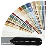
- Brand: Benjamin moore
- Container type: Box
- Finish type: Opa
50. Very Navy M500-7 — Behr
Best for: A deep navy living-room wall when a blue statement is preferred over charcoal or black. Light response: Low. Undertone to watch: Deep blue that may read grayer in shadow. Works with: White, camel, tan, brass, warm wood, and red or rust accents. Use it on: An accent wall, built-ins, or a well-lit full room. Best finish: Matte or eggshell. Potential problem: It can feel cold beside blue-gray furniture and may need careful primer and multiple finish coats. Behr documents the color and code in its current interior collection.
Choose by natural light and room direction
Paint does not have one fixed appearance. Light direction, glazing, trees, neighboring buildings, blinds, latitude, wall color, and artificial bulbs all change what you see. Sherwin-Williams provides room-orientation guidance, and Benjamin Moore similarly recommends adjusting warm and cool neutrals to exposure. Use the table as a starting direction, not a formula.
| Room condition | Good starting direction | What to test |
|---|---|---|
| North-facing | Warm white, warm greige, tan, clay, or warm green | Whether warmth prevents an icy appearance without turning yellow. |
| South-facing | Cooler white, blue-gray, muted green, or balanced neutral | Whether strong sunlight washes out the color or makes it too warm. |
| East-facing | Balanced colors or softly warm neutrals | The shade in bright morning light and cooler afternoon light. |
| West-facing | Balanced or slightly cooler colors | The late-afternoon golden shift, especially with warm whites and clay. |
| Low artificial light | Adequate-LRV warm or balanced colors | The evening appearance under the bulbs you actually use. |
| Bright room with pale furnishings | More saturated mid-tone or dark colors | Whether a pale shade becomes washed out and lacks enough contrast. |
North-facing rooms often benefit from warmer, higher-LRV choices; strong southern or western light can tolerate or benefit from cooler, muted colors. But a heavily shaded south-facing room may behave more like a dark room, while a north-facing room with large windows may not need much warmth.
LRV and undertones: the two numbers and ideas that matter
What LRV tells you
Light Reflectance Value, or LRV, expresses how much light a surface reflects on a 0–100 scale. In the manufacturer explanations, 0 represents absolute black and 100 represents pure white. Higher-LRV paint generally feels lighter and can create a less enclosed impression; lower-LRV paint generally creates more visual depth and intimacy.
What’s actually slowing this PC down?
Pick the symptom - the matching free tool is one click away.
LRV is not a complete prediction of how a room will feel. A high-LRV color can still look dull in a room with very little light, and a low-LRV color can look rich rather than oppressive in a bright room with light furniture and reflective surfaces. Sheen, undertone, adjacent colors, bulbs, and wall texture also matter.
Do not infer LRV from a photograph. Use the current manufacturer page for the exact color and product. For two documented reference points, Benjamin Moore lists White Dove OC-17 at 83.16 and Revere Pewter HC-172 at 55.05. Those values belong to those specific manufacturer colors and should not be treated as perfectly interchangeable measurements across brands.
What undertones do
An undertone is the less obvious hue beneath the main color. A white may contain yellow, pink, gray, blue, or green. A gray may lean blue, green, violet, beige, or taupe. A beige may lean yellow, pink, gray, or orange. A green may lean blue, yellow, gray, or brown.
To find the undertone that works, place the candidate beside the room’s existing white trim, flooring, sofa, stone, cabinetry, wood, rug, and nearby paint. A color that looks neutral on a small chip may become yellow beside bright white, blue beside cool upholstery, or green beside warm wood. These readings are contextual rather than permanent properties visible in exactly the same way in every room.
Quick wins for a faster PC:
Clear out junk files and repair common Windows errorsFree Scan →Scan for outdated or missing drivers - takes under a minuteDriver Scan →Repair Windows errors before they cause bigger problemsFix Now →What the 2026 color trends mean for a living room
As of August 10, 2026, major paint brands are emphasizing warmer, nature-based neutrals and deeper grounded colors. Sherwin-Williams selected Universal Khaki SW 6150, Benjamin Moore selected Silhouette AF-655, and Behr’s 2026 palette includes Hidden Gem, a smoky jade. See the Sherwin-Williams Color of the Year information, the Benjamin Moore 2026 announcement, and Behr’s 2026 palette.
These are brand forecasts and marketing programs, not objective rankings or evidence that one shade will work in every home. Trends are useful when they help you notice a color family you like. They should not override the flooring, light, furnishings, and sightlines already in your room.
Coordinate paint with furniture and fixed finishes
Begin with what is expensive or difficult to replace. If the sofa, rug, fireplace, flooring, cabinetry, or major artwork is staying, use it as the palette anchor. Pull a wall color from a secondary or subdued color in a patterned rug or artwork rather than matching the loudest color exactly.
- Warm woods and leather generally work comfortably with warm neutrals, clay, olive, and many blue-greens.
- Cool gray upholstery can clash with yellow-beige paint; compare samples directly against the fabric.
- Bright white trim can make creamy walls look more yellow.
- Dark walls usually benefit from lighter or contrasting furniture, artwork, rugs, or trim.
- Mixed finishes usually pair more easily with balanced greiges, muted greens, and soft whites than with strongly yellow or strongly pink colors.
In an open-plan home, check the paint from the main viewing positions and where it meets the kitchen, hallway, dining area, and adjacent rooms. A color that looks excellent on one living-room wall may create an awkward transition down a long sightline.
Do these 3 things before closing this tab:
1Fix the driver behind crashes, sound loss and screen glitches2Clear out junk files and repair common Windows errors3Scan for outdated or missing drivers - takes under a minuteSmall and dark living rooms: light is not the only goal
The rule that every small room must be white is too simple. A light warm white or pale greige can create a lighter, more open impression, but a mid-tone or dark color may better achieve the desired comfortable, enveloping effect. Those are different goals.
For a lighter impression, consider White Dove, Alabaster, Simply White, Pale Oak, or Classic Gray—but sample them because a small room can make undertones more noticeable. For coziness, consider Pashmina, Universal Khaki, Evergreen Fog, Kendall Charcoal, or Silhouette if the room has enough light and the furnishings provide contrast. Light-colored upholstery, reflective artwork, mirrors, and a lighter ceiling can keep a dark scheme from feeling visually dense.
A high-sheen wall paint reflects more light, but it also increases glare and reveals surface flaws. Do not choose satin solely to make a dark room brighter; test the actual sheen in the room.
Trim, ceilings, accents, and color drenching
- White trim with colored walls: The familiar high-contrast default. It is effective, but the trim white must be tested beside the wall color.
- Trim one step lighter or darker: A quieter, layered look that preserves architectural definition without a sharp outline.
- Same color, different sheen: A useful monochromatic approach for walls, trim, doors, and built-ins.
- Color drenching: Painting walls, trim, ceiling, and built-ins in related or identical color can blur boundaries and make a scheme feel intentional. Dark colors require careful planning for light, furniture, ceiling height, and coverage.
- Accent wall: Best when the color connects to upholstery, artwork, rugs, a fireplace, or another architectural feature. Benjamin Moore’s living-room guidance recommends relating accent colors to fabrics and accessories.
- Two-tone walls and molding: Particularly useful with wainscoting, picture-frame molding, chair rails, or a strong architectural division.
Painting the ceiling the wall color does not automatically make a room look larger. The result depends on contrast, ceiling height, lighting, and the value of the paint.
Free tools Windows power users keep installed
One-click scans. No signup required.
Which paint sheen is best?
| Finish | Living-room use | Trade-off |
|---|---|---|
| Matte | Soft appearance and better concealment of minor wall imperfections. | Choose a durable washable matte for a busy room; some flat-looking products are harder to clean and can show burnishing. |
| Eggshell | The safest general-purpose choice for many living rooms. | Balances modest reflection with easier cleaning, but will not hide flaws as well as flat or matte. |
| Satin | Busy family rooms, doors, trim, and surfaces needing more washability. | More reflective and more likely to emphasize dents, patches, roller marks, and uneven texture. |
| Flat | Low-traffic walls where hiding imperfections is the priority. | Often harder to clean unless the specific product is formulated for improved washability. |
| Semi-gloss or gloss | Usually trim, doors, built-ins, and architectural accents. | Too reflective for most broad living-room walls and unforgiving of surface defects. |
Manufacturers differ in product formulation, so follow the specific label. See the Sherwin-Williams sheen guide, Benjamin Moore finish guide, and Behr sheen guide.
How to sample paint correctly
A digital image, phone screen, printed swatch, or online visualizer is useful for narrowing the field, not for making the final decision. Benjamin Moore warns that on-screen and printer representations may differ from actual paint, and its brush-on samples are intended to provide a stronger visual test. Behr likewise recommends observing a wall sample as light changes.
Best Value

- Core Color Matching: Paint color sample cards include 83 standard colors to support paint color sample cards, color matching cards for painting, and paint chips standard samples, helping users compare shades before selecting a final finish for floor paint, hardware, and other project needs
- Reliable Reference: Paint samples are made with color matching materials designed to support accurate color comparison, giving painters and DIY users a practical paint and paint color samples reference for selecting tones that fit the project surface and intended look
- Portable Format: Measuring 3.74 x 1.57 x 1.18 in and weighing 3.88 oz, this paint samples set is compact for a toolbox, work bag, or travel use, making it easier to carry color test card paint and check shades on site when planning paint work
- Wide Project Use: Paint sample cards are suitable for floor paint, paint hardware, and related color selection tasks, offering a useful paint chips samples reference for contractors, decorators, and home improvement users working on color coordination across different surfaces
- Simple Set Package: Each package includes 1 set of paint sample cards, giving users a straightforward paint sample standard cards option for daily work, project planning, and quick shade comparison when choosing among paint color cards and paint chips sample cards
- Narrow the 50 colors to three to five candidates.
- Buy the manufacturer’s sample, a large color swatch, a peel-and-stick sample, or enough actual paint to make a substantial test.
- When possible, paint a real sample rather than relying only on a screen or tiny chip.
- Place samples on more than one wall, including a wall near a window and one in shadow.
- Keep the sample beside the actual sofa, rug, flooring, trim, curtains, artwork, and fireplace or stone.
- View it in morning, midday, late afternoon, evening, and under the artificial lights used in the room.
- Look at the sample from the main seating positions and from connected rooms.
- Leave it in place long enough to decide whether the color becomes irritating, dull, too yellow, too blue, or too dark.
- Only then buy the full-size quantity.
Warm LEDs and incandescent bulbs can make warm paint appear more yellow or pink; cooler bulbs can make blue-green and gray shades appear sharper. The exact result depends on the bulb, fixture, wall, and surrounding materials, so test under the lights you actually use.
How much paint to buy
For a basic estimate:
Wall area = room perimeter × wall height
Estimated paint = wall area ÷ product coverage × number of coats
Subtract doors and windows only if you need an unusually precise estimate. Behr says several of its interior products cover approximately 250–400 square feet per gallon for one coat. Sherwin-Williams gives a typical estimate of approximately 350–400 square feet per gallon, while noting that texture and desired coverage affect the amount. Always use the coverage printed on the specific product label and account for the number of coats, primer, porous patches, and a dark-to-light or light-to-dark change. The Sherwin-Williams paint calculator and Behr quantity guide can help with estimating.
Prepare the walls before painting
- Remove or protect furniture, fixtures, flooring, outlet covers, and hardware.
- Clean the walls and let them dry completely.
- Address mildew rather than covering it with new paint.
- Repair holes, cracks, dents, and damaged areas.
- Sand rough repairs and previously glossy surfaces as appropriate.
- Remove loose, peeling, or flaking paint.
- Prime porous, stained, patched, or dramatically changing surfaces.
- Use an appropriate deep-base or tinted primer when moving substantially from light to dark, following the paint and primer instructions.
- Paint only when the surface is clean, dry, sound, and properly prepared.
Paint-and-primer products do not eliminate cleaning, repairs, sanding, or the need for a separate primer on difficult surfaces. Do not promise one-coat coverage for a dark or saturated color unless the exact product, base, surface, and label support it. Benjamin Moore’s wall-preparation guide covers cleaning, sanding, priming, mildew, cracking, and flaking.
Ventilation, VOCs, and older homes
Use plenty of fresh air and ventilation during painting and afterward, and follow the product label. Low-VOC and zero-VOC labels do not automatically mean zero emissions or zero health risk. The EPA notes that total VOC labeling does not necessarily reflect the toxicity of individual compounds. People with asthma, chemical sensitivities, infants, older adults, or other vulnerabilities may need additional precautions and should avoid exposure to paint vapors. See the EPA’s guidance on ventilation and indoor air and its explanation of VOC labeling.
In the United States, homes built before 1978 may contain lead-based paint. Sanding, scraping, cutting, or otherwise disturbing old painted surfaces can create hazardous lead dust. Paid contractors disturbing paint in pre-1978 housing generally must be EPA- or state-certified and use lead-safe work practices. Homeowners working in their own homes are generally not subject to the same certification requirement, but EPA still recommends lead-safe practices and, in many cases, hiring a certified contractor. Do not aggressively sand old paint before addressing the lead risk. Consult the EPA’s Renovation, Repair and Painting program and lead-safe DIY guidance.
If you do not want a full repaint
- Paint only the fireplace wall or built-in cabinetry.
- Use the color on trim, doors, the back of shelving, or a reading nook.
- Color-drench a smaller architectural zone rather than the entire room.
- Use a lighter version of the same color in adjoining spaces.
- Test removable peel-and-stick samples before buying paint.
- Use a manufacturer visualizer to narrow choices, then confirm with real samples.
- Hire a color consultant if the room has difficult lighting, expensive furnishings, historic finishes, or multiple connected spaces.
Frequently Asked Questions
What is the most popular living-room paint color?
There is no single market-wide answer supported by the sources here. A manufacturer collection such as the Sherwin-Williams Top 50 shows colors the brand considers important or popular, but it is not a nationwide sales survey. Choose for the room’s light and finishes rather than treating a collection as proof of universal popularity.
The Tool Desk
Outbyte PC Repair FREERepair Windows errors before they cause bigger problemsFix Now →Outbyte Driver Updater FREEFix the driver behind crashes, sound loss and screen glitchesFind Drivers →What color makes a living room feel cozy?
Mid-tone and dark colors such as Pashmina, Universal Khaki, Evergreen Fog, Kendall Charcoal, Silhouette, or Hale Navy can create a more enveloping effect, especially with warm lighting and lighter contrasting furniture. Cozy is a design goal, not a guaranteed result; sample the color because dark furnishings and weak light can make the same shade feel heavy.
What colors can make a living room look larger?
Light warm whites, pale greiges, and soft balanced colors can create a lighter or more open impression by reducing visual contrast. They do not physically enlarge the room. A dark color-drenched scheme can also work in a small room when the goal is intimacy rather than visual expansion.
Should a living room be painted light or dark?
Choose light when you want the walls to recede, reflect more light, or connect several spaces quietly. Choose dark when you want depth, drama, or a cocooning effect and can provide adequate lighting and furniture contrast. Sample both directions on multiple walls before deciding.
Is gray still a good living-room color?
Yes, provided its undertone suits the room. Repose Gray, Agreeable Gray, Revere Pewter, Balboa Mist, and Kendall Charcoal cover different light levels and temperature effects. Gray can turn blue, green, violet, beige, or brown beside existing finishes, so compare it directly with the sofa, floor, trim, and stone.
The Tool Desk
Outbyte Driver Updater FREEScan for outdated or missing drivers - takes under a minuteDriver Scan →Outbyte PC Repair FREEClear out junk files and repair common Windows errorsFree Scan →What is the best neutral for an open floor plan?
Agreeable Gray, Repose Gray, Accessible Beige, Edgecomb Gray, White Dove, or Shoji White are useful starting points because they can connect varied furnishings and adjoining rooms. None is universally best. Test the color from the main sightlines into the kitchen, hallway, dining area, and other connected spaces.
Should living-room walls be matte or eggshell?
Eggshell is a practical default for many living rooms because it balances low reflection with easier cleaning. Durable matte is useful when hiding minor imperfections matters more. Satin is more washable but reflects more and shows more flaws; flat is best reserved for lower-traffic walls unless the product specifically offers improved washability.
Should trim match the living-room walls?
It can match, be lighter, be darker, or use the same color in a different sheen. Matching or closely coordinating trim supports color drenching and a quiet layered look; white trim creates stronger contrast. Test the exact trim white beside the wall color because bright white can make warm paint look more yellow.
How many gallons of paint are needed for a living room?
Estimate wall area as room perimeter multiplied by wall height, then divide by the product’s coverage and multiply by the number of coats. Many products cover roughly 250–400 square feet per gallon for one coat, but texture, porosity, color change, and product formula matter. Follow the label and use a manufacturer calculator.
Do I need primer before painting?
Sometimes. Primer is especially useful for porous, stained, patched, glossy, damaged, or dramatically changing surfaces. Paint-and-primer products still require cleaning, repairs, sanding, and sometimes a separate primer. Follow the exact product instructions rather than assuming one coat will cover every surface.
Can I paint over dark walls?
Yes, but plan for an appropriate primer and potentially more than one finish coat. The required base, primer tint, coverage, and number of coats depend on the old color, new color, product, surface, and application. Do not assume a light color will cover a dark wall in one coat.
How do I choose paint for a north-facing room?
Begin by testing warm whites, warm greiges, tan, clay, or warm greens because north-facing daylight is often cooler and less direct. The rule is not absolute: windows, trees, neighboring buildings, blinds, and artificial light can change the result. Test morning, midday, afternoon, and evening.
Are online paint visualizers accurate?
They are useful for narrowing the list and imagining color relationships, but they cannot reliably reproduce actual paint. Screen settings, photography, room lighting, surrounding colors, and product finish all affect the result. Confirm the choice with a real manufacturer sample on multiple walls.
Crashes, No Sound, or Screen Glitches?
Random freezes, missing sound and display glitches usually trace back to one bad driver. Find and replace yours safely.Free scan · under a minuteWindows Errors? Fix Them Before They Spread
Repair common Windows errors and clear accumulated junk for a smoother, more stable PC - no reinstall needed.Free scan · no reinstallIs low-VOC paint safer?
Low- or zero-VOC labeling can be useful, but it does not automatically mean the product is risk-free or free of emissions. EPA notes that total VOC labeling does not necessarily reflect the toxicity of individual compounds. Ventilate during and after painting and follow the label, especially around vulnerable occupants.
What precautions apply in a pre-1978 home?
In the United States, pre-1978 homes may contain lead-based paint. Avoid disturbing old paint until the lead risk is addressed. Sanding, scraping, or cutting can create hazardous dust. Paid contractors generally need EPA or state certification for covered work, and homeowners should follow EPA lead-safe practices or hire a certified contractor.
The Bottom Line
The best living-room color is the one that supports your room’s actual light, fixed finishes, furniture, and intended mood. Pick a family first, narrow the list to two or three named colors, test them on multiple walls through the full day, then choose the sheen and quantity for the way the room is used. A trend color can be a useful starting point, but the sample in your own living room is the final authority.
Quick Recap

Product prices and availability are accurate as of the date/time indicated and are subject to change. Any price and availability information displayed on Amazon at the time of purchase will apply.




