Quick wins for a faster PC:
Clear out junk files and repair common Windows errorsFree Scan →Scan for outdated or missing drivers - takes under a minuteDriver Scan →
ThatPainter is reader-supported. When you buy through links on our site, we may earn an affiliate commission. Learn More
Sherwin-Williams does not publish an official ranking of its six most calming colors. But its bedroom advice and tranquil color guidance point to a useful shortlist: Sleepy Blue SW 6225, Sea Salt SW 6204, Tradewind SW 6218, Halcyon Green SW 6213, Comfort Gray SW 6205 and Repose Gray SW 7015. These are design suggestions, not a promise that a color will have the same effect on everyone.
Which Sherwin-Williams colors can make a room feel more restful?
Sherwin-Williams’ advice for restful rooms most often favors soft blues, muted greens and subdued neutrals. The six colors below are an editorial selection based on the brand’s bedroom recommendations, tranquil palette and current color features—not a manufacturer ranking. Descriptions such as “calming” and “soothing” reflect the brand’s design language, not a guaranteed psychological or medical effect.

As an Amazon Associate I earn from qualifying purchases.
| Color | Hue family | Why consider it | Good starting point |
|---|---|---|---|
| Sleepy Blue SW 6225 | Soft blue | Sherwin-Williams specifically describes it as calming and suitable for bedrooms and many other spaces. | A lighter, recognizable blue for a bedroom retreat. |
| Sea Salt SW 6204 | Muted green | The brand calls it fresh and grounding, recommends it for a restful bedroom, and includes it in its “Serene Simplicity” palette. | A softened green for a restful bedroom or spa-like palette. |
| Tradewind SW 6218 | Blue with green undertones | A May 2026 Sherwin-Williams feature describes it as a calming blue with a hint of green. | A blue-green option when you want more than a straightforward blue. |
| Halcyon Green SW 6213 | Misty green with cool blue-gray undertones | A March 2026 feature describes it as a soothing, misty green. | A muted green for a cooler, softer impression. |
| Comfort Gray SW 6205 | Subdued palette option | It appears in Sherwin-Williams’ “Serene Simplicity” palette, which favors subdued colors and lighter, less-saturated tints of similar value. | A quieter palette choice; check its appearance in your room before deciding how it reads. |
| Repose Gray SW 7015 | Soft neutral gray | Sherwin-Williams includes it among bedroom gray examples and says cool neutrals can help create a restful vibe. | A neutral alternative if you prefer not to make the walls distinctly blue or green. |
How to choose among the six
For a soft blue bedroom: Sleepy Blue
Sherwin-Williams says, “Light blues like Sleepy Blue SW 6225 are calming and work well in most spaces.” That makes it the clearest pick here if you already know you want a light blue. As with any color, the room’s light and surrounding finishes affect the result.
For a muted green: Sea Salt or Halcyon Green
Sea Salt is the more direct fit if you want the brand’s restful-bedroom suggestion and its “Serene Simplicity” palette. Halcyon Green offers a misty green direction with cool blue-gray undertones, according to the March 2026 feature. In that feature, color marketing manager Emily Kantz says, “Halcyon Green leans into the calm, cool, and collected elements of everyday living.” That is Sherwin-Williams marketing language, not an independent finding.
#1 Best Overall
For a blue-green: Tradewind
Tradewind sits between a straightforward blue and green. Sherwin-Williams’ May 2026 feature describes its green hint as useful for bringing a calming impression to kitchens and hallways as well as other spaces. It may be worth comparing with Sleepy Blue if you like blue but want a greener cast.
For a subdued palette: Comfort Gray
Comfort Gray is included in the brand’s “Serene Simplicity” palette. That guide recommends subdued colors and lighter, less-saturated tints of similar value for a mellow bath retreat, and suggests pairing a soothing green with a warm neutral. Use those palette principles to guide nearby colors rather than assuming a color name alone determines how a room will feel.
Rank #2

- Oslo Home has created a comparable color based on color specifications of the original color using industry leading technology.
- Oslo Home is not associated or affiliated with Sherwin Williams in any way.
- REPAIR AND RESTORE IN MINUTES. Help get your rental deposit back, cover up the scuffs and knicks from kids, movers, pets or anything else life throws your way. With the bottle in brush design and quick drying, self-priming formulation, your living space will be looking great again with ease
- SKIP THE TIME-CONSUMING SETUP, SUPPLIES AND MESS. All in one bottle in brush design avoids heavy cans, prying, stirring, spilling, taping, drop cloths, pans, rollers, special brushes, and splatter. Simple to done, and back to life
- REDUCE THE PAINSTAKING COLOR GUESSWORK. Our curated color palette is based off the most popular shades of Sherwin Williams paint used in homes, apartments, rentals, new home construction, and more
For a quieter neutral: Repose Gray
Repose Gray is the neutral option among these six. Sherwin-Williams lists it as a bedroom gray example and describes soothing cool neutrals as a way to create a restful vibe. Choose it if you want a soft neutral wall rather than a clearly blue or green one.
Independent reader supportYour contribution helps us test, update, and keep practical guides available for everyone.How room light changes the choice
A paint chip or online image cannot tell you exactly how a shade will look on your walls. Sherwin-Williams explains that light reflectance value (LRV) indicates how much light a paint reflects, and that the light a room receives affects how the color appears. The direction the room faces matters too: the brand’s neutral-color guidance notes that north-facing rooms receive less natural light and suggests considering warmer undertones or adequate LRV to counter that effect.
Rank #3
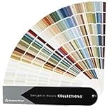
- Brand: Benjamin moore
- Container type: Box
- Finish type: Opa
- Room direction: Note whether the room faces north, east, south or west.
- Daylight: Consider how much daylight reaches the room and whether it reads warm or cool.
- Existing finishes: Compare the paint with flooring, trim, counters, furniture and other fixed surfaces.
- Personal preference: Decide whether you want a cooler or warmer impression and whether you prefer a clear hue or a subdued neutral.
If your room faces north and you are considering a blue, Sherwin-Williams’ light-green guidance specifically suggests Copen Blue SW 0068. The page describes it as subtly warm with cool blue undertones and gives it an LRV of 59. LRV describes reflectance, not a wellness effect; it is a useful comparison point, not a guarantee of how any paint will look in your room.
Quick Recap
Best Value

- Includes Three Shades to Match 90% of Surfaces: We offer two color shades of Matte Beige and one Matte White to instantly achieve the perfect color match. Eliminating the need for color charts, returns, and waiting for the right color to arrive. Instead, match to one of the two beige colors or mix colors and match to your desired shade.
- Repair and Restore in Minutes: Maintain and restore your home and home furnishings interior and exterior with our Matte finish, ultra-low VOC, water-based, and odor-free Matte Beige and White three-pack color matching kit.
- Instant Renovation: Whether it's from your children, movers, rental, pets, or anything else that comes your way. Spot.'s design and a quick-drying, self-priming formulation, your home furnishing or appliance will appear like new again.
- Easy and Simple: Everything you need is provided in an all-in-one paint and brush applicator. No other materials, tools or pre-process is required.
- Eco Friendly: Water-based paint with ultra-low emissions and odor means better indoor air quality. Non-toxic, eco-friendly, and safe for adults, children and pets.
Rank #4

- 【MULTIFUNCTIONAL PAINT REPAIRER】- Our tip of touch up paint pen is a soft brush, perfect for helping you quickly repair scuffs and scratches, chips, or nail holes on walls, trim, ceiling, and doors. Compared with ordinary paint brushes or paint rollers, it is more convenient to use in narrow spaces, without worrying about paint splatters or drips.
- 【2025 UPGRADED DESIGN】- 2025 latest design fillable paint pen can be controlled by pressing, allowing you to adjust the amount of paint as needed. Tackle your home painting project with ease and make your home look brand new.
- 【REUSABLE】- Our paint pens refillable are not disposable, you can refill paint into this touch up pen without any trouble, no need to buy and replace paint brushes frequently. Save money and be more environmentally friendly
- 【EFFICIENT AND SIMPLE】- Precise paint control device, one touch, and then apply evenly, which can ensure meticulous and neat repair, reduce mistakes and waste, and make home paint repair work simple and efficient.
- 【EASY PAINT STORAGE】- Precision-designed paint touch up pen can keep the paint inside the pens fresh for more than 48 months, and keep you away from messy paint cans, loose brushes, and paint trays. (for the best experience, please wet it with warm water before the second use nib).
How to test a calming color before painting
- Shortlist two or three shades. Choose candidates based on the hue and impression you want, then compare them with your fixed finishes.
- Get paint samples. Sherwin-Williams offers homeowner paint samples; check current availability with the brand.
- View them in the room. Evaluate the samples under the room’s actual lighting at different times of day.
- Choose only after comparing. Use what you see on your walls, not a screen rendering or tiny chip alone, to make the final decision.

Product prices and availability are accurate as of the date/time indicated and are subject to change. Any price and availability information displayed on Amazon at the time of purchase will apply.
What’s actually slowing this PC down?
Pick the symptom - the matching free tool is one click away.




