ThatPainter is reader-supported. When you buy through links on our site, we may earn an affiliate commission. Learn More
The strongest 2026 paint direction is warm, nature-linked, and more atmospheric—not the disappearance of neutrals. Designers and color forecasters are repeatedly pointing toward khaki, taupe, espresso brown, red-brown, restorative green, dusty blue-green, and softened pink. Stark cool whites and flat blue-gray are losing momentum in trend coverage, while warmer whites remain useful.
As an Amazon Associate I earn from qualifying purchases.
These nine shades are a practical, cross-source shortlist rather than a ranking or a claim that every interior designer prefers the same colors. It combines direct designer recommendations with repeated 2026 survey signals and official brand forecasts. Each color includes its U.S. brand name and number, likely room applications, light and undertone cautions, and ways to sample it before buying paint.
Windows Errors? Fix Them Before They Spread
Repair common Windows errors and clear accumulated junk for a smoother, more stable PC - no reinstall needed.Free scan · no reinstallOutdated Drivers Are Slowing You Down
One free scan finds every outdated or missing driver and matches the right update for your exact hardware.Free scan · exact hardware matchWhat paint colors are designers choosing for 2026?
The nine colors to start with are:
- Universal Khaki SW 6150 by Sherwin-Williams
- Silhouette AF-655 by Benjamin Moore
- Hidden Gem N430-6A by Behr
- Warm Eucalyptus 8004-28F by Valspar
- Warm Mahogany PPG1060-7 by Glidden
- October Mist CC-550 by Benjamin Moore
- Colorado Gray 2136-50 by Benjamin Moore
- Card Room Green No. 79 by Farrow & Ball
- Pink Shadow SW 0070 by Sherwin-Williams
They represent a broader and more useful picture of 2026 than a list made only from Color of the Year announcements. The selection includes official forecast colors, such as Universal Khaki, Silhouette, Hidden Gem, Warm Eucalyptus, and Warm Mahogany, alongside shades directly recommended by designers in Martha Stewart’s February 17, 2026 designer roundup.
#1 Best Overall
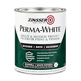
- Self-Priming formula - requires no sanding
- Mold & Mildew-Proof paint film - guaranteed for 5 years
- Resists dirt and moisture on film coating
- Finish is washable and scrubbable with soap and water
- Product contains a mildewcide to prevent the growth of mold and mildew on the paint film only
That distinction matters. A paint company’s Color of the Year is a commercial forecast and brand selection, not an independent vote by the entire design industry. A designer recommendation is also one person’s professional judgment. The most reliable conclusion comes from looking for overlap across forecasts, professional surveys, and reported designer choices.
What changed from recent paint trends?
Recent interiors often defaulted to cool blue-gray, stark white, or generic beige and greige. Those colors are not unusable, but 2026 coverage is more interested in colors with visible undertones, greater depth, and a connection to natural materials.
In a Fixr survey of 86 interior design professionals, 66% identified restorative greens as a leading palette, 59% cited nature-inspired neutrals, and 56% cited deep browns and khakis. The same survey found that 93% believed Millennial gray was on its way out and 70% recommended avoiding cool whites. Those figures describe the professionals surveyed; they are not an objective census of all designers or homeowners.
Other evidence points in the same direction. The 1stDibs 2026 Designer Trends Survey found chocolate brown selected by 33% of respondents and burgundy by 21%. ELLE Decor’s designer interviews similarly describe more interest in tobacco brown, rust, earthy greens, dusty jewel tones, saturated blues, merlot, and subdued cranberry.
The practical translation is not that every room should become dark green or brown. It is that color is being chosen with more attention to mood, material, and context.
Warm neutrals are expanding—not disappearing
Neutral does not mean only pale gray, beige, or white. A neutral can be a warm taupe, a khaki, a creamy white, a brown-black, a muted green, or even a dusty blue that behaves quietly beside wood and stone.
Universal Khaki, Taos Taupe, Silhouette, Cloud White, White Flour, Colorado Gray, and other shades can all perform neutral functions. Their differences are temperature, depth, and undertone. The better question is not whether neutrals are out, but whether the neutral works with your floor, cabinets, tile, upholstery, and lighting.
What’s actually slowing this PC down?
Pick the symptom - the matching free tool is one click away.
The nine 2026 paint colors
This is a reported shortlist, not a ranking. Each entry is labeled by the type of evidence behind it: official brand forecast, direct designer recommendation, or broader survey-supported direction.
1. Universal Khaki SW 6150 — Sherwin-Williams
What it looks like: Universal Khaki is Sherwin-Williams’ official 2026 Color of the Year. The company describes it as a warm, earthy mid-tone neutral with a slight yellow undertone and a balance of livability and longevity. See the official Universal Khaki page.
Why it belongs in the 2026 shortlist: It captures the movement toward warmer, nature-inspired neutrals without requiring a dramatic color commitment. It can sit between cream, tan, taupe, and light brown depending on the room.
Best rooms: Universal Khaki is a strong candidate for a living room, bedroom, dining room, hallway, or whole-home palette. It can also work on cabinetry or built-ins when you want more warmth than white.
Free tools Windows power users keep installed
One-click scans. No signup required.
Pair it with: Natural oak, rattan, linen, travertine, warm white, aged brass, charcoal, or a muted green. These are editorial pairings based on the color’s warm neutral character, not a manufacturer-prescribed scheme.
Trim and finish: A soft warm white can create a low-contrast trim scheme; a cleaner white creates more definition. Matte or eggshell is generally appropriate for living and dining walls, while satin may be more practical in a hall or family room. Follow the paint line’s product guidance.
Watch out for: The yellow influence may become more visible beside blue-gray floors, cool white trim, or blue lighting. It can also look more golden under warm nighttime bulbs. Test it against the actual fixed finishes before treating it as a whole-house neutral.
2. Silhouette AF-655 — Benjamin Moore
What it looks like: Silhouette is Benjamin Moore’s 2026 Color of the Year, described as a deep espresso brown with charcoal and burnt-umber influence. The brand’s announcement is available at Benjamin Moore.
The Tool Desk
Outbyte PC Repair FREEClear out junk files and repair common Windows errorsFree Scan →Outbyte Driver Updater FREEScan for outdated or missing drivers - takes under a minuteDriver Scan →Why it belongs: Silhouette reflects two recurring 2026 signals: chocolate brown and darker, more enveloping rooms. It is less stark than a pure black and can bring the visual weight of dark wood or leather to painted surfaces.
Best rooms: Use it as an enveloping color in a study, library, dining room, bedroom, or media room. It is also a practical choice for lower cabinetry, a kitchen island, built-ins, doors, or a fireplace wall.
Pair it with: Creamy white, cognac leather, natural or dark wood, aged bronze, brass, dusty green, and stone. A lighter ceiling can preserve contrast, while painting trim and doors in the same family creates a more architectural effect.
Rank #2

- PAINT + PRIMER IN ONE: Evolve’s paint-and-primer formula helps you get great coverage from the start, sealing your surface and reducing the extra work of multiple coats.
- AVAILABLE IN MULTIPLE SHEENS, COLORS & SIZES: Choose from a curated palette of designer colors in Flat, Eggshell, Satin, and Semi-Gloss sheens to match any style, room, or project. Available in 1-Gallons & 5-Gallons.
- EGGSHELL SHEEN – Soft, Velvety Glow: Offers a gentle sheen that balances elegance with durability. Ideal for moderate-traffic areas like dining rooms, hallways, and family rooms. Easy to clean without compromising the finish.
- STAIN & SCRUB RESISTANT: Built to last in real spaces, Evolve helps resist marks, scuffs, and water spotting, so your home continues to look polished and well-maintained.
- DESIGNED FOR MOISTURE-PRONE AREAS: Formulated to perform well in bathrooms, kitchens, entryways, laundry rooms, and other high-humidity spaces.
Trim and finish: Color drenching—using the same or a related shade on walls, trim, and doors—can make Silhouette feel deliberate rather than like a single dark accent. Eggshell or matte can soften a wall; satin or semi-gloss may suit cabinetry and trim.
Quick wins for a faster PC:
Fix the driver behind crashes, sound loss and screen glitchesFind Drivers →Clear out junk files and repair common Windows errorsFree Scan →Scan for outdated or missing drivers - takes under a minuteDriver Scan →Watch out for: Dark brown can absorb substantial light and expose patchy preparation or uneven walls. It may feel heavy in a dim room unless balanced with strong lighting, reflective surfaces, and lighter furnishings. Room size alone does not rule it out; mood and light matter more.
3. Hidden Gem N430-6A — Behr
What it looks like: Hidden Gem is Behr’s 2026 Color of the Year, a smoky jade that blends blue and green. Behr describes it as part of a palette combining earth tones, jewel tones, and relaxed pastels. Details are on the official Behr announcement.
Why it belongs: Green is the most persistent color family in the reviewed 2026 research, but Hidden Gem is not a simple sage. Its smoky blue-green character gives it more depth and a slightly jewel-like mood. Designer John McClain separately identified it as a favorite, noting its depth and changing appearance through the day; his recommendation is reported by Designers Today.
Best rooms: Try it on a kitchen island, powder-room walls, a library, bedroom, office, or built-in cabinetry. It can also work in a living room when the furnishings have enough warm and light contrast.
Pair it with: Warm white, pale oak, walnut, brass, terracotta, camel, cream, or muted blush. Blue-gray stone and cool white can make the color feel bluer, so compare the sample with your countertops and tile.
Trim and finish: Use a warm white for contrast or a related green on trim for a quieter, room-enveloping scheme. Matte or eggshell is suitable for many wall applications; satin or semi-gloss is more washable for cabinetry and trim.
Watch out for: Its blue-green balance can shift noticeably with daylight direction and artificial bulbs. In a north-facing room it may feel cooler and grayer; in warm light it may appear more green or subdued. That is an editorial lighting caution, not a fixed behavior in every home.
4. Warm Eucalyptus 8004-28F — Valspar
What it looks like: Warm Eucalyptus is Valspar’s official 2026 Color of the Year. The company describes it as naturally restorative and serene; see the Valspar color page.
Do these 3 things before closing this tab:
1Clear out junk files and repair common Windows errors2Fix the driver behind crashes, sound loss and screen glitches3Repair Windows errors before they cause bigger problemsWhy it belongs: It represents the softer, livable side of the green trend. Compared with a saturated emerald or forest green, eucalyptus suggests a quieter connection to foliage and natural landscapes.
Best rooms: It is a natural fit for bedrooms, bathrooms, kitchens, living rooms, and entryways. Use it on walls when you want color without a highly formal or theatrical effect; use it on cabinetry or a vanity when a full room feels like too much.
Pair it with: Warm ivory, pale wood, woven textures, natural stone, clay, tan leather, and muted black. The suggested combinations are editorial and should be checked against your existing materials.
Trim and finish: Warm white trim keeps the palette soft. A slightly higher-sheen satin can be useful in a bathroom or hardworking kitchen area, while matte or eggshell can make a bedroom or living room feel calmer.
Watch out for: Eucalyptus greens can look gray or blue in cool light and warmer or more yellow in incandescent light. If the room already has yellow-beige tile or orange wood, compare a large sample before committing.
5. Warm Mahogany PPG1060-7 — Glidden
What it looks like: Warm Mahogany is Glidden’s 2026 Color of the Year, a rich red with a grounded brown influence. Find it in Glidden’s 2026 color trends. The NKBA’s industry roundup also lists Warm Mahogany as a PPG selection, but similarly named colors from different brands should not be assumed to have identical formulas.
Why it belongs: Red-brown is one of the clearest areas where official forecasts and designer coverage overlap. It connects the chocolate-brown trend with the renewed interest in rust, merlot, cranberry, and burgundy rather than returning to bright primary red.
Best rooms: Warm Mahogany can anchor a dining room, office, library, powder room, or bedroom. It is often easier to use on lower cabinetry, an island, doors, or built-ins than across every wall of a large open-plan room.
Recommended Free Tools
Pair it with: Cream, tobacco, walnut, olive or eucalyptus green, aged brass, warm black, and natural stone. Use lighter upholstery or art if the room lacks daylight.
Rank #3

- Use for a variety of indoor and outdoor project surfaces including wood, metal, plaster, masonry or unglazed ceramic
- Water-based acrylic formula is low odor, resist chips and provides long-lasting protection
- Covers up to 120 sq ft and dries to touch in 30 minutes for quick project completion
- Semi-gloss finish minimizes surface imperfections, goes on smoothly and provides excellent hide
- Prior to application sand surfaces with 180/200 grit sandpaper, then wash with a degreaser, allow the surface to dry and apply paint
Trim and finish: Warm white trim will make the red-brown more visible; tonal trim can create a deeper, more enveloping room. Matte or eggshell usually keeps the walls from becoming overly reflective, while satin can make cabinetry easier to clean.
Watch out for: Red-brown becomes more assertive over a large area than it appears on a chip. It can also amplify orange or red undertones in existing wood and brick. Test it beside those materials in both daytime and evening light.
6. October Mist CC-550 — Benjamin Moore
What it looks like: Benjamin Moore describes October Mist as a gently shaded sage. Its manufacturer-listed LRV is 46.54. See the official color page.
Windows Errors? Fix Them Before They Spread
Repair common Windows errors and clear accumulated junk for a smoother, more stable PC - no reinstall needed.Free scan · no reinstallCrashes, No Sound, or Screen Glitches?
Random freezes, missing sound and display glitches usually trace back to one bad driver. Find and replace yours safely.Free scan · under a minuteWhy designers are using it: Janie Hungerford recommended October Mist as a warm, neutral green in the Martha Stewart roundup. She described its light behavior as fresh and airy in the morning, then deeper as the light softens. That ability to change without becoming highly saturated is part of its appeal.
Best rooms: Use it in kitchens, bedrooms, living spaces, home offices, or on cabinetry. It can support both traditional and contemporary rooms, particularly where wood, linen, rattan, or stone already appear.
Pair it with: Creamy white, natural oak, walnut, woven beige, terracotta, muted brass, and soft charcoal. A crisp blue-white may make it seem more yellow by contrast.
Trim and finish: Warm white trim gives the sage a gentle frame. For a calmer effect, carry the color onto cabinetry or use a related tone on the ceiling. Eggshell or matte is generally appropriate for living areas; choose a more washable sheen where the surface will be handled frequently.
Free tools Windows power users keep installed
One-click scans. No signup required.
Watch out for: LRV is useful for comparison, but it does not tell you the entire story. October Mist’s perceived warmth and grayness will change with exposure, surrounding colors, and bulbs. Sample it next to the real countertop, floor, and trim.
7. Colorado Gray 2136-50 — Benjamin Moore
What it looks like: Colorado Gray is a gray-tinged blue-green with a manufacturer-listed LRV of 44.16. Benjamin Moore’s description and specifications appear on the official color page.
Why it belongs: Dana Ayala recommended Colorado Gray as a dusty blue that can function as a new neutral, particularly in bedrooms, powder rooms, offices, and libraries. The recommendation is reported by Martha Stewart. It is also a useful rebuttal to the idea that every gray-related color is obsolete: the issue is usually a flat, cool, blue-gray formula used without regard to context.
Best rooms: Bedrooms and offices are natural applications, while a powder room or library can support its more atmospheric quality. It can be especially effective with white oak, aged metal, and textiles in cream or flax.
Recommended Free Tools
Pair it with: Warm white, natural wood, camel, taupe, muted sage, antique brass, and soft black. Avoid choosing trim from a tiny chip; compare the actual white beside the blue-green sample.
Trim and finish: Warm white trim can keep it from feeling icy. Matte or eggshell works well for bedrooms and offices; satin may be practical in a hall or bathroom depending on the product and wall condition.
Watch out for: Yellow artificial light and warm orange wood can push Colorado Gray toward a greener or muddier appearance. In cool daylight, it may read bluer. This is a color to test at several times of day, especially if the room has mixed lighting.
8. Card Room Green No. 79 — Farrow & Ball
What it looks like: Card Room Green is Farrow & Ball No. 79. Alicia Roche described it as classic, nostalgic, warm, deep, and versatile in the Martha Stewart designer roundup. Farrow & Ball’s official page emphasizes the need to sample because its colors can reveal different undertones as light changes.
The Tool Desk
Outbyte Driver Updater FREEFix the driver behind crashes, sound loss and screen glitchesFind Drivers →Outbyte PC Repair FREERepair Windows errors before they cause bigger problemsFix Now →Why it belongs: This is the more traditional, enveloping end of the 2026 green spectrum. It has the collected quality of a historic study rather than the airy neutrality of a pale sage.
Best rooms: Consider it for a study, office, library, dining room, or cabinetry. It can make a small powder room feel intentional and jewel-box-like, while a larger room may benefit from lighter upholstery and strong task lighting.
Pair it with: Dark or medium wood, aged brass, leather, cream, botanical prints, warm stone, and muted red-brown. These pairings are editorial suggestions rather than official Farrow & Ball color matches.
Rank #4

- ALL-IN-1 PAINT & PRIMER: A hardy multi-purpose and multi-surface one-coat paint and primer in one for almost any indoor or outdoor surface. A wall, ceiling, floor, skirting board, cabinet, furniture and door paint for your bathroom, kitchen, home and garden.
- DURABLE & VERSATILE: A highly pigmented, thick formula available in 12 bold colors and a Matte, Satin or Gloss finish. Ideal for interior and exterior paint jobs on wood, laminate, plastic/UPVC, metal, concrete, brick, masonry, stone, glass and more.
- EFFECTIVE MONEY & TIME SAVER: A quick painting solution for DIY or professional builders and painters; our luxuriously opaque formula requires just 1 coat and is fast drying for a premium finish.
- ADVANCED ECO FORMULA: Our UK-made chalk paint is water-based, non-toxic, low odor, and has low VOCs for an environmentally friendly decorating choice.
- EASY APPLICATION: Remove dirt with a damp cloth, wipe the surface clean and dry, sand/score the surface (optional based upon the finish required), stir to mix the color and paint with a brush or roller.
Trim and finish: A warm white provides classic contrast. For an old-world or architectural effect, use the green on walls and cabinetry or carry it across trim. Choose sheen according to use and surface condition; a dark color with more sheen will reveal more wall irregularity and reflect more light.
Quick wins for a faster PC:
Clear out junk files and repair common Windows errorsFree Scan →Scan for outdated or missing drivers - takes under a minuteDriver Scan →Watch out for: Do not judge Card Room Green only under bright store lighting. Its depth and undertone can change substantially through the day, and the deep finish may feel heavy in a poorly lit room.
9. Pink Shadow SW 0070 — Sherwin-Williams
What it looks like: Pink Shadow is a muted, architectural pink rather than a sugary or childlike pink. Meghan Sharp recommended it in the Martha Stewart 2026 roundup.
Why it belongs: Soft pinks and dusty jewel tones are part of the broader move toward rooms with atmosphere and personality. Pink Shadow can function almost like a warm neutral when it is balanced with natural materials and restrained furnishings.
Best rooms: Use it in a bedroom, nursery, sitting room, bathroom, dressing room, or powder room. It can also be effective on a ceiling or the back of built-ins when a full pink room is not the goal.
Pair it with: Cream, warm taupe, chocolate brown, eucalyptus green, muted burgundy, natural oak, and aged brass. A cool bright white may make the pink look more saturated by comparison.
Trim and finish: Creamy trim produces a softer, layered scheme; a darker brown or charcoal accent can make the pink feel more architectural. Matte or eggshell is generally more forgiving on walls, while a washable satin can suit a bathroom or children’s room if the product is appropriate.
Watch out for: Its appearance is especially sensitive to surrounding colors. Red-toned floors, warm bulbs, or pink and coral furnishings can intensify it. Use a large sample beside the actual trim and floor.
How to choose among the nine
| If you want… | Start with… | Why |
|---|---|---|
| A warm whole-home neutral | Universal Khaki or Taos Taupe | Both provide more warmth and depth than a pale cool gray. |
| A soft, nature-linked green | October Mist or Warm Eucalyptus | Both are calmer, livable greens suited to everyday rooms. |
| A richer green with drama | Hidden Gem or Card Room Green | Hidden Gem is smoky blue-green; Card Room Green is deeper and more traditional. |
| A deep brown statement | Silhouette or Warm Mahogany | Silhouette is espresso-charcoal; Warm Mahogany adds red and brown. |
| A livable blue-gray | Colorado Gray | Its blue-green influence gives gray more complexity than a flat neutral. |
| A muted pink | Pink Shadow | It brings warmth and personality without requiring a bright pink scheme. |
| A dramatic dark envelope | Silhouette, Card Room Green, or a black such as Wrought Iron | Use the darkest shades when the goal is intimacy, contrast, or architectural emphasis. |
The other designer-recommended colors worth knowing
The nine above intentionally broaden the palette beyond one published roundup. A closely matching Martha Stewart article published February 17, 2026 reported these nine designer recommendations: Taos Taupe, Colorado Gray, Tricorn Black, October Mist, White Flour, Wrought Iron, Pink Shadow, Card Room Green, and Cloud White.
Four of those colors are not in the cross-source nine because the broader 2026 evidence strongly supports adding brown, red-brown, and additional greens. They remain useful choices:
- Taos Taupe 2111-40, Benjamin Moore: a rich, warm taupe with an LRV of 23.65. Shannon Askinasi recommended it for living rooms, bar rooms, butler’s pantries, and mudrooms. It has considerably more depth than a pale gray and is worth testing in rooms already furnished with warm wood or stone. See Benjamin Moore’s color page.
- Tricorn Black SW 6258, Sherwin-Williams: Askinasi recommended this deep, flexible black for warm neutrals and wood. It is especially useful for doors, millwork, cabinetry, and color-drenched rooms. Test it carefully on uneven walls and in rooms with little daylight.
- Wrought Iron 2124-10, Benjamin Moore: Benjamin Moore lists an LRV of 8.17 and describes it as a relatively soft, malleable black. Askinasi noted that it can read as soft charcoal or slightly navy depending on the room. It suits libraries, bars, cabinetry, and full-room envelopes; details are on the official page.
- White Flour SW 7102, Sherwin-Williams: Sherwin-Williams describes it as a clean white with a subtle cream undertone and lists an LRV of 86.54. Meghan Sharp recommended it as a warm white without a pronounced yellow cast. See the official color page.
- Cloud White OC-130, Benjamin Moore: This soft, balanced white has a listed LRV of 85.05. Dana Ayala recommended it as a white that responds to flooring and adjacent materials, making it useful for kitchens, bathrooms, trim, and whole-home backgrounds. See Benjamin Moore’s page.
These alternatives show why a trend list should not be treated as a winner-take-all forecast. A homeowner who needs a white, black, or warm taupe may find a better fit among the direct designer recommendations than among the official 2026 colors.
The official 2026 Color of the Year landscape
Paint companies and color authorities did not make one unified selection. Their separate announcements show the same general direction—warmth, nature, and depth—but they serve different brand strategies and audiences. Treat them as evidence of industry forecasting, not independent consumer polling.
| Brand or authority | 2026 selection | Verified description |
|---|---|---|
| Pantone | Cloud Dancer, PANTONE 11-4201 | A lofty, balanced white intended to convey calm and act as a structural neutral. |
| Benjamin Moore | Silhouette AF-655 | Espresso brown with charcoal and burnt-umber influence. |
| Sherwin-Williams | Universal Khaki SW 6150 | Warm, earthy mid-tone neutral with a slight yellow undertone. |
| Behr | Hidden Gem N430-6A | Smoky jade blending blue and green. |
| Valspar | Warm Eucalyptus 8004-28F | Restorative, serene green. |
| Glidden | Warm Mahogany PPG1060-7 | Grounded red with brown influence. |
| Dunn-Edwards | Midnight Garden DE5657 | Deep, muted green with earthy undertones. |
| Dutch Boy | Melodious Ivory 313-2DB | Creamy, warm ivory. |
| PPG, as listed by the NKBA industry roundup | Warm Mahogany | A parallel red-brown selection; do not assume it is identical to Glidden’s formula without checking the brand. |
Why Pantone’s white does not contradict the move away from stark white
Pantone’s Cloud Dancer is a color-system selection, not a universal wall-paint formula. Pantone presents it as a soft, organic white rather than a technical, icy, pristine white. That distinction helps reconcile the two trends: design coverage is criticizing clinical cool whites, not eliminating every pale background.
Do these 3 things before closing this tab:
1Repair Windows errors before they cause bigger problems2Scan for outdated or missing drivers - takes under a minute3Clear out junk files and repair common Windows errorsIf you want a Cloud Dancer-inspired interior, treat it as a palette direction unless a specific paint manufacturer provides a product match. It is not interchangeable with Benjamin Moore Cloud White or Sherwin-Williams White Flour, even though all three are light whites.
Independent reader supportYour contribution helps us test, update, and keep practical guides available for everyone.Are dark paint colors practical?
Yes—if the room’s light, surfaces, and intended mood support them. Dark paint can make surfaces appear closer and can make a large room feel more intimate, while lighter colors generally reflect more light and can make a small room feel more open. Sherwin-Williams explains this relationship in its guide to choosing paint colors.
Dark colors are particularly effective in studies, libraries, dining rooms, powder rooms, media rooms, bedrooms, cabinetry, doors, and trim. A small room is not automatically the wrong place for a dark shade: a powder room or office may benefit from an enveloping mood.
The trade-off is that dark paint reveals poor preparation, absorbs more light, and creates stronger transitions into hallways or adjoining rooms. Test the walls, trim, ceiling, and neighboring spaces together. Color drenching—using one color or closely related colors over walls, trim, doors, and sometimes the ceiling—can make a dark room feel intentional and architectural, but it is not mandatory.
Color drenching or an accent wall?
Both approaches remain available, but 2026 trend reporting favors more integrated schemes. Fixr found that 41% of surveyed professionals identified color drenching as a major trend, while 38% identified accent walls as a trend to avoid. ELLE Decor’s coverage also discusses room-wide tonal schemes, color capping, and unexpected high-contrast combinations.
Best Value

- WHAT'S IN THIS 10 PIECE PAINT KIT FOR WALLS: includes one plastic paint tray; one 9 inch roller frame; one 4 inch mini roller frame; two 9 inch microfiber roller covers (1/2 inch nap); two 4 inch microfiber roller covers (1/2 inch nap); one 1 inch flat brush; one 1.5 inch angle sash brush; one 2 inch angle sash brush
- Versatile Application: Perfect for any project, this set includes paint rollers 9 inch for large surfaces and smaller brushes for detail work
- All-in-One Kit: This paint brush set and paint tray combo ensures you have all the paint supplies needed for any home improvement task
- Professional Grade: Get a smooth, even finish with our high-quality paint roller set; ideal for applying interior paint gallon or smaller quantities
- Cost-Effective: This paint brush and roller set provides unbeatable value; includes paint pan and paint trays for easy cleanup and reuse
Those numbers do not make accent walls universally outdated. Use color drenching when you want the room to feel enveloping, taller, or more architectural. Use an accent wall when it emphasizes a fireplace, headboard, built-in, or other genuine focal point. An accent wall chosen only because four full walls feel intimidating may look less resolved than a carefully scaled use of color on cabinetry, a ceiling, or trim.
How undertone and light should guide your choice
The key decision is not simply green versus beige. Ask whether a color leans yellow, red, blue, gray, or brown, and whether that undertone works with permanent materials.
Flooring, cabinets, countertops, tile, brick, fireplaces, rugs, upholstery, and artwork can all change how paint looks. Sherwin-Williams recommends using those existing materials during color selection rather than choosing paint in isolation. Cool bright trim beside a warm wall can look especially blue or harsh; a creamy wall beside yellowed trim can exaggerate the trim’s yellow.
What LRV tells you—and what it does not
Light Reflectance Value, or LRV, expresses the percentage of light reflected from a surface. Benjamin Moore describes the scale as 0 for absolute black and 100 for pure white in its LRV explanation. A higher LRV generally means a color reflects more light.
LRV is useful when comparing relative lightness: Wrought Iron at 8.17 is much more light-absorbing than Cloud White at 85.05. But LRV does not fully describe undertone, chroma, or how a color feels in a furnished room. It also does not guarantee that a room will appear larger. Ceiling height, window size, light direction, contrast, furnishings, and sheen matter too.
Choosing the right finish
Color and sheen are inseparable because sheen changes reflected light and can materially alter the effect of a dark or saturated shade. Sherwin-Williams’ paint sheen guide gives these practical starting points:
- Flat: best at hiding wall imperfections, but less forgiving in high-traffic areas.
- Matte: useful for living rooms and dining rooms when you want a low-reflection surface.
- Eggshell or satin: practical for hallways, family rooms, children’s rooms, and some woodwork.
- Semi-gloss: useful for kitchens, bathrooms, trim, and utility areas where cleanability and moisture resistance are priorities.
- Gloss or high-gloss: suited to doors, cabinets, trim, and furniture when a reflective statement is intentional.
Do not choose a finish solely because a color is fashionable. Match the sheen to traffic, moisture, surface condition, cleanability, and the amount of reflection you want. A higher sheen can highlight wall defects, while a flat finish may be impractical where frequent washing is needed.
How to sample a 2026 paint color correctly
- Begin with fixed materials. Gather flooring, countertops, cabinets, stone, tile, brick, rugs, and major upholstery. A color that works in an empty room may clash with the finishes that cannot be changed.
- Use physical samples. Collect manufacturer chips or sample paint. Screen images and digital color cards cannot reliably show undertone or finish.
- Paint a large movable board or a substantial wall area. A tiny chip hides how the color behaves across four walls. Place the sample beside the actual trim and permanent materials.
- View it in morning, afternoon, and evening light. Check daylight from the room’s real windows and the artificial bulbs used at night. Sherwin-Williams specifically recommends checking both natural and artificial lighting rather than deciding only in the store.
- Check the finish separately. The same formula can look different in flat, matte, eggshell, satin, semi-gloss, or gloss because each reflects light differently.
- Move the sample around. Test it near a window, in a shadowed corner, beside the floor, and next to trim. This is particularly important for Colorado Gray, Hidden Gem, Card Room Green, and warm whites.
- Test dark colors beyond the walls. If you are considering Silhouette, Wrought Iron, Tricorn Black, or Card Room Green, look at how the shade relates to the ceiling, doors, trim, and neighboring rooms.
- Use visualizer apps only as a first step. Sherwin-Williams’ ColorSnap app offers day-and-night visualization, but the manufacturer still recommends physical sampling.
Color names and numbers are brand-specific. Benjamin Moore Cloud White is not Pantone Cloud Dancer, and a retailer’s closest match is not automatically the same as the original formula. Verify the brand, collection, color number, sheen, and product line before ordering enough paint for the room.
A note about low-VOC and zero-VOC paint
If indoor air quality is part of your decision, do not assume that a low-VOC or zero-VOC label automatically means a product is harmless. The EPA explains that those labels do not necessarily account for every potentially harmful indoor chemical, and total VOC content alone does not establish overall safety.
Check the specific product’s composition, follow ventilation and curing instructions, and consider credible third-party emissions certifications. The EPA’s guidance on identifying greener paints and coatings is a better starting point than relying on a marketing phrase alone. Keep children, pets, and sensitive occupants away from freshly painted rooms as directed by the product label.
What does the 2026 trend mean for gray, white, and beige?
Is gray really out?
No. Cool, flat, blue-toned gray is losing momentum in some 2026 trend reporting, but gray itself is not forbidden. Colorado Gray demonstrates why undertone and context matter: its blue-green complexity gives it more atmosphere than a generic gray, and a designer still recommended it for 2026 rooms.
What’s actually slowing this PC down?
Pick the symptom - the matching free tool is one click away.
Gray can remain useful when it relates to the architecture, flooring, stone, or furnishings. The problem is usually selecting a default gray without checking whether it is too blue, too cold, too light, or disconnected from the materials around it.
Will a warm white look yellow?
It can. Warm white may contain cream, beige, red, or subtle gray influence; warm does not necessarily mean visibly yellow, but lighting and adjacent surfaces can make yellow more apparent. White Flour, Cloud White, and Pantone Cloud Dancer should not be treated as interchangeable. Sample the actual paint next to trim, cabinets, flooring, and tile.
Can one of these colors cover an entire house?
Yes, but you do not need to use a Color of the Year throughout the entire house. A forecast color can appear on one room, an island, a ceiling, a door, trim, built-ins, or a powder-room envelope. For a whole-home scheme, Universal Khaki, October Mist, or a carefully sampled warm white may be easier to carry between rooms than a deep brown or saturated green.
Frequently Asked Questions
Is green the official color of 2026?
No single authority selected green as the universal 2026 color. Green is the strongest recurring family in the reviewed surveys and forecasts, including Fixr’s restorative-green finding, Behr’s Hidden Gem, Valspar’s Warm Eucalyptus, Dunn-Edwards’ Midnight Garden, October Mist, and Card Room Green.
Quick wins for a faster PC:
Scan for outdated or missing drivers - takes under a minuteDriver Scan →Clear out junk files and repair common Windows errorsFree Scan →Are dark colors a bad choice for a small room?
No. A small powder room, bedroom, office, or library can benefit from an intimate, enveloping dark color. The decision depends on available light, wall condition, furnishings, and the mood you want—not room size alone.
Can I use Pantone Cloud Dancer as wall paint?
Cloud Dancer is a Pantone color-system selection, not a universal wall-paint formula. Use it as inspiration unless a specific paint manufacturer offers a verified product match. It is not automatically identical to Benjamin Moore Cloud White or Sherwin-Williams White Flour.
Does low-VOC paint automatically mean it is safer?
No. EPA guidance says low-VOC and no-VOC labels do not necessarily account for every potentially harmful indoor chemical, and VOC content alone does not establish safety. Review the specific product, ventilate properly, follow curing instructions, and consider third-party emissions certifications.
The Bottom Line
Bottom line: The most defensible 2026 palette is warmer, deeper, and more connected to nature: khaki and taupe instead of default greige, espresso and red-brown instead of purely gray neutrals, and restorative greens alongside softened whites and dusty accents. Start with Universal Khaki for a flexible warm neutral, October Mist or Warm Eucalyptus for a quiet green, Silhouette or Warm Mahogany for depth, and Colorado Gray or Pink Shadow when you want more color. Then test the exact paint beside your real flooring, trim, cabinets, lighting, and furnishings—the room, not the trend report, makes the final decision.
What’s actually slowing this PC down?
Pick the symptom - the matching free tool is one click away.
Quick Recap

Product prices and availability are accurate as of the date/time indicated and are subject to change. Any price and availability information displayed on Amazon at the time of purchase will apply.




