Quick wins for a faster PC:
Outdated Drivers Are Slowing You Down
One free scan finds every outdated or missing driver and matches the right update for your exact hardware.Free scan · exact hardware matchWindows Errors? Fix Them Before They Spread
Repair common Windows errors and clear accumulated junk for a smoother, more stable PC - no reinstall needed.Free scan · no reinstallClear out junk files and repair common Windows errorsFree Scan →Fix the driver behind crashes, sound loss and screen glitchesFind Drivers →Repair Windows errors before they cause bigger problemsFix Now →
ThatPainter is reader-supported. When you buy through links on our site, we may earn an affiliate commission. Learn More
From 2000 through 2025, Pantone selected 28 named colors across 26 calendar years. The difference comes from two paired selections: Rose Quartz and Serenity in 2016, and Ultimate Gray and Illuminating in 2021.
The timeline begins with 15-4020 Cerulean—also called Cerulean Blue in some later Pantone material—and ends with 17-1230 Mocha Mousse, Pantone’s selection for 2025. Pantone’s Color of the Year program itself began in 1999, before the first annual selection in this list.
As an Amazon Associate I earn from qualifying purchases.
This is a reference guide for painters, designers, interior professionals, marketers, and anyone checking a Pantone name or number. The descriptions of mood and meaning below summarize how Pantone positioned each color; they are cultural and design interpretations, not universal rules about what a color must mean.
Quick reference: the complete Pantone Color of the Year timeline
The names and core numbers below follow Pantone’s historical lists and color records. The number is shown without a library suffix so it can be read consistently across the timeline. For the important distinction between textile, paper, and graphics libraries, see How to read a Pantone number below.
#1 Best Overall
![Pantone Color Bridge Guide Coated | Pantone to CMYK, RGB & HTML Color Matching Fan Deck for Graphic Design, Branding & Print | GG6103B [Old Version]](https://m.media-amazon.com/images/I/41F8HJBMLBL._SL160_.jpg)
- INDUSTRY-STANDARD DIGITAL-TO-PRINT COLOR GUIDE The essential Pantone color book for translating color across workflows—trusted by designers, agencies, and print professionals to align digital and print using the Pantone Matching System.
- COMPLETE COLOR BRIDGE SYSTEM Features 2,359 Pantone coated colors, including 200+ new trend-driven additions, each displayed with PMS, CMYK, RGB, and HTML values for accurate cross-media color matching.
- SEE HOW CMYK MATCHES PANTONE COLORS Quickly visualize how CMYK process printing compares to Pantone spot colors—ideal for digital designers, packaging teams, and marketing professionals working across print and screen.
- PRINT ACCURACY WITH G7 CALIBRATION Printed to G7 CRPC6 standards to match real production conditions—ensuring consistent color reproduction for printers, agencies, and production teams.
- COATED PRINT SIMULATION Printed on 100 lb (148 gsm) coated paper to reflect final output; for coated and uncoated comparison, choose the Color Bridge Guide Set.
Why are there no browser swatches in the table? A screen color is only an approximation of a physical Pantone standard. Monitor calibration, browser rendering, lighting, substrate, and color-management settings all affect how a digital block appears. Pantone itself warns that website color representations are computer simulations, not guaranteed physical matches.
| Year | Pantone Color of the Year | Core Pantone number | Pantone’s stated or commonly documented context |
|---|---|---|---|
| 2000 | Cerulean Also called Cerulean Blue in later Pantone material |
15-4020 | A calm blue associated with the new millennium, stability, and inner peace. |
| 2001 | Fuchsia Rose | 17-2031 | A vivid pink-purple framed around boldness, femininity, sensuality, and power. |
| 2002 | True Red | 19-1664 | A forceful red associated with passion, courage, power, love, and unity. |
| 2003 | Aqua Sky | 14-4811 | A blue-green shade linked with hope, serenity, and repose. |
| 2004 | Tigerlily | 17-1456 | A reddish orange named for the flower and connected with orange’s growing design presence. |
| 2005 | Blue Turquoise | 15-5217 | A cool oceanic blue-green associated with serenity, clarity, and communication. |
| 2006 | Sand Dollar | 13-1106 | A soft beige neutral associated with simplicity, comfort, beaches, and softer neutrals. |
| 2007 | Chili Pepper | 19-1557 | A deep spicy red framed around confidence, celebration, exotic influence, love, and passion. |
| 2008 | Blue Iris | 18-3943 | A blue-purple shade described through meditation, emotional anchoring, and magic. |
| 2009 | Mimosa | 14-0848 | A warm golden yellow associated with sunlight, optimism, and nurturing energy. |
| 2010 | Turquoise | 15-5519 | A blue-green escape color linked with tropical water, healing, protection, and emotional relief. |
| 2011 | Honeysuckle | 18-2120 | A reddish pink presented as energetic, courageous, uplifting, and psychologically stimulating. |
| 2012 | Tangerine Tango | 17-1463 | A reddish orange associated with heat, energy, friendliness, movement, and optimism. |
| 2013 | Emerald | 17-5641 | A jewel green associated with growth, renewal, prosperity, balance, and luxury. |
| 2014 | Radiant Orchid | 18-3224 | A warm violet-pink described as expressive, exotic, confident, and versatile. |
| 2015 | Marsala | 18-1438 | An earthy wine red associated with richness, warmth, food, sophistication, and grounded natural tones. |
| 2016 | Rose Quartz and Serenity | 13-1520 15-3919 |
The first paired selection: a warm rose and cool blue presented as a balance of calm, connection, wellness, and gender fluidity. |
| 2017 | Greenery | 15-0343 | A yellow-green associated with nature, new beginnings, vitality, replenishment, and reconnecting with the outdoors. |
| 2018 | Ultra Violet | 18-3838 | A complex purple framed around originality, imagination, nonconformity, spirituality, and the future. |
| 2019 | Living Coral | 16-1546 | An animating coral with a golden undertone, positioned between the natural and digital worlds. |
| 2020 | Classic Blue | 19-4052 | A dependable blue associated with calm, confidence, connection, concentration, and a stable foundation. |
| 2021 | Ultimate Gray and Illuminating | 17-5104 13-0647 |
The second paired selection: gray represented steadiness and resilience; yellow represented optimism and hope. |
| 2022 | Very Peri | 17-3938 | A periwinkle blue with a violet-red undertone associated with creativity, transformation, digital life, and new possibilities. |
| 2023 | Viva Magenta | 18-1750 | A vivid crimson-red associated with strength, experimentation, self-expression, nature, and physical–virtual life. |
| 2024 | Peach Fuzz | 13-1023 | A soft peach associated with warmth, closeness, community, nurturing, comfort, and emotional well-being. |
| 2025 | Mocha Mousse | 17-1230 | A mellow brown positioned around comfort, simple pleasures, thoughtful indulgence, warmth, and sophisticated neutrality. |
Primary historical verification: Pantone’s 2000–2010 list, 2000–2015 list, and 2000–2020 list.
Why there are 28 colors but only 26 years
Most years have one selection, but Pantone deliberately named two colors in two years:
- 2016: Rose Quartz, 13-1520, and Serenity, 15-3919. Pantone described the pairing as a relationship between a warm rose and a tranquil blue, rather than as one blended shade.
- 2021: Ultimate Gray, 17-5104, and Illuminating, 13-0647. The gray and yellow were selected together to communicate steadiness alongside optimism.
That produces 24 single-color years + 2 paired years = 28 named colors. Neither pairing should be recorded as one new color or converted into an invented middle color.
The timeline in context
2000–2006: establishing the program’s visual language
The first part of the timeline moves between reassuring cool colors, assertive warm shades, and a neutral. Pantone introduced the program’s millennium-era story with Cerulean, a blue associated with calm and stability. The next two selections, Fuchsia Rose and True Red, were far more forceful, using saturated pink and red to express energy, confidence, passion, and power.
Aqua Sky and Blue Turquoise then returned to blue-green territory, with Pantone emphasizing serenity, clarity, communication, and hope. Tigerlily brought in a reddish orange at a time when Pantone was noting orange’s increasing visibility in fashion and design. Sand Dollar closed the group with a restrained beige, an early example of the comforting neutral shades that would become more prominent later in the timeline.
2007–2013: saturated color, optimism, and renewal
Chili Pepper continued the strong red direction with a darker, spicier character. Blue Iris shifted to blue-purple and was framed around meditation, emotional grounding, and imagination. Mimosa answered that cool shade with a sunny golden yellow associated with optimism and nurturing energy.
Turquoise returned to the blue-green family in 2010, this time as an escape-oriented color connected with tropical water, healing, and protection. Honeysuckle followed in 2011 with a lively reddish pink that Pantone presented as uplifting and energizing. Tangerine Tango continued the warm, active mood in 2012, while Emerald brought the sequence back to a richer green associated with renewal, prosperity, balance, and luxury.
These associations are best read as Pantone’s positioning for design and communication. They should not be treated as evidence that a shade caused a social mood or that every market adopted it uniformly.
2014–2019: expressive color, sophistication, and connection
Radiant Orchid combined violet and pink in a color Pantone described as expressive, exotic, confident, and adaptable across fashion, beauty, and interiors. Marsala followed in 2015 with an earthy wine red. Its food and wine associations gave the color a grounded, mature quality and helped position brown-red tones as sophisticated rather than merely rustic.
Rank #2

- Over 1,879 coated and 1,653 uncoated colours that have no close Pantone Spot Colour equivalent (≥ 2.0 ΔE 2000), unlocking fresh branding possibilities.
- This guide is used in 4-color process only. These are not Pantone Spot Colours. This is an extended gamut of colours for use in process printing.
- Two guides (Coated + Uncoated)
- Engineered to meet G7-calibrated CRPC standards so printed colours look as intended—from guide to press.
- Pantone Connect Compatible – Easily pick, save, and share colour data across your entire design stack
2016 marked the program’s first two-color selection. Rose Quartz and Serenity were presented together as a visual balance of warmth and coolness, with Pantone connecting the pairing to calm, connection, wellness, and changing ideas about gender. In 2017, Greenery shifted the focus outdoors: its yellow-green character was associated with vitality, replenishment, and new beginnings.
Ultra Violet in 2018 made imagination, originality, spirituality, and nonconformity central to the message. Living Coral followed in 2019 with a more playful, animated color. Pantone described it as occupying a space between the natural and digital worlds, an idea that became increasingly visible in the selections that followed.
2020–2025: stability, transformation, and comfort
Classic Blue opened the period with a familiar, dependable blue. Pantone associated it with calm, confidence, concentration, connection, and a stable foundation. The next year’s pairing, Ultimate Gray and Illuminating, made the contrast explicit: gray supplied resilience and steadiness while bright yellow supplied hope and optimism.
Very Peri, the 2022 selection, was a significant program milestone. Pantone says it was the first new color created specifically for the Color of the Year program. Its periwinkle blue base and violet-red undertone were intended to express creativity, transformation, digital life, and new possibilities. It was not simply a renamed, pre-existing Color of the Year.
Viva Magenta in 2023 brought back a powerful red family, this time with an emphasis on strength, experimentation, self-expression, nature, and the meeting of physical and virtual experience. Peach Fuzz in 2024 softened the palette considerably. Pantone connected the peach shade with closeness, community, care, comfort, and emotional well-being. Pantone’s 2024 press material also framed that selection around the program’s 25th anniversary.
Mocha Mousse, selected for 2025 and introduced in December 2024, returned to a brown-based neutral. Pantone positioned it around simple pleasures, warmth, thoughtful indulgence, and the renewed use of brown as a refined, versatile neutral. For this article’s stated range, it is the latest selection.
What Pantone’s Color of the Year program is—and is not
Pantone describes Color of the Year as an educational and trend-forecasting program created by the Pantone Color Institute. According to Pantone’s explanation of what the program is, the selection is intended to connect cultural conditions with color and express a global mood or attitude.
Pantone says its experts conduct research throughout the year across areas such as:
The Tool Desk
Outbyte Driver Updater FREEFix the driver behind crashes, sound loss and screen glitchesFind Drivers →Outbyte PC Repair FREEClear out junk files and repair common Windows errorsFree Scan →- fashion and beauty;
- entertainment and art;
- travel and technology;
- lifestyles and social media;
- materials and manufacturing; and
- socioeconomic conditions.
The team studies what Pantone calls the cultural zeitgeist, identifies a relevant color family, and narrows that direction to a particular shade. This is Pantone’s stated methodology and positioning; it is not an independently audited scientific prediction system.
The program is also not:
- a legally mandated industry standard;
- a requirement that designers, painters, or brands use the selected shade;
- the same thing as Pantone’s seasonal Fashion Color Trend Reports;
- a paint manufacturer’s annual color selection; or
- a guarantee that one color will dominate every market.
Pantone says its selections can influence product development and purchasing decisions, but it is more accurate to say that Color of the Year can become a widely recognized reference point. It does not single-handedly create every trend.
Rank #3
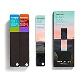
- COMPLETE FASHION, HOME & INTERIORS COLOR SYSTEM Access 2,800+ Pantone FHI colors, including 175 new shades from the Dualities collection—an essential Pantone color guide for fashion, textiles, interiors, and product design.
- DUALITIES COLLECTION – TREND-DRIVEN COLORS Explore curated palettes including New Age pastels and monochromatic Shadows, designed to reflect modern trends across apparel, home décor, and lifestyle products.
- DESIGNED FOR TEXTILES & MATERIALS Features TPG (Textile Paper – Green) colors that align with the Pantone Textile Cotton System (TCX)—ensuring accurate color development across fabrics, soft goods, and hard surfaces.
- CONNECTED TO THE FHI COTTON SYSTEM Works seamlessly with tools like the Cotton Passport, Cotton Planner, Cotton Chip Set, and FHI Cotton Library, supporting complete color development, sampling, and production workflows.
- PORTABLE FAN DECK FOR DESIGNERS ON THE GO Includes three handheld Pantone color fan decks in a compact, collector-style package, ideal for design studios, client meetings, and on-site color selection.
How to read a Pantone number when you are choosing paint
A core number such as 17-1230 identifies Mocha Mousse within Pantone’s color system, but the bare number does not tell you that a wall, fabric, printed card, or product will look identical in every setting. Pantone maintains multiple libraries and material systems.
- TCX refers to Textile Cotton.
- TPG refers to Textile Paper–Green, a paper-based reference used in the Fashion, Home + Interiors system.
- TPX is an older paper-related suffix that may appear in historical references.
- C and U identify graphics references for coated and uncoated paper.
Pantone explains that TPG and TCX colors are designed to correspond across different media, but a paper version and a cotton version are not physically identical. The substrate changes the way light interacts with the color. Pantone’s Fashion, Home + Interiors technical guide and its suffix guidance are the appropriate references when a production specification matters.
What’s actually slowing this PC down?
Pick the symptom - the matching free tool is one click away.
For a painting project, a Pantone number is therefore a starting point—not a ready-made paint formula. A paint store or manufacturer may be able to create a close match, but the result depends on the paint system, sheen, base, pigment limitations, application, surface, and lighting.
A practical workflow for using a Pantone selection on a wall
- Confirm the exact Pantone selection. Record the name and core number, and note whether the reference is TCX, TPG, or a graphics library.
- Use a physical reference when accuracy matters. Do not rely only on a web image or a color copied from a screenshot.
- Ask for a paint match or custom formulation. Treat the result as a paint-system interpretation of the Pantone reference, not as the Pantone standard itself.
- Paint a large sample board. A tiny chip can conceal undertones and make a color look more neutral than it will on a wall.
- View it in the room’s actual light. Check morning, afternoon, evening, artificial light, and adjacent finishes.
- Approve the finish separately. Matte, eggshell, satin, and gloss reflect light differently and can make the same pigment appear lighter, darker, softer, or more intense.
This is especially important for saturated selections such as True Red, Tangerine Tango, Ultra Violet, Viva Magenta, and Illuminating. Conversely, neutrals such as Sand Dollar, Ultimate Gray, Peach Fuzz, and Mocha Mousse can shift noticeably toward pink, yellow, green, or gray depending on surrounding colors and light.
Independent reader supportYour contribution helps us test, update, and keep practical guides available for everyone.Can you convert Pantone colors to RGB, CMYK, or HEX?
Only as a clearly labeled digital approximation. RGB, CMYK, and HEX values describe a particular reproduction process; they are not universal physical equivalents of a Pantone standard. Pantone notes that RGB and HEX values may differ according to measurement conditions, including M1 and M2 data. Its support documentation explains why RGB and HEX values differ.
For a website or design mockup, a digital conversion can be useful if it is labeled with:
Free tools Windows power users keep installed
One-click scans. No signup required.
- the source Pantone library;
- the conversion method or software;
- the date retrieved; and
- the fact that the result is a nearest digital approximation.
For a physical painting, textile, printed package, or branded product, do not promise that a HEX swatch will match the finished object. Pantone’s color-finder pages also warn that colors displayed on a monitor are simulations. When the match is important, compare a physical standard under controlled or representative lighting.
Patterns across the 2000–2025 timeline
The following observations are editorial patterns in the list, not statistical conclusions about the whole design industry:
- Blue and blue-green recur frequently. Cerulean, Aqua Sky, Blue Turquoise, Blue Iris, Turquoise, Serenity, Classic Blue, and Very Peri show how often blue-family colors are used to communicate calm, trust, escape, connection, or possibility.
- Saturation alternates with grounding. Strong reds, oranges, pinks, and purples are repeatedly followed or surrounded by colors that offer calm, renewal, neutrality, or comfort.
- Pairings emphasize relationships. Both two-color years use contrast or coexistence as part of the message: Rose Quartz with Serenity, and Ultimate Gray with Illuminating.
- Recent explanations address lived conditions more directly. The later selections increasingly use ideas such as digital life, physical–virtual overlap, wellness, resilience, community, emotional comfort, and simple pleasures.
- Neutrals are not absent from the program. Sand Dollar, Marsala, Ultimate Gray, Peach Fuzz, and Mocha Mousse demonstrate that Pantone’s selections are not limited to vivid fashion colors.
Important verification notes
Cerulean versus Cerulean Blue: Pantone’s current color finder identifies 15-4020 as Cerulean, while later historical material—including Pantone’s 2024 press material—uses Cerulean Blue. These refer to the same 2000 selection, not two separate colors.
Fuchsia Rose: The official number is 17-2031. References that list 17-2034 are incorrect for this Color of the Year entry; see Pantone’s current color record.
Do these 3 things before closing this tab:
1Repair Windows errors before they cause bigger problems2Scan for outdated or missing drivers - takes under a minute3Clear out junk files and repair common Windows errorsRank #4

- The Complete Color Harmony: Pantone Edition
Sand Dollar: The official selection is 13-1106, not 13-0002. Pantone’s current record identifies it as 13-1106.
Historical cause and effect: Some accounts connect the early-2000s colors directly to specific events, including September 11. Unless Pantone explicitly made that connection, it is safer to say that Pantone framed a color around a particular mood or that contemporary coverage interpreted it in light of events. A color timeline can show cultural context without proving that an event caused a selection.
What is outside this list?
This guide ends with 2025 because that is the requested range. Pantone announced 11-4201 Cloud Dancer as its 2026 Color of the Year on December 4, 2025. It is the current selection as of August 10, 2026, but it is intentionally not included in the 2000–2025 timeline. See Pantone’s 2026 announcement for that separate selection.
Frequently Asked Questions
What was Pantone’s first Color of the Year?
Cerulean, number 15-4020, was selected for 2000. Pantone’s program began in 1999, so Cerulean was the first annual selection in the timeline rather than the year the program was created.
Recommended Free Tools
Which Pantone Color of the Year years had two colors?
Pantone selected two colors in 2016—Rose Quartz, 13-1520, and Serenity, 15-3919—and again in 2021—Ultimate Gray, 17-5104, and Illuminating, 13-0647.
Did Pantone create Very Peri?
Yes. Pantone says Very Peri, 17-3938, was the first new color created specifically for the Color of the Year program. It was introduced as the 2022 selection.
Is Cerulean the same as Cerulean Blue?
Yes, for this timeline. Pantone’s current color finder calls 15-4020 Cerulean, while later Pantone historical material calls it Cerulean Blue. The naming variation does not represent two separate selections.
What is the difference between TCX and TPG?
TCX is a Textile Cotton reference, while TPG is a Textile Paper–Green reference. They are designed to correspond across media, but paper and fabric are different physical substrates and should not be assumed to look identical. Pantone provides additional guidance in its Fashion, Home + Interiors documentation.
Can I use a HEX code as an exact Pantone match?
No. A HEX value is a digital approximation for a particular display workflow, not a universal physical equivalent. Pantone warns that on-screen colors are simulations and explains that RGB and HEX values can vary with measurement conditions. Use a physical Pantone reference and a tested paint sample when accuracy matters.
What was Pantone’s Color of the Year for 2025?
Mocha Mousse, 17-1230. Pantone described the mellow brown around comfort, simple pleasures, warmth, thoughtful indulgence, and the use of brown as a sophisticated neutral.
What is Pantone’s 2026 Color of the Year, and why is it not in this list?
Cloud Dancer, 11-4201, is Pantone’s 2026 selection. This article deliberately ends with 2025, so Cloud Dancer is outside its stated scope.
The Bottom Line
For 2000–2025, the complete record is 26 years, 28 named colors, and two paired selections. Use the official name and core Pantone number for historical reference, but use a physical standard and a real paint sample—not a HEX value alone—when translating one of these colors onto a wall.
PC Slower Than It Used to Be?
A free scan shows the junk files, broken settings and background clutter dragging Windows down - then fixes them in one click.Free scan · Windows 10 & 11Outdated Drivers Are Slowing You Down
One free scan finds every outdated or missing driver and matches the right update for your exact hardware.Free scan · exact hardware matchQuick Recap

Product prices and availability are accurate as of the date/time indicated and are subject to change. Any price and availability information displayed on Amazon at the time of purchase will apply.




