Recommended Free Tools
Crashes, No Sound, or Screen Glitches?
Do these 3 things before closing this tab:
1Fix the driver behind crashes, sound loss and screen glitches2Clear out junk files and repair common Windows errors3Scan for outdated or missing drivers - takes under a minuteFree scan · under a minute
PC Slower Than It Used to Be?
Free scan · Windows 10 & 11
Outdated Drivers Are Slowing You Down
Free scan · exact hardware match
ThatPainter is reader-supported. When you buy through links on our site, we may earn an affiliate commission. Learn More
You cannot make printer colours literally identical to display colours: a monitor emits light, while paper reflects it. What you can achieve is a close, repeatable match by stabilising and profiling the display, using the exact ICC profile for your printer and paper, soft-proofing the image, and allowing only one device to manage colour.
The reliable method: profile the display, profile the printer-and-paper combination, soft-proof the image, and let only one device manage colour
For photographs, paintings, and design work, the goal is not a literally identical screen and print. A display emits light; paper reflects it. They have different gamuts, brightness ranges, white points, surfaces, and viewing conditions. The practical goal is a close, repeatable match: a print whose colours, contrast, and overall character are predictable.
Quick wins for a faster PC:
Scan for outdated or missing drivers - takes under a minuteDriver Scan →Repair Windows errors before they cause bigger problemsFix Now →The most dependable workflow is:
- Stabilise and calibrate/profile the display.
- Use the ICC profile for the exact printer, ink, paper, and driver/media setting.
- Soft-proof the image before printing.
- Choose either application-managed or printer-managed colour. Never use both at once.
- Compare the print under neutral, consistent lighting.
For casual home printing, you can simplify this: use an sRGB file, the correct paper setting, the printer’s normal colour management, and a small test print. For artwork that must be repeatable, use a hardware display calibrator and a proper printer/paper profile.
#1 Best Overall
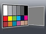
- Professional version of our popular DKK Card with n-Chrome coated color targets
- The color patches are 100% coated with DGK's n-Chrome process, allowing for a much higher level of color saturation, luminance, and accuracy, while getting rid of metamerism.
- Includes 2 DKC-Pro Cards - Each with Precision 12% and 18% Gray reference for white balance plus 18-Color patches for superior digital color correction
- For use with software such as Adobe Photoshop and Lightroom
Why a print cannot look exactly like a display
A monitor creates colour with light shining directly toward your eyes. A print depends on ambient light hitting the paper, being absorbed by ink, and reflecting back. A luminous white monitor can look much brighter than the white of paper, while a black screen can be darker than any ink-and-paper combination.
There are several further differences:
- Gamut: the display and printer can reproduce different ranges of colour. Bright cyan, electric blue, vivid green, and saturated orange on screen may be outside the printer’s printable gamut.
- Display brightness: a monitor set too bright makes an image appear lighter and more energetic than its print.
- Paper white: warm, natural-white, bright-white, glossy, satin, and matte papers each reflect light differently.
- Surface and absorption: glossy paper usually holds sharper, more saturated colour than absorbent matte paper, which can make the same image look softer or duller.
- Viewing light: daylight, household bulbs, gallery lighting, and a dim room can all change the appearance of the print.
This is why “screens use RGB and printers use CMYK” is an incomplete explanation. Many modern printers accept RGB image data and use their own combinations of cyan, magenta, yellow, black, and sometimes additional inks. What matters is the colour-managed conversion from the image’s colour space to the printer-and-paper condition. The International Color Consortium explains how profiles enable device-independent colour conversion, while X-Rite describes why a display often has a larger gamut than a printer.
Calibration and profiling are different
These terms are often used interchangeably, but they solve different parts of the problem.
- Calibration adjusts the display toward chosen conditions, such as a target brightness, white point, and gamma.
- Profiling measures the display after adjustment and creates an ICC profile describing how it actually reproduces colour. Colour-managed applications use that profile to interpret the display correctly.
A visual operating-system wizard can improve a basic setup. For serious colour work, a colorimeter is preferable because it measures the display rather than relying on your eyesight. The ICC describes profiling as displaying or printing colour patches, measuring them, and generating a device profile; its profile-creation guidance explains the general process.
A monitor calibrator is not essential for every home print. Apple notes that calibration is usually unnecessary for a typical home or office Mac. It becomes much more valuable when you reproduce paintings, sell prints, need consistency across sessions, or are trying to diagnose a persistent colour error.
Prepare the display before judging colour
Colour-changing display features can make an apparently correct print look wrong. Before editing or comparing:
- Turn off Night Shift on macOS or Night light on Windows.
- Turn off True Tone and other ambient-light colour adjustments.
- Disable automatic brightness and content-adaptive brightness if available.
- Use a stable, ordinary display mode rather than Vivid, Game, or HDR mode for normal print work.
- Reduce reflections and glare.
- Avoid strongly coloured walls or light falling directly onto the screen.
- Keep the room lighting reasonably consistent while editing and evaluating prints.
Apple documents that True Tone changes display colour and intensity according to ambient light, and Night Shift changes the display’s colour temperature. Windows’ current display controls, including Night light, automatic brightness, and colour calibration, are described by Microsoft.
Windows
- Open Settings → System → Display.
- Turn off Night light.
- Turn off automatic or content-adaptive brightness if those options are available on your hardware.
- Search Settings for calibrate display color and follow the calibration wizard.
- For critical work, use a hardware calibrator and leave the resulting ICC profile active.
Exact options vary by display and Windows version. If Windows or the monitor manufacturer has a vivid, HDR, or “enhanced colour” mode enabled, switch to a stable mode before profiling.
Rank #2
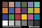
- QUANTITY: Set of 2, Printed on SmartFlex Synthetic Paper with a matt finish coating to avoid glare
- AFFORDABLE: Professional color and gray target, at an affordable price
- PORTABLE: fit easily in your equipment bag
- PROFESSIONAL: Pixel Perfect offers full size, spectrally formulated pigment patches, and highly accurate FREE Adobe correction software
- EASY TO USE: Pixel Perfect provides easy-to-follow instructions and download link for Adobe DNG profile editor
macOS
- Open Apple menu → System Settings → Displays.
- Turn off True Tone and Night Shift.
- Open the Colour profile menu and choose Customise.
- Click Add to launch Display Calibrator Assistant.
- For demanding work, create the profile with a hardware calibrator instead.
Apple’s current path is documented in its display-calibration guide.
Useful reference conditions
For controlled print evaluation, Canon gives one example target of D50/5000 K, 100–120 cd/m², gamma 2.2, and approximately 500 lux viewing illumination. These are useful reference recommendations, not universal requirements for every artist, display, room, or print process. See Canon’s colour-correction guidance for the manufacturer’s context.
Paper is part of the colour system
A printer profile is not simply a profile for the printer. It describes a particular output condition: printer model, ink set, paper surface, driver/media setting, and often print-quality mode. Change one of those and the expected result can change.
At minimum, match the profile to:
- the exact printer model;
- the ink set, especially if using third-party ink;
- the exact paper brand and surface;
- the paper type selected in the printer driver;
- the print-quality mode;
- sometimes the driver version or RIP workflow.
A glossy-paper profile is not interchangeable with a matte-paper profile. Glossy and matte papers have different white points, ink behaviour, black density, and gamut. Adobe’s profile overview explains that output profiles describe the printer or press condition and notes the difference between paper types.
Use the printable side of the paper, select its correct media type, and use the ink-and-paper combination for which the profile was created. Same-brand paper may be a sensible starting point, but it is not a substitute for the correct profile.
Choose and preserve the right file colour space
When opening an image, preserve its embedded profile. Do not assign a random profile simply because the colours look wrong.
Assigning a profile changes how the existing numerical RGB values are interpreted. Converting to a profile changes the numerical values so the appearance is preserved as closely as possible in the destination colour space. Adobe explains the difference between assigning and converting profiles.
For an unknown consumer workflow, sRGB is usually the safest interchange space because it is widely supported. In a controlled wide-gamut photography workflow, Adobe RGB or another larger RGB space can retain colours that capable printers may reproduce, but only if every application in the chain is colour-managed. Adobe’s colour-settings documentation covers these choices.
Rank #3
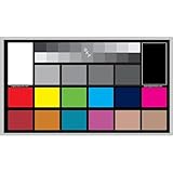
- SUPERIOR ACCURACY - Ensures precise color calibration with professional-grade chips, delivering consistent and reliable results for video production.
- ENHANCED IMAGE QUALITY - Optimizes video quality using 16:9 aspect ratio charts, allowing for detailed adjustments and accurate color reproduction.
- INCREASED DURABILITY - Constructed with robust materials, the Digital Kolor Pro charts are designed for long-term use, resisting wear and tear in demanding environments.
- WIDE COMPATIBILITY - Versatile calibration tool compatible with various cameras and editing software, making it an essential asset for diverse video workflows.
- SIMPLE AND EASY TO USE - Streamlines the color correction process with intuitive chart layouts, enabling quick and efficient calibration for both beginners and experts.
Do not blindly convert every photograph to CMYK. Follow the specification of the printer, press, or print service. Many inkjet workflows remain RGB until the application or driver performs the output conversion.
Save in a format that preserves profiles, such as JPEG, TIFF, PSD, or an appropriately prepared PDF.
The simple home-printer workflow
If you are printing a normal photograph, reference image, or painting reproduction without a trustworthy custom profile, printer-managed colour is usually the least error-prone approach.
- Use an image with an embedded sRGB profile.
- Use the correct printable side of the paper.
- In the printer driver, select the exact paper type, size, and quality.
- Choose Printer Manages Colors in the application.
- Leave the printer driver’s normal colour management, ICM, ColorSync, or equivalent enabled.
- Print a small test section before using a full sheet or making multiple copies.
- Let the print dry as recommended for that ink and paper before making a final judgement.
Do not start by changing cyan, magenta, brightness, and contrast sliders. First establish that the file profile, paper setting, ink, and printer mode are correct. Manual adjustments can improve one image but will not reliably correct the next image or a different paper.
On macOS, ColorSync Utility exposes related choices including Prematch to printer profile, Hand off to printer, and Print as colour target, without colour management. These are documented in Apple’s ColorSync Utility guide. The “without colour management” option is for profiling targets, not ordinary photographs.
The accurate workflow for photographs and painting reproductions
For repeatable artwork prints, you need two profiles:
- a profile describing the display;
- a profile describing the exact printer, ink, paper, and print condition.
The basic sequence is:
- Calibrate and profile the display.
- Install or select the correct printer/paper ICC profile.
- Soft-proof the image.
- Make any proof-specific adjustments on a separate layer or virtual copy.
- Print with the application managing colour.
- Turn colour management off in the printer driver.
- Evaluate the dried print under consistent, reasonably neutral light.
Step 1: Obtain the printer-and-paper ICC profile
Look for a profile from:
- the printer manufacturer’s support page;
- the paper manufacturer’s download page;
- the printer driver’s installed profiles;
- the commercial print service supplying the output profile.
Check the profile name carefully. It should identify the printer, paper, surface, ink or driver family, and sometimes quality mode. An .icc and an .icm file are equivalent profile formats with different extensions; see the ICC FAQ.
Free tools Windows power users keep installed
One-click scans. No signup required.
Manufacturer profiles are a good starting point, but they may not perfectly describe an individual printer. Printer age, ink batch, maintenance, paper batch, and environmental conditions can all affect output.
Rank #4
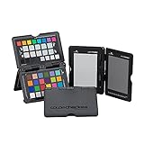
- SPECIFICATIONS: Portable ColorChecker Passport kit with 4 targets for exposure control, custom white balance, camera profiling, and enhancement patches, folding protective case with multiple positions, includes lanyard for quick access, Calibrite PROFILER calibration software supports DNG and ICC profiling workflows.
- COMPLETE COLOR WORKFLOW: 4 target set provides exposure reference, neutral balance, and profiling tools to improve consistency from capture through editing and output, reducing time spent correcting color across large projects.
- CUSTOM WHITE BALANCE: Create a consistent white point across a set of images to reduce color casts and minimize per file corrections, improving continuity when lighting changes during travel or location shoots.
- PROFILE CREATION READY: Calibrite PROFILER calibration software supports custom DNG and ICC camera profiles based on specific camera and lens combinations, helping deliver more predictable color rendering and improved matching across different cameras and sessions.
- PORTABLE CASE DESIGN: Folding protective case adjusts into multiple positions for easy scene placement, and the included lanyard keeps the kit close at hand for fast reference capture during busy production workflows.
Step 2: Soft-proof the image
Soft-proofing simulates the printer-and-paper condition on the profiled display. It lets you see which colours will shift, lose saturation, or become darker before wasting paper.
Photoshop
- Choose View → Proof Setup → Custom.
- Under Device to Simulate, select the exact printer/paper ICC profile.
- For a normal photographic conversion, leave Preserve RGB Numbers disabled.
- Start with Perceptual or test Relative Colorimetric.
- Enable Black Point Compensation where appropriate.
- Enable Simulate Paper Color and Simulate Black Ink if available.
- Choose View → Proof Colors.
- Use View → Gamut Warning to identify colours outside the printer’s gamut.
Soft proofing is only as reliable as the display profile, output profile, display quality, and ambient lighting. Adobe discusses those limits in its soft-proofing documentation.
For photographs, Perceptual is a sensible starting point because it tends to preserve relationships and smooth transitions while bringing out-of-gamut colours into range. It can also alter colours that were already in gamut. Relative Colorimetric generally preserves in-gamut colours more closely but may clip or compress out-of-gamut colours. Test both when a particular painting or photograph contains highly saturated colours.
The Tool Desk
Outbyte Driver Updater FREEScan for outdated or missing drivers - takes under a minuteDriver Scan →Outbyte PC Repair FREEClear out junk files and repair common Windows errorsFree Scan →For logos, solid colour areas, or formal proofing, also test Relative Colorimetric or Absolute Colorimetric when the workflow calls for it. Saturation is intended to prioritise vividness rather than accurate photographic reproduction. There is no universal best rendering intent; the ICC rendering-intent guidance and Adobe’s Lightroom descriptions explain the trade-offs.
Step 3: Let Photoshop manage colour
- Choose File → Print.
- Expand Color Management.
- Select Photoshop Manages Colors.
- Select the exact printer/paper profile.
- Choose the rendering intent used for the soft proof.
- Enable Black Point Compensation if appropriate.
- Open Print Settings or Printer Settings.
- Select the exact paper type, paper size, and quality.
- Disable colour management in the printer driver.
Adobe’s Photoshop print workflow documents this application-managed route.
What “off” means in common drivers
| Printer ecosystem | Typical driver wording when the application supplies the profile |
|---|---|
| Epson | Off (No Color Adjustment) or equivalent |
| Canon | Matching → None or Off |
| HP and other drivers | Application Managed, No Color Adjustment, ICM off, or similar |
| macOS | ColourSync or application-managed choices, depending on the application and driver |
Labels vary by model, operating system, and driver version. Epson, Canon, and HP use different names for the same basic hand-off. If you select an ICC profile in Photoshop and simultaneously enable ICM, ColorSync, Driver Matching, or automatic colour correction in the driver, the colour may be converted twice. That commonly causes dark, dull, or strongly tinted prints.
Lightroom Classic
In Lightroom Classic, use the printer profile selected for soft proofing in the Print Job panel. Select the appropriate rendering intent and disable colour management in the printer driver when Lightroom is managing colour. Adobe’s current Lightroom print settings explain the available controls.
What’s actually slowing this PC down?
Pick the symptom - the matching free tool is one click away.
When printer-managed colour is the better choice
Printer-managed colour is appropriate when you do not have a trustworthy printer/paper profile, are printing ordinary documents, or want a simple casual-photo workflow.
Best Value
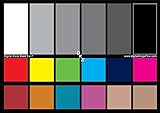
- SUPERIOR ACCURACY - Ensures precise color calibration with two 5x7" DKK charts, providing a reliable reference for consistent image quality across all your video projects.
- ENHANCED IMAGE QUALITY - Achieve optimal color balance and exposure using the integrated colorbar and grayscale combo, designed for professional-grade video calibration.
- ULTIMATE PORTABILITY - Compact 5x7" size makes these charts easy to transport, ensuring accurate color calibration wherever your video shoots take you, enhancing ease of use.
- INCREASED DURABILITY - Built with high-quality materials, these calibration charts are designed to withstand frequent use, offering a long-lasting solution for video professionals.
- VERSATILE COMPATIBILITY - Works seamlessly with various video editing software and cameras, providing a universal solution for color calibration across different platforms.
Choose Printer Manages Colors in the application, enable the driver’s normal colour management, select the exact paper type and quality, and let the driver perform the conversion. This is easier but offers less control and may vary between applications, drivers, and paper types. Do not select a specific output profile in the application while also asking the printer driver to make an independent correction.
Diagnose the symptom before changing settings
| Symptom | Likely causes | Recovery |
|---|---|---|
| Print is darker than the display | Display brightness is too high; the print is viewed in dim light; the paper cannot reproduce the display’s brightness. | Lower and profile the display, soft-proof the image, and compare the print under neutral, adequate light. |
| Everything has a green, magenta, or other colour cast | Wrong printer/paper profile, wrong media setting, double colour management, or an ink mismatch. | Confirm printer, ink, paper, driver media type, and colour-management mode as one complete set. |
| Colours are dull or neon colours disappear | The colours are outside the printer’s gamut, or matte paper is reducing saturation. | Turn on gamut warning, test Perceptual and Relative Colorimetric, and consider a wider-gamut paper or printer. |
| Photoshop and another application print differently | One application is colour-managed and the other is ignoring embedded profiles, or the two workflows use different printer management. | Use a known colour-managed application, or use printer-managed colour consistently across the workflow. |
| Bands, missing colours, or uneven patches | Clogged nozzles, an empty cartridge, or an incorrectly aligned print head. | Run a nozzle check first. Clean only if the pattern shows gaps or missing segments, then align the print head if needed. |
| The result changes after changing paper | The paper surface and white point changed, but the profile or driver media setting did not. | Select the exact paper profile and matching driver media type. |
| A custom profile looks wrong | The test chart was colour-managed, the chart was measured too soon, or the wrong paper setting was used. | Reprint the target with colour management disabled and follow the profiling software’s drying instructions. |
Before adjusting colour, rule out mechanical faults. Epson recommends checking the nozzle pattern before cleaning; gaps or faint lines indicate that cleaning may be needed. Canon similarly links uneven or streaked colour to paper settings, clogged nozzles, ink supply, cleaning, and print-head alignment.
Creating a custom printer profile
Use a custom profile when the print must be highly consistent, the paper is unusual, the manufacturer does not provide a suitable profile, or a supplied profile does not describe your individual printer well enough.
Crashes, No Sound, or Screen Glitches?
Random freezes, missing sound and display glitches usually trace back to one bad driver. Find and replace yours safely.Free scan · under a minutePC Slower Than It Used to Be?
A free scan shows the junk files, broken settings and background clutter dragging Windows down - then fixes them in one click.Free scan · Windows 10 & 11The general process is:
- Print a standard colour target with colour management disabled.
- Use the exact printer, ink, paper, media setting, and quality mode intended for the final workflow.
- Allow the target to dry for the period recommended by the profiling system.
- Measure the dried patches with a spectrophotometer.
- Generate and install the ICC profile.
- Use that profile for soft proofing and application-managed printing.
The ICC provides profile-creation guidance. HP also documents a custom ICC profiling procedure. A profile is valid only for the conditions it describes. Changing the printer, ink, paper, driver, quality mode, or sometimes the viewing light can invalidate the expected match.
Important exceptions
- Commercial printing: request the print service’s current output profile and submission specification. A home inkjet print is not automatically a press proof.
- Black-and-white work: a neutral or advanced black-and-white driver mode may produce better results. Ordinary colour management can sometimes introduce a colour cast.
- Glossy versus matte: treat them as separate output conditions, even when they are sold by the same manufacturer.
- Third-party ink: an OEM profile may not describe its colour behaviour. Use a profile made for that ink set or create a custom one.
- Manual driver sliders: useful only as a last-resort adjustment for a known defect. They are not a replacement for calibration, profiling, or correct media selection.
A practical decision guide
| Workflow | Best for | Main advantage | Main risk |
|---|---|---|---|
| Printer manages colour | Casual photos, office documents, basic home printing | Simple and quick | Less predictable across applications, drivers, and papers |
| Application manages colour with an ICC profile | Photography, painting reproductions, artwork, repeatable prints | Greatest control and consistency | Requires the correct profile and driver hand-off |
| Custom printer profile | Professional work or unusually sensitive printer/paper combinations | Describes the actual output condition | Requires measurement hardware or a profiling service |
| Manual driver sliders | Last-resort correction of one known problem | Can alter a particular print quickly | Not transferable to different images or papers |
Final checklist before printing an important painting or photograph
- Night Shift, Night light, True Tone, automatic brightness, and vivid display modes are disabled.
- The display is calibrated and profiled if the work requires accuracy.
- The file’s embedded colour profile has been preserved.
- The printer profile matches the exact printer, ink, paper, media setting, and quality mode.
- The image has been soft-proofed.
- Only Photoshop, Lightroom, or the printer driver is managing colour.
- The printable side of the paper is being used.
- The print has dried before evaluation.
- The print is being viewed under consistent, neutral light.
- A nozzle check has ruled out clogged or misaligned print hardware.
If the result is still wrong, change one variable at a time. Start with the profile and media setting, then verify the colour-management hand-off, then inspect the display brightness and viewing light. This preserves a diagnosable workflow and prevents random saturation or brightness edits from becoming part of the problem.
Frequently Asked Questions
Why are my prints darker than the display?
Usually the display is too bright, the print is being judged in dim light, or the paper cannot reproduce the display’s brightness. Lower and profile the display, soft-proof the image, and compare the dried print under neutral, adequate lighting.
Should I let the printer or Photoshop manage colour?
For ordinary home printing, use an sRGB file and let the printer manage colour. For demanding photography or painting reproductions, use the exact printer-and-paper ICC profile, soft-proof the image, let the application manage colour, and disable colour management in the driver.
The Tool Desk
Outbyte PC Repair FREEClear out junk files and repair common Windows errorsFree Scan →Outbyte Driver Updater FREEScan for outdated or missing drivers - takes under a minuteDriver Scan →Should I convert my photograph to CMYK before printing?
No. CMYK is an oversimplification for many inkjet workflows. Follow the printer or print service’s specification; many inkjet printers accept RGB data and perform the output conversion through their profile and driver.
Do I need a monitor calibrator?
A colorimeter is recommended for critical work because it measures the display and creates a profile. It is not necessary for casual home printing, where a stable display and printer-managed sRGB workflow may be sufficient.
Why did changing paper ruin the colour match?
Changing paper changes the output condition. Select the profile made for that exact paper surface and choose the matching paper type in the driver. A glossy profile should not be used for matte paper.
The Bottom Line
A predictable printer-to-display match comes from controlling the entire colour chain: a stable profiled display, the exact printer-and-paper ICC profile, soft proofing, correct media settings, one—and only one—colour manager, and consistent viewing light. Literal identity is impossible, but repeatable, convincing prints are achievable.
Recommended Free Tools
Quick Recap

Product prices and availability are accurate as of the date/time indicated and are subject to change. Any price and availability information displayed on Amazon at the time of purchase will apply.




