Outdated Drivers Are Slowing You Down
Recommended Free Tools
One free scan finds every outdated or missing driver and matches the right update for your exact hardware.
Scan My Drivers Free →Free scan · exact hardware match
ThatPainter is reader-supported. When you buy through links on our site, we may earn an affiliate commission. Learn More
Pantone’s 2026 Color of the Year is PANTONE 11-4201 Cloud Dancer, a lofty, billowy white announced on December 4, 2025. Pantone is using this unusually restrained choice to express a cultural desire for quiet, clarity, and creative breathing room. For painters, it is best understood as a flexible white-neutral direction—not a universal paint formula or a color that can be reproduced accurately from a screen.
Do these 3 things before closing this tab:
1Repair Windows errors before they cause bigger problems2Scan for outdated or missing drivers - takes under a minute3Clear out junk files and repair common Windows errors#1 Best Overall
![Pantone Color Bridge Guide Coated | Pantone to CMYK, RGB & HTML Color Matching Fan Deck for Graphic Design, Branding & Print | GG6103B [Old Version]](https://m.media-amazon.com/images/I/41F8HJBMLBL._SL160_.jpg)
- INDUSTRY-STANDARD DIGITAL-TO-PRINT COLOR GUIDE The essential Pantone color book for translating color across workflows—trusted by designers, agencies, and print professionals to align digital and print using the Pantone Matching System.
- COMPLETE COLOR BRIDGE SYSTEM Features 2,359 Pantone coated colors, including 200+ new trend-driven additions, each displayed with PMS, CMYK, RGB, and HTML values for accurate cross-media color matching.
- SEE HOW CMYK MATCHES PANTONE COLORS Quickly visualize how CMYK process printing compares to Pantone spot colors—ideal for digital designers, packaging teams, and marketing professionals working across print and screen.
- PRINT ACCURACY WITH G7 CALIBRATION Printed to G7 CRPC6 standards to match real production conditions—ensuring consistent color reproduction for printers, agencies, and production teams.
- COATED PRINT SIMULATION Printed on 100 lb (148 gsm) coated paper to reflect final output; for coated and uncoated comparison, choose the Color Bridge Guide Set.
What is Pantone’s 2026 Color of the Year?
Pantone’s 2026 Color of the Year is PANTONE 11-4201 Cloud Dancer, a soft, airy white announced on December 4, 2025. Pantone describes it as lofty, billowy, ethereal, and natural—a white intended to suggest quiet, clarity, focus, relaxation, creativity, and a fresh start.
For painters, the important point is that Cloud Dancer is not simply a universal “white paint.” It is a color-system reference and a design direction. Its appearance will change with the pigment, binder, sheen, surface, lighting, and neighboring colors. Treat it as an inspiration for an airy white-neutral palette unless you have access to the relevant physical Pantone standard or an officially matched paint or product.
Why Pantone chose a quiet white
Pantone says Cloud Dancer responds to an overloaded, noisy cultural moment. Rather than choosing a saturated statement color, the company is presenting white as a pause: a visual reset that can make room for reflection, concentration, and new ideas.
Those emotional meanings belong to Pantone’s cultural and design positioning; they should not be read as proven psychological or clinical effects. A white wall will not automatically make a room calm, and a white canvas will not guarantee creativity. The surrounding colors, materials, light, architecture, and the viewer’s own associations all matter.
Recommended Free Tools
Pantone’s broader Color of the Year process is based on year-round macro-level trend forecasting. Its team looks across entertainment, films in production, art, fashion, interiors, travel, technology, materials, lifestyles, social media, sporting events, and socioeconomic conditions. In that context, Cloud Dancer is less a prediction that one white paint will dominate sales and more a statement about a perceived cultural appetite for simplification, quiet, and creative breathing room.
Cloud Dancer is a structural neutral—not an empty one
The unusual part of this choice is the role Pantone gives the color. Cloud Dancer can stand alone, but it is also intended to support other colors, create contrast, harmonize with nearby tones, and provide negative space. That makes it a structural neutral: a foundation that influences the entire composition without demanding all the attention.
White can communicate emptiness, sterility, ceremony, luxury, simplicity, or possibility. The interpretation depends heavily on context. A chalky, matte white may feel softer than a bright glossy white. A warm white beside terracotta can look different from the same white beside cobalt blue. A white textile with visible pile or weave can feel more inviting than a perfectly smooth white surface.
For artists and decorators, Cloud Dancer’s usefulness lies in that flexibility. It can be the lightest value in a painting, the negative space around a subject, the base of a limited palette, or the quiet field against which a stronger color becomes more legible.
How painters can use the Cloud Dancer idea
1. Build a light, limited palette
Start with an airy white as the dominant field, then add a small number of values and accents rather than filling every area with high contrast. Pale blue, gray, blush, lavender, muted green, sand, or a single deeper accent can preserve the sense of open space while keeping the work from appearing blank.
Rank #2

- Over 1,879 coated and 1,653 uncoated colours that have no close Pantone Spot Colour equivalent (≥ 2.0 ΔE 2000), unlocking fresh branding possibilities.
- This guide is used in 4-color process only. These are not Pantone Spot Colours. This is an extended gamut of colours for use in process printing.
- Two guides (Coated + Uncoated)
- Engineered to meet G7-calibrated CRPC standards so printed colours look as intended—from guide to press.
- Pantone Connect Compatible – Easily pick, save, and share colour data across your entire design stack
Cloud Dancer does not require a pastel painting. A nearly white ground can make charcoal, black, indigo, red, or metallic details feel more deliberate. The key is controlling the proportion of the stronger color so that it acts as an accent rather than overwhelming the quiet structure.
2. Let texture carry the interest
When a composition uses very pale colors, texture becomes especially important. Try contrasting a smooth gessoed passage with dry-brushed marks, a thin wash with an opaque scumble, or a crisp edge with a soft, broken one. In decorative work, matte and glossy finishes, rough and polished surfaces, and hard and soft materials can keep a white-led composition from becoming visually flat.
This is a practical design inference from Pantone’s emphasis on texture and versatility, not a technical rule attached to the color. The same principle applies to a painting: if hue contrast is restrained, vary value, edge, opacity, mark-making, or surface relief.
3. Use the white as negative space
Cloud Dancer’s blank-canvas association makes it well suited to compositions that deliberately leave areas unresolved. Instead of treating every white area as unfinished, use it to create pauses around the subject, separate visual groups, or guide the eye through the painting.
Before covering the entire surface, ask whether the untouched or lightly worked ground is contributing to the composition. A quiet area can provide more visual breathing room than another layer of detail.
4. Test the actual material
Do not select a production color from a screenshot. Pantone’s official color-finder record identifies Cloud Dancer as 11-4201 TCX in the Fashion, Home + Interiors system and Cotton TCX library, and warns that its on-screen display is a computer simulation that may not match the physical standard.
For a painting, make a test panel using the actual paint, primer, varnish, paper, canvas, or panel you plan to use. View it in the light where the work will be displayed. Compare it beside the surrounding colors, not against a white webpage. If an exact Pantone match matters for a commissioned or commercial project, obtain the appropriate physical or professionally specified color standard rather than guessing a hex value or mixing by eye from an online image.
The Tool Desk
Outbyte Driver Updater FREEFix the driver behind crashes, sound loss and screen glitchesFind Drivers →Outbyte PC Repair FREERepair Windows errors before they cause bigger problemsFix Now →What Cloud Dancer can look like in different settings
| Setting | Useful approach | Watch out for |
|---|---|---|
| Canvas or paper | Use an airy white ground and reserve stronger colors for focal areas. | Paper and primer color can shift every mixture placed over them. |
| Interior walls | Pair pale surfaces with contrasting wood, stone, metal, textiles, or darker trim. | Daylight and artificial light can make a white appear noticeably different. |
| Packaging or illustration | Use white-on-white type, embossing, relief, shadow, or black-and-white contrast to create hierarchy. | White symbolism does not prove that the packaging is sustainable. |
| Textiles and clothing | Let weave, pile, quilting, wool, or other surface qualities supply dimension. | A commercially labeled white garment is not automatically an exact Cloud Dancer match. |
Using Cloud Dancer in interiors
Pantone positions the shade for open, spacious, visually clean rooms, including kitchens and bathrooms. It can appear on furniture, upholstery, rugs, lamps, wall décor, pillows, and other accessories. The official Joybird collaboration extends the idea into customizable furniture fabrics and a range of home silhouettes.
A room built entirely from similar whites can become sterile or visually indistinct. A more reliable approach is to vary at least three things: surface texture, finish, and value. For example, combine a matte wall with a nubby upholstery, a smoother table, darker hardware, and a few warmer or deeper accents. This gives the eye something to read without losing the spacious quality associated with the palette.
Rank #3
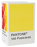
- PERFECT FOR PANTONE COLOR BOOK FANS: This charming postcard collection features a palette drawn from the Pantone Color Matching Systems.
- GRAPHIC DESIGN INSPIRATION: Each postcard in this set of 100 offers a different bold hue to brighten up the mail.
- COLOR MATTERS: Color as a form of communication is incredibly powerful. The art of Pantone makes this set of cards a brilliant way to connect.
- BLANK POSTCARDS: These high-quality cards are great for any occasion: birthdays, thank yous, sympathy, or just saying hello.
- DOUBLES AS DECOR: Postcards work wonderfully as miniature art pieces to display on the desk or bulletin board.
Paint shoppers should also distinguish between “Cloud Dancer-inspired” and an official PANTONE 11-4201 match. A paint company may create a visually similar white, but the label alone does not establish equivalence across systems. Always request the manufacturer’s matching information and test the paint in the intended room.
Fashion, beauty, packaging, and branding
Fashion and accessories
Pantone presents Cloud Dancer as a foundation for monochromatic dressing, shirts, T-shirts, denim, activewear, and suiting. It can also support higher-contrast details such as black, pearls, cut-outs, shimmer, or pastel accents. Texture is what prevents a pale neutral outfit from looking flat: padded, plush, woolly, fluffy, or softly dimensional materials all change how the color is perceived.
Quick wins for a faster PC:
Scan for outdated or missing drivers - takes under a minuteDriver Scan →Repair Windows errors before they cause bigger problemsFix Now →Fix the driver behind crashes, sound loss and screen glitchesFind Drivers →Packaging and branding
On packaging, a pared-back white can give other colors more room to stand out on a shelf. Designers can create depth with black-and-white contrast, white-on-white typography, blind embossing, relief, and carefully controlled shadow rather than relying on a saturated brand color.
Pantone also connects the natural-white idea with materials such as recycled paper and molded fiber. That is a visual and material association—not evidence that a package is environmentally responsible. Sustainability depends on sourcing, manufacturing, durability, transport, and end-of-life handling, not on the color printed on the package.
Beauty and personal style
The official press material points to white nails, white or brightening eye looks, and white hair as possible beauty expressions of the trend. These are directional examples rather than universal recommendations or evidence of product performance. As with fabric and paint, a product described as white or cream may not reproduce the Pantone standard.
Seven palette stories: Cloud Dancer needs company
Pantone has created seven Cloud Dancer palette narratives intended to move across fashion, accessories, beauty, interiors, industrial design, graphic design, and multimedia. The publicly described examples include Powdered Pastels, a nuanced blend of pastel and neutral tones, and Light & Shadow, a softened progression from pale hues into darker shades.
Windows Errors? Fix Them Before They Spread
Repair common Windows errors and clear accumulated junk for a smoother, more stable PC - no reinstall needed.Free scan · no reinstallOutdated Drivers Are Slowing You Down
One free scan finds every outdated or missing driver and matches the right update for your exact hardware.Free scan · exact hardware matchFor painters, these descriptions suggest several useful compositional roles:
- Quiet center: place Cloud Dancer among powdered pastels so the composition feels layered without becoming highly saturated.
- Light end of a value scale: use it as the pale limit of a progression that moves through grays, muted colors, and deeper shadows.
- Negative space: allow the white to separate more assertive colors and make their edges easier to read.
- Monochromatic structure: build interest through warm and cool shifts, opacity, texture, and value rather than many unrelated hues.
If you need exact palette values for print, manufacturing, or color-managed production, use Pantone Connect or the official downloadable assets. Online screenshots are not sufficient for an exact match, and the correct specification may differ depending on the material and color library.
Independent reader supportYour contribution helps us test, update, and keep practical guides available for everyone.Official Cloud Dancer collaborations
Pantone’s partner list shows how the color is being translated beyond a color swatch:
Rank #4
![Pantone Solid Chips Coated & Uncoated | Shareable & Versatile Spot Color Chips for Graphics and Prints | GP1606B [OLD VERSION]](https://m.media-amazon.com/images/I/313PmqK27zL._SL160_.jpg)
- Perforated, removable Spot Color Chips makes sharing easy
- Ring-bound, two-volume desktop reference book enables impressive presentations and allows for page replacements
- Includes two Paper Chip Savers to organize and store loose Color Chips or Color collections
- Browse a wide selection of colors at a glance: each page provides up to seven Pantone Colors with six individual 1.2” x 0.8” chips per color provided
- Printed on common paper stock weights: 100 lb (148 gsm) coated and 80 lb 118 gsm) uncoated
- Joybird: furniture and home accessories using Cloud Dancer-related fabrics, including sofas, sleeper sofas, bed frames, accent chairs, ottomans, pillows, tables, lamps, rugs, and wall décor.
- Play-Doh: a Cloud Dancer modeling-compound collaboration that connects the blank-canvas idea with tactile play and imagination.
- Motorola: a special Cloud Dancer version of the motorola edge 70. The colorway is a design feature, not a performance or wellness claim.
- Pura: a scent-based interpretation of Cloud Dancer. Exact product names, markets, and inventory should be checked before publication or purchase.
- itel: Cloud Dancer smart accessories, including wireless buds, a magnetic powerbank, and a precision clipper. The launch language indicates emerging-market availability; U.S. availability should not be assumed.
- Mandarin Oriental: Cloud Dancer-themed hospitality experiences described as including afternoon tea, spa treatments, stays, and related activations.
Availability, pricing, geography, inventory, and referral terms for these collaborations can change. An official partnership does not necessarily mean a product is currently available in every country.
A practical way to bring the trend into your studio
- Choose the role first. Decide whether the airy white will be a ground, a dominant field, a highlight, or negative space.
- Make a physical test. Apply the actual material to the intended surface and let it dry or cure fully.
- Build a value map. Add at least one middle value and one dark accent so the pale areas have structure.
- Introduce material contrast. Change the brushwork, opacity, edge quality, or finish before adding more colors.
- Check the work under real lighting. Compare it in daylight and the artificial light used where it will hang.
- Document the mixture. If the result needs to be repeated, record brands, pigments, ratios, ground, finish, and lighting conditions. A visual approximation is not the same as a Pantone-standard match.
If you want a simple creative extension of the blank-canvas theme, the Pantone Color of the Year 2026 notebook is an official 2026 product associated with Cloud Dancer. It is useful as a sketchbook or color-notes journal, but it should not be treated as a physical reproduction of the Pantone standard. Marketplace availability, seller quality, price, and affiliate eligibility should be confirmed before purchase.
The distinction that matters: official match versus inspiration
“Cloud Dancer” can refer to several different things: the official PANTONE 11-4201 color reference, an authorized collaboration, or a product that merely resembles the trend. Those categories should not be blurred.
- Official Pantone color: identified by the complete code and the relevant physical or digital standard.
- Authorized collaboration: a partner product described by Pantone or the partner as using or interpreting Cloud Dancer.
- Cloud Dancer-inspired: a similar airy white chosen for its mood or appearance, without proof of an exact match.
For casual painting, the third category may be entirely appropriate. For a coordinated interior, branded commission, printed package, or manufacturing project, the distinction can affect the final result and should be documented.
Frequently Asked Questions
What is Pantone’s 2026 Color of the Year?
Pantone’s 2026 Color of the Year is PANTONE 11-4201 Cloud Dancer, a soft, airy white neutral.
Is Cloud Dancer the same as pure white or a standard white paint?
Not necessarily. Pantone identifies Cloud Dancer in the 11-4201 TCX Cotton TCX system, and its on-screen color is only a simulation. A paint, fabric, or digital color needs an official or professionally documented match to be called exact.
How can painters use Cloud Dancer accurately?
Use a physical sample or test panel made with the actual paint or material, and evaluate it under the intended lighting. Do not rely on a screenshot or guessed hex value for production work.
Which brands are collaborating with Pantone on Cloud Dancer?
Pantone describes official collaborations with Joybird, Play-Doh, Motorola, Pura, itel, and Mandarin Oriental. Availability and exact product names vary by market and should be verified before purchase.
The Bottom Line
PANTONE 11-4201 Cloud Dancer is a soft, airy white chosen to represent quiet, clarity, and creative breathing room. Its strongest lesson for painters is not to search for a magic white, but to use a pale neutral deliberately: support it with texture, value contrast, material variation, and tested lighting. For exact work, rely on the appropriate Pantone standard—not a screenshot, guessed hex code, or generic white product.
What’s actually slowing this PC down?
Pick the symptom - the matching free tool is one click away.
Quick Recap

Product prices and availability are accurate as of the date/time indicated and are subject to change. Any price and availability information displayed on Amazon at the time of purchase will apply.




