Free tools Windows power users keep installed
One-click scans. No signup required.
Recommended Free Tools
ThatPainter is reader-supported. When you buy through links on our site, we may earn an affiliate commission. Learn More
The 2027 paint Colors of the Year announced by October 7, 2026, suggest a move toward nature-linked, grounding interiors—but not toward one dominant shade. Brand selections range from herbal and moss greens to powder blue, dusty pink, terracotta, and coffee brown. Their shared message is more about comfort, natural references, and personal expression than a single industry-wide palette.

Which 2027 paint Colors of the Year have been announced?
These selections come from individual paint brands, each with its own forecast and rationale. They are not the result of a shared industry vote or a ranking of the year’s best colors.
| Brand | 2027 selection | Reported character |
|---|---|---|
| Sherwin-Williams | Celery SW 6421 | Airy, herbal green with subtle yellow undertones; positioned around clarity, comfort, calm, and a restorative home. Sherwin-Williams lists sample options for its forecast colors. See the Celery announcement and sample options. |
| PPG | Country Soil (PPG15-30) | Announced September 29, 2026; a warm, saturated mix described as beige, taupe, and gray, inspired by clay-rich earth and weathered stone. It anchors PPG’s Foundations theme and its Solid Ground, Quiet Zone, and Life Shared palettes. Read PPG’s announcement. |
| Dunn-Edwards | French Press Coffee | Rich coffee brown with a subtle plum undertone that becomes more apparent as daylight changes, according to Dunn-Edwards Color Marketing Manager Lauren Hoferkamp, as reported by Homes & Gardens. |
| Behr | Grounded | Deep, mossy or olive green. Behr Head of Color Kayla Kratz connects its organic warmth with calm and renewal, as reported by Homes & Gardens. |
| Valspar | Cottage Door 8004-38E | Powder blue, described by Valspar Color Marketing Director Sue Kim as a reflective, warm mid-tone neutral blue with personal, grounding appeal. Homes & Gardens’ roundup. |
| Graham & Brown | Rose Earth | Dusty pink, as listed in Homes & Gardens’ roundup. |
| Dutch Boy | Deep Rooted | Terracotta, as listed in Homes & Gardens’ roundup. |
| Dulux | Soulful Sage | Pale sage green, as listed in Homes & Gardens’ roundup. |
This is a snapshot as of October 7, 2026, not a complete final census. Homes & Gardens’ September 22 roundup said more announcements were expected; PPG and Dunn-Edwards announced their selections afterward.
#1 Best Overall
What do the colors of the year 2027 say about design trends?
Nature is a recurring reference, not a uniform palette
Earth, stone, soil, moss, and sage appear in several brand descriptions, while terracotta adds another earthy note. That repetition supports a design reading centered on natural references and grounded spaces. It does not establish that consumers have adopted these colors: the announcements are brand forecasts, not consumer research.
Restful rooms can still have color and character
Calm and comfort recur in the brands’ framing, but the selections include distinct greens, blue, pink, terracotta, and brown—not just beige and white. A restorative room can therefore be interpreted through color rather than through an absence of it. That is a reading of the announced hues and brand language, not evidence of a measured change in household preferences.
Rank #2

- Easily mix, match, and plan flawless color schemes with this expansive card deck featuring 200 colors
Personal expression sits alongside grounding
Sherwin-Williams describes its Rewild forecast as encouraging creative freedom and individuality, while PPG’s Foundations theme ranges from understated tones to warmer, more energetic choices. The useful takeaway is not to match a prescribed palette, but to decide whether a room needs a quiet base, a distinctive focal point, or a combination. Sherwin-Williams’ Rewild collection contains 48 handpicked hues, according to the company; that collection is separate from its single spotlight shade, Celery. See the Rewild forecast.
How to compare the 2027 shades for your room
A color name or trend label cannot tell you how a paint will look in a particular space. Compare the actual paint options on these practical points:
Rank #3

- Core Color Matching: Paint color sample cards include 83 standard colors to support paint color sample cards, color matching cards for painting, and paint chips standard samples, helping users compare shades before selecting a final finish for floor paint, hardware, and other project needs
- Reliable Reference: Paint samples are made with color matching materials designed to support accurate color comparison, giving painters and DIY users a practical paint and paint color samples reference for selecting tones that fit the project surface and intended look
- Portable Format: Measuring 3.74 x 1.57 x 1.18 in and weighing 3.88 oz, this paint samples set is compact for a toolbox, work bag, or travel use, making it easier to carry color test card paint and check shades on site when planning paint work
- Wide Project Use: Paint sample cards are suitable for floor paint, paint hardware, and related color selection tasks, offering a useful paint chips samples reference for contractors, decorators, and home improvement users working on color coordination across different surfaces
- Simple Set Package: Each package includes 1 set of paint sample cards, giving users a straightforward paint sample standard cards option for daily work, project planning, and quick shade comparison when choosing among paint color cards and paint chips sample cards
- Hue and undertone: Country Soil is described as beige, taupe, and gray, while Celery is a green with yellow undertones. Those distinctions can matter next to flooring, woodwork, furnishings, and other fixed finishes.
- Lightness and saturation: PPG calls Country Soil warm and saturated and notes its low light reflectance; Sherwin-Williams describes Celery as soft and muted. Consider whether you want a deeper, more present wall color or a lighter, quieter effect.
- Room role: Decide whether the color will be an accent, a feature wall, or an immersive treatment. PPG says Country Soil can be used as an accent or across walls, trim, and ceiling.
- Palette and materials: PPG suggests pairing Country Soil with organic materials, soft pastels, or its vintage-sports-inspired Life Shared palette. The intended mood and the materials already in the room should guide the pairing.
- Local availability: Sample formats and product availability vary by brand and market. Sherwin-Williams lists peel-and-stick samples, Color To Go samples, and free color chips for its 2027 forecast hues; the same options are not established for every brand in the table. Check Sherwin-Williams sample formats.
How to test a trend color before painting
- Choose the mood and role first. Decide whether you want a restful background, a color feature, or a room where the walls, trim, and ceiling work together.
- Compare undertones against the room. Look at candidate colors alongside flooring, cabinets, trim, and large furnishings rather than judging a paint name in isolation.
- Try a real sample in the space. View it in the room’s changing daylight and under its evening lighting before committing. Sherwin-Williams offers peel-and-stick samples, Color To Go samples, and free chips for its own forecast hues; verify local options for other brands.
- Build the palette around the intended effect. For Country Soil, PPG suggests a 60-30-10 scheme in which it may serve as the dominant wall color, with a secondary tone and an accent completing the mix. This is PPG’s suggested framework, not a requirement.
What a Color of the Year can—and cannot—tell you
Each annual selection reflects a brand’s own forecast, audience, and palette. Sherwin-Williams’ 48-color Rewild forecast, for example, is not the same thing as its Celery spotlight shade, and PPG’s Country Soil belongs to its separate Foundations theme. Comparing the colors’ properties and the reasons each company gives is more informative than treating the announcements as a consensus.
Sherwin-Williams says its Trendsight Team brings more than 200 years of collective experience to its forecast; that is the company’s description of the team’s experience, not an independent measure of forecasting accuracy. The sources cited here do not establish how accurately 2027 selections predict consumer choices or how widely those specific colors will be adopted.
Quick Recap
Best Value

- 365 Essential Color Chart Cards: Our paint sample cards offers 365 different colors, providing a comprehensive palette to inspire and fulfill any painting project. Size: 18.00X4.50X2.30cm/7.07X1.77X0.90in
- Superior Assurance: Our color cards are crafted to the highest standards, ensuring exceptional and reliability for use, making them a reliable tool for professionals and enthusiasts
- Versatile Application: Suitable for building color schemes, mixing paint, exploring palettes, and developing color charts for art, branding. our paint color matching tool are ideal for various fields. Explore endless possibilities and bring your to life
- Accurate Color Matching: Our paint color cards paint color matching tool are meticulously designed to provide precise color matching, meeting your exact requirements,suitable for professionals and DIY enthusiasts alike. Achieve the desired color results with confidence and accuracy
- Practical and Portable: Crafted with materials, our color paint cards are resistant to fading, and easy to carry. Experience the convenience of having a reliable color reference tool at your fingertips. This palette cards color card deck are ieal for artists and designers
Rank #4
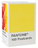
- PERFECT FOR PANTONE COLOR BOOK FANS: This charming postcard collection features a palette drawn from the Pantone Color Matching Systems.
- GRAPHIC DESIGN INSPIRATION: Each postcard in this set of 100 offers a different bold hue to brighten up the mail.
- COLOR MATTERS: Color as a form of communication is incredibly powerful. The art of Pantone makes this set of cards a brilliant way to connect.
- BLANK POSTCARDS: These high-quality cards are great for any occasion: birthdays, thank yous, sympathy, or just saying hello.
- DOUBLES AS DECOR: Postcards work wonderfully as miniature art pieces to display on the desk or bulletin board.

Product prices and availability are accurate as of the date/time indicated and are subject to change. Any price and availability information displayed on Amazon at the time of purchase will apply.




