Windows Errors? Fix Them Before They Spread
The Tool Desk
Outbyte Driver Updater FREEFix the driver behind crashes, sound loss and screen glitchesFind Drivers →Outbyte PC Repair FREEClear out junk files and repair common Windows errorsFree Scan →Outbyte PC Repair · freeRepair common Windows errors and clear accumulated junk for a smoother, more stable PC - no reinstall needed.
Fix My PC Now →ThatPainter is reader-supported. When you buy through links on our site, we may earn an affiliate commission. Learn More
Choose a color palette by starting with the purpose and mood of the work, then selecting a base color, adding a few supporting hues, and assigning each color a role. Harmony rules can help you find colors that relate, but they do not guarantee readability or accessibility: check the actual color pairs you use, and never rely on color alone to communicate meaning.
How to choose a color palette
- Define the job. Note the audience, context, and intended mood or energy. A palette for a quiet illustration may need a different balance from one for a bold poster or a website. Color associations and preferences vary, so treat mood as a design intention rather than a universal effect.
- Pick a starting point. Choose a base color, or begin with an image whose colors capture the direction you want.
- Build supporting colors. Use a color-wheel relationship as a starting structure, then adjust the hues, values, and saturation to suit the work. Adobe suggests three to five colors for many brand palettes; that is a practical guideline, not a rule for every project. Adobe’s palette guide explains common harmony approaches.
- Assign each color a job. Decide which colors will be dominant, supporting, or accent colors. For a digital design, define roles such as background, text, primary action, secondary action, and status. Consistent roles make a palette easier to use.
- Test the palette in context. Try it in the actual composition and at likely display sizes. For web content, check foreground and background pairs for contrast; for charts or other information, make sure viewers can distinguish meaning without color alone.
What colors go together? Common palette structures
These approaches describe relationships on the color wheel. They are ways to generate and organize options, not scientific laws or predictions of how every viewer will respond.
| Palette structure | How the hues relate | Useful consideration |
|---|---|---|
| Monochromatic | Variations of one hue | Often straightforward to keep cohesive. Make sure neighboring shades have enough contrast when they serve different functional roles. |
| Analogous | Neighboring hues | Can feel cohesive, but nearby hues may be hard to distinguish if they are the only way to tell chart or interface elements apart. |
| Complementary | Opposing hues | Creates a strong difference. Saturated colors can compete, so control their roles and how much area each occupies. |
| Triadic | Three hues spaced around the wheel | One dominant hue with two accents can help keep the composition from feeling too busy. |
| Split-complementary | One hue plus the two hues adjacent to its complement | Offers contrast with more nuance than a direct complementary pair. |
| Tetradic or square | Four hues arranged in different wheel patterns | Provides more variety, but calls for careful balancing and clear color roles. |
A harmonious set of swatches is not automatically easy to read. Test the combinations where they will actually appear, particularly small text, controls, labels, and data marks.
Do these 3 things before closing this tab:
1Clear out junk files and repair common Windows errors2Fix the driver behind crashes, sound loss and screen glitches3Repair Windows errors before they cause bigger problemsHow to make a palette from a picture
A reference image can give you a useful starting direction, whether it is a landscape, a still life, or an image chosen for its overall mood. Adobe describes Adobe Color as a free online tool for creating schemes from harmony rules and extracting colors from an image.
#1 Best Overall
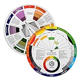
- Helps organise colours to make choices and combinations easier;Defines common terms and helps the artist to understand colour uses and interactions.
- Designed for all artists, including: Painters, crafters, interior, graphic, garden, and landscape designers;Perfect gift for creative people!
- Two-sided rotating wheel shows colour relationships;230mm diameter,2 packs Convenient and portable.
- UV coated to minimise fading and protect from moisture.Paper cover makes it;Paper evelope cover makes it difficult to break during transportation.
- Good for beginners to identify any of the colors easily and recognize the middle of the color simply.
- Choose an image that reflects the colors or atmosphere you want, rather than one that merely contains a color you like.
- Extract or sample a small set of colors, then decide which should be dominant, supporting, and accent colors.
- Adjust the sampled colors for the work. A color that looks balanced in a photograph may be too bright, too similar to its neighbor, or unsuitable for text in your finished design.
- Place the colors in the intended composition and check contrast and legibility. Image extraction speeds up exploration; it does not replace those checks.
How to make a color palette accessible
For web text, WCAG 2.2 sets a minimum contrast ratio of 4.5:1 for normal text and 3:1 for large text. The W3C defines large text for this criterion as at least 18 point regular or 14 point bold. Contrast is calculated from the relative luminance of the lighter and darker colors; the thresholds apply to text contrast, not to a palette’s overall attractiveness or every aspect of accessibility. See the W3C explanation of Contrast (Minimum) for the criterion and calculation.
- Check actual pairs. Test the foreground and background colors as used, including text over colored surfaces. A palette can look coordinated while a particular pairing is difficult to read. Adobe’s contrast guide discusses checking color contrast.
- Do not make color the only signal. Add text, an icon, a pattern, a shape, or another visible cue to distinguish meaning such as an error state or a chart category. W3C’s Use of Color guidance explains this requirement.
- Use grayscale as an extra check. A grayscale view can expose weak hierarchy or distinctions that rely heavily on hue. It is a practical inspection, not a substitute for a contrast calculation or a complete accessibility review.
Tools and learning aids
Adobe Color can generate schemes from harmony rules and extract colors from images, while Adobe’s contrast guide describes ways to check contrast. These tools can help with exploration, but using a palette generator does not certify that a design is accessible. A physical artist’s color wheel can also be a useful learning aid for seeing hue relationships; it is optional, not a required purchase.
Quick Recap
Best Value

- Master Color Theory Visually - This dual-sided artist color wheel makes understanding color theory effortless. The front is a dynamic spinning color wheel for instant color mixing results, while the back explains advanced relationships like complementary colors, serving as your ultimate color harmony wheel and artist mixing guide.
- Interactive Dual-Sided Learning - Simply spin the interactive color wheel to see color combinations come to life in the window. Flip it over to discover sophisticated color combinations and triad schemes, providing endless inspiration for your paintings, designs, and creative projects.
- Complete Set for Every Need (3 Sizes) - Get unmatched value with three durable color wheels in large and pocket color wheel sizes. This versatile set is perfect for the studio, classroom, or on-the-go, ensuring you always have the right paint mixing guide or color matching wheel at hand.
- Professional-Grade & Built to Last - Crafted from high-gloss, coated paper, our professional color wheel features a smooth 360-degree rotation that won't catch or tear. The laminated surface resists water and paint stains, making it a durable blending guide for everyday use.
- Your Universal Creative Companion - More than a paint color wheel, it's an essential tool for artists, makeup artists, tattoo designers, interior decorators, and teachers. This color wheel art teaching tool simplifies color theory for beginners and provides a quick reference for professionals in any field.
Rank #4

- Comprehensive Color Theory Guide: This color wheel clearly organizes hues, tints, shades, and tones in a visually intuitive layout, making it easy to understand color relationships and harmonies. It includes essential color theory terms and definitions, helping users expand their knowledge while providing a practical reference for creating balanced and appealing color schemes in various projects. Tips: Instructions printed on the exterior of the product
- Enhanced Learning and Creativity Support: Designed with a detailed English-language interface, the wheel effectively illustrates color mixing results and interactions. It supports both intuitive and technical color selection, allowing artists to quickly identify complementary, split-complementary, and analogous colors. This tool helps reduce guesswork and improves accuracy in color matching
- Durable and User-Oriented Design: Made from lightweight yet durable paper material, the color wheel is resistant to frequent use and easy to clean. Its compact and portable design offers convenience for artists and instructors on the go. The clear markings and smooth spinning mechanism ensure effortless operation during creative sessions
- Suitable for Multiple Disciplines and Users: Ideal for painters, quilters, makeup artists, art students, and teachers, this color wheel is a versatile tool across various fields. It supports activities such as watercolor painting, fabric dyeing, cosmetic blending, and classroom instruction, making it an essential accessory for anyone working with color
- Package Contents and Size Details: Both wheels are designed with the same accurate color layout and sturdy construction, offering flexibility for different working environments and user preferences
Rank #3
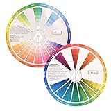
- This package include one Creative Color Mixing Board with one regular Color Wheel (9.25 inch).
- Easy-to-use tool that visually illustrates relationships between colors and demonstrates the results Features a grayscale, tints and tones, definitions of color terms, and illustrations of color.
- Color Wheel helps show which colors are complimentary, and how they go (or don't go) together.
- Some people know instinctively, and others need a visual tool to help them choose.
- Two sided wheel with indicators for complementary, split complementary and triad color schemes, how to tint and shade, primary, secondary and tertiary references, and more.
Rank #2
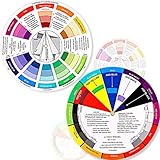
- Package include: 2 creative color wheel, 5.5 inch in diameter, the artist wheel helps show which colors are complimentary, and how they go (or don't go) together, suitable for learning how to color; Two identical color wheels, with different designs on the front and back
- Color mixing guide: the color wheel shows color, from basic principles and color mixing results on the front side; Spin around the paint wheel, then you will find the color mixture results in the windows, to learn the color theory in a fun way
- Color leaning tool: the backside of the color artist wheel that visually illustrates relationships between colors and demonstrates the results features a grayscale, and triad colors tints and tones, definitions of color terms, and illustrations of color, such as complementary colors, and triad colors
- Easy to use: this color mix guide consists of 3 layers, made of reliable cardboard with smooth surface and smooth rotation; And the size is moderate, easy to operate and carry
- Wide application: the relationship wheel is suitable to use when painting, quilting, interior design, having creative craft projects, and home decorating; Suitable for artists, teachers, kids, painters, designers, and tattoo learners

Product prices and availability are accurate as of the date/time indicated and are subject to change. Any price and availability information displayed on Amazon at the time of purchase will apply.
What’s actually slowing this PC down?
Pick the symptom - the matching free tool is one click away.




