Free tools Windows power users keep installed
One-click scans. No signup required.
ThatPainter is reader-supported. When you buy through links on our site, we may earn an affiliate commission. Learn More
Warm off-white, soft greige, muted sage, and pale blue-gray are the most reliable wall colors for a minimalist bedroom with floor bedding. They keep the largest visible surface quiet while the futon, wood, rug, and woven textures provide interest. Choose among them by looking at your room’s daylight, fixed undertones, and bedding color: warm off-white suits cream and oak, greige bridges mixed woods and black accents, sage adds a restrained natural note, and blue-gray works with cooler bedding. Sample the paint beside the actual futon and floor at different times of day before buying a full quantity.
As an Amazon Associate I earn from qualifying purchases.
What are the best wall colors for a minimalist bedroom with floor bedding?
Start with a softened, low-saturation color rather than a vivid hue. A floor mattress leaves more wall and floor visible than a conventional bed, so a strong color can dominate quickly. The following palette keeps the room calm while creating enough separation for the sleeping area to read clearly.
Windows Errors? Fix Them Before They Spread
Repair common Windows errors and clear accumulated junk for a smoother, more stable PC - no reinstall needed.Free scan · no reinstallOutdated Drivers Are Slowing You Down
One free scan finds every outdated or missing driver and matches the right update for your exact hardware.Free scan · exact hardware match| Wall direction | Works best with | Why it suits a floor-bed room | Watch-outs |
|---|---|---|---|
| Warm off-white or creamy white | Cream futon, pale oak, linen, rattan, beige rugs | Reflects light and creates an airy, continuous field around low furniture | A stark blue-white can look chilly beside warm wood and cream textiles |
| Soft greige or warm gray | Mixed woods, beige textiles, black metal, gray bedding | Adds definition to white or cream bedding without high contrast | Check the undertone in daylight and lamplight; some greiges turn pink or purple |
| Muted sage or gray-green | Natural fibers, oak, terracotta accents, Japanese-inspired ceramics | Introduces a quiet botanical note while remaining subdued | Keep the rest of the palette restrained so the green does not become the room’s loudest element |
| Pale blue-gray | Cool gray bedding, white cotton, charcoal details | Feels crisp and retreat-like with cooler materials and daylight | In a dim room it can read colder; balance it with warm wood and woven textiles |
| Light clay, sand, or muted terracotta | Tatami-like textures, beige bedding, dark wood | Adds earthiness while preserving a minimalist, low-contrast composition | Use a softened version; saturated orange can overwhelm a low sleeping arrangement |
These are starting directions, not guarantees. Color response is subjective, and the same formula can shift substantially with window direction, artificial light, neighboring colors, and wall texture.
Popular on Amazon
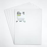
- PERFECT SAMPLES: These 12" x 9" white, styrene panels provide a smooth, warp-free surface for testing up to 5 color samples with paint, stain or other coatings.
- DURABLE MATERIAL: Made of sturdy styrene, these panels can withstand multiple coats and are non-absorbent so colors will stay true.
- CONVENIENT SIZING: At 12" x 9", the panels are just the right size for testing many common paint colors side by side before committing to a full project.
- PACKAGE INCLUDES: This value pack contains 5 white panels, enough for testing several color options on one purchase.
- VERY FLEXIBLE: Mighty Boards do not warp like foam core and you can bend them without breaking.
How should room size and natural light change the color?
Use lighter colors to maximize an open feeling in a small room, and consider deeper colors only when you intentionally want a more intimate effect. Behr’s bedroom guidance says light colors can make a small bedroom feel more open, while darker colors can make a larger room feel intimate. It also advises testing paint beside the actual bedding and furniture because lighting and shadows alter the finished appearance. Sherwin-Williams similarly points to lighter shades for small rooms and soft blues, greens, and cool neutrals for a soothing retreat.
Small rooms with limited daylight
Warm off-white is usually the safest first sample because it reflects available light without the icy cast of a stark blue-white. A very pale greige can also work when you need a little more boundary between a cream futon and the wall. If you try blue-gray, pair the sample with warm wood or a woven rug and inspect it after sunset; a color that looks airy at noon may feel cold under a single cool lamp.
Bright rooms with strong daylight
Abundant daylight gives you more room to test muted sage, pale blue-gray, or a light clay. A dark clay, olive, or charcoal can work as an accent wall when the room receives ample daylight and the bedding remains simple. It will reduce the airy effect, so use it only when a cocooning mood is more important than visual expansion.
North- and south-facing differences
Rather than relying on a name such as “warm” or “cool,” watch the sample in your actual exposure. Compare the same swatch on two walls, because one may sit in direct sun while another remains in shadow. Keep the least saturated option that still produces the mood you want; softened undertones are easier to live with when daylight changes through the year.
How do wall colors interact with a futon, mattress, and floor?
Match the wall’s depth and undertone to the bedding first, then let the floor and accessories provide controlled contrast. A low bed exposes a broad band of wall above it and a large area of floor below it, so contrast is more noticeable than it would be behind a tall headboard.
White or cream floor bedding
Choose a slightly deeper greige, warm gray, or muted sage if the white or cream mattress needs definition. The wall should sit close enough in value that the room still feels calm; a dramatic dark wall can make the mattress look like an isolated object.
Charcoal or patterned bedding
A warm white or pale neutral keeps the sleeping area as the focal point. Avoid adding another strong pattern or gallery wall above the futon. One or two carefully chosen objects can supply color without competing with the bedding.
Wood, tatami-like, and woven surfaces
Warm off-whites, sand, light clay, and sage harmonize with pale oak, rattan, jute, and tatami-like textures. Pale blue-gray can also work, but add a warm wood element so the combination does not become visually chilly. If the floor is already dark, a lighter wall preserves a sense of breathing room around the low bed.
Japandi-inspired composition
Woman&Home’s Japandi guidance combines bright, light Scandinavian tones with darker, richer Japanese earth colors. It notes that low-level beds can make a room feel more spacious, stay cooler, and remain easier to approach, and recommends leaving breathing space around furniture. In practice, keep the wall broad and quiet, limit accent colors to one or two objects, and resist a high-contrast gallery wall directly above the futon.
Also popular on Amazon

- suitable for various mailing and storage needs
- Soft and easy to use
- No batterries required
- No Assembly required
- Safe to use
Which palette is better: warm white or muted sage?
Warm white is the more forgiving choice; muted sage is the better choice when you want a gentle natural accent and your room has enough light. Warm white accommodates cream bedding, pale wood, linen, rattan, and beige rugs with little risk of an undertone clash. Sage gives a little more color and definition, especially against white bedding and oak, but it needs restraint elsewhere.
| Decision factor | Warm off-white | Muted sage |
|---|---|---|
| Airy effect | Strongest, particularly in small rooms | Still light when softened, but visually more present |
| Undertone behavior | Warm formulas support cream and oak; blue-white formulas can look cold | Gray-green versions are calmer than yellow or highly saturated greens |
| With a cream futon | Nearly seamless and low contrast | Creates gentle definition without a hard edge |
| With black hardware | Produces a crisp, graphic contrast | Softens black and adds an organic note |
| Repainting risk | Usually easiest to live with if light changes | More dependent on daylight; sample carefully |
Benjamin Moore’s bedroom guidance includes White Dove OC-17, Pashmina AF-100, and Wickham Gray HC-171 as bedroom options. Its relaxing-bedroom examples also include Palest Pistachio 2122-60 and Simply White OC-117. Treat the names and codes as reference points, not substitutes for a physical sample in your room.
The Tool Desk
Outbyte Driver Updater FREEFix the driver behind crashes, sound loss and screen glitchesFind Drivers →Outbyte PC Repair FREERepair Windows errors before they cause bigger problemsFix Now →How do I choose a color by undertone and contrast?
Identify the fixed elements you cannot easily replace: floor wood, futon cover, rug, curtains, and black or brass hardware. Then compare wall samples by lightness, warm or cool bias, saturation, and contrast against the low bed.
Warm undertones
Warm off-whites, taupes, sand, and softened clay sit comfortably with cream, beige, pale oak, and rattan. They are useful when the floor has yellow, honey, or reddish notes. Keep the color muted; a highly yellow wall can make natural wood look orange.
Cool undertones
Pale blue-gray and cooler greiges complement gray bedding, white cotton, charcoal, and some black metal. In rooms with weak daylight, add warm wood, linen, or a woven textile to prevent a stark result.
Low saturation versus strong color
Minimalist rooms benefit from colors that have been grayed or lightened. A low-saturation sage reads as a quiet accent, whereas a bright green becomes a feature wall. The same principle applies to clay, blue, and gray: soften the formula until the wall supports the room rather than announcing itself.
Contrast against the floor bed
Low contrast between wall, bedding, and floor creates the most spacious effect. If everything is nearly the same value and the room feels flat, add definition with a slightly deeper wall, a dark timber detail, or one charcoal object rather than introducing several unrelated colors.
How can I test bedroom paint colors before buying a full quantity?
Test two or three color families beside the real bedding, on more than one wall, through changing light. Benjamin Moore recommends display chips, brush-on samples, or peel-and-stick samples. Behr also emphasizes that lighting and shadows change the finished appearance and recommends testing on more than one wall.
- Record the fixed undertones. Write down whether the floor, futon cover, rug, curtains, and hardware read warm, cool, or neutral. Photograph them in daylight so you are not relying on memory.
- Narrow the field to two or three families. For this room type, begin with warm off-white, greige, sage, or pale blue-gray. Add light clay or sand only if the existing materials support an earthier direction.
- Use a physical sample format. Compare display chips, a brush-on patch, or a peel-and-stick sample. Place each beside the futon and floor rather than on an empty wall.
- Test multiple walls. Put samples on a wall near the window and another in shadow. Leave enough surrounding wall visible to judge contrast, and keep labels with the samples.
- Check three lighting periods. Look in the morning, afternoon, and lamplight. Note whether the color becomes pink, purple, green, or blue as the light changes.
- Choose the least saturated successful option. If two samples create the same mood, select the quieter one. It will usually integrate more easily with bedding, wood, and woven textures.
Do not judge a sample only from a phone photo or a store display. The wall’s sheen, nearby colors, and shadows can change both perceived lightness and undertone.
Also popular on Amazon

- Package Includes: this set includes 5 paint color test boards, allowing you to evaluate multiple color options at once, improving your color selection efficiency, and enabling you to choose colors for spaces such as the living room, bedroom, and kitchen
- Moderate Size: measuring about 12 x 9 inches, these paint sample boards provide a larger color display area, allowing you to judge the visual effect of paint on the actual wall surface, and can also be placed side by side for direct color comparison
- Quality Polystyrene Material: these color tester sample boards thickness about 1 mm crafted from polystyrene material, resisting warping after it dries, and you can use it multiple times
- Portable Design: after painting, you can place the sample in different rooms, on different walls, and facing different directions to observe it, helping you to evaluate the color effect under various lighting conditions
- Versatile Uses: except home painting projects, this polystyrene sheet is also an ideal paint sample board for artists who need a color tester sample board for practice; Use it to test color mixtures before applying to final canvases
What paint formulation and sheen suit a bedroom wall?
Look for a low-VOC, washable interior formulation and choose matte or satin according to wall condition and cleaning needs. Asian Paints recommends low-VOC, washable bedroom paint with matte or satin finishes. Mizutani’s Pure Wall page describes a low-VOC, water-based interior paint and states, “VOC is 1% or less.” That page is undated; the figure was accessed in 2026. It is product-specific information, not a promise that every paint has the same emissions, so follow the label for ventilation and curing.
Free tools Windows power users keep installed
One-click scans. No signup required.
Matte finish
Matte minimizes glare and hides minor surface variation, which helps a large, quiet wall recede. It can be less forgiving of repeated wiping, so consider how often the wall near the floor bed will be touched or cleaned.
Satin finish
Satin is easier to wipe and can be practical in a room where bedding, pets, or floor-level activity may mark the wall. It reflects more light, making surface preparation and patching more visible.
Choosing between them
Use the finish the manufacturer offers in the selected color, and test the actual sheen if possible. A color that feels perfect in matte may look brighter or more contrasty in satin because of reflected light.
What supplies and preparation do I need?
Sherwin-Williams lists painter’s tape, high-quality brushes and rollers, a paint tray, drop cloth, and primer among bedroom-painting supplies. Buy samples first; purchase the full paint and tools only after the color survives the lighting test.
Do these 3 things before closing this tab:
1Repair Windows errors before they cause bigger problems2Scan for outdated or missing drivers - takes under a minute3Clear out junk files and repair common Windows errors- Painter’s tape for trim, sockets, and edges
- High-quality brushes and a roller suited to the wall surface
- Paint tray and a drop cloth
- Primer when the existing wall is highly contrasting, stained, glossy, or uneven
- Low-VOC, washable interior paint in the chosen matte or satin sheen
Clean and repair the wall according to the paint maker’s instructions. Primer is not automatically required for every repaint; it is most useful when the old surface or color could telegraph through the new coat. Follow the specific product label for drying, ventilation, and curing times.
Independent reader supportYour contribution helps us test, update, and keep practical guides available for everyone.How do I make a floor-bed room cozy without adding clutter?
Use texture and proportion instead of a collection of decorations. A quiet wall lets the futon, rug, wood, linen, and woven pieces carry the visual warmth.
Keep the wall as a calm backdrop
Choose one wall color and avoid a high-contrast gallery arrangement above the mattress. If you want an accent, make it a single wall in a well-lit room and keep the bedding simple.
Layer tactile materials
Combine a washable rug, linen or cotton bedding, pale or dark wood, and one woven element. These materials create depth without requiring many colors or objects.
Also popular on Amazon

- Core Color Matching: Paint color sample cards include 83 standard colors to support paint color sample cards, color matching cards for painting, and paint chips standard samples, helping users compare shades before selecting a final finish for floor paint, hardware, and other project needs
- Reliable Reference: Paint samples are made with color matching materials designed to support accurate color comparison, giving painters and DIY users a practical paint and paint color samples reference for selecting tones that fit the project surface and intended look
- Portable Format: Measuring 3.74 x 1.57 x 1.18 in and weighing 3.88 oz, this paint samples set is compact for a toolbox, work bag, or travel use, making it easier to carry color test card paint and check shades on site when planning paint work
- Wide Project Use: Paint sample cards are suitable for floor paint, paint hardware, and related color selection tasks, offering a useful paint chips samples reference for contractors, decorators, and home improvement users working on color coordination across different surfaces
- Simple Set Package: Each package includes 1 set of paint sample cards, giving users a straightforward paint sample standard cards option for daily work, project planning, and quick shade comparison when choosing among paint color cards and paint chips sample cards
Protect breathing space
Leave visible floor around the low bed and avoid pushing every piece of furniture against it. The open area is part of the minimalist composition and helps the room feel approachable rather than crowded.
Use controlled color accents
With sage walls, a small terracotta ceramic can reinforce the natural palette. With blue-gray walls, warm oak or beige textiles prevent the scheme from feeling cold. Keep accent colors to one or two objects so the wall remains the largest quiet field.
What common color mistakes should I avoid?
- Choosing from a tiny screen image: digital color is not reliable enough for an undertone decision. Use a physical chip or sample.
- Testing only under store lighting: inspect the paint in morning, afternoon, and lamplight on more than one wall.
- Pairing warm materials with a blue-white: the wall can look icy beside cream bedding and honey-toned wood. Start with a warm off-white instead.
- Using a saturated accent in a small room: strong color reduces the airy effect and can overpower a floor mattress. Try a grayed or lightened version.
- Ignoring the sheen: satin reflects more light and reveals more surface variation than matte. Decide based on both appearance and cleaning needs.
- Adding contrast everywhere: a dark wall, patterned bedding, gallery wall, and multiple accent colors compete with one another. Let one element lead.
- Assuming color guarantees better sleep: available guidance concerns mood and visual comfort. No independent published statistic establishes that a particular wall color improves sleep.
What does the evidence say about calming bedroom colors?
Benjamin Moore’s color-psychology guidance describes light green and blue as relaxing, classic white as clear, and warm gray as soothing, while stressing that responses are subjective. Helen Shaw, Director of Marketing at Benjamin Moore, said: “We typically see people reaching for more calming hues when choosing paint colors for their bedrooms. This can help create a more tranquil space to relax and unwind.” Those statements support using gentle, quiet colors for atmosphere, not promising a measurable sleep benefit.
How should I make the final choice?
Begin with the material that dominates your room. For cream bedding and pale wood, sample warm off-white and a soft greige before anything cooler. For gray bedding, charcoal details, and cooler daylight, add pale blue-gray to the test board. For oak, rattan, and natural fibers, compare muted sage with warm off-white. Keep the samples in place through changing light, choose the least saturated color that still gives the desired mood, and select matte or satin based on wall condition and cleaning needs. The result should make the floor bedding feel intentional while leaving enough visual breathing room for the room to stay minimalist.
Frequently Asked Questions
Can a minimalist bedroom combine two wall colors?
It can, but keep the relationship quiet: use colors from the same warm or cool family and limit the deeper shade to one clearly defined wall. A single controlled change is easier to balance with low furniture than several small color blocks.
What should I do if my sage sample looks too green?
Move toward a grayer, less saturated sage and compare it with the oak, rug, and bedding in both daylight and lamplight. If it still draws attention before the furniture is installed, a warm off-white or soft greige will be more forgiving.
Is matte paint a problem beside a floor mattress?
Matte reduces glare and hides small wall flaws, but it may not tolerate frequent wiping as well as satin. Consider where hands, bedding, or pets contact the wall and follow the chosen product’s cleaning guidance.
Can wall color alone make the room feel cozy?
No. The strongest effect comes from the combination of a quiet wall, tactile bedding, wood or woven materials, appropriate lighting, and open floor space. Color establishes the backdrop; texture and proportion provide most of the physical warmth.
Quick wins for a faster PC:
Fix the driver behind crashes, sound loss and screen glitchesFind Drivers →Repair Windows errors before they cause bigger problemsFix Now →Scan for outdated or missing drivers - takes under a minuteDriver Scan →Quick Recap

Product prices and availability are accurate as of the date/time indicated and are subject to change. Any price and availability information displayed on Amazon at the time of purchase will apply.

