ThatPainter is reader-supported. When you buy through links on our site, we may earn an affiliate commission. Learn More
Burgundy is usually the better choice for a warm, grounded powder room with brass, wood and warm-white trim. Plum is the better choice when you want a more obviously purple, layered or jewel-box effect. Neither name describes one standardized color, however. Burgundy can lean brown or violet, while plum ranges from warm red-violet to cool purple. The winning shade depends on the undertone revealed by your room’s bulbs, daylight, fixtures and paint sheen.
As an Amazon Associate I earn from qualifying purchases.
For a reliable decision, compare physical samples of one burgundy and one warm and cool plum on more than one wall. View them in daylight, at night and under the actual bulbs before buying paint.
Quick wins for a faster PC:
Clear out junk files and repair common Windows errorsFree Scan →Fix the driver behind crashes, sound loss and screen glitchesFind Drivers →Repair Windows errors before they cause bigger problemsFix Now →What is the practical difference between burgundy and plum paint?
Burgundy is a deep red-led color with wine-like warmth. Plum belongs to the red-violet and purple family, so it can look reddish and cozy or distinctly blue-purple depending on the formula. In a powder room, burgundy tends to feel intimate and traditional; plum can feel more decorative, contemporary and jewel-like.
Popular on Amazon
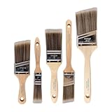
- COMPLETE 5-PIECE BRUSH SET FOR EVERY PAINTING TASK — Includes 1 Inch Flat, 1.5 Inch Angle, 2 Inch Flat, 2 Inch Angle Stubby, and 2.5 Inch Angle brush giving you every size professional painters use daily. Get all 5 for less than the price of a single brush from hardware store brands — professional grade performance at a fraction of the cost. Perfect for walls, trim, cabinets, doors, furniture, and detailed cutting-in work on any project.
- ZERO BRISTLE LOSS — GUARANTEED BY PRECISION ADHESIVE BONDING — Every bristle is locked in place with precision-set adhesive that keeps them in the brush — not in your paint job. The coated steel ferrule provides structural support while the adhesive bond ensures clean performance on every stroke. Premium SRT synthetic filaments load more paint and release it evenly for a smooth streak-free finish on walls, ceilings, and trim. Works with latex, oil-based paint, primer, sealer, and wood stain.
- INCLUDES THE ANGLE STUBBY MOST SETS LEAVE OUT — Professional painters know the 2 Inch Angle Stubby is the go-to brush for tight cabinet interiors, window sashes, inside corners, and detailed trim where standard angle brushes are too long. Combined with the 1.5 and 2.5 inch angle sash brushes you have precision cutting-in covered at every scale — baseboards, crown molding, door casings, and ceiling lines.
- FLAT BRUSHES FOR BROAD SMOOTH COVERAGE ON ANY SURFACE — The 1 and 2 inch flat brushes deliver even coverage on walls, furniture, shelving, doors, fences, decks, and wood surfaces. Ideal for applying primers, stains, varnishes, polyurethane, and specialty coatings. Solid wood handles provide all-day comfort and control for both professional contractors and weekend DIY homeowners tackling interior or exterior painting projects.
- TRUSTED BY PROFESSIONAL PAINTERS AND CONTRACTORS NATIONWIDE — Pro Grade delivers professional-grade results at a price that makes sense for crews who go through brushes on every job. Ideal for property managers, remodeling contractors, apartment turnover crews, maintenance teams, and commercial painting operations. Backed by thousands of verified reviews from working painters. Washable and reusable for multiple projects.
| Consideration | Burgundy | Plum |
|---|---|---|
| Color family | Deep, muted red; some versions carry a plum-brown cast | Red-violet through purple, with warm and cool versions |
| Typical mood | Grounded, enveloping and wine-rich | Layered, dramatic and potentially jewel-box-like |
| Strongest partners | Warm white, natural wood, aged brass, cream stone | Gold or brass, off-white, walnut, dark stone and patterned textiles |
| Main risk | Can look brown or flat under cool light | Cool formulas can look gray-purple; warm formulas can turn noticeably red under warm bulbs |
| Best starting point | When you want red-led drama without an obviously purple wall | When a visible purple or red-violet statement is the goal |
The distinction is about the specific paint, not just the label on the fan deck. Sherwin-Williams describes Burgundy SW 6300 as a deep muted red with a plum-brown cast. By contrast, PPG Royal Plum PPG1178-7 is described as a dark, subdued heliotrope purple with a raspberry undertone. Both can work in a small bathroom, but they will not create the same atmosphere.
How do undertones change the result?
Undertones are the subtle colors beneath a paint’s dominant appearance. They become easier to see beside another color or under a different light source. Sherwin-Williams color expert Sue Wadden explains that “the green or pink or blue undertone will show up in comparison.” That is why a plum chip that looks neutral in a store can appear blue-purple beside warm-white trim, or redder beside a cool white.
Burgundy undertones
A red-led burgundy normally reads warm, but brown or violet in the formula can change its character. Against cream trim and wood, it looks rich and enveloping. Beside stark white tile or blue-white LEDs, the same paint may lose its wine quality and appear flatter, browner or slightly purplish.
Warm plum undertones
Warm plums contain more red, brown or rose. They are the easiest plum colors to pair with aged brass, walnut, terracotta, blush textiles and warm off-whites. Sherwin-Williams Plum Brown SW 6272 is positioned as a deep, warm-neutral plum-brown for moody bathrooms, with gold and wood shown as companion materials.
Cool plum undertones
Cool plums contain more blue or violet. They produce a crisp, dramatic jewel-box effect with bright white, polished nickel, gray stone or charcoal accents. In a north-facing room or under cool bulbs, a cool plum can shift toward gray-purple, which may be attractive if intentional but disappointing if you expected a red-violet wall.
Why the color name is not enough
“Plum” covers a broad range. HGTV Home Poetry Plum HGSW6019 is listed as a warm gray red-violet with an LRV of 12.0, while HGTV Home Expressive Plum HGSW6271 is a cool purple, also with an LRV of 12.0. Their equal listed light-reflectance value does not make them interchangeable; hue and undertone still control how the walls relate to fixtures and light.
Also popular on Amazon

- Great Value Pack Artist Paint Brushes: Soucolor 20 brushes in 10 sizes professional paintbrushes set — no shedding, holds paint well, cleans easily, Acrylic, watercolor, oil, gouache, Halloween pumpkin decoration & face painting, rock painting, ceramics. Fantastic high quality gifts for creative, artistic siblings to share!
- Awesome Set of Paint brushes: Professional paint brushes can cover all of your needs. The multi-purposed brushes are ideal for Watercolor, Oil, Gouache, enamel, Acrylic Painting, Body, Nail, Face Painting, Miniature, Model, Wood, Glass, Cup, Ceramic, Fine work, Art class, Craft Art Painting, DIY Art Crafts etc.
- Soft and long-lasting: The bristles are soft and strong, with nickel metal ferrules and blue wooden handles. After cleaning, the bristles will become soft and fluffy again and will not fall off.
- Easy to clean: it’s very convenient to Wash well in soap and water. Retain shape after drying. the brushes hold up very well. Nice selection to beginners and professionals. Keep them clean and they last a long time.
- Halloween Pumpkin Ceramic Crafts Supplies: A Great painting gift for family, friends, kids, girls, women, student, classmate, teacher. For using in school, travel or used in the home and office.
Is burgundy or plum better for a small or windowless powder room?
Both can succeed because a powder room is viewed for short periods and does not need to feel as visually expansive as a bedroom or kitchen. Benjamin Moore describes the powder room as an opportunity to use strong color, and Sherwin-Williams experts likewise recommend saturated or unexpected colors for dim rooms. In a windowless room, choose the color whose undertone supports the artificial light rather than trying to make a dark room look artificially bright.
When burgundy works best in low light
Burgundy is a strong choice when the room has warm LEDs or incandescent lamps, cream or warm-white trim, wood cabinetry and traditional, collected or vintage-inspired fixtures. Its red base remains present when daylight is scarce, creating an intimate backdrop for a mirror and metallic hardware.
When plum works best in low light
Plum suits a room intended to feel immersive and decorative. A warm plum can cocoon the space without becoming obviously purple, while a cool plum can create a deliberate jewel-box effect with bright trim and reflective metal. Benjamin Moore marketing director Helen Shaw, quoted by Homes & Gardens, notes that in small bathrooms with little natural light, “dark, rich colors like plum, deep green, or navy blue can create an instantly immersive, cocooning effect.”
How shadows affect both colors
Insufficient daylight and directional lighting create wall-to-wall variation. Sherwin-Williams notes that shadows subdue wall color; saturated, cleaner colors generally hold their presence better than weak tints. A burgundy or plum that looks balanced on a sunny sample board may look nearly black in a corner behind the toilet. Place samples where the mirror, vanity and door will cast their real shadows.
How do warm and cool bulbs change burgundy and plum?
Light temperature can change the apparent undertone more than a small shift in paint color. Warm bulbs emphasize red, rose and brown. Neutral or cool bulbs reveal blue and violet. Daylight changes again during the day, especially in a room with a small window or a transom.
Recommended Free Tools
| Light condition | Burgundy tendency | Plum tendency | What to watch |
|---|---|---|---|
| Warm LED or incandescent | Redder, wine-like and sometimes brown | Warm plum becomes rosier; cool plum can lose some blue | Too much red if the room already has terracotta or pink accents |
| Neutral LED | More balanced deep red; brown cast becomes clearer | Undertone is easier to judge | Useful for comparing chips without strongly warming them |
| Cool or blue-white LED | Can look flatter, browner or slightly violet | Cool plum can become gray-purple and warm plum can look less red | Check whether the result still suits white fixtures |
| Limited daylight | Deep, enveloping and shadowed | More dramatic; cool versions may lose saturation in corners | Look at the wall behind the mirror and beside the vanity |
Do not judge either color from a phone or monitor. Screens are not color-accurate, and their brightness can hide a paint’s undertone. Physical chips or peel-and-stick samples are the dependable way to see the interaction between paint, bulbs and existing surfaces.
Also popular on Amazon

- 【All sizes of art brushes】: The 10 sizes of multi-functional brushes have various shapes, making the mixing color easier, which is very suitable for artists, students, teenagers, children and painters at all levels. Wonderful Present ideas for friends and family who like painting!
- 【general brush set】: Professional paint brush can meet all your needs. Multifunctional brush is very suitable for watercolor, oil, gouache, acrylic painting, body, nail, face painting, miniature, model, ceramics, arts and crafts painting, etc.
- 【high quality process】: It is designed with anti falling bristles, anti-rust nickel ferrule and solid wood handle. You can use the brush to focus on the painting and always be creative.
- 【easy to maintain】: After using the brush, it is very convenient to clean the brush with warm soapy water and reshape the tip of the brush. Air dry the brush and place it on top of the top for long use.
- 【100% satisfaction guarantee - buy now】1 packs of set brushes, you can also get friendly customer service, any questions feel free to contact us, within 24 hours to help you! There is no risk in buying our paint brush kit.
Which trim, hardware and materials pair with each color?
Pairings for burgundy
- Trim: warm white, ivory and soft cream keep burgundy from looking harsh.
- Metals: aged brass, antique brass and bronze reinforce its warmth; polished brass adds a more formal contrast.
- Wood: walnut, oak with warm stain and mahogany support the wine-like depth.
- Stone and tile: cream marble, beige limestone and warm gray surfaces are safer than blue-gray tile.
- Textiles: camel, rust, muted rose and olive can make the room feel collected rather than themed.
Pairings for warm plum
- Trim: off-white and warm gray-white allow the red-violet undertone to remain visible.
- Metals: brass and gold bring out raspberry or red notes; bronze creates a quieter, cocooning scheme.
- Wood: walnut and medium-to-dark oak provide depth without competing with the purple.
- Stone and tile: taupe, mushroom, cream and softly veined marble bridge the gap between red and violet.
- Textiles: dusty pink, cinnamon, moss and ochre create a layered palette.
Pairings for cool plum
- Trim: clean white or very pale gray makes the purple read intentional and crisp.
- Metals: polished nickel, chrome and silver emphasize its cooler side; brass creates a deliberate warm-cool contrast.
- Wood: neutral oak and espresso work better than orange-toned stains.
- Stone and tile: charcoal, blue-gray and white surfaces support a more contemporary scheme.
Existing materials should decide the direction. If the countertop has yellow, cream or red veining, a warm burgundy or plum will usually connect more naturally. If the room already contains blue-gray tile and chrome, a cool plum may look more coherent than a brown-leaning burgundy.
What are useful named burgundy and plum paint starting points?
Named colors are reference points, not guarantees. The finished appearance depends on the room, the primer, the number of coats, the sheen and the light. Order a chip for the exact product and finish you plan to use.
| Paint | Published description | Listed LRV | Why consider it |
|---|---|---|---|
| Sherwin-Williams Burgundy SW 6300 | Deep, muted red with a plum-brown cast | Not stated | A red-led option for an enveloping, traditional powder room |
| PPG Royal Plum PPG1178-7 | Dark, subdued heliotrope purple with a raspberry undertone | 7 | A very deep plum for a dramatic jewel-box effect |
| HGTV Home Poetry Plum HGSW6019 | Warm gray red-violet | 12.0 | A warmer plum starting point that can sit between burgundy and purple |
| HGTV Home Expressive Plum HGSW6271 | Cool purple | 12.0 | A clearer purple statement for cool or contemporary schemes |
| Sherwin-Williams Plum Brown SW 6272 | Deep, warm-neutral plum-brown; featured as a 2026 color of the month | Not stated | A moody, brown-balanced plum for gold and wood pairings |
| Benjamin Moore Chambourd AF-645 | Dark plum shown on a powder-room wall in the brand’s color handbook | Not stated | An example of using a bold dark plum in an occasional-use room |
LRV, or light reflectance value, describes how much visible light a color reflects on a standardized scale. The listed LRV of 7 for Royal Plum indicates a very dark color, while the listed value of 12.0 for Poetry Plum and Expressive Plum is still deep. LRV does not predict undertone, sparkle or whether a color will look lighter under your particular bulbs.
What finish should you use for dark bathroom walls?
Use a bathroom-rated eggshell or satin for the best balance of cleanability, reflected light and visual depth. Choose semi-gloss or gloss for trim, paneling or a carefully prepared feature wall when you want more sparkle. Matte can look sophisticated in a color-drenched powder room, but it absorbs more light and makes surface flaws easier to see.
| Finish | Reflection | Best use in a powder room | Trade-off |
|---|---|---|---|
| Flat or matte | Very low | Quiet, deep walls with a soft, enveloping appearance | Shows preparation flaws and absorbs the most light |
| Eggshell | Low to medium | General walls when you want depth with easier cleaning | Less dramatic than matte, less reflective than satin |
| Satin | Medium | Walls exposed to fingerprints, splashes and frequent wiping | Can highlight uneven patches or roller marks |
| Semi-gloss | Medium to moderate | Trim, wainscoting and selected accent surfaces | Creates visible highlights and exposes poor prep |
| Gloss | High | Small areas where reflected light is intentional | Very demanding of surface preparation |
Sherwin-Williams classifies flat or matte as very low reflection, eggshell as low-to-medium, semi-gloss as medium-to-moderate and gloss as high reflection. A 2026 Homes & Gardens roundup reports designers using gloss to catch light and matte to create depth; it attributes an 87–90% gloss sheen range to Little Greene Intelligent Gloss. That high-sheen approach can be striking, but it is less forgiving than eggshell or satin.
Humidity is usually lower in a powder room than in a full bathroom, but a bathroom-rated product remains a sensible choice where condensation or frequent cleaning is possible. Benjamin Moore describes Aura Bath & Spa as mildew-resistant and soft-matte for humid rooms. Follow the product label for surface preparation, ventilation and recoat timing.
Also popular on Amazon

- Bates paint brushes come in a convenient 6 pieces with 3 flat and 3 angled bristle styles, including (1”, 1.5”, 2”) flat and (1.5”, 2”, 2.5”) angled bristles, perfect for tackling any surface painting or staining job.
- The sturdy natural bristles of each brush are designed to hold more paint, creating a smoother finish with fewer streaks and saving you time on the job.
- The lightweight wooden handles provide extra comfort and ease during long painting processes like walls, trims, cabinets, and doors.
- These versatile brushes are ready-to-use, easy to clean, and can be reused multiple times, making them economical as well as reliable tools for any painting project.
- Bates paint brushes can be used for both oil-based paints as well as latex stains and are ideal for home or commercial projects such as decks, fences or DIY painting jobs.
How should you sample burgundy and plum before committing?
Sample both colors in the room rather than choosing from a screen or a small store card. A two-wall comparison reveals undertones, shadows and sheen far better than a single swatch.
Free tools Windows power users keep installed
One-click scans. No signup required.
- Choose three candidates: one burgundy, one warm plum and one cool plum. Include the exact sheen you intend to buy if sample pots are available.
- Prepare the surface: clean dust and soap residue, repair obvious defects and prime dramatic color changes as recommended by the paint manufacturer. A dirty or patchy wall can distort the color.
- Use large samples: apply each color to a generous board or large peel-and-stick sample rather than relying on a tiny card. Keep the samples movable so you can compare several walls.
- Place them on two walls: use the wall beside the mirror and another wall near the door or vanity. These locations show direct light and shadowed light.
- Observe a full day: check morning or afternoon daylight, the room’s normal daytime lighting and the evening bulbs. Look at the samples with the door open and closed.
- Compare against fixed materials: hold the samples next to the countertop, tile, trim, faucet and mirror frame. Notice whether the paint makes white fixtures look yellow, blue or gray.
- Evaluate the finish: view the sample from an angle to see reflected hotspots. A dark satin can appear lighter in a highlight than the same color in matte.
- Live with the finalists: leave the samples in place for at least several lighting cycles. Buy paint only after one color still looks right beside the room’s permanent materials.
Side-by-side comparison is especially important because the eye adapts to a single dark color. Sherwin-Williams recommends comparing colors together so hidden blue, red, pink or violet shifts become visible.
Which color should you choose for common powder-room styles?
Traditional powder room with brass and wood
Start with burgundy or a warm plum-brown. Warm-white trim, aged brass and stained wood reinforce the red and brown notes, producing a settled, library-like atmosphere. Use satin or eggshell on the walls and reserve higher sheen for trim if you want the brass to catch light.
Contemporary room with white fixtures and chrome
Start with a cool plum if you want contrast that reads intentionally purple. Crisp white and chrome keep the scheme clean, while a low-reflectance finish prevents the color from becoming overly shiny. If the room’s bulbs are very cool, compare a slightly warmer plum as insurance against grayness.
Eclectic or jewel-box room
Either family can work, but plum gives the clearest jewel-box signal. Pair it with patterned wallpaper on the ceiling, a decorative mirror or saturated textiles only after checking that the undertones do not fight. Burgundy is the quieter option when you want drama without making purple the room’s dominant identity.
Minimal room with pale stone and simple fixtures
A muted burgundy can add depth while preserving a restrained palette. A warm gray red-violet such as Poetry Plum can provide a similar effect with a more contemporary edge. Keep trim and accessories limited so the dark wall remains the focal point.
Also popular on Amazon

- 2 Inch Angled Paint Brush for Precision Cutting-In – Designed for clean, sharp lines around trim, baseboards, ceilings, corners, and detailed edge work. The perfect size for control and coverage.
- Value 3-Pack for Pros & DIY Projects – Includes three professional 2-inch angled sash brushes — ideal for contractors, remodelers, and homeowners tackling multiple rooms or repeat paint jobs.
- Smooth Results on Walls, Trim & Cabinets – Great for interior wall painting, cabinet edges, furniture projects, and trim work where a smooth finish and crisp control matter most.
- Works with Latex Paint, Oil-Based Paint & Stains – Premium synthetic filaments hold more paint, reduce streaks, and provide a clean finish with latex paints, oil coatings, and wood stains.
- Works with Latex Paint, Oil-Based Paint & Stains – Premium synthetic filaments hold more paint, reduce streaks, and provide a clean finish with latex paints, oil coatings, and wood stains.
What mistakes make dark powder-room paint look wrong?
- Choosing from a color name: “Plum” may mean warm red-violet or cool purple. Inspect the actual chip.
- Ignoring the bulbs: A color selected in daylight can shift sharply at night. Evaluate it under the lamps that will remain in the room.
- Using one tiny sample: Small cards conceal undertones and do not show how shadows affect a broad wall.
- Matching only the faucet: Countertops, tile, trim and mirror frames occupy more visual area and can pull the paint warmer or cooler.
- Picking gloss for a damaged wall: High sheen reflects every ridge and patch. Repair and prime thoroughly or choose a lower sheen.
- Assuming low LRV means unusable: A very dark color can be successful in a powder room because the space is occasional-use and a bold wall is expected. Provide adequate task lighting at the mirror.
- Using a non-bathroom formula where humidity is present: Select a product rated for the room’s conditions and follow its ventilation and curing guidance.
- Painting before resolving undertones: If the sample turns unexpectedly red or blue, change the color before committing rather than trying to correct it with accessories.
What is the final recommendation?
Choose burgundy when your priority is a warm, grounded room that works naturally with brass, wood and warm-white trim. Choose plum when you want the wall to read more distinctly purple or to create a layered, immersive jewel-box mood. Within either family, undertone and lighting matter more than the name on the label.
For a first comparison, place Burgundy SW 6300 beside a warm plum such as Poetry Plum or Plum Brown, then add a cool plum such as Expressive Plum if your fixtures and bulbs lean blue. Keep the samples on two walls through daylight and evening illumination, and select the shade that remains compatible with the permanent materials in the room.
Frequently Asked Questions
Can the ceiling be painted burgundy or plum too?
Yes, a matching or slightly lighter ceiling can create a color-drenched effect that makes a small room feel intentional rather than chopped into sections. Use a lower-sheen ceiling product if you want to reduce glare, and check the sample overhead because the same color can appear darker above eye level.
Quick wins for a faster PC:
Scan for outdated or missing drivers - takes under a minuteDriver Scan →Clear out junk files and repair common Windows errorsFree Scan →Should the door and vanity be the same color as the walls?
Not necessarily. A dark wall with a lighter door or painted vanity creates a clear break and can keep the room from feeling enclosed. Matching the vanity to the wall is useful when you want the cabinetry to recede, while contrasting wood makes the furniture a focal point.
How can I keep dark paint from showing fingerprints and water marks?
Choose a washable bathroom-rated eggshell or satin, allow the coating to cure according to its label and wipe marks with a soft, damp cloth rather than abrasive cleaners. Good exhaust ventilation and a properly sealed sink backsplash reduce the moisture and splashing that create recurring spots.
Does a dark powder room need brighter lighting than a pale one?
The wall color does not determine a single required lumen value, but dark surfaces absorb more light, so mirror lighting becomes especially important. Use even, shadow-reducing light at the face and avoid relying on one overhead fixture that leaves the vanity wall dark.
Quick Recap

Product prices and availability are accurate as of the date/time indicated and are subject to change. Any price and availability information displayed on Amazon at the time of purchase will apply.
The Tool Desk
Outbyte PC Repair FREEClear out junk files and repair common Windows errorsFree Scan →Outbyte Driver Updater FREEFix the driver behind crashes, sound loss and screen glitchesFind Drivers →
