Recommended Free Tools
PC Slower Than It Used to Be?
Free scan · Windows 10 & 11
Crashes, No Sound, or Screen Glitches?
The Tool Desk
Outbyte PC Repair FREEClear out junk files and repair common Windows errorsFree Scan →Outbyte Driver Updater FREEFix the driver behind crashes, sound loss and screen glitchesFind Drivers →Free scan · under a minute
Windows Errors? Fix Them Before They Spread
Free scan · no reinstall
ThatPainter is reader-supported. When you buy through links on our site, we may earn an affiliate commission. Learn More
Workplace color can shape how an office feels, but the cited studies do not establish a universally best paint color or a reliable productivity boost. Findings vary with the task, the amount and intensity of color, exposure time, study setting, and the people using the space. For a workplace painter or designer, the practical takeaway is to treat color as one design variable: define what the room needs to do, consider its light and materials, and compare paint samples in the actual space before committing.
As an Amazon Associate I earn from qualifying purchases.
PC Slower Than It Used to Be?
A free scan shows the junk files, broken settings and background clutter dragging Windows down - then fixes them in one click.Free scan · Windows 10 & 11Crashes, No Sound, or Screen Glitches?
Random freezes, missing sound and display glitches usually trace back to one bad driver. Find and replace yours safely.Free scan · under a minuteDoes office color improve productivity?
There is evidence that workplace color can be associated with mood, wellbeing, and some work-related outcomes. There is not dependable evidence that painting an office a particular color will make its occupants more productive. The distinction matters: a change in reported mood or perceived performance is not necessarily a measurable improvement in completed work, accuracy, or output.
A 2018 systematic review examined 40 papers on color in work environments. It found research linking color with affect, wellbeing, and work outcomes, but also described contradictory findings and limitations: studies used different methods and outcomes, often took place in hypothetical or laboratory settings, and rarely examined realistic combinations of colors. The review also noted the possibility of individual and cultural differences. Its findings on color in work environments support taking color seriously as part of design, not treating any hue as a guaranteed intervention.
Popular on Amazon

- Great Value Paint Brush Set: Soucolor 20 acrylic paint brushes come in 10 different sizes, making them ideal for fine detailing, model painting, rock painting, nail art, face painting, DIY crafts, and general art projects. The varied brush sizes give you better control for both delicate lines and broader color coverage, while the soft bristles deliver smooth, consistent results on acrylic, oil, watercolor, canvas, wood, ceramic, and more.
- Awesome Set of Paint brushes: Professional paint brushes can cover all of your needs. The multi-purposed brushes are ideal for Watercolor, Oil, Gouache, enamel, Acrylic Painting, Body, Nail, Face Painting, Miniature, Model, Wood, Glass, Cup, Ceramic, Fine work, Art class, Craft Art Painting, DIY Art Crafts etc.
- Soft and long-lasting: The bristles are soft and strong, with nickel metal ferrules and blue wooden handles. After cleaning, the bristles will become soft and fluffy again and will not fall off.
- Easy to clean: it’s very convenient to Wash well in soap and water. Retain shape after drying. the brushes hold up very well. Nice selection to beginners and professionals. Keep them clean and they last a long time.
- Perfect for All Painters & Occasions: Suitable for art beginners, hobbyists and professional artists. Great for art class, home creation, travel painting and DIY handmade projects. A practical art gift for students, teachers, family and craft lovers.
Experiments illustrate why a simple rule is hard to defend. In a 1993 experiment, 45 women aged 18–24 spent one hour in an office with red/warm, blue-green/cool, or white/neutral walls. The researchers found no significant differences between the three groups in typing performance, anxiety, depression, or arousal. They cautioned that any effect could have been too small to detect with 15 people per group or might have required longer exposure. The study record describes a specific short experiment; it cannot settle what happens in every workplace.
In a four-day laboratory study, participants in white and predominantly blue-green offices reported higher perceived performance and job satisfaction than participants in a predominantly red office. Those findings concern participants’ perceptions in a controlled setting, not proof that blue-green paint raises objective productivity in ordinary offices. The same study found that participants with moderate or high ability to screen out irrelevant stimuli reported greater perceived performance and satisfaction than participants with low screening ability. See the study on color schemes, environmental sensitivity, and perceived performance.
Another study assigned 90 workers to red, blue-green, or white offices for four consecutive workdays. People in the red office reported more dysphoria than those in the blue-green office, while performance differences depended on environmental sensitivity: high screeners did better in the red condition and worse in the blue-green condition than low screeners. That result is a useful warning against assuming that everyone responds to a color in the same way. It is not a paint-selection formula.
Color may matter, but the evidence does not justify a claim such as “this paint color increases productivity by a set percentage.” The reviewed sources establish no defensible general percentage increase. They also do not show that changing paint alone can compensate for problems with lighting, noise, layout, workload, or other conditions that affect a workplace.
Also popular on Amazon
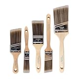
- COMPLETE 5-PIECE BRUSH SET FOR EVERY PAINTING TASK — Includes 1 Inch Flat, 1.5 Inch Angle, 2 Inch Flat, 2 Inch Angle Stubby, and 2.5 Inch Angle brush giving you every size professional painters use daily. Get all 5 for less than the price of a single brush from hardware store brands — professional grade performance at a fraction of the cost. Perfect for walls, trim, cabinets, doors, furniture, and detailed cutting-in work on any project.
- ZERO BRISTLE LOSS — GUARANTEED BY PRECISION ADHESIVE BONDING — Every bristle is locked in place with precision-set adhesive that keeps them in the brush — not in your paint job. The coated steel ferrule provides structural support while the adhesive bond ensures clean performance on every stroke. Premium SRT synthetic filaments load more paint and release it evenly for a smooth streak-free finish on walls, ceilings, and trim. Works with latex, oil-based paint, primer, sealer, and wood stain.
- INCLUDES THE ANGLE STUBBY MOST SETS LEAVE OUT — Professional painters know the 2 Inch Angle Stubby is the go-to brush for tight cabinet interiors, window sashes, inside corners, and detailed trim where standard angle brushes are too long. Combined with the 1.5 and 2.5 inch angle sash brushes you have precision cutting-in covered at every scale — baseboards, crown molding, door casings, and ceiling lines.
- FLAT BRUSHES FOR BROAD SMOOTH COVERAGE ON ANY SURFACE — The 1 and 2 inch flat brushes deliver even coverage on walls, furniture, shelving, doors, fences, decks, and wood surfaces. Ideal for applying primers, stains, varnishes, polyurethane, and specialty coatings. Solid wood handles provide all-day comfort and control for both professional contractors and weekend DIY homeowners tackling interior or exterior painting projects.
- TRUSTED BY PROFESSIONAL PAINTERS AND CONTRACTORS NATIONWIDE — Pro Grade delivers professional-grade results at a price that makes sense for crews who go through brushes on every job. Ideal for property managers, remodeling contractors, apartment turnover crews, maintenance teams, and commercial painting operations. Backed by thousands of verified reviews from working painters. Washable and reusable for multiple projects.
Which colors are best for focus, calm, creativity, or productivity?
No color is established as the best choice for focus, calm, creativity, or productivity across workers and work settings. Instead of assigning a guaranteed psychological effect to a hue, choose a scheme that suits the room’s activities and users, then consider how its hue, saturation, lightness, coverage, and surrounding materials work together.
Color labels such as “calming blue” or “energizing red” are easy to remember, but they can imply a consistency that the workplace studies do not show. Outcomes differed across experiments and participants. A color that one person prefers may be distracting or unpleasant to another, and a task result may not match a person’s mood or stated preference.
What’s actually slowing this PC down?
Pick the symptom - the matching free tool is one click away.
A 1996 experiment involving 675 subjects examined nine monochromatic office conditions. It found more proofreading errors in the white office than in the blue and red offices, and reported mood differences associated with saturation and gender. Participants’ stated office-color preferences did not simply mirror their task results. This is a large experiment compared with many studies in the field, but it still does not mean that blue or red is the best choice for proofreading—or that either reliably improves productivity. The nine-color office study measured particular conditions and outcomes, not a universal response.
A 2026 Scientific Reports paper studied red, blue, green, and yellow workspace walls using immersive virtual reality with 60 participants. It reported differences in proofreading performance and self-reported affect between color conditions, but no significant effect on the physiological indicators it measured. The VR setting and specific task make this a recent, relevant result—not a settled rule for painted offices. The immersive-VR workspace study is best read as evidence that color effects warrant further study, not as a ranking of paint colors.
Also popular on Amazon
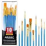
- 【All sizes of art brushes】: The 10 sizes of multi-functional brushes have various shapes, making the mixing color easier, which is very suitable for artists, students, teenagers, children and painters at all levels. Wonderful Present ideas for friends and family who like painting!
- 【general brush set】: Professional paint brush can meet all your needs. Multifunctional brush is very suitable for watercolor, oil, gouache, acrylic painting, body, nail, face painting, miniature, model, ceramics, arts and crafts painting, etc.
- 【high quality process】: It is designed with anti falling bristles, anti-rust nickel ferrule and solid wood handle. You can use the brush to focus on the painting and always be creative.
- 【easy to maintain】: After using the brush, it is very convenient to clean the brush with warm soapy water and reshape the tip of the brush. Air dry the brush and place it on top of the top for long use.
- 【100% satisfaction guarantee - buy now】1 packs of set brushes, you can also get friendly customer service, any questions feel free to contact us, within 24 hours to help you! There is no risk in buying our paint brush kit.
For a real design decision, use the following questions rather than a fixed hue-to-outcome chart:
- What happens in the room? Consider whether the space is used for individual concentration, collaborative work, meetings, reception, or several activities. These are design considerations, not scientifically proven color prescriptions.
- How much color will be visible? A saturated color across every wall is a different visual condition from a muted color used on one wall or in small areas. Coverage and placement affect the overall scheme.
- What are the light and materials like? Existing lighting, flooring, furniture, trim, and other surfaces contribute to how a painted color is perceived. Judge samples in that context rather than selecting from a swatch alone.
- Who uses the space? Preferences and sensitivity differ. Where practical, ask regular users for input instead of assuming a single color will suit everyone.
- What outcome are you trying to support? Mood, preference, perceived performance, proofreading accuracy, and overall productivity are distinct outcomes. Evidence for one does not automatically establish another.
How do red, blue, green, and neutral office colors compare?
The available studies offer comparisons under specific conditions, not a dependable color league table. Red, blue-green, white, blue, green, and yellow appear in the available data, but their results cannot be collapsed into a claim that one hue reliably produces a particular feeling or work outcome.
| Color condition studied | What the cited research found | What the result does not establish |
|---|---|---|
| Red/warm | A one-hour experiment found no significant difference in measured typing performance or mood compared with blue-green or white. In a four-day study, participants in a red office reported more dysphoria than those in blue-green; performance differences varied with environmental sensitivity. | That red always raises energy, causes dysphoria, or harms performance. |
| Blue-green/cool | In one four-day laboratory study, participants reported higher perceived performance and job satisfaction in predominantly blue-green or white offices than in a predominantly red office. Another study found less reported dysphoria than in the red office. | That blue-green paint improves objective productivity or is best for every worker. |
| White/neutral | One short experiment found no significant difference from red or blue-green in the measured outcomes. In a separate nine-color experiment, the white office had more proofreading errors than the blue and red offices. | That white is emotionally neutral or always supports concentration. |
| Blue and red monochromatic conditions | In the 1996 nine-color experiment, proofreading errors were higher in white than in blue and red conditions; mood findings also varied with saturation and gender. | That these colors are universally preferable, or that a monochromatic office is a good model for a real-world color scheme. |
| Red, blue, green, and yellow in VR | A 2026 immersive-VR study reported differences in proofreading and self-reported affect, but no significant effect on measured physiological indicators. | That VR results predict long-term responses to painted walls in occupied offices. |
These findings are not directly interchangeable. The studies differ in duration, participant groups, room conditions, task, and outcome measure. Some compared a single short session, others several workdays; one recent study used simulated rooms. Even when results point in a direction, they may relate to perceived performance or a narrow task rather than a lasting change in work output.
Nor should “neutral” be treated as a scientifically proven absence of effect. White walls were a condition in several experiments, and the results were mixed. “Neutral” describes a design category more readily than it predicts how every occupant will feel or perform.
Also popular on Amazon

- 【KIDS PAINT BRUSHES SET】Anezus paint brushes for kids come with 10 pcs paint brushes of 5pcs round paintbrushes and 5 flat paint brushes with colorful handles, good for the young artist to explore their creativity in painting and crafting
- 【HIGH QUALITY PAINT BRUSHES FOR KIDS】These toddler paint brushes made of soft hog bristle, bright colored handles and rust proof ferrules. The bristles are firmly fixed in the kids paint brushes and no shedding. Each children paint brush measure 6 1/4 inches (16cm) in length and ferrules 1/2"(1.3cm) diameter, large enough for the little hand to grip and control
- 【WIDE APPLICATIONS】With combination of round and flat craft paint brushes for kids, work great with washable paint, tempera paint and acrylic paint. Great for arts and craft, rock, leather, gesso and ceramic, or body, nail and face art painting.
- 【EASY TO CLEAN 】After using paint brushes for acrylic, oil or watercolor painting, it’s very convenient to clean them with warm soapy water and reshape the paint brush tips. Keep these craft paint brushes clean and they last a long time.
- 【GREAT GIFT IDEA】Perfect for students, teens, kids, children and painters of all levels. Wonderful gift idea for girls, boys and kids who love painting! These all-purpose paint brushes for kids are ideal for kids' school projects, birthday parties, painting parties, art parties, back to school supplies, classroom decoration and more.
How should a workplace designer choose and test a color scheme?
Start with the intended use of the space and evaluate the paint as part of the whole room. Compare candidate colors under the room’s actual lighting and alongside its existing finishes. This is a practical way to reduce the risk of choosing a color that looks different in place; it is not a proven productivity intervention.
- Define the room’s activities. List the main tasks and the people who use the space. Note whether the room is dedicated to one activity or needs to support different uses. Do not assume that a color associated with one study outcome will deliver that outcome in this room.
- Record the conditions the paint has to work with. Consider the existing light, fixed finishes, furniture, and any organizational visual identity that needs to be accommodated. These variables shape the design decision and help prevent a paint choice from being judged in isolation.
- Choose a few candidate schemes. Compare options across hue, saturation, lightness, and how much of the room each color would cover. A muted whole-room scheme, a more saturated accent, and a combination of hues are different choices; the studies do not identify one arrangement as universally superior.
- Ask regular users for input where feasible. Invite feedback on comfort, preference, and whether the proposed scheme suits the room. Record what people are responding to: visual preference, perceived atmosphere, or a practical concern. Preference is valuable design information, but it is not evidence of improved task performance.
- Compare paint samples in the room. Put sample cards, swatches, or other samples against the surfaces they are intended to relate to. View them in the room’s actual lighting and with nearby materials in place. Paint samples are decision aids; they do not demonstrate that a color or product will improve wellbeing or work outcomes.
- Make a decision based on the design brief, not a productivity promise. Choose the scheme that best fits the room, its users, and the project’s visual and practical constraints. If the organization later evaluates outcomes, distinguish user feedback and mood from objective task measures, and avoid attributing any change to paint alone without suitable evidence.
The usefulness of in-room samples is straightforward: a small swatch lets people compare a candidate before a large area is painted. It helps answer a color-selection question under real room conditions. It cannot answer the separate causal question of whether that paint will make people more productive.
Quick wins for a faster PC:
Scan for outdated or missing drivers - takes under a minuteDriver Scan →Repair Windows errors before they cause bigger problemsFix Now →Fix the driver behind crashes, sound loss and screen glitchesFind Drivers →What are the limits of the workplace color research?
The central limitation is that “color affects productivity” combines many questions that studies measure separately. A study might assess proofreading errors, typing speed, mood, arousal, job satisfaction, perceived performance, or physiological indicators. Those outcomes are not synonyms, and one should not be presented as proof of another.
Study settings also matter. The evidence includes short laboratory exposures, multi-day laboratory office conditions, and immersive virtual rooms. These approaches can help isolate variables, but they do not fully represent a long-term, occupied workplace with mixed tasks, changing daylight, varied finishes, and a diverse group of users.
Also popular on Amazon
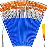
- 【162-Piece Bulk Set | Dual Brush System】Maximize versatility with 81 flat brushes (0.59 inch edge for bold strokes) and 81 round brushes (0.39 inch tips for details) – 3X more tools than standard kits! Pre-sorted in labeled compartments for instant access during painting sessions. Ideal for art classrooms, mural projects, and multi-artist households.
- 【Pro-Grade Durability | Zero Shedding Guarantee】 "Engineered with triple-crimped nylon bristles (43% higher resilience vs. standard) and aerospace aluminum ferrules tested for 10,000+ flex cycles. Lab-verified 0.01% shedding rate even with heavy impasto techniques – outperforms flimsy bristles in budget brushes."
- 【Multi-Scenario Readiness | Event & Daily Use】 Optimized for: Thanksgiving/Christmas face designs classroom projects ceramic decorating fabric printing and model painting; Lightweight plastic handles each reduce hand fatigue during prolonged sessions
- 【Effortless Maintenance | Long-Term Durability】 Clean with warm soapy water in 10 seconds; Reshape tips and air-dry vertically to preserve bristle integrity,After use, air-dry brushes thoroughly and store upright in the provided case to preserve bristle shape. The premium nylon filaments naturally regain their original form after each stroke. For cleaning, simply rinse in warm soapy water and gently reshape bristles with fingertips."
- 【Multiple Application】These acrylic paint brushes can be applied for most occasions,such as:watercolor,oil, gouache paint,face paint, acrylic paint, suitable for Thanks Giving Day, Christimas, Halloween face and body painting, canvas painting, fabric, rock, miniature, model, ceramics, arts and crafts painting, etc.
Participants and color conditions differ as well. Some studies included narrow age or gender groups; some found that environmental sensitivity or screening ability changed the relationship between color and performance. Studies focused on a limited selection of hues and often on monochromatic conditions, while real interiors combine wall colors, furnishings, flooring, lighting, and other surfaces.
A 2023 systematic-review search abstract reported 55 workplace studies and noted limited evidence about interior decoration, including one study that found no significant effects of partition color on mood and attention. The abstract did not provide the full article, so this is only high-level corroboration, not a basis for detailed claims about the review. It aligns with the broader caution: the evidence base is developing, and it does not support a universal office-paint prescription.
Outdated Drivers Are Slowing You Down
One free scan finds every outdated or missing driver and matches the right update for your exact hardware.Free scan · exact hardware matchPC Slower Than It Used to Be?
A free scan shows the junk files, broken settings and background clutter dragging Windows down - then fixes them in one click.Free scan · Windows 10 & 11For workplace painting projects, that uncertainty is not a reason to ignore color. It is a reason to be precise about what a design choice can do. Paint can contribute to the appearance and atmosphere of a space; the cited studies do not establish that a particular color, by itself, reliably improves work performance.
Frequently Asked Questions
Can paint color reduce workplace stress?
The studies summarized here measured outcomes such as dysphoria, anxiety, mood, and arousal, but they do not establish a dependable stress-reduction effect from a specific paint color. If stress is the concern, color should be treated as one element of the environment rather than a substitute for addressing workload, noise, lighting, or other sources of strain.
Does office color affect everyone in the same way?
No. Some cited studies reported differences associated with environmental sensitivity, screening ability, saturation, or gender, and the 2018 review noted possible individual and cultural differences. A result for one group should not be assumed to predict the response of every team.
Should I paint a whole office one color or use an accent wall?
The cited studies do not establish that either approach produces better work outcomes. The choice is a design decision involving coverage, existing finishes, lighting, and the room’s intended use; compare the options in the actual space before selecting one.
Recommended Free Tools
Are virtual-office color studies relevant to real paint projects?
They can add evidence about how people respond to controlled visual conditions, but simulated rooms are not equivalent to long-term exposure to painted walls. Treat virtual-reality findings as informative research, not a direct forecast of how a real office will function.
Quick Recap


