Quick wins for a faster PC:
Clear out junk files and repair common Windows errorsFree Scan →Fix the driver behind crashes, sound loss and screen glitchesFind Drivers →Repair Windows errors before they cause bigger problemsFix Now →
ThatPainter is reader-supported. When you buy through links on our site, we may earn an affiliate commission. Learn More
In interior design, color flow is the way paint colors relate as you look from one room into the next. It can come from shared undertones, a repeated accent, a common wall color, or consistent trim—not from painting every room the same shade. This guide is about home paint planning, not the unrelated software, medical-imaging, or physics uses of “Color Flow.”
What makes paint colors flow from room to room?
A connected color scheme gives the eye some relationship to follow across doorways, shared walls, and open sightlines. The rooms can still have distinct identities: the link might be a similar undertone, a smaller repeat of a bolder color, or a shared neutral or trim color.
| # | Preview | Product | Price | |
|---|---|---|---|---|
| 1 |
|
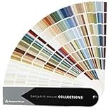
Benjamin Moore Collections Fan Deck | $33.99 | Buy on Amazon |
| 2 |

|
Sherwin Williams Colors collection Deck Complete Paint Colors | $35.00 | Buy on Amazon |
| 3 |
!['BENJAMIN MOORE' CLASSIC COLORS FAN DECK [CASE OF 1]](https://m.media-amazon.com/images/I/41Xq67AO80L._SL160_.jpg)
|
"BENJAMIN MOORE" CLASSIC COLORS FAN DECK [CASE OF 1] | $48.57 | Buy on Amazon |
| 4 |

|
RAL K7 Color Chart, 216 Colors, Gloss, 5 Languages | $26.13 | Buy on Amazon |
As an Amazon Associate I earn from qualifying purchases.
Recommended Free Tools
There is no prescribed formula or measured outcome that guarantees a home will feel larger or more inviting. Color flow is an aesthetic planning idea; the most useful choices depend on what is visible from each space and on the finishes already in place.
Four ways to connect adjoining rooms
Sherwin-Williams’ homeowner guidance, “6 Expert Color Flow Tips”, suggests several ways to relate adjoining spaces. These are design suggestions from a paint manufacturer, not results of controlled testing.
#1 Best Overall
- Brand: Benjamin moore
- Container type: Box
- Finish type: Opa
Repeat a bold color as a smaller accent
If one room has a strong wall color, echo it in the next room in a smaller dose—for example, on an accent wall or another painted feature. The repeat can make the transition feel intentional without requiring both rooms to use the bold color across all their walls.
Use a neutral for continuity
Neutral walls can provide a visual link between rooms with different focal colors. Consider whether the neutral’s undertone relates to both spaces; a neutral that reads warm beside one color and distinctly cool beside another may not connect them as readily.
Do these 3 things before closing this tab:
1Fix the driver behind crashes, sound loss and screen glitches2Repair Windows errors before they cause bigger problems3Scan for outdated or missing drivers - takes under a minuteCarry a color through an entrance or shared wall
Where an opening makes both rooms visible at once, consider the transition at the entrance: contrast can mark the change between spaces, while extending one color across a shared wall can make the connection more direct. Which approach works depends on the sightline and the amount of each color visible.
Repeat the trim color
A consistent trim color can link rooms even when their wall colors differ. Check how the trim meets fixed finishes such as flooring and cabinetry, since those surfaces also affect how the colors read together.
Quick Recap
Rank #4
- Features 216 timeless hues from the RAL CLASSIC collection with five colors per page - fan size 15.0 x 5.0 x 2.0, color display 2.0 x 5.0 cm
- Crafted with low-solvent, low-odour water-based paints for eco-friendly use
- Enhanced UV resistance provides long-lasting color protection
- Cover made from 100% recyclable post-industrial polypropylene waste
- Compact and portable design, ideal for precise color matching on the go
Rank #3
- Very good condition
- Benjamin Moore Classic Colors Fan Deck
- Classic Colors
- Includes the American Classic Colors (AC)
How to plan a color transition
- Start with the sightline. Stand where the rooms meet and note which walls, openings, and trim are visible together. A color relationship matters most where the spaces can be seen at the same time.
- Choose the link. Decide whether the rooms will share an undertone or color family, repeat a color in a smaller area, use a neutral between stronger colors, or carry trim consistently. These are comparison options, not a ranked standard.
- Account for fixed finishes. Compare the proposed colors with flooring, cabinetry, and other finishes that remain in view across the transition. They are part of the visible palette, even though they are not paint.
- Check the amount of each color. A full wall of a bold color creates a different relationship from a small accent. Adjust the scale of the repeat to suit the rooms and their sightlines.
- Review the colors in context. Sherwin-Williams names its ColorSnap Visualizer as an inspiration tool. Use a visualizer for ideas, then assess actual paint choices alongside the room’s finishes and adjoining colors before committing.
Questions to use when comparing options
- Undertone: Do the colors share a warm, cool, or otherwise compatible cast?
- Repeat: Is the connecting color present on a full wall, as an accent, or only in trim?
- Visibility: Are the rooms seen together through an opening or across a shared wall?
- Existing finishes: Do the trim and fixed surfaces support the relationship between the wall colors?

Product prices and availability are accurate as of the date/time indicated and are subject to change. Any price and availability information displayed on Amazon at the time of purchase will apply.




