ThatPainter is reader-supported. When you buy through links on our site, we may earn an affiliate commission. Learn More
The most damaging color mistakes are not bad taste; they are decisions that make text unreadable, hide status information, fail for people with color-vision deficiency, or break when a design moves from screen to print. Avoid them by checking luminance contrast with actual color values, never using color as the only signal, simulating common color-vision conditions, inspecting typography and overlays, and confirming whether the final output is RGB or CMYK. This workflow catches problems while the palette is still easy to change—not after a launch, export, or print run.
As an Amazon Associate I earn from qualifying purchases.
What are the most common color mistakes designers make?
Most failures come from treating color as decoration instead of information. A palette can look harmonious in a swatch sheet yet fail in a dense interface, a chart, a form, a presentation projector, or a printed proof. The practical question is not whether a hue is attractive; it is whether every important distinction remains understandable under real viewing conditions.
What’s actually slowing this PC down?
Pick the symptom - the matching free tool is one click away.
- Choosing by hue while ignoring luminance. Two colors can be far apart on the color wheel but too similar in lightness. Text, icons, and controls then lose definition, especially when the type is thin or small.
- Using color as the only signal. A red outline, green dot, or colored chart legend is ambiguous when color is unavailable, misread, or viewed quickly.
- Assuming red and green are universally distinct. Red-green color-vision deficiency can make those states difficult to tell apart.
- Waiting until final QA to check accessibility. If contrast is considered only after layouts and components are locked, designers often weaken hierarchy or introduce inconsistent exceptions to repair it.
- Trusting a monitor or screenshot instead of measured values. Brightness, display settings, compression, and surrounding colors can disguise a failure.
- Assuming screen colors are print-ready. RGB and CMYK describe different output conditions; a color that works on a backlit display may shift substantially in print.
- Making the palette carry too much information. When every category, priority, and state has a different color, users must decode a legend instead of reading the content.
These are design-process mistakes, not evidence that a particular hue is inherently “wrong.” The reliable remedy is a repeatable preflight that combines measurements, redundant cues, and context-specific review.
Popular on Amazon

- Great Value Paint Brush Set: Soucolor 20 acrylic paint brushes come in 10 different sizes, making them ideal for fine detailing, model painting, rock painting, nail art, face painting, DIY crafts, and general art projects. The varied brush sizes give you better control for both delicate lines and broader color coverage, while the soft bristles deliver smooth, consistent results on acrylic, oil, watercolor, canvas, wood, ceramic, and more.
- Awesome Set of Paint brushes: Professional paint brushes can cover all of your needs. The multi-purposed brushes are ideal for Watercolor, Oil, Gouache, enamel, Acrylic Painting, Body, Nail, Face Painting, Miniature, Model, Wood, Glass, Cup, Ceramic, Fine work, Art class, Craft Art Painting, DIY Art Crafts etc.
- Soft and long-lasting: The bristles are soft and strong, with nickel metal ferrules and blue wooden handles. After cleaning, the bristles will become soft and fluffy again and will not fall off.
- Easy to clean: it’s very convenient to Wash well in soap and water. Retain shape after drying. the brushes hold up very well. Nice selection to beginners and professionals. Keep them clean and they last a long time.
- Perfect for All Painters & Occasions: Suitable for art beginners, hobbyists and professional artists. Great for art class, home creation, travel painting and DIY handmade projects. A practical art gift for students, teachers, family and craft lovers.
How do I check whether a color palette has enough contrast?
Start with the actual foreground and background values, then verify the ratio with a contrast checker before polishing the palette. WCAG guidance summarized by MDN uses 4.5:1 for normal text, 3:1 for large text, and 3:1 for active interface components and meaningful graphical objects; the AAA target for normal text is 7:1.
Use the ratio as a baseline, not a guarantee
A ratio is a mathematical relationship between relative luminance values. It does not account for every reading condition. Thin strokes, cramped letterforms, low-resolution displays, glare, motion, and a changing image behind text can still make an element feel weak when the ratio technically passes. MDN specifically cautions that text weight and size matter alongside the color relationship.
| Element | WCAG baseline | What to inspect in addition |
|---|---|---|
| Normal text | 4.5:1 | Font weight, size, spacing, and anti-aliasing |
| Large text | 3:1 | Whether the size and weight genuinely read as large in the chosen typeface |
| Active interface components and meaningful graphics | 3:1 | State changes, borders, focus indicators, and adjacent colors |
| AAA normal text | 7:1 | Whether the stronger contrast supports long reading and low-vision use |
Check every meaningful pair, not just the brand color against white. Include body text, captions, links, disabled-looking states that still convey information, buttons, form borders, icons, chart marks, focus rings, and text over photographs. If a gradient or image sits behind text, sample the lightest and darkest plausible areas and design for the weakest relationship.
PC Slower Than It Used to Be?
A free scan shows the junk files, broken settings and background clutter dragging Windows down - then fixes them in one click.Free scan · Windows 10 & 11Crashes, No Sound, or Screen Glitches?
Random freezes, missing sound and display glitches usually trace back to one bad driver. Find and replace yours safely.Free scan · under a minuteMeasure programmatic values, not a screenshot
Section 508 guidance recommends checking HEX or RGB values with tools such as WebAIM’s Color Contrast Checker, Colour Contrast Analyser, or ANDI. A screenshot can contain color-management changes, transparency, compression, or a different background than the source token. Record the tested values in the design file or component documentation so a later adjustment does not silently invalidate the result.
Why is luminance more important than hue?
Luminance describes how light or dark a color appears, while hue describes its position in the color spectrum. Accessibility depends heavily on the lightness relationship between foreground and background. A saturated blue and saturated purple may look dramatically different yet have nearly identical luminance, making small text blend together. Conversely, two colors with similar hue can be perfectly legible when their lightness values are sufficiently separated.
Also popular on Amazon
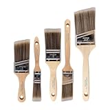
- COMPLETE 5-PIECE BRUSH SET FOR EVERY PAINTING TASK — Includes 1 Inch Flat, 1.5 Inch Angle, 2 Inch Flat, 2 Inch Angle Stubby, and 2.5 Inch Angle brush giving you every size professional painters use daily. Get all 5 for less than the price of a single brush from hardware store brands — professional grade performance at a fraction of the cost. Perfect for walls, trim, cabinets, doors, furniture, and detailed cutting-in work on any project.
- ZERO BRISTLE LOSS — GUARANTEED BY PRECISION ADHESIVE BONDING — Every bristle is locked in place with precision-set adhesive that keeps them in the brush — not in your paint job. The coated steel ferrule provides structural support while the adhesive bond ensures clean performance on every stroke. Premium SRT synthetic filaments load more paint and release it evenly for a smooth streak-free finish on walls, ceilings, and trim. Works with latex, oil-based paint, primer, sealer, and wood stain.
- INCLUDES THE ANGLE STUBBY MOST SETS LEAVE OUT — Professional painters know the 2 Inch Angle Stubby is the go-to brush for tight cabinet interiors, window sashes, inside corners, and detailed trim where standard angle brushes are too long. Combined with the 1.5 and 2.5 inch angle sash brushes you have precision cutting-in covered at every scale — baseboards, crown molding, door casings, and ceiling lines.
- FLAT BRUSHES FOR BROAD SMOOTH COVERAGE ON ANY SURFACE — The 1 and 2 inch flat brushes deliver even coverage on walls, furniture, shelving, doors, fences, decks, and wood surfaces. Ideal for applying primers, stains, varnishes, polyurethane, and specialty coatings. Solid wood handles provide all-day comfort and control for both professional contractors and weekend DIY homeowners tackling interior or exterior painting projects.
- TRUSTED BY PROFESSIONAL PAINTERS AND CONTRACTORS NATIONWIDE — Pro Grade delivers professional-grade results at a price that makes sense for crews who go through brushes on every job. Ideal for property managers, remodeling contractors, apartment turnover crews, maintenance teams, and commercial painting operations. Backed by thousands of verified reviews from working painters. Washable and reusable for multiple projects.
Inspect a palette in a lightness or grayscale view before you decide that its colors are distinct. This quickly reveals pairs that rely on hue alone. Then check the real component: a 4.5:1 ratio in a large, sturdy heading does not automatically make a 12-pixel, light-weight label readable. Increase weight, size, spacing, or contrast where the component demands it; do not ask color to compensate for weak typography.
How can I stop color from being the only way users understand something?
Pair every color-coded distinction with at least one independent cue: words, icons, patterns, borders, underlines, shape, position, or direct annotation. The American Library Association recommends that color not carry meaning by itself, and the American Chemical Society advises directly labeling chart elements instead of relying on a color legend alone.
The Tool Desk
Outbyte PC Repair FREERepair Windows errors before they cause bigger problemsFix Now →Outbyte Driver Updater FREEFix the driver behind crashes, sound loss and screen glitchesFind Drivers →Apply redundancy to common components
- Forms: Do not mark an invalid field only with a red border. Add an error icon and a message adjacent to the field, and connect the message programmatically where applicable.
- Status messages: Pair green success and red error states with explicit words such as “Saved” or “Payment failed,” plus a recognizable icon.
- Navigation: A current-page color should be accompanied by an underline, weight change, shape, or other persistent indicator.
- Charts: Use direct labels, varied line styles, point shapes, or patterns. Keep a legend as a supplement, not the sole decoding method.
- Maps and diagrams: Add symbols, texture, or labels so adjacent regions remain distinguishable in grayscale.
- Calls to action: Use text and placement to establish priority; do not depend on a “brighter” color that may disappear in another theme or output.
Redundancy does not require visual clutter. Choose one quiet secondary cue per distinction, keep icon and label placement consistent, and reserve patterns or heavy borders for cases where they materially improve comprehension.
How do I design for red-green color-vision deficiency?
Assume that red and green may not separate reliably. A Creative Bloq interview report cites an estimate of around one in 12 men and one in 200 women having some form of colour-vision deficiency; preserve that figure as a reported estimate, not a universal count for every population.
Run a color-vision simulation on the complete composition, not only on isolated swatches. Check whether adjacent categories collapse, whether text remains legible, and whether a status change is still obvious without its color. If two states converge, change lightness or add a label, icon, pattern, line style, or shape. A simulator is a diagnostic aid; it does not replace the color-independent cues that make the design robust.
Also popular on Amazon
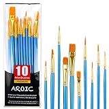
- 【All sizes of art brushes】: The 10 sizes of multi-functional brushes have various shapes, making the mixing color easier, which is very suitable for artists, students, teenagers, children and painters at all levels. Wonderful Present ideas for friends and family who like painting!
- 【general brush set】: Professional paint brush can meet all your needs. Multifunctional brush is very suitable for watercolor, oil, gouache, acrylic painting, body, nail, face painting, miniature, model, ceramics, arts and crafts painting, etc.
- 【high quality process】: It is designed with anti falling bristles, anti-rust nickel ferrule and solid wood handle. You can use the brush to focus on the painting and always be creative.
- 【easy to maintain】: After using the brush, it is very convenient to clean the brush with warm soapy water and reshape the tip of the brush. Air dry the brush and place it on top of the top for long use.
- 【100% satisfaction guarantee - buy now】1 packs of set brushes, you can also get friendly customer service, any questions feel free to contact us, within 24 hours to help you! There is no risk in buying our paint brush kit.
Do not limit the review to red and green. Different simulations can expose blue-yellow confusion, reduced saturation, or other perception changes. Also inspect combinations in context: a tiny red marker on a dark photograph may fail for everyone, while a larger, labeled marker remains clear.
Quick wins for a faster PC:
Repair Windows errors before they cause bigger problemsFix Now →Fix the driver behind crashes, sound loss and screen glitchesFind Drivers →When should accessibility checks happen in the design process?
Run the first checks while selecting the palette, before components and illustrations multiply. W3C guidance places contrast decisions in the early design and palette-selection stage; late checking turns a simple token change into a cascade of exceptions.
- Map the content hierarchy. Identify what must be noticed first, what is merely decorative, and which states or categories need to be distinguished.
- Choose the output context. Decide whether the work is a web interface, social graphic, presentation, PDF, or print piece. This decision determines how you review color and whether RGB-to-CMYK conversion is relevant.
- Define candidate foreground/background pairs. Include text, controls, icons, borders, data marks, focus indicators, and overlays—not just the primary brand combination.
- Check actual values. Enter HEX or RGB values into a contrast checker and record passing and failing pairs. Replace or adjust failing pairs before building the full layout.
- Simulate color-vision conditions. Use an accessible palette tool or color-blindness simulator on representative screens, charts, and illustrations.
- Remove color-only instructions. Add labels, icons, underlines, patterns, direct data labels, or shape differences wherever meaning would otherwise disappear.
- Review typography and context. Inspect weight, size, spacing, image overlays, transparency, gradients, and focus states at the dimensions people will actually see.
- Recheck after export and layout changes. Compression, transparency flattening, a new image, or print conversion can alter the effective contrast.
This sequence is faster than repairing a finished system because it keeps the decision at the token, component, or template level.
What changes when a design moves from screen to print?
RGB is generally the digital color mode, while CMYK is generally used for print, according to guidance from the University of Minnesota Office for Digital Accessibility. The modes use different color models and output conditions, so an RGB palette should not be treated as print-ready by default.
Ask where the design will be consumed before finalizing colors. For a screen-only interface, review on the intended display types and account for overlays, dark themes, and user settings. For a printed brochure, poster, or book, convert or build in the required CMYK workflow, review a proof, and check that text, rules, and small symbols retain enough separation on the paper stock. If one file serves both screen and print, maintain separate output checks rather than assuming one export serves both.
Also popular on Amazon

- 【KIDS PAINT BRUSHES SET】Anezus paint brushes for kids come with 10 pcs paint brushes of 5pcs round paintbrushes and 5 flat paint brushes with colorful handles, good for the young artist to explore their creativity in painting and crafting
- 【HIGH QUALITY PAINT BRUSHES FOR KIDS】These toddler paint brushes made of soft hog bristle, bright colored handles and rust proof ferrules. The bristles are firmly fixed in the kids paint brushes and no shedding. Each children paint brush measure 6 1/4 inches (16cm) in length and ferrules 1/2"(1.3cm) diameter, large enough for the little hand to grip and control
- 【WIDE APPLICATIONS】With combination of round and flat craft paint brushes for kids, work great with washable paint, tempera paint and acrylic paint. Great for arts and craft, rock, leather, gesso and ceramic, or body, nail and face art painting.
- 【EASY TO CLEAN 】After using paint brushes for acrylic, oil or watercolor painting, it’s very convenient to clean them with warm soapy water and reshape the paint brush tips. Keep these craft paint brushes clean and they last a long time.
- 【GREAT GIFT IDEA】Perfect for students, teens, kids, children and painters of all levels. Wonderful gift idea for girls, boys and kids who love painting! These all-purpose paint brushes for kids are ideal for kids' school projects, birthday parties, painting parties, art parties, back to school supplies, classroom decoration and more.
Print review also exposes a different failure: a subtle tint that separates beautifully on a monitor may merge when ink coverage, paper, or viewing light changes. Preserve the labels, symbols, and patterns that make meaning independent of exact color reproduction.
Independent reader supportYour contribution helps us test, update, and keep practical guides available for everyone.Which tools can check contrast and color-vision performance?
Use several small tools for different questions instead of expecting one score to certify a design.
- WebAIM’s Color Contrast Checker: Quickly evaluates foreground/background values and helps compare alternate pairs.
- Colour Contrast Analyser: Useful for sampling and checking interface colors during implementation or review.
- ANDI: Section 508 guidance names it as a way to inspect accessibility issues in web content.
- Accessible palette tools: Digital.gov recommends palette testing tools that help generate or validate combinations rather than selecting by eye alone.
- Color-vision simulators: Use them on complete layouts to find distinctions that collapse under common color-vision conditions.
- ColorBrewer: The ACS mentions it as a resource for accessible data palettes, particularly when categories or numeric ranges must remain distinguishable.
Save the tool output with the design rationale: the values tested, the component size and weight, the non-color cue selected, and the intended output mode. That record makes future edits safer than a vague note that a palette was “checked.”
How do I review a palette before handoff?
Use this short preflight on every key screen, chart, and exported asset:
Windows Errors? Fix Them Before They Spread
Repair common Windows errors and clear accumulated junk for a smoother, more stable PC - no reinstall needed.Free scan · no reinstallOutdated Drivers Are Slowing You Down
One free scan finds every outdated or missing driver and matches the right update for your exact hardware.Free scan · exact hardware match- Can a reader identify priority and status without seeing color?
- Do normal-text pairs reach 4.5:1, and do large-text or qualifying graphic pairs reach 3:1?
- Does any important distinction rely only on red versus green or another hue pair?
- Are labels, icons, patterns, borders, or direct annotations present where color carries meaning?
- Does thin or tightly spaced type remain readable at its actual size?
- Do images, gradients, transparency, and overlays preserve the weakest contrast area?
- Does the design remain understandable in grayscale and in a color-vision simulation?
- Is the final file intended for RGB, CMYK, or separate versions of both?
- Were values checked again after export, compression, or layout changes?
If any answer is no, fix the underlying token, component, or annotation instead of adding a one-off exception. A consistent system is easier to maintain and more dependable for readers.
Also popular on Amazon

- 【162-Piece Bulk Set | Dual Brush System】Maximize versatility with 81 flat brushes (0.59 inch edge for bold strokes) and 81 round brushes (0.39 inch tips for details) – 3X more tools than standard kits! Pre-sorted in labeled compartments for instant access during painting sessions. Ideal for art classrooms, mural projects, and multi-artist households.
- 【Pro-Grade Durability | Zero Shedding Guarantee】 "Engineered with triple-crimped nylon bristles (43% higher resilience vs. standard) and aerospace aluminum ferrules tested for 10,000+ flex cycles. Lab-verified 0.01% shedding rate even with heavy impasto techniques – outperforms flimsy bristles in budget brushes."
- 【Multi-Scenario Readiness | Event & Daily Use】 Optimized for: Thanksgiving/Christmas face designs classroom projects ceramic decorating fabric printing and model painting; Lightweight plastic handles each reduce hand fatigue during prolonged sessions
- 【Effortless Maintenance | Long-Term Durability】 Clean with warm soapy water in 10 seconds; Reshape tips and air-dry vertically to preserve bristle integrity,After use, air-dry brushes thoroughly and store upright in the provided case to preserve bristle shape. The premium nylon filaments naturally regain their original form after each stroke. For cleaning, simply rinse in warm soapy water and gently reshape bristles with fingertips."
- 【Multiple Application】These acrylic paint brushes can be applied for most occasions,such as:watercolor,oil, gouache paint,face paint, acrylic paint, suitable for Thanks Giving Day, Christimas, Halloween face and body painting, canvas painting, fabric, rock, miniature, model, ceramics, arts and crafts painting, etc.
What is a useful reference for accessible graphic design?
AccessAbility 2: A Practical Handbook on Accessible Graphic Design, Revised + Supersized Second Edition, published by Registered Graphic Designers, is a focused reference for teams that need to carry accessibility principles into graphic work. Check the current edition and listing before purchasing because retail availability and details can change.
Frequently Asked Questions
Can a palette pass contrast checks and still be inaccessible?
Yes. A ratio can pass while thin type, glare, motion, image overlays, or cramped spacing make reading difficult. Review the actual component at its production size and add stronger typography or a redundant cue when the context is demanding.
Should I create separate light-mode and dark-mode color tokens?
Usually, yes. A pair that works on a light background may fail when inverted or placed on a dark surface. Define and check each theme’s foreground, background, border, icon, and focus values independently rather than deriving one by simple hue rotation.
Free tools Windows power users keep installed
One-click scans. No signup required.
How can I make a chart understandable when it must be printed in grayscale?
Assign each series a combination of direct labels, line or marker styles, and—where appropriate—patterns. Produce a grayscale proof and verify that labels remain attached to the data they describe instead of forcing readers to decode a color legend.
What should I record when handing a color system to developers?
Document token names, HEX or RGB values, approved pairings, minimum text sizes or weights, focus-state requirements, and the non-color cue for each status. Include the intended RGB or CMYK output and the date of the last contrast review.
Is a color-blindness simulator enough to certify accessibility?
No. Simulation helps reveal collapsed distinctions, but it cannot test every form of color-vision difference or replace text, icons, patterns, and direct labels. Combine simulation with measured contrast and a review of the real layout.
Quick Recap


