PC Slower Than It Used to Be?
Outbyte PC Repair · freeA free scan shows the junk files, broken settings and background clutter dragging Windows down - then fixes them in one click.
Run a Free PC Scan →ThatPainter is reader-supported. When you buy through links on our site, we may earn an affiliate commission. Learn More
Juventus unveiled its stark J-based identity in January 2017 and adopted it that July, aiming to make the club’s identity work beyond matchday and beyond football’s existing audience. The redesign offers a clear case study in football’s superbrand ambitions—but the available evidence documents the strategy and its activations, not proof that the logo itself caused commercial growth or began a new era for the sport.
Why did Juventus change its logo?
Juventus framed the redesign as a business and audience strategy, not simply a visual refresh. At the Milan event where the identity was unveiled on 16 January 2017, the club said it wanted “to grow in terms of presence and influence and to expand the business side of the club,” including among people “with less of an interest in football.” Juventus’s launch account presented the new identity as a way to carry the club’s spirit into areas beyond the game.

Interbrand, the agency that worked on the project, described the strategy as reaching customers outside football through premium lifestyle experiences. Its case study points to stadium experiences, the UNDICI café, fashion and lifestyle apparel, and fan products as places where the identity could be encountered. Those are documented strategic touchpoints; they do not, on their own, establish the redesign’s effect on revenue or audience size.
The Tool Desk
Outbyte Driver Updater FREEScan for outdated or missing drivers - takes under a minuteDriver Scan →Outbyte PC Repair FREEClear out junk files and repair common Windows errorsFree Scan →What does the Juventus J logo mean?
When the identity officially came into use in July 2017, Juventus explained the mark through three references: the black-and-white stripes of the team’s shirt, the shape of the Scudetto, and the initial J of Juventus. The club said the design was intended to combine recognizable football heritage with a simpler symbol that could travel into other contexts. The club’s explanation of the new logo describes those elements.
#1 Best Overall
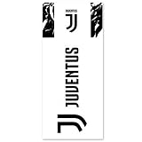
- Official Soccer Licensed Product
- Removable and Reusable
- Indoor and Outdoor use
- Ideal for mirrors or windows surfaces
That combination matters to the superbrand argument. The stripes and Scudetto connect the mark to football tradition; the letterform can function as a compact identity on a shirt, product, or other experience without requiring the full club name. That is an interpretation of the design’s strategic usefulness, not evidence that every audience recognized it or preferred it.
From unveiling to the standalone J: the timeline
| Date | What changed | Why it matters |
|---|---|---|
| 16 January 2017 | Juventus unveiled the identity at its “Black and White and More” event in Milan. | The club presented the launch as the start of a new era and tied it to business initiatives beyond its existing football audience. |
| July 2017 | The identity entered official use. The 2017/18 home and away shirts were the first jerseys to carry the new logo. | The design moved from launch presentation into a highly visible club product and matchday context. |
| 2020 | Juventus described a further identity step: the logo became a standalone J, with the word “Juventus” removed from above it. | The club said the simplified symbol could be recognized on its own. |
The 2020 change was an evolution of the 2017 direction rather than the original unveiling. Juventus’s accounts of the logo and the later J Icon distinguish the initial identity from the standalone J.
Rank #2

- Made in the USA
- Stunning Designs & High-Quality Craftsmanship - Crafted with precision and attention to detail, each kiss-cut skin decal features bold, vibrant prints created with advanced printing technology that enhances color depth, sharpness, and longevity. Made from lightweight, flexible Premium Vinyl, these decals ensure long-lasting adhesion without damaging your surfaces.
- Easy to Apply, Reposition, and Remove ? No Sticky Residue - Applying your kiss-cut sticker is effortless, simply peel, align, and press down for a smooth, bubble-free finish. Thanks to advanced air release technology, any trapped air escapes quickly, making application faster and easier. Need a change? These decals are repositionable and removable, ensuring zero residue or sticky mess when replaced.
- Versatile for a Wide Range of Surfaces - Our premium kiss-cut stickers and skin decal kits are perfect for personalizing and protecting a variety of devices. From laptops, smartphones, and gaming consoles to headphones, and VR headsets, our decals offer a precision fit. They're also ideal for your vision board, water bottles, travel mugs, notebooks, journals, plus drones, camera cases, and musical instrument covers.
- Express Yourself - Whether you're looking for trendy laptop skins, aesthetic kiss-cut stickers, or durable decals for your tech accessories, we have the perfect collection for you. Shop now and customize your world with premium, high-quality designs!
How was the identity meant to work beyond football?
Juventus’s launch account described applications across sport, food, design, art, music, and fashion, while insisting that football remained the starting point. As the club put it: “In each project and each experience, football will always be the origin, never the end.” The club’s account of the launch documents that ambition.
Recommended Free Tools
Interbrand’s case study gives the strategy more concrete settings: the stadium, UNDICI café, fashion and lifestyle apparel collections, and fan products. Read together, the club’s stated ambitions and the agency’s examples show a plan to make Juventus recognizable in places where a supporter might be buying, eating, or taking part in a cultural experience—not only watching a match. Interbrand says the work received two D&AD awards, but its case page does not identify the award categories. Interbrand’s Juventus case study describes its work and named touchpoints.
Independent reader supportYour contribution helps us test, update, and keep practical guides available for everyone.Does the redesign prove football’s superbrand era has arrived?
No single rebrand can establish that an industry-wide era has begun. Juventus clearly stated an ambition to expand its reach and business, and its partners documented the intended lifestyle touchpoints. But the sources cited here do not quantify the redesign’s effect on revenue, audience, or brand value, or show that it caused measurable growth. Nor do they establish a wider causal shift across football.
Interbrand’s Manfredi Ricca, identified by Juventus as the agency’s Chief Strategy Officer for EMEA & LatAm, captured the intended leap: “No club in Europe has so far been able to transcend sport and convey the philosophy behind that.” The remark is a strategic claim from a project representative, not independent proof that Juventus achieved a first or that the redesign transformed the market. The most defensible reading of “the age of football’s superbrands,” then, is as a lens on what clubs may aspire to—not a historical outcome this logo alone can prove.
Rank #4

- The standard canvas is mounted on 3/4 inch wood frames and is available in multiple sizes.
- Superb reproduction in vibrant color
- Arrives ready to hang
- UV Resistant
That distinction also keeps fan reaction in perspective. The cited primary accounts do not quantify supporter approval or opposition, so they cannot support claims that the design was universally welcomed or rejected.
Windows Errors? Fix Them Before They Spread
Repair common Windows errors and clear accumulated junk for a smoother, more stable PC - no reinstall needed.Free scan · no reinstallCrashes, No Sound, or Screen Glitches?
Random freezes, missing sound and display glitches usually trace back to one bad driver. Find and replace yours safely.Free scan · under a minuteQuick Recap
Best Value

- Sports Club Logo design. Trendy Graphic Apparel
- 15MISC3960J
- Lightweight, Classic fit, Double-needle sleeve and bottom hem

Product prices and availability are accurate as of the date/time indicated and are subject to change. Any price and availability information displayed on Amazon at the time of purchase will apply.




