Windows Errors? Fix Them Before They Spread
The Tool Desk
Outbyte Driver Updater FREEFix the driver behind crashes, sound loss and screen glitchesFind Drivers →Outbyte PC Repair FREEClear out junk files and repair common Windows errorsFree Scan →Outbyte PC Repair · freeRepair common Windows errors and clear accumulated junk for a smoother, more stable PC - no reinstall needed.
Fix My PC Now →ThatPainter is reader-supported. When you buy through links on our site, we may earn an affiliate commission. Learn More
Choose baby blue by comparing its undertone, brightness, room lighting, and relationship to permanent finishes—not by trusting a single store chip. “Baby blue” is a practical description for a pale, soft blue rather than a universal technical color standard. Put two or three physical samples on the actual wall, watch them in morning, afternoon, and evening light, and check them beside flooring, tile, cabinets, trim, upholstery, and artwork before buying the full quantity.
What does “baby blue” mean in paint?
Baby blue is an editorial and decorating term for a light blue chosen to create a soft, airy wall effect. Paint companies do not use one universal formula or technical standard for the name, so two colors sold or described as baby blue can differ noticeably in grayness, greenness, warmth, and depth.
As an Amazon Associate I earn from qualifying purchases.
Sherwin-Williams lists pale examples such as Dew Drop SW 9641 and Sky High SW 6504. It also lists warmer or dustier directions, including Niebla Azul SW 9137 and historic Powder Blue SW 2863. Benjamin Moore’s softer examples include Woodlawn Blue HC-147, Santorini Blue 1634, and Windy Sky 1639, while Palladian Blue HC-144 and Wythe Blue HC-143 bring more green influence.
Those names are starting points, not guarantees. The same named color can read bluer, greener, grayer, or darker when the light, surrounding materials, and viewing angle change. Your goal is therefore not to find a universally “correct” baby blue; it is to find the pale blue that behaves well in your specific room.
Popular on Amazon
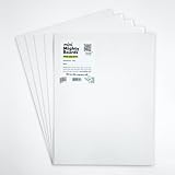
- PERFECT SAMPLES: These 12" x 9" white, styrene panels provide a smooth, warp-free surface for testing up to 5 color samples with paint, stain or other coatings.
- DURABLE MATERIAL: Made of sturdy styrene, these panels can withstand multiple coats and are non-absorbent so colors will stay true.
- CONVENIENT SIZING: At 12" x 9", the panels are just the right size for testing many common paint colors side by side before committing to a full project.
- PACKAGE INCLUDES: This value pack contains 5 white panels, enough for testing several color options on one purchase.
- VERY FLEXIBLE: Mighty Boards do not warp like foam core and you can bend them without breaking.
How do I choose a baby blue paint color for my walls?
Use this sequence: inventory the room’s fixed finishes, decide which undertone direction fits them, study the room’s natural and artificial light, use LRV to frame the brightness you want, then test two or three finalists on the wall before purchasing.
1. Start with what cannot easily change
Make a list of flooring, cabinets, countertops, tile, brick, trim, rugs, upholstery, window treatments, and artwork that will remain after painting. Place color cards beside these items rather than comparing paint against a blank white page. Sherwin-Williams recommends using fixed finishes and favorite furnishings as the starting context for a palette because they supply the colors your new blue must live with every day.
Do these 3 things before closing this tab:
1Fix the driver behind crashes, sound loss and screen glitches2Clear out junk files and repair common Windows errors3Scan for outdated or missing drivers - takes under a minutePhotograph the group in the room, but use the physical materials as your final reference. A phone camera can shift blue and neutral tones, while a real floor or fabric reveals whether the paint looks coordinated or unexpectedly muddy.
2. Choose an undertone direction
Every paint has a visible mass tone—the color you notice first—and a subtler undertone that appears beside other colors or under changing light. To expose the undertone, compare several chips with a purer blue or look farther down the manufacturer’s color strip, where the bias is often easier to see.
Benjamin Moore’s guidance associates green or gray undertones with a soothing, soft effect. Purple or black undertones can make a blue feel more romantic or dramatic. None is automatically better; the right choice depends on the fixed colors in your room and the mood you want.
- Green-leaning blue: useful when the room already contains green, warm wood, natural stone, or other earthy colors, but it can look minty beside a cool white.
- Gray-leaning blue: usually reads quiet and restrained, though a dim room can make it appear substantially grayer than the chip.
- Purple-leaning blue: can feel gentle and slightly rosy in balanced light, yet may clash with yellowed finishes.
- Black-leaning or deepened blue: gives more drama and visual weight; on a small or shaded wall it may stop looking “baby” blue.
For a useful comparison, hold the candidates next to a known pure blue and next to the room’s trim. As Sue Wadden, Sherwin-Williams Director of Color Marketing, explains: “If you’re just looking at a white by itself, it will probably just look white.” Adjacent comparisons reveal what a single chip hides.
3. Read the room’s natural light
Window direction, exposure, time of day, and the amount of glazing all affect the apparent cast. Sherwin-Williams says northern light tends to emphasize blue undertones. That means a cool blue may look cleaner and more pronounced there, while a gray or green bias can become easier to notice. Treat this as a tendency, not a prediction: trees outside, neighboring buildings, weather, and the color of the floor also alter the reflected light.
Observe the wall in the morning, around midday, and after sunset with the room’s usual lamps on. A color that looks airy at noon can look steely at night, while a slightly green or gray blue may provide the balance a cool room needs.
Also popular on Amazon

- suitable for various mailing and storage needs
- Soft and easy to use
- No batterries required
- No Assembly required
- Safe to use
4. Account for artificial light and bulb temperature
Do not evaluate a sample only in daylight if the room is used after dark. Benjamin Moore notes that bulbs above 3500K tend to cast cooler light. Cooler lamps can strengthen a blue or gray impression; warmer lamps may soften it and make neighboring warm finishes more prominent. Check the sample with the bulbs you actually plan to use, not with a display lamp or a phone flashlight.
5. Use LRV as a brightness clue, not a verdict
Light Reflective Value (LRV) indicates how much light a paint reflects. It interacts with the amount of light the room receives, so the same LRV can feel different in a bright room and a shaded one. Sherwin-Williams describes 50–60 LRV as a typical neutral range for an airy look. That is a manufacturer guideline, not an independent scientific cutoff.
What’s actually slowing this PC down?
Pick the symptom - the matching free tool is one click away.
Use LRV to narrow your search: a higher value generally supports a lighter, more open impression, while a lower value gives the blue more visual weight. Then verify the result on the wall. LRV cannot show whether the paint’s undertone will turn green, gray, or violet beside your furnishings.
6. Test before buying the full quantity
Apply a wall swatch or use a peel-and-stick sample for each finalist. Sherwin-Williams recommends viewing a sample at different times and under different lighting; Benjamin Moore likewise calls brushing on a sample and observing it in every lighting condition the best way to avoid surprises.
- Choose two or three finalists that differ in a meaningful way—for example, one gray-leaning, one green-leaning, and one cleaner blue.
- Place each sample on a wall that receives the room’s typical light. If possible, test on more than one wall because a north-facing wall and an adjacent wall can show different casts.
- Make the samples large enough to judge; a tiny chip can hide shifts that are obvious across a broad wall.
- Leave the samples in place through morning, afternoon, evening, and lamp-lit conditions.
- Stand several feet away and view them beside trim, flooring, fabrics, and artwork. Also inspect them close up for gray, green, purple, or dull patches.
- Record observations before moving or removing a sample. Choose the color that remains compatible across the full cycle, not the one that wins at one attractive moment.
Peel-and-stick paint samples or a paint color fan deck make this comparison easier because you can move the reference beside different finishes without repainting a large area. They are comparison tools, not substitutes for seeing the color in the actual room.
Which undertone should baby blue paint have?
Choose the undertone that supports your permanent finishes and the light you cannot change. A soft gray or green bias often feels calm; purple or black influence can make the blue more expressive. The safest choice is the one that still looks intentional beside your trim and furnishings at night, when the room’s weakest or coolest light exposes undertones.
PC Slower Than It Used to Be?
A free scan shows the junk files, broken settings and background clutter dragging Windows down - then fixes them in one click.Free scan · Windows 10 & 11Outdated Drivers Are Slowing You Down
One free scan finds every outdated or missing driver and matches the right update for your exact hardware.Free scan · exact hardware matchWhen a soft gray undertone works
Gray-muted blues suit rooms where you want the walls to recede rather than become a vivid feature. They can bridge cool tile and neutral upholstery, but a low-light room may make them appear almost gray. Compare the sample with the room’s lightest and darkest fixed surfaces so the color does not lose its blue identity.
When a green undertone works
Green-influenced blues can connect with foliage views, warm wood, stone, or existing green accents. They may appear greener in warm reflected light or beside a clean, cool white. If you want a distinctly blue nursery or bedroom, reject any finalist that reads minty during the room’s main use period.
Also popular on Amazon

- Package Includes: this set includes 5 paint color test boards, allowing you to evaluate multiple color options at once, improving your color selection efficiency, and enabling you to choose colors for spaces such as the living room, bedroom, and kitchen
- Moderate Size: measuring about 12 x 9 inches, these paint sample boards provide a larger color display area, allowing you to judge the visual effect of paint on the actual wall surface, and can also be placed side by side for direct color comparison
- Quality Polystyrene Material: these color tester sample boards thickness about 1 mm crafted from polystyrene material, resisting warping after it dries, and you can use it multiple times
- Portable Design: after painting, you can place the sample in different rooms, on different walls, and facing different directions to observe it, helping you to evaluate the color effect under various lighting conditions
- Versatile Uses: except home painting projects, this polystyrene sheet is also an ideal paint sample board for artists who need a color tester sample board for practice; Use it to test color mixtures before applying to final canvases
When a purple or black undertone works
Purple or black undertones add romance, depth, or drama. They are useful when the room contains related mauves, charcoal accents, or richly colored textiles. On a small wall or in a north-facing room, however, they can look darker and less airy than expected, so a large sample is essential.
Which baby blue paint colors are useful starting points?
The following colors illustrate different directions rather than ranking universal winners. Confirm every candidate in your own lighting and beside your own finishes.
| Direction | Examples | What to check in your room |
|---|---|---|
| Soft, pale blue | Sherwin-Williams Dew Drop SW 9641; Sky High SW 6504 | Whether the pale value stays blue instead of washing toward gray or white. |
| Warm or dusty blue | Sherwin-Williams Niebla Azul SW 9137; historic Powder Blue SW 2863 | Whether the softened quality coordinates with warm wood, fabric, and aged finishes. |
| Soft muted blue | Benjamin Moore Woodlawn Blue HC-147; Santorini Blue 1634; Windy Sky 1639 | Whether the muted quality remains airy in the room’s dimmest light. |
| Pale blue with green influence | Benjamin Moore Palladian Blue HC-144; Wythe Blue HC-143 | Whether the green cast complements or fights your trim, tile, and furnishings. |
Color names and collection labels do not predict the final appearance by themselves. Put the actual paint or a manufacturer sample on your wall and assess it under the conditions in which you live.
What is the difference between powder blue, sky blue, and baby blue paint?
These labels describe related visual intentions, not fixed technical categories. Baby blue usually signals a pale, soft blue; sky blue suggests a clearer, brighter blue; powder blue generally implies a softened or dusty blue. A manufacturer can interpret each term differently, so compare undertone and apparent lightness rather than choosing by name.
| Label | Typical visual expectation | Questions to ask before choosing |
|---|---|---|
| Baby blue | Pale, gentle, airy | Does it stay blue beside white trim, or become gray? |
| Sky blue | Cleaner, clearer, sometimes brighter | Will strong daylight make it too vivid for the room? |
| Powder blue | Muted, softened, often slightly gray or warm | Does the room have enough light to keep it from looking dull? |
Use the label to build a shortlist, then let the wall sample settle the decision. A “sky” color can be calmer than a “baby” color in one brand, while a “powder” color can show a noticeable green or violet bias in another.
How should I compare two or three finalists?
Compare every candidate on the same five axes and write down observations while standing in the room. A consistent method prevents the brightest chip or the most attractive photograph from dominating the decision.
Recommended Free Tools
| Axis | What to record |
|---|---|
| Undertone | Does the sample lean gray, green, purple, black, or remain close to a pure blue? |
| Lightness | How airy or weighty does it look on the broad wall? Note its stated LRV when available, but do not treat LRV as a guarantee. |
| Natural-light behavior | What happens in morning, midday, and late-day light? Does northern exposure intensify the blue? |
| Artificial-light behavior | How does it look with the room’s regular bulbs, especially if they are above 3500K? |
| Coordination | Does it support flooring, cabinets, tile, brick, trim, rugs, upholstery, and artwork without making one fixed element look dirty or mismatched? |
Keep the finalists visible long enough to see changing conditions. If one color looks ideal only at one time of day, it is a risky choice for a room used throughout the day.
Independent reader supportYour contribution helps us test, update, and keep practical guides available for everyone.What mistakes make baby blue look gray or green?
Most surprises come from judging a small chip in isolation, ignoring fixed finishes, or assuming the color name predicts the undertone. Correct the process rather than trying to compensate with a larger paint order.
Also popular on Amazon

- Core Color Matching: Paint color sample cards include 83 standard colors to support paint color sample cards, color matching cards for painting, and paint chips standard samples, helping users compare shades before selecting a final finish for floor paint, hardware, and other project needs
- Reliable Reference: Paint samples are made with color matching materials designed to support accurate color comparison, giving painters and DIY users a practical paint and paint color samples reference for selecting tones that fit the project surface and intended look
- Portable Format: Measuring 3.74 x 1.57 x 1.18 in and weighing 3.88 oz, this paint samples set is compact for a toolbox, work bag, or travel use, making it easier to carry color test card paint and check shades on site when planning paint work
- Wide Project Use: Paint sample cards are suitable for floor paint, paint hardware, and related color selection tasks, offering a useful paint chips samples reference for contractors, decorators, and home improvement users working on color coordination across different surfaces
- Simple Set Package: Each package includes 1 set of paint sample cards, giving users a straightforward paint sample standard cards option for daily work, project planning, and quick shade comparison when choosing among paint color cards and paint chips sample cards
- Choosing from a screen: displays vary in brightness and color balance. Use the screen only to find candidates; use a physical sample for the decision.
- Testing on a white card only: the surrounding wall and trim change your perception. Put the sample where it will live.
- Ignoring the evening view: a blue that works in daylight may become steely under cool lamps or overly muted in a dark corner.
- Comparing samples in different rooms: different exposures and furnishings make the comparison unreliable. Keep candidates in the same room and under the same conditions.
- Assuming a higher LRV solves everything: brightness does not remove an unwanted green, gray, or purple undertone.
- Buying before sampling: repainting or storing excess paint costs more than testing a few samples first.
If a sample looks wrong, identify the specific failure: too gray at night, too green beside the trim, too dark on the shaded wall, or too bright in direct sun. Replace it with a finalist that changes that one variable, then repeat the same observation cycle.
How can I make the final choice with confidence?
Choose the sample that meets the room’s needs across the entire day, not the color with the most appealing name or the strongest first impression. Before ordering paint, confirm that the selected sample still coordinates with every permanent finish and that its apparent brightness suits the room’s available light.
Free tools Windows power users keep installed
One-click scans. No signup required.
- Remove any finalist that shows an objectionable undertone beside the trim or another fixed finish.
- Remove any finalist that becomes too dark, too gray, or too saturated during the room’s main use period.
- Between the remaining options, select the one with the best overall balance of undertone, lightness, natural-light behavior, artificial-light behavior, and coordination.
- Keep the sample or its label until the project is complete so you can match the color for touch-ups.
This process turns “baby blue” from a vague color search into a repeatable room-specific decision. The paint name starts the conversation; the wall, light, and permanent materials provide the evidence.
Frequently Asked Questions
Can I choose a baby blue paint color from an online photo?
Use online photos only to discover possible color families. Cameras, screens, and editing can change blue’s brightness and undertone, so order or make a physical sample and judge it in your room before purchasing paint.
How many baby blue samples should I test?
Two or three finalists are usually enough when they represent genuinely different undertone or lightness directions. Testing many nearly identical chips can make the decision harder without adding useful information.
Should I sample baby blue on every wall?
At minimum, test the wall that receives the room’s most typical light and inspect the sample from adjacent walls. If the room has strongly different exposures, place a sample on each distinct light condition so you can see whether the undertone changes.
The Tool Desk
Outbyte PC Repair FREERepair Windows errors before they cause bigger problemsFix Now →Outbyte Driver Updater FREEFix the driver behind crashes, sound loss and screen glitchesFind Drivers →Why does my sample look different beside white trim than beside wood?
Paint is perceived in relation to surrounding colors. Cool white can make a blue appear greener or more saturated, while warm wood can emphasize gray or green components; compare the sample with the finishes that will remain in the room.
Quick Recap

Product prices and availability are accurate as of the date/time indicated and are subject to change. Any price and availability information displayed on Amazon at the time of purchase will apply.

