PC Slower Than It Used to Be?
A free scan shows the junk files, broken settings and background clutter dragging Windows down - then fixes them in one click.Free scan · Windows 10 & 11
Crashes, No Sound, or Screen Glitches?
Random freezes, missing sound and display glitches usually trace back to one bad driver. Find and replace yours safely.Free scan · under a minute
ThatPainter is reader-supported. When you buy through links on our site, we may earn an affiliate commission. Learn More
Choose your cabinet paint by starting with the countertop’s undertone and visual movement, not with a favorite color chip. Counters are usually harder and more expensive to replace, so the paint should relate to their warm, cool, creamy, gray, beige, pink, yellow, or green cast. Then check the backsplash, floor, appliances, lighting, fixtures, and hardware as one palette. You can echo a subtle vein, share an undertone, or create deliberate contrast; exact matching is rarely necessary. Test two to four large samples vertically beside the real countertop through a full day and under artificial light. For the finish, a cabinet-rated satin or semi-gloss over thorough cleaning, suitable primer, and careful curing is the dependable starting point.
How do I choose a cabinet color that goes with my countertops?
Begin by describing what the countertop actually looks like in your kitchen, then choose a paint family that supports that description. Hold a white sheet of paper beside the slab and look for the counter’s dominant cast: warm cream, beige, tan, yellow, brown, pink, cool gray, blue-gray, blue-green, or a relatively neutral white. Next note the amount of visual movement. A quiet solid or lightly flecked surface gives you more freedom than a slab with bold veins, clouds, or several competing colors.
Recommended Free Tools
As an Amazon Associate I earn from qualifying purchases.
Benjamin Moore’s guidance is straightforward: “When choosing kitchen cabinet paint colors, take note of your countertop’s undertones. Selecting cabinet colors that share similar undertones helps create a cohesive and well-balanced look.” The practical implication is to coordinate relationships rather than hunt for an identical paint match. Pulling a small, quiet color from a vein can be more successful than trying to reproduce the entire countertop.
Read the counter in context
- View a sample or the slab beside a truly neutral reference, because surrounding walls and flooring can make a white counter appear cream or gray.
- Separate the background color from accent movement. A mostly white quartz with thin warm veins is not the same decision as a beige stone with large rust-colored patches.
- Look at the counter at several times of day. A color that seems gray in morning daylight may read green or beige beneath warm evening bulbs.
- Record the fixed finishes before selecting paint: backsplash grout, flooring, appliance color, faucet, light fixtures, pulls, and any exposed wood.
Why the countertop gets priority
Paint can be changed relatively easily; replacing stone, tile, or fabricated surfaces is disruptive and costly. Behr recommends beginning with finishes that are hardest to change. Treat the countertop as the anchor, then let cabinet color connect it to the rest of the room.
Popular on Amazon
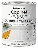
- CABINET TRANSFORMATION: Refresh outdated cabinets, vanities, furniture and trim with rich Pure White color and a smooth semi-gloss finish
- DURABLE PERFORMANCE: Easy-to-clean finish resists dirt and grime while standing up to household chemicals
- SMOOTH APPLICATION: Outstanding flow and leveling help create a beautiful finish with brush, roller, pad applicator or airless sprayer
- FAST PROJECT COMPLETION: Dries to touch in 30 minutes, recoats in 2 hours and is ready for normal use after 24 hours
- INTERIOR CABINET COATING: Ideal for kitchens, bathrooms, laundry rooms and other interior cabinet and trim applications
What cabinet colors work with warm countertops?
Warm countertops usually pair best with colors that contain a warm or softened undertone. The goal is not to make every surface beige; it is to avoid a cold cabinet color that makes the counter look muddy or unexpectedly orange.
Free tools Windows power users keep installed
One-click scans. No signup required.
Warm white and creamy off-white
Warm whites, ivory, and creamy off-whites can bridge cream quartz, travertine, warm limestone looks, and counters with tan, yellow, red, or brown movement. Compare several whites because one may lean yellow while another is a muted neutral. A creamy cabinet can make a bright white backsplash look stark, so place the samples against both surfaces before deciding.
Beige, mushroom, and warm greige
Beige and mushroom tones repeat the softer minerals found in many warm stones. Warm greige is useful when you want less yellow than a traditional cream but still need enough warmth to sit comfortably beside tan or brown movement. Keep the value (lightness or darkness) distinct from the counter if you want the cabinetry to read as a separate layer.
Muted greens and blue-greens
Gray-green, olive-leaning, and subdued sage can complement warm stone while introducing color. A blue-green can work when it has enough gray or yellow to relate to the counter; an icy blue-green may look disconnected. Test the painted sample with your hardware, since brass and aged brass can reinforce the warm relationship.
Wood and warm metal accents
Warm wood, brass, and aged brass can reinforce a warm countertop scheme. They do not require matching cabinet paint, but the cabinet color should not fight their temperature. If the room already contains several wood tones, a restrained neutral may provide more visual rest than another strong color.
Do these 3 things before closing this tab:
1Repair Windows errors before they cause bigger problems2Scan for outdated or missing drivers - takes under a minute3Clear out junk files and repair common Windows errorsWhat cabinet colors work with cool countertops?
Cool gray quartz, Carrara-style marble, blue-gray stone, stainless-heavy kitchens, and gray tile generally connect with cool or balanced cabinet colors. The same white paint can expose blue, pink, or yellow undertones when placed directly beside a cool stone, so never choose from a single isolated chip.
Soft gray and blue-gray
Soft gray cabinets can echo a gray counter without making the room monochromatic. Blue-gray is effective when the countertop already shows blue or slate notes. Compare the samples in daylight and under warm lamps; artificial light can push a blue-gray toward violet or make it look more neutral.
Cool or balanced whites
A clean white can emphasize the brightness of marble-look counters, while a slightly softened white reduces the risk of a clinical effect. If the backsplash is bright white and the counter is gray-white, choose cabinet samples that do not create a third, competing white.
Also popular on Amazon

- Includes 30 featured and newest released color card. Sprayed on color to see our colors in your homes lighting for more accurate color choices.
- ALL-IN-ONE Paint - NO Sanding, NO Priming, NO Top Coat Required, Low Luster, Velvet Sheen Finish
- Interior/Exterior - Paint your whole house - Ideal for hard surfaces including walls, doors, cabinets, counters, furniture, metal, glass, ceramics and floor and wall tile
- Durable yet stretches to paint smooth fabrics, vinyl and leather
- Results cannot be guaranteed. Digital screens may not show color accurately. Product search "ALL-IN-ONE PAINT by Heirloom Traditions, Color Confidence Card", for an accurate color choice.
Restrained charcoal
Charcoal provides controlled contrast with pale cool counters. Use it when the room has enough light and the other finishes can support a darker mass. Check how the color behaves at night, when dark cabinets can absorb light and make work areas feel smaller.
Blue-green accents
Muted blue-green can connect cool counters with natural elements such as wood floors. Keep the saturation restrained if the stone already has prominent veining; a vivid cabinet color may compete with the slab.
How should I paint cabinets when the countertop is strongly veined or busy?
Let a highly patterned countertop lead and make the cabinetry calmer. Choose a cabinet color that repeats one quiet undertone or acts as a steady neutral, rather than adding another high-contrast pattern.
Use one quiet cue
Identify a minor thread in the slab—soft taupe, gray-green, charcoal, or a warm white—and test cabinet colors in that family. The connection can be subtle; it only needs to make the countertop look intentional.
Avoid near-matches that look accidental
A paint color that is almost, but not quite, the background of a dramatic counter can make the difference look like a mistake. Either move clearly lighter or darker, or choose a related undertone that does not pretend to match.
The Tool Desk
Outbyte Driver Updater FREEScan for outdated or missing drivers - takes under a minuteDriver Scan →Outbyte PC Repair FREEClear out junk files and repair common Windows errorsFree Scan →Keep other patterns quiet
If the counter has strong movement, limit competing patterns in the backsplash, runner, and prominent textiles. Simple hardware and a calmer wall color help the eye rest on the stone and cabinetry together. Homes & Gardens describes complementing as sharing an undertone, material character, color family, or degree of visual movement—not matching every detail.
What cabinet color works beside wood countertops or existing wood cabinets?
Keep the paint in conversation with the wood’s temperature and finish. Soft whites, warm neutrals, muted greens, and carefully chosen blue-greens can support warm timber, while very cool grays may look flat or disconnected beside strongly warm wood.
Use an actual offcut, door, or finished sample of the wood when testing. Grain, stain, sheen, and daylight all alter its apparent temperature. If the wood has orange or red warmth, a green-leaning neutral may balance it; if the wood is pale and neutral, a warm white may be enough. In an open-plan room, check the proposed cabinet color against adjacent wood flooring and furniture as well as the counter.
Also popular on Amazon

- Ultra-White Brilliance: Experience the transformative power of Titanium Infusion, an ultra-white hue inspired by the artist’s palette – perfect for a modern, timeless look.
- One-Day Transformation: Redefine your kitchen cabinets in a single day with our brush-and-roll application - no professional help needed.
- All-Inclusive Kit: Each package covers 100 square feet, ideal for the typical kitchen, and includes all the necessary tools for a flawless finish.
- Eco-Friendly & Safe: Enjoy the peace of mind with our low-VOC, water-based formula, ensuring a safer painting experience.
- Effortless Transformation: No stripping or priming required; our paint adheres beautifully to wood, laminate, and metal cabinets with minimal preparation.
Should kitchen cabinets match the countertop or contrast with it?
Neither exact matching nor maximum contrast is automatically correct. A successful palette can echo a vein, share an undertone, complement the counter’s material character, or create a measured light-dark contrast.
Quick wins for a faster PC:
Clear out junk files and repair common Windows errorsFree Scan →Fix the driver behind crashes, sound loss and screen glitchesFind Drivers →Repair Windows errors before they cause bigger problemsFix Now →| Relationship | Best use | Watch for |
|---|---|---|
| Echo a subtle vein | Quietly ties cabinet paint to a small color in marble, quartz, or stone. | Do not select a saturated version of a minor vein that makes the room look busier. |
| Share an undertone | Creates cohesion when the counter is mostly calm but has a noticeable warm or cool cast. | Two colors with different undertones can make one surface look dirty or overly yellow. |
| Controlled contrast | Separates cabinets from a pale or dark counter and gives the room structure. | Check value contrast in low light; very dark paint can reduce the sense of openness. |
| Calm neutral against movement | Lets a strongly veined or multicolored slab remain the focal point. | A near-match may look accidental; a neutral still needs the correct temperature. |
Choose the relationship that suits the amount of movement, the room’s natural light, and how much contrast you want to live with every day. A restrained difference is usually easier to maintain visually than several competing statements.
How do I coordinate cabinets with the backsplash, floor, appliances, and hardware?
Make the decision as a complete fixed-finish palette, not as a countertop-and-cabinet pair. Place the cabinet samples beside the backsplash tile and grout, flooring, appliance face, faucet, handles, and any exposed wood.
Backsplash and grout
Tile grout can carry a surprisingly strong undertone. A warm gray grout may make a neutral cabinet appear cooler, while cream grout can pull a white toward yellow. Hold the sample against the actual grout joint or a representative tile, not only against the tile’s face.
Flooring
Floors occupy a large visual area and can shift the apparent temperature of the whole kitchen. A warm wood floor may allow a balanced gray cabinet, while a cool gray floor can make a warm beige cabinet look more pronounced. Test at the floor level as well as at the counter.
Outdated Drivers Are Slowing You Down
One free scan finds every outdated or missing driver and matches the right update for your exact hardware.Free scan · exact hardware matchWindows Errors? Fix Them Before They Spread
Repair common Windows errors and clear accumulated junk for a smoother, more stable PC - no reinstall needed.Free scan · no reinstallAppliances and fixtures
Stainless steel, black, white, and integrated appliances each reflect light differently. Chrome and polished nickel generally read cooler; brass and aged brass read warmer. You do not need every metal to match, but the cabinet color should not intensify an unwanted cast.
Open-plan transitions
View samples from the adjoining dining or living area. A cabinet color that looks balanced inside the work zone can appear strongly green, pink, or blue when seen against the neighboring wall color or furniture.
How can I tell whether a white paint is too yellow, gray, or blue?
Compare several near-whites side by side in the actual kitchen. Michelle Lisac’s advice is to “pull a few similar colors and compare them,” because undertones become easier to see through direct comparison than through a single chip.
Also popular on Amazon
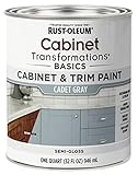
- CABINET TRANSFORMATION: Refresh outdated cabinets, vanities, furniture and trim with rich Cadet Gray color and a smooth semi-gloss finish
- DURABLE PERFORMANCE: Easy-to-clean finish resists dirt and grime while standing up to household chemicals
- SMOOTH APPLICATION: Outstanding flow and leveling help create a beautiful finish with brush, roller, pad applicator or airless sprayer
- FAST PROJECT COMPLETION: Dries to touch in 30 minutes, recoats in 2 hours and is ready for normal use after 24 hours
- INTERIOR CABINET COATING: Ideal for kitchens, bathrooms, laundry rooms and other interior cabinet and trim applications
- Choose two to four related whites: one warmer, one balanced, one cooler, and—if appropriate—one slightly deeper off-white.
- Place large cards, peel-and-stick samples, or sample boards vertically beside the countertop and backsplash. Vertical placement represents how cabinet faces are seen and how they receive light.
- Check the group in morning, afternoon, and evening light. Then turn on under-cabinet, pendant, recessed, and other kitchen fixtures.
- Look for the sample that makes the counter appear intentional. A yellow-looking white may exaggerate creamy stone; a blue-looking white may make warm veins appear orange; a gray-looking white may dull a lively counter.
- Leave the samples in place for at least a full day and write down your observations before ordering paint.
Do not evaluate a white from a photograph or a phone screen alone. Cameras and displays alter color, and a digital rendering cannot reproduce the way your particular bulbs, windows, finishes, and reflections interact.
What sheen is best for kitchen cabinets?
Satin or semi-gloss is the practical default for most high-touch kitchens because both provide a cleanable, durable surface without the extreme reflection of full gloss. Benjamin Moore identifies satin, semi-gloss, and high-gloss finishes as cabinet options and describes its Advance coating as a waterborne alkyd with a furniture-quality finish. Behr recommends cabinet, door, and trim enamel, while Dulux lists satin, semi-gloss, or gloss for hard-wearing, cleanable cabinets.
| Sheen | Strengths | Trade-offs |
|---|---|---|
| Satin | Lower reflection, forgiving appearance, practical for everyday cleaning. | May require more care to remove heavy grease without burnishing the surface. |
| Semi-gloss | More washable and reflective; a common choice for busy kitchens. | Highlights dents, brush marks, sanding scratches, and uneven repairs more readily. |
| High-gloss | Strong visual impact and easy wipe-down when the substrate is exceptionally smooth. | Shows surface irregularities and reflections; preparation must be meticulous. |
Use the same system—primer, enamel, and compatible tools—rather than mixing products without checking the labels. Follow the manufacturer’s specified recoat and cure times; a surface that feels dry may not yet be ready for heavy use.
What primer and preparation do painted kitchen cabinets need?
Preparation determines whether the chosen color remains attractive and adhered. Cooking oils, glossy films, laminate, and damaged edges can defeat even a premium topcoat.
- Remove and label parts. Take off doors, drawers, hinges, pulls, and knobs. Mark each part so it returns to its original position and alignment.
- Degrease thoroughly. Clean every face, edge, and recess. Residual oil can cause fisheyes, peeling, or poor adhesion.
- Dull glossy surfaces. Sand or degloss only as the product instructions require. Remove loose coating and feather damaged edges.
- Repair defects. Fill holes, dents, and open seams with a suitable filler or putty. Let repairs dry, sand them smooth, and remove all dust.
- Select a compatible primer. Benjamin Moore names Fresh Start High-Hiding All-Purpose Primer; Sherwin-Williams names Extreme Bond Primer and advises testing an inconspicuous area first. The correct choice depends on whether the substrate is wood, previously painted coating, MDF, or laminate.
- Confirm adhesion. On an inconspicuous section, apply the proposed primer and allow it to dry as directed. Test the bond before committing to every door.
Laminate and other slick substrates deserve particular caution. Dulux emphasizes adequate drying time and warns against applying thick coats on laminate surfaces. A thin, even film that cures fully is more reliable than a heavy coat intended to finish the job faster.
How do I paint the cabinets after choosing the color?
- Set up a clean, dust-controlled work area and support doors horizontally on painter’s pyramids or equivalent stands.
- Remove hardware and label each door, drawer, and hinge location.
- Clean and degrease, rinse if the cleaner requires it, and allow the surfaces to dry completely.
- Repair defects, sand or dull glossy areas as directed, and vacuum or wipe away dust.
- Apply the compatible bonding or high-hiding primer in a thin, even coat. Respect its drying time and sand with very fine grit only when the label calls for it.
- Remove sanding dust and inspect under strong, angled light. Correct ridges, pinholes, or missed contamination before topcoating.
- Apply the cabinet enamel in thin, even finish coats with a quality nylon or polyester brush, appropriate roller, or the application method specified by the product.
- Allow each coat to dry and recoat for the full label-specified period. Avoid closing doors or stacking parts while the coating is soft.
- Reassemble only after the stated cure period. Reinstall hardware carefully so tools do not mar the fresh finish.
Keep a small amount of labeled touch-up paint for later repairs, but expect the sheen and color to shift if the remaining paint is stored poorly or applied over a dirty surface.
Independent reader supportYour contribution helps us test, update, and keep practical guides available for everyone.What common color-selection problems should I troubleshoot?
| Symptom | Likely cause | Correction |
|---|---|---|
| The cabinet white looks yellow. | The paint is warmer than the counter, or warm bulbs are amplifying its undertone. | Compare a more balanced or cooler sample beside the counter under both daylight and the installed bulbs. |
| The counter suddenly looks orange. | A blue-leaning cabinet or backsplash is making warm veins appear stronger by contrast. | Test a softened warm-neutral or a less blue white against the actual slab. |
| The room feels flat and gray. | Cabinets, counter, floor, and backsplash all have similar cool values with little variation. | Introduce controlled contrast through cabinet value or a restrained warm accent, then reassess the complete palette. |
| Veining looks chaotic. | Cabinet paint adds another strong pattern or is a near-match that competes with the slab. | Switch to a calm neutral or a quiet undertone pulled from the counter. |
| Brush marks or scratches show. | The substrate was not smooth enough for the selected sheen, or coats were too thick. | Allow full cure, sand and repair as appropriate, then apply thinner coats; semi-gloss and gloss demand especially careful preparation. |
| Paint peels at edges or around pulls. | Grease remained, the primer was incompatible, or the coating was handled before curing. | Remove loose paint, clean again, test the primer system on a hidden area, and observe the complete cure schedule. |
Which cabinet color should I choose if two samples both seem right?
Use a decision matrix instead of relying on the prettiest isolated swatch. Score each finalist against the conditions that will remain in the room.
| Decision test | Question to ask | Keep the sample that… |
|---|---|---|
| Undertone compatibility | Does it share or respectfully balance the counter’s warm, cool, creamy, gray, pink, yellow, or green cast? | Makes the countertop look clean and intentional. |
| Visual movement | Does the paint calm or compete with the slab’s veining and pattern? | Provides the right amount of visual rest. |
| Lighting behavior | How does it read in morning, afternoon, evening, and artificial light? | Remains acceptable through the entire day. |
| Fixed-finish relationship | Does it sit comfortably beside tile, grout, flooring, appliances, fixtures, and hardware? | Does not create a new competing undertone. |
| Contrast level | Is the light-dark difference deliberate and comfortable? | Gives the room structure without making it feel cramped. |
| Maintenance tolerance | Will the chosen sheen and value reveal fingerprints, chips, or dust in your household? | Fits how much cleaning and touch-up you are willing to do. |
If one sample wins in daylight and another wins only under a single fixture, choose the one with the more stable behavior. A cabinet color must work in the kitchen you inhabit, not just in the lighting used for a showroom photograph.
Also popular on Amazon

- Includes 30 featured and newest released color card. Sprayed on color to see our colors in your homes lighting for more accurate color choices.
- ALL-IN-ONE Paint - NO Sanding, NO Priming, NO Top Coat Required, Low Luster, Velvet Sheen Finish
- Interior/Exterior - Paint your whole house - Ideal for hard surfaces including walls, doors, cabinets, counters, furniture, metal, glass, ceramics and floor and wall tile
- Durable yet stretches to paint smooth fabrics, vinyl and leather
- Results cannot be guaranteed. Digital screens may not show color accurately. Product search "ALL-IN-ONE PAINT by Heirloom Traditions, Color Confidence Card", for an accurate color choice.
What should I buy for a kitchen cabinet painting project?
Choose products by substrate and compatibility first, then by color. A practical supply list includes:
- A cabinet-rated enamel such as Benjamin Moore Advance or Dulux Quick Dry Satinwood.
- A compatible primer, such as Benjamin Moore Fresh Start High-Hiding All-Purpose Primer or Sherwin-Williams Extreme Bond Primer when appropriate for the substrate.
- Degreaser, fine-grit sandpaper, a quality nylon or polyester brush, suitable roller or spray equipment, painter’s tape, wood filler or putty, clean lint-free cloths, labels, and supports for doors.
- Large physical color cards, peel-and-stick samples, or sample pots in two to four related colors.
Check the product label for substrate restrictions, ventilation, application temperature, recoat interval, and full cure time. Product availability, pricing, and regional formulations vary, so confirm those details with the manufacturer or local retailer before purchasing.
What is the final checklist before I order cabinet paint?
- I can describe the countertop’s dominant undertone and amount of movement.
- I have checked the backsplash, grout, floor, appliances, fixtures, hardware, and nearby wood.
- I tested two to four related colors vertically beside the actual counter.
- I viewed the samples in morning, afternoon, evening, and artificial light.
- I chose a relationship—echo, shared undertone, calm neutral, or controlled contrast—instead of forcing an exact match.
- I selected a sheen and coating rated for cabinets and compatible with the substrate.
- I have a cleaning, sanding, priming, and curing plan before opening the topcoat.
The most dependable choice is the sample that keeps the countertop looking intentional across changing light while fitting the room’s fixed finishes. Once that color is selected, careful preparation and full curing matter as much as the shade itself.
Frequently Asked Questions
Can I choose cabinet paint from a photo of my kitchen?
Use photos only to narrow the family, not to make the final decision. Camera white balance, screen settings, reflections, and artificial lighting can shift undertones; the final check should use physical samples beside the actual countertop and finishes.
How long should cabinet paint cure before normal use?
Use the product label’s full cure schedule rather than relying on a surface that merely feels dry. Reinstalling doors, stacking parts, or wiping aggressively too soon can imprint or dull the finish.
What’s actually slowing this PC down?
Pick the symptom - the matching free tool is one click away.
Should an island use a different cabinet color from the perimeter?
It can, provided both colors relate to the countertop and the room’s fixed finishes. Test the pair together from the adjoining living spaces so the island reads as a deliberate accent rather than an unrelated third undertone.
Is spray application better than brushing kitchen cabinets?
Spraying can produce a very smooth film, but it requires controlled ventilation, masking, equipment, and technique. Brushing or rolling is workable when the surface is properly prepared and coats are thin and even; the product label should determine the approved method.
Quick Recap

Product prices and availability are accurate as of the date/time indicated and are subject to change. Any price and availability information displayed on Amazon at the time of purchase will apply.

