Windows Errors? Fix Them Before They Spread
Outbyte PC Repair · freeRepair common Windows errors and clear accumulated junk for a smoother, more stable PC - no reinstall needed.
Fix My PC Now →ThatPainter is reader-supported. When you buy through links on our site, we may earn an affiliate commission. Learn More
A successful paint colour scheme starts with the room you have, not a colour trend or a screen image. Look at the light, fixed finishes, furniture and views; decide how you want the space to feel; then choose a palette relationship and check real paint samples in the room before committing.
What should you look at before choosing paint colours?
Start with the elements that are difficult or expensive to change. Note the floor, stone or tile, timber, built-in features, large pieces of furniture and the view through each window. These are not background details to ignore: their colours and materials will sit beside the paint and affect whether the whole room feels joined up.
As an Amazon Associate I earn from qualifying purchases.
What’s actually slowing this PC down?
Pick the symptom - the matching free tool is one click away.
Make a quick inventory of those fixed or long-lasting elements. For each one, record its main colour and whether it reads warm, cool, muted or strong in the room. You do not need technical colour names. The point is to notice relationships: for example, a timber floor may look golden next to one wall colour and noticeably pink beside another. Look at the materials in the room itself rather than relying on a photo, which can shift colour.
The Army Materiel Command’s archived Interior Design Guide recommends keeping permanent background finishes relatively neutral and using more changeable elements, such as upholstery or wallcoverings, for accents. That is facilities guidance, not a rule for every home, but it offers a useful decision principle: put colours you may tire of on things that are easier to replace, and let existing permanent finishes help set the palette.
Popular on Amazon

- Great Value Paint Brush Set: Soucolor 20 acrylic paint brushes come in 10 different sizes, making them ideal for fine detailing, model painting, rock painting, nail art, face painting, DIY crafts, and general art projects. The varied brush sizes give you better control for both delicate lines and broader color coverage, while the soft bristles deliver smooth, consistent results on acrylic, oil, watercolor, canvas, wood, ceramic, and more.
- Awesome Set of Paint brushes: Professional paint brushes can cover all of your needs. The multi-purposed brushes are ideal for Watercolor, Oil, Gouache, enamel, Acrylic Painting, Body, Nail, Face Painting, Miniature, Model, Wood, Glass, Cup, Ceramic, Fine work, Art class, Craft Art Painting, DIY Art Crafts etc.
- Soft and long-lasting: The bristles are soft and strong, with nickel metal ferrules and blue wooden handles. After cleaning, the bristles will become soft and fluffy again and will not fall off.
- Easy to clean: it’s very convenient to Wash well in soap and water. Retain shape after drying. the brushes hold up very well. Nice selection to beginners and professionals. Keep them clean and they last a long time.
- Perfect for All Painters & Occasions: Suitable for art beginners, hobbyists and professional artists. Great for art class, home creation, travel painting and DIY handmade projects. A practical art gift for students, teachers, family and craft lovers.
Also ask what the room is for and who uses it. A bedroom, a busy family room and a small work area may call for different moods, even if they share the same flooring or sit beside one another. Write down a few feeling words—calm, warm, fresh, dramatic or relaxed—before looking at paint colours. They give you a way to filter options without expecting a particular hue to produce the same effect in every room.
Which direction does the room face, and how does light affect paint colour?
Natural light changes the way a paint colour appears, so account for the room’s orientation before settling on a shade. Homes & Gardens describes north-facing rooms as receiving cooler light and south-facing rooms as receiving warmer light; east- and west-facing rooms shift as the day progresses. These are useful tendencies, not guarantees of how a particular colour will look in every home.
Recommended Free Tools
Check when the room gets its strongest daylight and where it falls. A colour that seems balanced in the morning may look different later, especially in an east- or west-facing space. Artificial light and the surfaces around the walls matter too. The same paint can appear unlike its sample in another room because the light, furnishings and materials are different. As Homes & Gardens’ interior-design guidance emphasizes, colour is relative to its surroundings; the choice needs to work with the design elements in that space.
Orientation is a prompt to sample and observe, not a reason to rule out an entire colour family. If a room feels cool, you might compare warmer-looking candidates; if it feels very bright, you might check whether a strong shade becomes more intense than you want. Let the actual room decide. Windows, trees, nearby buildings and room layout all affect the light reaching a wall, so a broad rule about compass direction cannot replace an in-room check.
How do you choose a palette that feels cohesive?
Choose a simple relationship among colours before building a long list of individual shades. A tonal, analogous or complementary approach gives you a starting structure. None is universally best: the right one depends on how much contrast you want, the room’s existing finishes and the atmosphere you are aiming for.
Also popular on Amazon
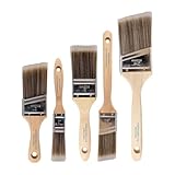
- COMPLETE 5-PIECE BRUSH SET FOR EVERY PAINTING TASK — Includes 1 Inch Flat, 1.5 Inch Angle, 2 Inch Flat, 2 Inch Angle Stubby, and 2.5 Inch Angle brush giving you every size professional painters use daily. Get all 5 for less than the price of a single brush from hardware store brands — professional grade performance at a fraction of the cost. Perfect for walls, trim, cabinets, doors, furniture, and detailed cutting-in work on any project.
- ZERO BRISTLE LOSS — GUARANTEED BY PRECISION ADHESIVE BONDING — Every bristle is locked in place with precision-set adhesive that keeps them in the brush — not in your paint job. The coated steel ferrule provides structural support while the adhesive bond ensures clean performance on every stroke. Premium SRT synthetic filaments load more paint and release it evenly for a smooth streak-free finish on walls, ceilings, and trim. Works with latex, oil-based paint, primer, sealer, and wood stain.
- INCLUDES THE ANGLE STUBBY MOST SETS LEAVE OUT — Professional painters know the 2 Inch Angle Stubby is the go-to brush for tight cabinet interiors, window sashes, inside corners, and detailed trim where standard angle brushes are too long. Combined with the 1.5 and 2.5 inch angle sash brushes you have precision cutting-in covered at every scale — baseboards, crown molding, door casings, and ceiling lines.
- FLAT BRUSHES FOR BROAD SMOOTH COVERAGE ON ANY SURFACE — The 1 and 2 inch flat brushes deliver even coverage on walls, furniture, shelving, doors, fences, decks, and wood surfaces. Ideal for applying primers, stains, varnishes, polyurethane, and specialty coatings. Solid wood handles provide all-day comfort and control for both professional contractors and weekend DIY homeowners tackling interior or exterior painting projects.
- TRUSTED BY PROFESSIONAL PAINTERS AND CONTRACTORS NATIONWIDE — Pro Grade delivers professional-grade results at a price that makes sense for crews who go through brushes on every job. Ideal for property managers, remodeling contractors, apartment turnover crews, maintenance teams, and commercial painting operations. Backed by thousands of verified reviews from working painters. Washable and reusable for multiple projects.
| Palette approach | How it is built | What it can help you achieve |
|---|---|---|
| Tonal or monochromatic | One colour family, varied by lightness, depth or saturation. | A cohesive, lower-contrast starting point. Texture or a controlled accent can add interest. |
| Analogous | Neighbouring hues on the colour wheel. | A coordinated look with more variation in hue than a single-colour-family scheme. |
| Complementary | Hues opposite one another on the colour wheel. | More visible contrast and energy. Adjust the proportions and intensity so one colour does not overwhelm the room. |
A colour wheel helps you explore relationships; it does not certify that a combination will suit your room. First decide whether you want the walls to blend with the fixed finishes or stand out from them. Then consider how many hues you want to see and how strong you want the contrast to feel. If you are unsure, a tonal approach is a straightforward place to begin, but it still needs texture, materials and real-room sampling to avoid feeling flat.
For an analogous palette, look at neighbouring hues and ask whether they relate comfortably to the floor, furniture and other permanent elements. For a complementary scheme, treat the contrast as something to control rather than maximize: a highly vivid pairing may draw more attention than you want. You can keep one colour more restrained and use the other more selectively. These are design choices, not fixed ratios; no universal formula such as a required percentage split has been established.
How do architecture, room size and materials shape the choice?
Consider the room’s architecture before choosing where and how to use colour. Note the ceiling height, doors, frames, alcoves, trim, built-ins and any feature you want to emphasize or let recede. Homes & Gardens’ guidance puts a room’s architecture, size, features, setting and views at the centre of palette decisions. A paint shade should connect to the elements that already define the space, rather than being judged as an isolated swatch.
The archived Army design guide suggests using fewer colour breaks in small rooms and matching doors and frames to walls as ways to avoid visual interruption. It also offers this perceptual guidance: “Use warm colors to make a room seem smaller, more ‘human’ in scale; warm colors appear to advance toward the viewer,” while cool colours are described as appearing to recede and making a room seem larger or more spacious. Treat those statements as guidance from an institutional interiors manual, not a guaranteed result. Light, surface, furnishings and the exact colours all affect what a person perceives.
Materials and finish contribute to the result alongside hue. The same guide notes that smooth, shiny surfaces reflect more light than rough, dull ones. That observation can help you think about why two surfaces painted a similar colour may not appear identical, but do not assume a finish will produce a specific effect in all lighting conditions. Consider the existing surface and the light in your own room when evaluating the overall scheme.
Also popular on Amazon

- 【All sizes of art brushes】: The 10 sizes of multi-functional brushes have various shapes, making the mixing color easier, which is very suitable for artists, students, teenagers, children and painters at all levels. Wonderful Present ideas for friends and family who like painting!
- 【general brush set】: Professional paint brush can meet all your needs. Multifunctional brush is very suitable for watercolor, oil, gouache, acrylic painting, body, nail, face painting, miniature, model, ceramics, arts and crafts painting, etc.
- 【high quality process】: It is designed with anti falling bristles, anti-rust nickel ferrule and solid wood handle. You can use the brush to focus on the painting and always be creative.
- 【easy to maintain】: After using the brush, it is very convenient to clean the brush with warm soapy water and reshape the tip of the brush. Air dry the brush and place it on top of the top for long use.
- 【100% satisfaction guarantee - buy now】1 packs of set brushes, you can also get friendly customer service, any questions feel free to contact us, within 24 hours to help you! There is no risk in buying our paint brush kit.
Texture and pattern can also help colours feel connected. If a tonal palette feels too plain, variation in fabric, flooring or other materials may provide interest without adding several new wall colours. Conversely, a room with strong patterns or prominent finishes may need a simpler wall palette to avoid competing focal points. Let the room’s existing visual activity guide how much colour variation you introduce.
How should you test paint colours before committing?
Shortlist a small number of plausible colours, then look at them physically in the room before choosing a final shade. A paint colour on a screen or in a different room is not a reliable preview of how it will appear on your walls. Ideal Home’s paint-colour guide, updated May 12, 2025, recommends tester pots or pre-painted paper swatches so you can judge candidates in your own space.
- Choose candidates that fit the room. Narrow options using your fixed finishes, desired mood, light and chosen palette relationship. Avoid buying a shade simply because it looked right in a picture.
- Use a physical sample. Follow the paint maker’s directions for a tester pot, or use a pre-painted sample card. A movable card is useful because you can check a colour in more than one part of the room without treating a screen display as a true paint sample.
- View it in context. Place or hold the sample near the floor, furniture, trim and other materials it must work with. If a candidate looks good alone but clashes beside a permanent finish, it is not the right choice for that room.
- Check at different times. Revisit the sample as the light changes, especially in east- or west-facing rooms. Compare candidates under the light in which you actually use the space, not only at the time you first looked.
- Compare the finalists together. Look at each candidate’s relationship to the rest of the palette, not only whether you like it in isolation. Decide whether it supports the intended mood and the amount of contrast you want.
Give the sample enough time and attention to see it under more than one condition. If you are torn between two shades, compare them in the same location and beside the same room elements. A movable card makes that comparison practical. Do not assume that a colour is wrong merely because it looks different from a digital image; the real question is whether it works in the room where it will be used.
Sampling does not eliminate every uncertainty, but it helps prevent a common source of regret: committing based on how a colour looked somewhere else. The Asian Paints colour guide likewise cautions that displayed shades are indicative rather than precise representations of actual paint colour. That page is specific to its India site, so it is best treated as a general reminder about screen previews, not as information about local products or services elsewhere.
What’s actually slowing this PC down?
Pick the symptom - the matching free tool is one click away.
What if the palette feels wrong after you sample it?
Use the sample to diagnose the mismatch rather than starting over at random. Check whether the issue is the colour itself, its intensity, the relationship to a fixed finish, or the conditions in which you are viewing it.
Also popular on Amazon

- 【KIDS PAINT BRUSHES SET】Anezus paint brushes for kids come with 10 pcs paint brushes of 5pcs round paintbrushes and 5 flat paint brushes with colorful handles, good for the young artist to explore their creativity in painting and crafting
- 【HIGH QUALITY PAINT BRUSHES FOR KIDS】These toddler paint brushes made of soft hog bristle, bright colored handles and rust proof ferrules. The bristles are firmly fixed in the kids paint brushes and no shedding. Each children paint brush measure 6 1/4 inches (16cm) in length and ferrules 1/2"(1.3cm) diameter, large enough for the little hand to grip and control
- 【WIDE APPLICATIONS】With combination of round and flat craft paint brushes for kids, work great with washable paint, tempera paint and acrylic paint. Great for arts and craft, rock, leather, gesso and ceramic, or body, nail and face art painting.
- 【EASY TO CLEAN 】After using paint brushes for acrylic, oil or watercolor painting, it’s very convenient to clean them with warm soapy water and reshape the paint brush tips. Keep these craft paint brushes clean and they last a long time.
- 【GREAT GIFT IDEA】Perfect for students, teens, kids, children and painters of all levels. Wonderful gift idea for girls, boys and kids who love painting! These all-purpose paint brushes for kids are ideal for kids' school projects, birthday parties, painting parties, art parties, back to school supplies, classroom decoration and more.
- It clashes with the floor or furniture: revisit the room inventory and shortlist a colour that relates more comfortably to those elements.
- It feels more vivid than expected: compare a more muted or less intense candidate within the same general colour relationship.
- It changes too much through the day: evaluate candidates at several times and decide whether that variation suits the room’s use.
- The room feels visually busy: reduce the number of colour breaks or let pattern and texture provide interest instead of adding more hues.
- The palette feels dull: consider a controlled accent or material variation rather than assuming every wall needs a different colour.
Make one adjustment at a time. If you change the colour family, contrast and intensity simultaneously, it becomes harder to tell what improved the scheme. Use the room’s fixed elements and the feeling you want as your reference points; they keep the next shortlist focused.
Independent reader supportYour contribution helps us test, update, and keep practical guides available for everyone.When should you use extra care with colour?
If colour is only decorative, the main question is whether the palette suits the room and its occupants. If colour communicates information—such as a warning, category, route or status—do not make it the only way to convey meaning. A scheme that looks clear to one person may not be distinguishable to someone with colour vision deficiency.
The American Chemical Society’s accessibility guidance recommends combining colour with text, shapes, symbols or patterns. For digital designs and other informational materials, also check contrast between text or important elements and their backgrounds. Harvard Digital Accessibility Services recommends contrast testing and reviewing a design in grayscale to see whether its meaning remains understandable without colour. Apply the accessibility standard relevant to the medium: web contrast requirements are not a rule for choosing decorative room paint.
Windows Errors? Fix Them Before They Spread
Repair common Windows errors and clear accumulated junk for a smoother, more stable PC - no reinstall needed.Free scan · no reinstallCrashes, No Sound, or Screen Glitches?
Random freezes, missing sound and display glitches usually trace back to one bad driver. Find and replace yours safely.Free scan · under a minuteWhat is a practical way to make the final decision?
Bring the choices together in this order: room conditions first, palette relationship second, sample evidence last. That keeps you from selecting a fashionable shade that conflicts with a permanent finish or from mistaking a digital preview for the appearance you will get at home.
- List the finishes, furniture and views that will remain.
- Write down the room’s purpose and the feeling you want.
- Account for orientation, daylight and the times the room is used.
- Select a tonal, analogous or complementary relationship based on the contrast and variety you want.
- Shortlist paint candidates that work with the fixed elements.
- Check physical samples in the room, beside furnishings and in changing light.
- Choose the candidate that works with the whole room, not simply the one that looks best as an isolated colour.
There is no colour-wheel shortcut that can replace the last step. A considered scheme is the one that fits the room’s materials, light, architecture and purpose—and still feels right when you see the actual sample where it will be used.
Also popular on Amazon

- 【162-Piece Bulk Set | Dual Brush System】Maximize versatility with 81 flat brushes (0.59 inch edge for bold strokes) and 81 round brushes (0.39 inch tips for details) – 3X more tools than standard kits! Pre-sorted in labeled compartments for instant access during painting sessions. Ideal for art classrooms, mural projects, and multi-artist households.
- 【Pro-Grade Durability | Zero Shedding Guarantee】 "Engineered with triple-crimped nylon bristles (43% higher resilience vs. standard) and aerospace aluminum ferrules tested for 10,000+ flex cycles. Lab-verified 0.01% shedding rate even with heavy impasto techniques – outperforms flimsy bristles in budget brushes."
- 【Multi-Scenario Readiness | Event & Daily Use】 Optimized for: Thanksgiving/Christmas face designs classroom projects ceramic decorating fabric printing and model painting; Lightweight plastic handles each reduce hand fatigue during prolonged sessions
- 【Effortless Maintenance | Long-Term Durability】 Clean with warm soapy water in 10 seconds; Reshape tips and air-dry vertically to preserve bristle integrity,After use, air-dry brushes thoroughly and store upright in the provided case to preserve bristle shape. The premium nylon filaments naturally regain their original form after each stroke. For cleaning, simply rinse in warm soapy water and gently reshape bristles with fingertips."
- 【Multiple Application】These acrylic paint brushes can be applied for most occasions,such as:watercolor,oil, gouache paint,face paint, acrylic paint, suitable for Thanks Giving Day, Christimas, Halloween face and body painting, canvas painting, fabric, rock, miniature, model, ceramics, arts and crafts painting, etc.
Frequently Asked Questions
Should I choose wall paint before buying furniture?
If major furniture is already in the room, include it in your paint decision because its colour and material will sit beside the walls. If you are planning a room from scratch, decide which elements are likely to be long-lasting first, then coordinate the remaining choices around them rather than treating each purchase as unrelated.
Can I use the same colour scheme in rooms with different window directions?
You can carry a shared palette through the home, but do not assume the same paint shade will look identical in every room. Check a physical sample in each space because orientation, daylight and surrounding finishes change how colour appears.
Quick wins for a faster PC:
Repair Windows errors before they cause bigger problemsFix Now →Scan for outdated or missing drivers - takes under a minuteDriver Scan →Do I need a colour wheel to choose paint?
No. A colour wheel is a useful way to identify tonal, neighbouring or opposite-hue relationships, but it cannot account for your room’s light and materials. Use it to generate candidates, then judge those candidates in context.
Is a screen preview accurate enough to order paint?
A screen preview is useful for narrowing ideas, not for confirming the final shade. Displayed colours may not precisely represent paint, so use a physical sample in the room before making a full-room decision.
Quick Recap


