Outdated Drivers Are Slowing You Down
One free scan finds every outdated or missing driver and matches the right update for your exact hardware.Free scan · exact hardware match
PC Slower Than It Used to Be?
A free scan shows the junk files, broken settings and background clutter dragging Windows down - then fixes them in one click.Free scan · Windows 10 & 11
ThatPainter is reader-supported. When you buy through links on our site, we may earn an affiliate commission. Learn More
The most reliable way to choose a timeless kitchen palette is to start with what will stay: cabinets, worktops, backsplash, flooring, appliances, hardware and the rooms that connect to the kitchen. Identify their undertones, then choose a quiet base color, a related contrast, natural texture and a restrained accent. Test large samples in the actual room before ordering paint or cabinetry.
Timeless does not mean one approved shade. Warm whites, greiges, muted greens, deep blues, charcoal, monochrome schemes and earthy colors can all remain convincing when they suit the home’s architecture, fixed finishes, light and your long-term taste. Put trend-sensitive color on elements that are inexpensive to change, and reserve the permanent envelope for adaptable, complex colors.
Do these 3 things before closing this tab:
1Fix the driver behind crashes, sound loss and screen glitches2Repair Windows errors before they cause bigger problems3Scan for outdated or missing drivers - takes under a minuteAs an Amazon Associate I earn from qualifying purchases.
What makes a kitchen color palette timeless?
A timeless palette continues to look appropriate after current trends pass because it belongs to the room rather than copying a moment. The architecture, daylight, neighboring rooms and permanent materials do more to determine longevity than a paint-color name.
Timelessness is therefore a compatibility test, not a universal color rule. A period home may support a historically sympathetic deep blue or earthy red, while a bright contemporary room may look best with warm white, pale greige or charcoal. The same color can feel elegant in one kitchen and disconnected in another.
Popular on Amazon
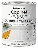
- CABINET TRANSFORMATION: Refresh outdated cabinets, vanities, furniture and trim with rich Pure White color and a smooth semi-gloss finish
- DURABLE PERFORMANCE: Easy-to-clean finish resists dirt and grime while standing up to household chemicals
- SMOOTH APPLICATION: Outstanding flow and leveling help create a beautiful finish with brush, roller, pad applicator or airless sprayer
- FAST PROJECT COMPLETION: Dries to touch in 30 minutes, recoats in 2 hours and is ready for normal use after 24 hours
- INTERIOR CABINET COATING: Ideal for kitchens, bathrooms, laundry rooms and other interior cabinet and trim applications
Stephanie Dyer, a Portland designer with a background in historic preservation, describes the principle this way: “There are always trends, especially with color. But when it comes to timelessness, think about meeting the space where it is rather than trying to force a style that isn’t congruent with the era.”
Choose colors you will enjoy seeing every day, not just colors that photograph well or appear frequently in trend reports. Mara McDonald of The Designery puts the everyday test first: “Color sets the tone for the entire kitchen, so it’s important to choose a finish you’ll enjoy living with every day, not just what’s trending at the moment.”
How do I inventory the kitchen before choosing colors?
Photograph and list every element that is staying. These surfaces form the palette’s permanent envelope and should be considered before you look at paint cards.
Record the fixed elements
- Cabinet doors, frames and any exposed wood grain.
- Worktops or counters, including veining, speckles and dominant background color.
- Backsplash tile, grout and adjacent wall surfaces.
- Flooring and thresholds where the kitchen meets another room.
- Appliances, sinks and faucets, including stainless, black, white or colored finishes.
- Handles, hinges, lighting metals and other hardware.
- Views into dining, living and hallway spaces.
- Artwork, rugs, stools, curtains and textiles you intend to keep.
Take the photographs in daylight and under the kitchen’s evening lighting. A counter that looks neutral in a showroom can reveal green, pink, yellow or blue when placed beside your cabinets. Keep physical samples of tile, worktop material, flooring and cabinet doors together; a phone photograph cannot reliably preserve undertones.
Mark what can and cannot change
Separate expensive or disruptive items from replaceable ones. Cabinet boxes, stone counters, flooring and a tiled backsplash normally sit in the first group. Wall paint, an island color, stools, artwork, runners and handles are easier to revise. This distinction tells you where to take risks and where to stay adaptable.
How do I identify undertones in cabinets, counters and tile?
Undertone is the subtle hue beneath a surface’s obvious color. Two beige materials may differ because one leans yellow and the other pink; two grays may differ because one leans blue and the other green. A paint that repeats an existing undertone usually looks intentional, while a near-match with the opposite undertone can look muddy.
Use a controlled comparison
- Place the material or a high-quality photograph against a clean white sheet.
- Compare it with warm and cool whites, not only with the wall’s current color.
- Look for the hue that remains visible in both daylight and artificial light.
- Repeat the comparison beside the largest fixed surface, such as the counter or cabinet run.
Wood deserves special attention. Sherwin-Williams advises determining permanent features first and accounting for cabinet wood undertones. Honey oak, cherry, walnut and painted wood each influence whether a proposed neutral reads warm, cool, pink, yellow or gray. If the wood stays, select a color that acknowledges it rather than trying to disguise it with an unrelated near-neutral.
Do not chase an exact match
Paint rarely needs to duplicate a countertop or tile. A related undertone with a clear value difference is safer than a weak attempt at a perfect match. For example, a warm off-white wall can support a cream counter while remaining visibly lighter; a muted green can connect to green-gray stone without pretending to be the same color.
Which colors work best for the permanent envelope?
Use the most expensive-to-replace surfaces for colors with complexity and flexibility. The following directions are reliable starting points, not mandatory formulas.
The Tool Desk
Outbyte Driver Updater FREEScan for outdated or missing drivers - takes under a minuteDriver Scan →Outbyte PC Repair FREERepair Windows errors before they cause bigger problemsFix Now →Also popular on Amazon

- Includes 30 featured and newest released color card. Sprayed on color to see our colors in your homes lighting for more accurate color choices.
- ALL-IN-ONE Paint - NO Sanding, NO Priming, NO Top Coat Required, Low Luster, Velvet Sheen Finish
- Interior/Exterior - Paint your whole house - Ideal for hard surfaces including walls, doors, cabinets, counters, furniture, metal, glass, ceramics and floor and wall tile
- Durable yet stretches to paint smooth fabrics, vinyl and leather
- Results cannot be guaranteed. Digital screens may not show color accurately. Product search "ALL-IN-ONE PAINT by Heirloom Traditions, Color Confidence Card", for an accurate color choice.
| Palette direction | Typical combination | Where it fits | Watch for |
|---|---|---|---|
| Warm neutral | Warm white, cream, beige or greige with natural wood and aged metal | Traditional, transitional and mixed-material kitchens; rooms with warm flooring or wood | A yellow or pink cast can become stronger beside cool lighting or blue-gray stone |
| Soft color | Muted sage, olive, dusty blue or deep blue with a neutral counter and backsplash | Homes that need color without high saturation; cabinetry or an island with a calm focal point | Test carefully because daylight direction can make muted colors appear gray or much brighter |
| Monochrome | Black, charcoal and white or off-white, softened with wood or stone texture | Modern, industrial and high-contrast rooms | Large dark areas can feel heavy if the room has limited light or little textural variation |
| Earth-based | Terracotta, ochre, reddish brown or olive grounded by cream, beige or natural materials | Rooms with brick, timber, stone, handmade tile or a warm architectural character | Strong warm colors need a quiet field color and should be viewed at night as well as day |
| Two-tone | Lighter upper or wall field with a deeper island or base cabinet | Kitchens where a focal point is useful and the fixed finishes can support clear contrast | Contrast that ignores the counter, floor or room orientation can make the layout look fragmented |
Warm whites and soft off-whites are not automatically safer than color. A stark white can expose blue or yellow undertones in neighboring materials, while a complex green or blue may be more harmonious. Choose the direction that repeats the room’s existing character.
How should I build the palette in layers?
A restrained, layered palette prevents the room from becoming a collection of unrelated samples. Wilsonart’s published five-part formula is “LIGHT NEUTRAL,” “COMPLEMENTARY NEUTRAL,” “NATURAL TEXTURE,” “TRACE OF METAL,” and “PERSONAL TOUCH.” Translate that formula into roles rather than exact percentages.
1. Set the base field
Choose the largest visual field: walls, main cabinetry or both. A warm white, soft neutral, muted green, deep blue, charcoal or natural timber can serve as the base if it fits the permanent finishes. Keep this color calm enough to live with across changing light.
2. Add a related contrast
Use a second neutral or hue that is clearly related but not identical. Contrast can come from value, temperature or depth: cream against a deeper beige, pale walls against a blue island, or charcoal cabinetry against an off-white field. Repeat the base undertone in the contrast so the two colors do not appear accidental.
3. Ground the scheme with texture
Natural wood, stone, woven fibers, handmade tile or another tactile material keeps a neutral palette from feeling flat and softens high-contrast schemes. Texture is especially useful when the color count is intentionally small.
4. Limit metal
Choose one dominant metal family for handles, faucets or lighting, then use a second finish only as a trace. Aged brass, brushed nickel, blackened metal and stainless steel each change the perceived temperature of nearby paint. Sample the metal beside the proposed cabinet and wall colors.
5. Reserve a personal touch
Let artwork, a runner, stools, pottery or a small appliance introduce a color that is meaningful to you. Because these items are replaceable, they can carry more personality than the permanent envelope.
Should my cabinets be lighter or darker than the walls?
Neither choice is universally correct. Select the relationship that makes the kitchen’s fixed finishes and architecture read clearly.
Lighter cabinets
Lighter cabinetry can make a compact or shaded kitchen feel more open and can keep patterned counters from competing with the doors. It works best when the wall color is not an almost-identical near-match; a small difference in value or undertone gives the cabinetry definition.
Also popular on Amazon

- Ultra-White Brilliance: Experience the transformative power of Titanium Infusion, an ultra-white hue inspired by the artist’s palette – perfect for a modern, timeless look.
- One-Day Transformation: Redefine your kitchen cabinets in a single day with our brush-and-roll application - no professional help needed.
- All-Inclusive Kit: Each package covers 100 square feet, ideal for the typical kitchen, and includes all the necessary tools for a flawless finish.
- Eco-Friendly & Safe: Enjoy the peace of mind with our low-VOC, water-based formula, ensuring a safer painting experience.
- Effortless Transformation: No stripping or priming required; our paint adheres beautifully to wood, laminate, and metal cabinets with minimal preparation.
Darker cabinets
Deep blue, charcoal, olive or stained wood can anchor a large or bright room and create a deliberate focal point. Balance the depth with a lighter wall field, reflective or pale worktop, and enough wood, stone or woven texture to prevent a single dark block.
Two-tone cabinetry
A lighter upper or wall field with deeper base cabinets or an island can organize an open plan. Keep the contrast connected to the counter and floor, and check the view from adjoining rooms so the two colors do not create a visual stop-start effect.
Where should a bold or trend-sensitive color go?
Place high-commitment color on components that can be changed without rebuilding the kitchen. An island, one wall, a backsplash accent, handles, pendants, stools, artwork or textiles can carry a strong hue while the main cabinetry remains adaptable.
Free tools Windows power users keep installed
One-click scans. No signup required.
This approach also lets you adjust the room as your taste changes. A deep green island can become neutral gray, or bright stools can be replaced, without repainting every cabinet door. If you do choose a saturated cabinet color, confirm that it works with the permanent counter, floor and neighboring rooms before treating it as a trend statement.
How can I test kitchen colors before committing?
Test in the actual room, on a large scale and at several times of day. Small cards hide undertones and make colors appear more uniform than they will on a cabinet run or wall.
- Paint large swatches on removable boards or use removable sample sheets; place several around the kitchen rather than one beside the sink.
- Put samples beside the cabinet, counter, backsplash, floor and metal hardware they must coordinate with.
- View them in morning, afternoon and evening light, and with every artificial light source switched on.
- Check walls facing different directions. Orientation changes how a shade reads, particularly in rooms with limited daylight.
- Leave the samples in place long enough to see them during ordinary routines. Note whether the color feels comfortable at breakfast, under task lighting and at night.
- Decide only after comparing the finalists together. Remove rejected samples so their contrast does not distort your judgment.
Peel-and-stick samples and sample pots are practical tools because they can move with the light and avoid permanently marking a wall. The sample is a decision aid, not a guarantee: the final sheen, substrate and surrounding materials will still affect the result.
What paint finish is suitable for kitchen walls and cabinets?
Use a coating intended for the surface and follow its preparation, curing, cleaning and maintenance instructions. Cabinet doors and trim experience more handling than a quiet wall, so a wall-only coating is not an equivalent substitute.
Recommended Free Tools
Cabinetry and trim
BEHR identifies BEHR PREMIUM Cabinet, Door & Trim Enamel as a product for a smooth, durable finish. Verify the current label, compatible substrates, preparation steps and recoat instructions before purchase; manufacturer durability language is product guidance, not an independent performance test.
Walls and woodwork
Little Greene describes washable, kitchen-suitable formulations for walls, woodwork and cabinet doors. Confirm the exact product’s sheen, washability and curing requirements, since those characteristics vary by formulation and can change how the color reflects light.
Also popular on Amazon
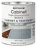
- CABINET TRANSFORMATION: Refresh outdated cabinets, vanities, furniture and trim with rich Cadet Gray color and a smooth semi-gloss finish
- DURABLE PERFORMANCE: Easy-to-clean finish resists dirt and grime while standing up to household chemicals
- SMOOTH APPLICATION: Outstanding flow and leveling help create a beautiful finish with brush, roller, pad applicator or airless sprayer
- FAST PROJECT COMPLETION: Dries to touch in 30 minutes, recoats in 2 hours and is ready for normal use after 24 hours
- INTERIOR CABINET COATING: Ideal for kitchens, bathrooms, laundry rooms and other interior cabinet and trim applications
Preparation matters as much as color
- Degrease cabinet surfaces thoroughly before sanding or priming.
- Repair dents, raised grain and failing coatings before applying new paint.
- Use the primer specified for the existing surface and chosen topcoat.
- Respect drying and curing times before reinstalling hardware or washing the surface.
- Keep a labeled touch-up container and record the product, color name and sheen.
How do I compare two promising palettes?
Judge both schemes under the conditions in which the kitchen will be used, not by preference for an isolated swatch. Score each option against the same questions.
| Decision test | Questions to ask |
|---|---|
| Permanent-finish compatibility | Does the palette sit comfortably beside the counter, backsplash, floor, appliances and cabinet wood? |
| Actual-light performance | Does it remain attractive in morning, afternoon, evening and artificial light? |
| Maintenance and durability | Is the selected coating appropriate for grease, handling, cleaning and the substrate? |
| Future flexibility | Could you change stools, art, handles or an island accent without making the base colors look wrong? |
| Architectural fit | Does it respect the home’s era, proportions and adjoining rooms? |
| Long-term taste | Would you choose it if no trend report or social-media image were influencing you? |
A palette that scores well across all six tests is usually a better long-term choice than one that wins only on novelty or a single photograph.
Recommended Free Tools
What mistakes make a kitchen palette look dated?
Most dated-looking results come from a mismatch between color and context, not from using the “wrong” decade’s shade.
Choosing paint before fixed finishes
Paint cards are easy to carry, so they often get chosen first. If the counter or backsplash is already installed, reverse the order: sample paint beside those materials and let their undertones guide the field color.
Using several almost-neutrals
Three near-identical beiges or grays can clash more than three clearly differentiated colors. Reduce the number of neutrals, then make the remaining relationships intentional through value and undertone.
Ignoring adjacent rooms
An open-plan kitchen is seen from multiple angles. A color that works inside the kitchen may conflict with a cool hallway or warm living-room upholstery. Test the palette from those sightlines.
The Tool Desk
Outbyte PC Repair FREEClear out junk files and repair common Windows errorsFree Scan →Outbyte Driver Updater FREEFix the driver behind crashes, sound loss and screen glitchesFind Drivers →Making every surface a focal point
Patterned counters, colorful cabinets, a statement backsplash and bright hardware compete when all are equally strong. Choose one primary focal point, keep the field quieter and use texture for depth.
Skipping the night test
Artificial lamps can exaggerate yellow, blue or green in a paint. Include the actual bulbs and under-cabinet lighting in the final review.
Assuming “washable” means indestructible
Washability and durability depend on the product, surface preparation, sheen, curing and cleaning method. Follow the manufacturer’s instructions and keep touch-up paint rather than relying on broad promises.
Also popular on Amazon

- Includes 30 featured and newest released color card. Sprayed on color to see our colors in your homes lighting for more accurate color choices.
- ALL-IN-ONE Paint - NO Sanding, NO Priming, NO Top Coat Required, Low Luster, Velvet Sheen Finish
- Interior/Exterior - Paint your whole house - Ideal for hard surfaces including walls, doors, cabinets, counters, furniture, metal, glass, ceramics and floor and wall tile
- Durable yet stretches to paint smooth fabrics, vinyl and leather
- Results cannot be guaranteed. Digital screens may not show color accurately. Product search "ALL-IN-ONE PAINT by Heirloom Traditions, Color Confidence Card", for an accurate color choice.
How can I choose a palette for common kitchen situations?
A small or poorly lit kitchen
Start with a light, complex neutral or a restrained muted color, then add contrast through the island, hardware or texture. Test more than one light option: a warm white may brighten the room, while a cool white could emphasize unwanted blue in the tile.
Free tools Windows power users keep installed
One-click scans. No signup required.
An open-plan kitchen
Begin with colors already visible in the adjoining rooms. Repeat one undertone or material, such as warm wood or a stone gray, so the kitchen transitions instead of appearing as a separate box.
A kitchen with prominent wood cabinets
Treat the wood’s undertone as a permanent color. Cream, greige, muted green, dusty blue or another complex shade can complement it; a stark white selected without comparison may make the wood look more orange or yellow.
A kitchen with a dominant countertop or backsplash
Let the strongest pattern or veining lead. Pull a quiet background color for the walls or main cabinets, then use a deeper or lighter related tone for contrast. Avoid introducing a new saturated hue unless it appears elsewhere in the room.
A period or character home
Respect the architecture’s proportions, trim and existing materials. A historically sympathetic color with modern lighting and hardware can feel current without forcing a contemporary scheme onto an incongruent room.
Do these 3 things before closing this tab:
1Repair Windows errors before they cause bigger problems2Scan for outdated or missing drivers - takes under a minute3Clear out junk files and repair common Windows errorsHow do I keep the palette adaptable over time?
Document the final colors, product names, sheens and application areas. Store a labeled touch-up sample and keep spare hardware or the exact manufacturer reference when possible. This makes repairs and future changes more precise.
Refresh the replaceable layer first: textiles, stools, artwork, lighting shades or handles can alter the room’s emphasis without disturbing the permanent envelope. If you later want a stronger change, repaint the island or one wall before committing to all cabinetry. The base, contrast, natural texture, metal and personal-touch structure can remain while individual accents evolve.
Frequently Asked Questions
What kitchen colors won’t look dated?
No single color is guaranteed to stay current. Colors that repeat the home’s architecture and existing undertones—such as a suitable warm neutral, muted green, deep blue, charcoal or earthy shade—tend to age better than a color chosen only because it is popular.
What are the most timeless kitchen cabinet colors?
Adaptable choices include warm white, soft off-white, greige, natural timber, muted green, deep blue and charcoal. The best option depends on your counter, backsplash, flooring, daylight and the amount of contrast the room can support.
How do I choose a kitchen color that works with my countertops and backsplash?
Identify the counter or backsplash’s background color and undertone first, then select a paint that is related but visibly distinct. Test the finalists beside the actual materials in daylight and under the kitchen’s evening lighting.
How can I test kitchen paint colors before I commit?
Use large removable boards, peel-and-stick samples or sample pots on several walls. Leave them in place through morning, afternoon and evening, with artificial lights on, and compare them directly with cabinets, counters, tile and flooring.
Is a two-tone kitchen harder to keep timeless?
Not necessarily. A lighter wall or upper field with a deeper island or base can remain classic when the contrast relates to the room’s fixed finishes. Keep the stronger color on a component that could be repainted without replacing the entire kitchen.
Quick Recap

Product prices and availability are accurate as of the date/time indicated and are subject to change. Any price and availability information displayed on Amazon at the time of purchase will apply.

