Windows Errors? Fix Them Before They Spread
Repair common Windows errors and clear accumulated junk for a smoother, more stable PC - no reinstall needed.Free scan · no reinstallOutdated Drivers Are Slowing You Down
One free scan finds every outdated or missing driver and matches the right update for your exact hardware.Free scan · exact hardware matchThatPainter is reader-supported. When you buy through links on our site, we may earn an affiliate commission. Learn More
Start with the furniture and finishes you cannot easily change, then choose one cabinet colour that relates to them without copying them. Antique wood, worktops, backsplash, flooring, appliances and natural light establish whether your kitchen needs a warm, cool, deep or softened colour. In a Victorian room, rich forest green, navy, burgundy or muted terracotta can feel historically convincing; a Georgian room usually rewards quieter stone, putty, taupe or dark sage; an Edwardian kitchen often suits sage, soft blue, cream or charcoal. Keep the palette controlled, place strong contrast on an island or lower cabinets, and test vertical samples beside the actual materials in changing daylight and artificial light before ordering anything.
As an Amazon Associate I earn from qualifying purchases.
What should you assess before choosing a cabinet colour?
The safest bold colour is the one that responds to the room’s permanent elements. Treat the antique furniture, stone, timber, floor, backsplash, appliances and hardware as a palette that already exists, not as obstacles to be covered up.
Photograph and identify the antique wood
Take photographs of every major antique piece in daylight and identify the wood’s visual bias. Walnut and some dark stained woods can read red, orange, yellow, neutral or slightly grey depending on finish and light. Orange-toned pine often benefits from a cooler green or blue that balances it; a red-brown walnut can support deep green, blue, charcoal or warm brown. The cabinet colour should relate to the wood’s undertone without becoming a simulated match. Exact matching often makes two large surfaces look accidentally similar rather than intentionally connected.
Popular on Amazon
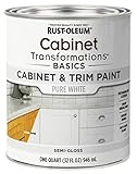
- CABINET TRANSFORMATION: Refresh outdated cabinets, vanities, furniture and trim with rich Pure White color and a smooth semi-gloss finish
- DURABLE PERFORMANCE: Easy-to-clean finish resists dirt and grime while standing up to household chemicals
- SMOOTH APPLICATION: Outstanding flow and leveling help create a beautiful finish with brush, roller, pad applicator or airless sprayer
- FAST PROJECT COMPLETION: Dries to touch in 30 minutes, recoats in 2 hours and is ready for normal use after 24 hours
- INTERIOR CABINET COATING: Ideal for kitchens, bathrooms, laundry rooms and other interior cabinet and trim applications
Lay out every fixed sample together
Place a cabinet door or painted board beside the actual worktop, backsplash tile, floor, antique furniture and hardware. Stone and timber undertones can pull an entire scheme warm or cool, so a colour that looked neutral on a card may turn pink beside red-brown wood or blue beside grey stone. Include appliances if their fronts are prominent; stainless steel, enamel and dark finishes each alter the perceived contrast.
Read the room’s natural light
North-facing light tends to cool whites and greys, while strong southern exposure intensifies warm hues. A warm LED can soften a colour; a cooler LED can reveal blue or grey undertones that were barely visible in daylight. The same green may look smoky at breakfast, vivid in afternoon sun and almost black under evening pendants. Light is part of the colour decision, not a final decoration.
Alissa Pulcrano, founder and principal designer of Bright Designlab, describes this starting point as looking at the home’s “soul” before considering a paint chip. That principle is especially useful when a kitchen shares sightlines with rooms containing old timber, plasterwork or patterned rugs.
Do these 3 things before closing this tab:
1Repair Windows errors before they cause bigger problems2Scan for outdated or missing drivers - takes under a minute3Clear out junk files and repair common Windows errorsHow bold can a period kitchen be?
Bold does not have to mean high-saturation primary colour. Complex, slightly muted pigments usually sit more comfortably with aged wood, stone and brass than a flat, electric accent. Match the colour’s depth and saturation to the architecture as well as to the furniture.
| House period or influence | Cabinet directions | How to keep the result coherent |
|---|---|---|
| Victorian | Deep bottle or forest green, navy, burgundy, maroon, muted terracotta, warm cream and rich blue | Use substantial colour confidently, then temper it with aged brass or bronze, natural stone and traditionally scaled details. |
| Georgian | Stone, putty, warm grey, muted blue, cream, taupe and dark sage | Let symmetry, restrained mouldings and orderly hardware carry the form; avoid several unrelated accent colours. |
| Edwardian | Sage, duck-egg or soft blue, cream, warm off-white and soft charcoal | Keep the effect light and calm with natural materials, simple Shaker lines or glazed doors. |
| Art Nouveau influence | Mossy green, lilac-grey and dusty rose | Echo the period through curved, botanical or nature-inspired details rather than adding many colours. |
| Art Deco influence | Black and cream, deep teal, rich woods and brass | Use matt or low-sheen surfaces so strong geometry and metal accents do not become excessively glossy. |
These are directions rather than mandatory historical palettes. A listed building may contain several layers of alteration, and a modern extension can justify a contemporary interpretation. The room’s surviving details and the adjacent rooms should decide how literally you follow a period scheme.
Which bold cabinet colours work best with antique furniture?
Deep green
Forest, bottle, olive and moss greens bridge the gap between foliage, aged timber and oxidised metal. A blue-leaning green can cool orange pine; an olive or yellow-leaning green can sit comfortably with walnut and warm limestone. Pair deep green with pale or honed stone, oak, handmade tile and antique bronze. If the room is small or dim, reserve the deepest value for an island or lower run and use a lighter related tone above.
Navy and deep blue
Navy gives dark wood a crisp counterpoint without the starkness of pure black. It works with pale stone, marble, oak and both polished and aged metal. Look closely at the blue’s undertone: a purplish navy can fight red-brown furniture, while a greenish or smoky navy often feels more settled. In a kitchen with limited daylight, a slightly softened navy is generally easier to live with than an ink colour at every level.
Also popular on Amazon

- Includes 30 featured and newest released color card. Sprayed on color to see our colors in your homes lighting for more accurate color choices.
- ALL-IN-ONE Paint - NO Sanding, NO Priming, NO Top Coat Required, Low Luster, Velvet Sheen Finish
- Interior/Exterior - Paint your whole house - Ideal for hard surfaces including walls, doors, cabinets, counters, furniture, metal, glass, ceramics and floor and wall tile
- Durable yet stretches to paint smooth fabrics, vinyl and leather
- Results cannot be guaranteed. Digital screens may not show color accurately. Product search "ALL-IN-ONE PAINT by Heirloom Traditions, Color Confidence Card", for an accurate color choice.
Burgundy, maroon and muted terracotta
Red-based colours can make a Victorian kitchen feel enveloping and connect to mahogany, brick, rugs and copper. They are less forgiving of orange timber, so test them beside the furniture rather than relying on a printed swatch. Muted terracotta is a gentler route to warmth; combine it with warm cream, aged brass and pale stone so the cabinetry does not become a single heavy block.
Charcoal and warm brown
Charcoal can modernise antiques while preserving a low-contrast, architectural mood. Choose a charcoal with a discernible brown, green or blue bias that repeats somewhere else in the room. Mushroom, putty and warm brown are softer alternatives when black-grey would swallow the furniture. Mushroom with travertine and walnut is particularly effective because the tonal relationship is close but the textures differ.
Teal and softened blue-green
Teal has enough complexity to feel intentional beside old wood, but its saturation must be controlled. Use a dusty or mineral teal with cream, pale stone and brushed brass; highly saturated turquoise can make antique furniture look disconnected. A blue-green on an island with quieter perimeter cabinets supplies personality without turning every wall into a focal point.
How do you build a supporting palette without making the kitchen look mismatched?
Christine Markatos Lowe, principal of Christine Markatos Design, recommends beginning with a dominant colour that is timeless, soft and responsive to natural light, then layering complementary tones for depth and warmth. In practice, cabinetry is normally the dominant visual area, so decide it first and limit everything else.
Use a three-part hierarchy
- Dominant: the main cabinet colour, usually covering the largest surface.
- Supporting: one wall, secondary-cabinet or architectural tone that relates to the dominant colour.
- Accent: one metal, textile or furniture note repeated in several small locations.
A pale stone worktop can connect navy to antique wood; warm white can connect oak to aged brass; sage can connect marble to bronze. Keep the supporting colours related in temperature even when their values differ. Texture should provide variety so you do not need additional hues: grainy oak, honed stone, handmade tile and brushed metal create movement within a restrained palette.
Repeat, but do not copy
Repeat the cabinet colour or its undertone in a runner, window treatment, artwork or adjoining room, using a different material or value. Repeating a colour in exactly the same paint finish on every surface makes the scheme feel staged. An aged metal can bridge two unrelated woods more effectively than another painted accent.
Where should you place the strongest contrast?
Concentrate contrast where it can anchor the composition. A darker island, pantry wall or lower run allows upper cabinets to remain calmer and keeps the eye from jumping between many isolated dark and light patches.
Also popular on Amazon

- Ultra-White Brilliance: Experience the transformative power of Titanium Infusion, an ultra-white hue inspired by the artist’s palette – perfect for a modern, timeless look.
- One-Day Transformation: Redefine your kitchen cabinets in a single day with our brush-and-roll application - no professional help needed.
- All-Inclusive Kit: Each package covers 100 square feet, ideal for the typical kitchen, and includes all the necessary tools for a flawless finish.
- Eco-Friendly & Safe: Enjoy the peace of mind with our low-VOC, water-based formula, ensuring a safer painting experience.
- Effortless Transformation: No stripping or priming required; our paint adheres beautifully to wood, laminate, and metal cabinets with minimal preparation.
In a compact kitchen, several sharp changes can make the room feel tighter. Gentler two-tone relationships are easier to read: sage with warm white, deep blue with pale stone, or mushroom with walnut. Keep tall cabinets and large appliance panels from becoming an accidental third block unless that hierarchy is deliberate.
What’s actually slowing this PC down?
Pick the symptom - the matching free tool is one click away.
Island as a controlled experiment
An island is a useful place for a bolder colour because it can be visually separated from the wall run. Check its colour against the floor from standing height and from the adjoining rooms; an island seen through a doorway needs to relate to those spaces as well as to the kitchen.
Lower cabinets as a visual foundation
A dark lower run grounds a room while pale uppers preserve reflected light. Use the same worktop or backsplash across both levels where possible so the two colours read as one composition rather than separate furniture sets.
How do sheen and surrounding materials change a bold colour?
Finish can alter perceived intensity as much as pigment. Matte doors scatter light and soften a deep colour; polished surfaces increase reflection and make saturation feel stronger. If the cabinet colour already has considerable depth, a matt or eggshell finish is usually easier to integrate with old furniture than a high gloss.
- Honed stone: quieter and less reflective than polished marble, so it supports stronger cabinetry without competing highlights.
- Handmade tile: small variations and edge shadows add age and depth around a single cabinet colour.
- Oak or walnut: visible grain supplies warmth and prevents a painted scheme from feeling flat.
- Aged brass or antique bronze: warmer and less stark than shiny chrome, linking new hardware to old furniture.
- Brushed finishes: disguise fingerprints and soften reflections around dark paint.
The aim is tactile variation, not a room in which every surface looks distressed. One polished element can provide a deliberate highlight, but several glossy surfaces may push a period kitchen toward a showroom effect.
PC Slower Than It Used to Be?
A free scan shows the junk files, broken settings and background clutter dragging Windows down - then fixes them in one click.Free scan · Windows 10 & 11Outdated Drivers Are Slowing You Down
One free scan finds every outdated or missing driver and matches the right update for your exact hardware.Free scan · exact hardware matchHow should you test paint or cabinet samples?
Never approve a bold colour from a small horizontal card. Use a large board or door sample and inspect it in the finished room.
- Prepare the sample: apply the proposed sheen and number of coats to a board large enough to read at a distance.
- Hold it vertically: position it as the cabinet will stand, because vertical surfaces receive light differently from a flat card.
- Place it beside real materials: include the worktop, backsplash, floor, antique furniture and hardware, not substitute photographs.
- Move it around: check the main run, island, shadowed corner and sightline into adjacent rooms.
- Check three daylight periods: compare morning, afternoon and evening, recording whether the colour shifts warmer, cooler, brighter or darker.
- Turn on the actual lighting: use under-cabinet strips and pendants at their normal settings; warm and cool LEDs can expose very different undertones.
- Live with the board: leave it in place through several weather conditions before ordering doors or committing to a full repaint.
Sample cards can hide the influence of nearby surfaces. A vertical board reveals whether the colour has enough depth in shadow and whether it becomes too vivid when direct sun reaches it.
Also popular on Amazon
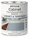
- CABINET TRANSFORMATION: Refresh outdated cabinets, vanities, furniture and trim with rich Cadet Gray color and a smooth semi-gloss finish
- DURABLE PERFORMANCE: Easy-to-clean finish resists dirt and grime while standing up to household chemicals
- SMOOTH APPLICATION: Outstanding flow and leveling help create a beautiful finish with brush, roller, pad applicator or airless sprayer
- FAST PROJECT COMPLETION: Dries to touch in 30 minutes, recoats in 2 hours and is ready for normal use after 24 hours
- INTERIOR CABINET COATING: Ideal for kitchens, bathrooms, laundry rooms and other interior cabinet and trim applications
Which combinations are dependable starting points?
| Dominant cabinets | Supporting materials | Best use |
|---|---|---|
| Sage green | Marble or pale stone, oak, antique bronze | Balances warm timber while retaining a light, classic feel. |
| Navy | Pale stone, oak, polished or aged metal | Creates crisp contrast with dark antiques without using black. |
| Warm white | Oak, aged brass, handmade tile | Brightens a room where the furniture supplies most of the colour. |
| Mushroom | Travertine, walnut, brushed metal | Offers a cocooning, low-contrast scheme with layered texture. |
| Deep teal | Cream, rich wood, brass | Adds character when softened by matte surfaces and quiet stone. |
Use these as relationships, not formulas. The same navy may need a warmer stone in a north-facing room and a cooler stone in intense southern light.
How can you avoid the most common colour mistakes?
The cabinet matches the antique wood too closely
When paint and timber share nearly the same value and undertone, their edges disappear and the room can look muddy. Shift the cabinet hue cooler, lighter or deeper while keeping a small accessory or metal finish to connect the two.
Recommended Free Tools
The bold colour is too saturated
A bright, clean pigment can make aged surfaces appear dull by comparison. Choose a complex, greyed or earth-modified version of the hue, then introduce stronger colour in a small element if more energy is needed.
Dark cabinets absorb the room
Check the sample in the darkest corner and under evening lighting. If the furniture loses definition, keep the dark colour to lowers or an island, increase reflected light with pale stone or warm white uppers, and use a lighter floor treatment where practical.
Every period detail is competing
Ornate mouldings, patterned tile, dramatic hardware and a strong cabinet colour can each demand attention. Keep one or two details quiet; simple knobs or cup pulls may let the furniture and paint carry the character.
The scheme works only in daylight
LED temperature and under-cabinet placement can reveal an unwanted blue, green or pink cast. Test the actual bulbs and dimmer settings before finalising the colour, not after installation.
Quick wins for a faster PC:
Clear out junk files and repair common Windows errorsFree Scan →Fix the driver behind crashes, sound loss and screen glitchesFind Drivers →How do period details influence the final cabinet style?
Colour and door design should support each other. Victorian rooms can carry richer paint with framed doors, substantial rails and aged metal. Georgian interiors benefit from symmetry, measured panel proportions and restrained hardware, allowing muted colour to do the work. Edwardian kitchens often suit simpler Shaker or glazed cabinetry, where sage, cream or soft blue remains airy.
Also popular on Amazon

- Includes 30 featured and newest released color card. Sprayed on color to see our colors in your homes lighting for more accurate color choices.
- ALL-IN-ONE Paint - NO Sanding, NO Priming, NO Top Coat Required, Low Luster, Velvet Sheen Finish
- Interior/Exterior - Paint your whole house - Ideal for hard surfaces including walls, doors, cabinets, counters, furniture, metal, glass, ceramics and floor and wall tile
- Durable yet stretches to paint smooth fabrics, vinyl and leather
- Results cannot be guaranteed. Digital screens may not show color accurately. Product search "ALL-IN-ONE PAINT by Heirloom Traditions, Color Confidence Card", for an accurate color choice.
If the room has Art Nouveau influence, curved or botanical details can carry mossy green, lilac-grey or dusty rose more convincingly than a purely rectangular treatment. In an Art Deco-influenced space, black and cream, deep teal, rich wood and brass gain clarity from clean geometry and matte surfaces.
Hubert Sobulski, a London designer at Harvey Jones, advises incorporating finishes that match the rest of the house for longevity. That does not mean reproducing every old detail; it means selecting cabinet hardware, timber, stone and sheen that do not stop abruptly at the kitchen doorway.
What is the final decision checklist?
- Have you identified whether the principal antique wood reads warm, cool, red, orange, yellow, neutral or grey?
- Does the cabinet colour relate to the worktop, backsplash, floor and appliances without becoming an exact match?
- Is one colour clearly dominant, with only a small number of supporting tones?
- Is the depth and saturation appropriate to the house period and the room’s daylight?
- Would concentrating contrast on an island or lower run improve the composition?
- Do stone, tile, timber and metal provide enough tactile variation without introducing visual clutter?
- Have you checked a vertical sample in morning, afternoon and artificial light?
- Does the kitchen still relate to adjoining rooms and the antique furniture when viewed from a doorway?
Georgian practical colours were historically valued partly because muted browns and neutrals concealed dirt and damage, as creative director Ruth Mottershead has noted. Modern kitchens still benefit from that logic: a colour that accommodates daily wear and changing light is more durable visually than one chosen only for its first photograph.
The Tool Desk
Outbyte Driver Updater FREEScan for outdated or missing drivers - takes under a minuteDriver Scan →Outbyte PC Repair FREEClear out junk files and repair common Windows errorsFree Scan →Frequently Asked Questions
Should kitchen cabinets match antique furniture exactly?
No. A near-identical match can erase the distinction between painted cabinetry and real timber. Match an undertone, value or metal detail instead, then create enough contrast for the furniture to remain legible.
Can I use two different antique woods in the same kitchen?
Yes, provided one wood is clearly dominant and the cabinet colour acts as a mediator. Use a shared undertone, consistent sheen or repeated hardware finish to stop walnut, oak or pine from reading as unrelated samples.
Are dark cabinet colours practical for a busy family kitchen?
Practicality depends more on finish, lighting and maintenance than on darkness alone. Matt or brushed surfaces are generally more forgiving of reflections and fingerprints, while a sample board lets you judge whether marks will show under your actual LEDs.
How should a kitchen in a listed or protected historic building be handled?
Check local conservation requirements before altering joinery, openings, extraction or plumbing. A colour change may be straightforward, but structural work, replacement windows or visible external equipment can require separate consent and a designer familiar with the building’s restrictions.
Quick Recap

Product prices and availability are accurate as of the date/time indicated and are subject to change. Any price and availability information displayed on Amazon at the time of purchase will apply.

