Quick wins for a faster PC:
Do these 3 things before closing this tab:
1Clear out junk files and repair common Windows errors2Scan for outdated or missing drivers - takes under a minute3Repair Windows errors before they cause bigger problemsFix the driver behind crashes, sound loss and screen glitchesFind Drivers →Repair Windows errors before they cause bigger problemsFix Now →Scan for outdated or missing drivers - takes under a minuteDriver Scan →
ThatPainter is reader-supported. When you buy through links on our site, we may earn an affiliate commission. Learn More
Start with the stone’s background undertone, not a paint-name trend. Warm stone with cream, beige, tan, rust, or golden-brown notes usually works with warm white, cream, taupe, greige, muted olive, or natural wood. Blue-gray, slate, or silvery stone usually works with soft gray, blue-green, navy, charcoal, or a clean—but not icy—white. Then set the contrast you want, account for daylight and bulbs, and test large samples vertically in the actual kitchen before buying paint. These are reliable starting families rather than guarantees: the stone, surrounding finishes, and light in your room determine the final result.
Cabinets do not need to match a stone wall exactly. They need a deliberate relationship with it, the countertop, flooring, appliances, backsplash, hardware, and any wood that will remain. The method below helps you choose a color that looks balanced at breakfast, under evening lights, and after the novelty of a new finish wears off.
As an Amazon Associate I earn from qualifying purchases.
What’s actually slowing this PC down?
Pick the symptom - the matching free tool is one click away.
What should you look at first when choosing cabinet color for a stone wall?
Look at the stone’s overall background temperature and value before choosing a paint chip. Natural stone often contains several colors, but its background usually reads as predominantly warm or cool. That background should guide the cabinet family; a smaller vein or fleck can then supply an accent.
Inventory every fixed finish
Write down the stone wall, floor, countertop, appliances, backsplash, hardware, window trim, and wood elements that will stay. Behr’s color guidance emphasizes coordinating cabinets with these permanent surfaces instead of selecting a color from a trend board alone. A cabinet that looks attractive by itself can clash with a countertop undertone or make an existing floor look unexpectedly orange.
Popular on Amazon
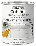
- CABINET TRANSFORMATION: Refresh outdated cabinets, vanities, furniture and trim with rich Pure White color and a smooth semi-gloss finish
- DURABLE PERFORMANCE: Easy-to-clean finish resists dirt and grime while standing up to household chemicals
- SMOOTH APPLICATION: Outstanding flow and leveling help create a beautiful finish with brush, roller, pad applicator or airless sprayer
- FAST PROJECT COMPLETION: Dries to touch in 30 minutes, recoats in 2 hours and is ready for normal use after 24 hours
- INTERIOR CABINET COATING: Ideal for kitchens, bathrooms, laundry rooms and other interior cabinet and trim applications
Judge the background, not the loudest vein
Step back far enough that individual mineral lines blur. Cream, sand, tan, rust, and golden-brown backgrounds are warm. Blue-gray, slate, and silvery backgrounds are cool. If the stone is strongly mixed, identify the color that occupies the most visual area and use a secondary color only as a controlled accent.
Use undertone language accurately
Sherwin-Williams describes warm undertones as tending toward red, yellow, or orange, and cool undertones as tending toward blue, green, or purple. Two paints can both be called white or gray while having very different undertones. Compare them directly beside the stone rather than trusting the name on the label.
How should cabinet contrast relate to a textured stone wall?
Choose low, medium, or high contrast intentionally. Low contrast makes the wall and cabinets read as one quiet composition; medium contrast gives the cabinetry definition; high contrast makes the cabinet run graphic and prominent.
Low contrast for a calm, blended room
A cabinet color close to the stone’s lightness creates continuity. Warm white beside pale limestone, or greige beside beige-gray ledgestone, can make a small kitchen feel less chopped up. Low contrast is especially useful when the stone already has heavy joints, irregular edges, or many colors.
Medium contrast for definition without competition
Move the cabinets a few value steps lighter or darker than the wall while keeping a compatible undertone. This is often the most forgiving choice: doors remain readable, yet the stone retains visual importance. Taupe against light beige stone and soft gray against mid-tone slate are typical medium-contrast relationships.
High contrast when cabinetry is meant to lead
Deep navy, charcoal, or blue-gray against pale stone creates a deliberate focal point. High contrast can look sophisticated, but it also makes door alignment, hardware, and paint defects more noticeable. Keep at least one other major surface light when daylight is limited, and avoid adding another busy pattern.
Do these 3 things before closing this tab:
1Fix the driver behind crashes, sound loss and screen glitches2Repair Windows errors before they cause bigger problems3Scan for outdated or missing drivers - takes under a minuteAlso popular on Amazon

- Includes 30 featured and newest released color card. Sprayed on color to see our colors in your homes lighting for more accurate color choices.
- ALL-IN-ONE Paint - NO Sanding, NO Priming, NO Top Coat Required, Low Luster, Velvet Sheen Finish
- Interior/Exterior - Paint your whole house - Ideal for hard surfaces including walls, doors, cabinets, counters, furniture, metal, glass, ceramics and floor and wall tile
- Durable yet stretches to paint smooth fabrics, vinyl and leather
- Results cannot be guaranteed. Digital screens may not show color accurately. Product search "ALL-IN-ONE PAINT by Heirloom Traditions, Color Confidence Card", for an accurate color choice.
Let the busiest surface be the star
If the wall has dramatic movement or rough texture, use calmer door profiles and a restrained cabinet color. Michelle Lisac, quoted by Homes & Gardens, summarizes the choice this way: “You can complement the stone’s colors by accenting with the paint color(s) or let the stone be the star of the kitchen by pairing it with wood cabinetry.” Wood adds texture without introducing another strong painted hue.
Which cabinet colors work with warm or cool stone?
The table gives starting points, not automatic prescriptions. Always test the actual paint beside the actual stone because the same color can shift substantially with neighboring surfaces and light.
| Cabinet color family | Best starting use | Contrast and focal effect | What to check before committing |
|---|---|---|---|
| Warm white or cream | Warm limestone, beige fieldstone, tan or golden stone | Low to medium contrast; supports traditional or farmhouse rooms | A yellow undertone can look stronger next to gray stone; compare with a neutral white sample |
| Greige or taupe | Mixed beige-and-gray stone or rooms needing a restrained neutral | Usually low to medium contrast; bridges competing undertones | Confirm it does not turn pink, purple, or muddy beside the countertop |
| Muted sage or olive | Stone with quiet green or moss notes and earthy surroundings | Medium contrast; introduces color without fighting texture | Keep saturation controlled when the wall is highly patterned |
| Soft gray | Cool gray, slate, or silvery stone | Low to medium contrast; creates a tailored, quiet scheme | Check that blue or violet undertones do not make warm flooring look orange |
| Navy, charcoal, or deep blue-gray | Pale stone when you want cabinetry to be the graphic focal point | High contrast; visually heavier and more formal | Evaluate daylight, task lighting, and whether another major surface stays light |
| Natural wood | Busy, multicolor, or strongly textured stone | Low color contrast while adding material contrast | Coordinate the wood’s red, yellow, or brown cast with floors and trim |
What cabinet color works with specific stone backgrounds?
Use these combinations as a way to narrow the sample board. The stone’s actual background still outranks its category name.
Cream, beige, or tan stone
Begin with warm white, cream, taupe, or a softly muted greige. Warm white keeps the room light while echoing the stone; taupe creates a more enveloping, low-contrast effect. If the stone has olive or moss flecks, a muted sage can pick them up without making the room look themed.
Recommended Free Tools
Rust, terracotta, or golden-brown stone
Natural wood, cream, warm white, and olive are safer starting families than icy gray. A clean neutral can work only if it does not expose a blue cast against the warm masonry. Sample the cabinet next to both the stone and the floor, because a warm floor can intensify yellow or orange in the paint.
Blue-gray or slate stone
Soft gray, blue-green, navy, charcoal, and balanced white are useful candidates. A white with a strong yellow cast may look dated beside slate, while an excessively cool white can make the room feel stark. Medium gray cabinets often provide definition without the visual weight of near-black.
Also popular on Amazon

- Ultra-White Brilliance: Experience the transformative power of Titanium Infusion, an ultra-white hue inspired by the artist’s palette – perfect for a modern, timeless look.
- One-Day Transformation: Redefine your kitchen cabinets in a single day with our brush-and-roll application - no professional help needed.
- All-Inclusive Kit: Each package covers 100 square feet, ideal for the typical kitchen, and includes all the necessary tools for a flawless finish.
- Eco-Friendly & Safe: Enjoy the peace of mind with our low-VOC, water-based formula, ensuring a safer painting experience.
- Effortless Transformation: No stripping or priming required; our paint adheres beautifully to wood, laminate, and metal cabinets with minimal preparation.
Highly varied or multicolor stone
Choose one quiet color from the stone’s background or use natural wood so the wall remains the focal point. Avoid matching a minor vein exactly; that can make the room look accidental when the vein is seen from another angle.
How do daylight, bulbs, and LRV change the result?
Light can make the same cabinet color appear warmer, cooler, lighter, or darker at different times of day. North-facing rooms receive cooler daylight, so warmer undertones and higher-light-reflectance colors are generally more forgiving. South-facing rooms receive warmer light and tolerate a broader range, including cooler neutrals.
Free tools Windows power users keep installed
One-click scans. No signup required.
Use LRV as a practical guide
Light reflectance value (LRV) runs from 0 to 100. Higher LRV colors reflect more light and generally read lighter; this is useful in dim kitchens or rooms with limited northern daylight. Sherwin-Williams presents approximately 50–60 as a broadly usable neutral zone for brightening rooms while cautioning that extremely bright white can feel sterile. LRV is a comparison tool, not a substitute for an in-room sample.
Account for artificial lighting
Warm bulbs can push a neutral toward cream or beige; cooler bulbs can make the same paint look grayer or bluer. Turn on the kitchen’s actual under-cabinet, ceiling, and pendant lights while evaluating samples. If you plan to change bulbs, test the intended color temperature before finalizing paint.
Why a white sample can surprise you
Sue Wadden, Sherwin-Williams’ director of color marketing, explains: “If you’re just looking at a white by itself, it will probably just look white, but put it next to a pure white and you’ll see how it differs.” Place candidate whites beside a truly neutral reference and the stone; the undertone becomes easier to see.
How do you test cabinet colors in the kitchen?
Paint cards taped to a wall are too small and too flat to predict a full cabinet run. Use large samples, keep them vertical, and observe them over a full day.
Also popular on Amazon
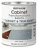
- CABINET TRANSFORMATION: Refresh outdated cabinets, vanities, furniture and trim with rich Cadet Gray color and a smooth semi-gloss finish
- DURABLE PERFORMANCE: Easy-to-clean finish resists dirt and grime while standing up to household chemicals
- SMOOTH APPLICATION: Outstanding flow and leveling help create a beautiful finish with brush, roller, pad applicator or airless sprayer
- FAST PROJECT COMPLETION: Dries to touch in 30 minutes, recoats in 2 hours and is ready for normal use after 24 hours
- INTERIOR CABINET COATING: Ideal for kitchens, bathrooms, laundry rooms and other interior cabinet and trim applications
- Make a short list. Select two or three colors from the same temperature family and, if useful, one deliberate contrast option. Include the stone’s background color in your notes.
- Use large sample boards. Apply the paint to large boards or use large cabinet color samples. A larger field reveals undertones and value shifts that disappear on a small chip.
- Place samples vertically. Set each board beside the stone, countertop, floor, backsplash, and hardware. A horizontal sample receives light differently and can mislead you.
- View morning, afternoon, and evening. Record what happens in direct sun, indirect daylight, and the kitchen’s actual bulbs. North-facing and shaded areas deserve extra attention because they can mute or cool a color.
- Move the boards around. Check the color near a window, in a corner, beside a tall appliance, and under upper cabinets. A paint that succeeds in one location may read too dark in a shadowed run.
- Live with the finalists. Leave the boards in place for several days and view them from the room’s normal sight lines. Sherwin-Williams and Behr both recommend in-room sample testing before commitment.
- Confirm the surrounding materials. Put the sample beside the exact hardware and any wood trim that will remain. Do not approve a color based only on its relationship with the stone.
Should kitchen cabinets match the stone wall or backsplash?
No. Cabinets should coordinate with the stone, not duplicate it. Exact matching is difficult with natural material and can produce a flat or overly themed room; a related undertone, a controlled value difference, or a quiet wood finish usually creates a more durable composition.
When a near-match helps
A close value and undertone can calm a small kitchen or visually connect separate walls. Use this approach when the stone has moderate texture and you want the architecture to recede.
When a contrast is better
If the wall disappears into the cabinetry, move the cabinets lighter or darker while retaining temperature compatibility. Contrast is also useful when you need the cabinet layout and hardware to read clearly.
How to coordinate a backsplash
With a busy stone wall, choose a backsplash that repeats one quiet color or stays simple. Introducing a second, equally active pattern competes with both the wall and the cabinet color.
What coating and sheen should you use on painted cabinets?
Use a product formulated for cabinets, doors, and trim rather than assuming any wall paint will withstand daily handling. Behr lists PREMIUM Cabinet, Door & Trim Enamel for these surfaces. Before purchase, verify the product’s preparation requirements, adhesion guidance, recoat time, and available sheen.
Preparation determines the finish
Clean away grease, dull glossy areas as directed, repair dents, and remove dust before priming or painting. Follow the coating manufacturer’s instructions for existing finish, bare wood, laminate, and previously painted surfaces; adhesion problems often come from skipping preparation rather than choosing the wrong color.
Also popular on Amazon

- Includes 30 featured and newest released color card. Sprayed on color to see our colors in your homes lighting for more accurate color choices.
- ALL-IN-ONE Paint - NO Sanding, NO Priming, NO Top Coat Required, Low Luster, Velvet Sheen Finish
- Interior/Exterior - Paint your whole house - Ideal for hard surfaces including walls, doors, cabinets, counters, furniture, metal, glass, ceramics and floor and wall tile
- Durable yet stretches to paint smooth fabrics, vinyl and leather
- Results cannot be guaranteed. Digital screens may not show color accurately. Product search "ALL-IN-ONE PAINT by Heirloom Traditions, Color Confidence Card", for an accurate color choice.
Choose sheen with the room’s texture in mind
A higher sheen reflects more light and makes doors easier to wipe, but it can emphasize dents, brush marks, and uneven stone reflections. A lower or mid sheen can look quieter beside rough masonry. Confirm the exact sheen on a sample door because labels and product lines vary.
Check color and coating together
Sheen changes perceived depth and brightness. Approve a painted sample in the intended sheen, not only a flat color chip, and inspect it beside the stone under both daylight and artificial light.
What mistakes make cabinet colors look wrong with stone?
- Choosing by paint name alone: Names such as white, gray, or taupe conceal undertones. Compare the actual color to the stone and a neutral reference.
- Matching a minor vein: A small mineral line may not represent the wall’s overall temperature. Match the background first.
- Ignoring the floor: Warm flooring can make a neutral cabinet look cooler or more blue; cool flooring can exaggerate yellow.
- Using tiny samples: Small chips hide shifts that become obvious across a full door run. Use large vertical boards.
- Testing in only one light: A color approved at noon may look different under evening LEDs. Check all normal lighting conditions.
- Adding too much contrast to a busy wall: Dark cabinets plus dramatic stone and patterned counters can create visual noise. Let one surface lead.
- Assuming bright white always opens the room: Extremely bright white can feel sterile, while a slightly softened white may provide light without glare.
- Painting before confirming adhesion: Cabinets require compatible preparation and coating. Test a hidden area or sample door when the existing finish is uncertain.
What is a practical final decision framework?
Use the following sequence to move from dozens of paint chips to one defensible choice.
- Temperature: Is the stone predominantly warm, cool, or genuinely mixed?
- Fixed-finish check: Which cabinet candidates work with the countertop, floor, appliances, backsplash, hardware, and wood trim?
- Contrast goal: Do you want the room blended, defined, or graphic?
- Focal point: Should the stone remain the star, or should the cabinetry lead?
- Texture and pattern: Will the cabinet color and door detail calm the wall or compete with it?
- Light and LRV: Does the color retain the intended value from morning through evening and under the actual bulbs?
- Coating reality: Does the cabinet enamel, sheen, and preparation plan suit the existing doors and expected wear?
- Sample approval: Have you viewed a large vertical sample beside every fixed finish before ordering paint?
These recommendations are design guidance rather than the result of an independent performance study or consumer survey specific to stone-walled kitchens. Physical samples in your own room remain the most reliable way to validate the choice.
Frequently Asked Questions
Can I use the same cabinet color on an island and perimeter cabinets with a stone wall?
Yes, but the island can carry a darker or more saturated version if the perimeter remains quiet. Test both colors together with the stone so the island reads as an intentional focal point rather than a disconnected accent.
How many cabinet color samples should I test at once?
Three or four large boards are usually enough for a useful comparison: two compatible undertones, one lighter or darker value, and one contrast candidate if desired. Too many samples make subtle differences harder to judge.
Outdated Drivers Are Slowing You Down
One free scan finds every outdated or missing driver and matches the right update for your exact hardware.Free scan · exact hardware matchWindows Errors? Fix Them Before They Spread
Repair common Windows errors and clear accumulated junk for a smoother, more stable PC - no reinstall needed.Free scan · no reinstallShould cabinet hardware be selected before or after the paint color?
Choose the paint family first, then evaluate hardware against the painted sample and stone. Metal temperature and reflectivity can expose undertones that are difficult to see on a color chip.
Is natural wood safer than painted cabinets beside highly patterned stone?
Often, because wood adds material texture without introducing another strong color. It is not automatically neutral, however; compare the wood’s red, yellow, or brown cast with the stone, floor, and trim.
Quick Recap

Product prices and availability are accurate as of the date/time indicated and are subject to change. Any price and availability information displayed on Amazon at the time of purchase will apply.

