Quick wins for a faster PC:
Repair Windows errors before they cause bigger problemsFix Now →Fix the driver behind crashes, sound loss and screen glitchesFind Drivers →
ThatPainter is reader-supported. When you buy through links on our site, we may earn an affiliate commission. Learn More
For a north-facing or dim room, begin with a light-to-medium warm gray, greige, beige-gray, or taupe-gray and screen samples at an LRV of about 60 or higher. Cool daylight from a north-facing window can make blue-gray look icy, while a low-LRV charcoal can absorb the little light available. The right choice still depends on your trim, floor, cabinets, furnishings, and evening bulbs, so judge large physical samples on the actual wall from morning through night before buying a full tin.
What gray paint is best for a north-facing room?
A warm neutral gray is the safest starting point. Look for beige, taupe, or greige undertones rather than an obvious blue or violet cast, and favor a relatively high light-reflectance value (LRV). Sherwin-Williams advises using warm neutrals and looking for LRV 60 or higher because north-facing rooms receive the least daylight and that daylight is cool and diffuse.
As an Amazon Associate I earn from qualifying purchases.
Free tools Windows power users keep installed
One-click scans. No signup required.
This is a screening method, not a guaranteed color match. A warm gray that appears balanced beside your oak floor may look pink beside a red-toned rug; the same paint can read cooler under bright, high-Kelvin LEDs. Treat the following colors as sample candidates, then let the room decide.
Start with warm gray, greige, or taupe-gray
Warm gray contains a small amount of beige, brown, or taupe. Those undertones counter the blue cast that cool northern light can add. Greige sits between gray and beige and is often easier to live with when a room has wood, cream upholstery, stone, or warm-white trim.
Popular on Amazon
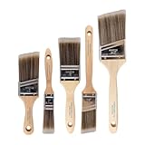
- COMPLETE 5-PIECE BRUSH SET FOR EVERY PAINTING TASK — Includes 1 Inch Flat, 1.5 Inch Angle, 2 Inch Flat, 2 Inch Angle Stubby, and 2.5 Inch Angle brush giving you every size professional painters use daily. Get all 5 for less than the price of a single brush from hardware store brands — professional grade performance at a fraction of the cost. Perfect for walls, trim, cabinets, doors, furniture, and detailed cutting-in work on any project.
- ZERO BRISTLE LOSS — GUARANTEED BY PRECISION ADHESIVE BONDING — Every bristle is locked in place with precision-set adhesive that keeps them in the brush — not in your paint job. The coated steel ferrule provides structural support while the adhesive bond ensures clean performance on every stroke. Premium SRT synthetic filaments load more paint and release it evenly for a smooth streak-free finish on walls, ceilings, and trim. Works with latex, oil-based paint, primer, sealer, and wood stain.
- INCLUDES THE ANGLE STUBBY MOST SETS LEAVE OUT — Professional painters know the 2 Inch Angle Stubby is the go-to brush for tight cabinet interiors, window sashes, inside corners, and detailed trim where standard angle brushes are too long. Combined with the 1.5 and 2.5 inch angle sash brushes you have precision cutting-in covered at every scale — baseboards, crown molding, door casings, and ceiling lines.
- FLAT BRUSHES FOR BROAD SMOOTH COVERAGE ON ANY SURFACE — The 1 and 2 inch flat brushes deliver even coverage on walls, furniture, shelving, doors, fences, decks, and wood surfaces. Ideal for applying primers, stains, varnishes, polyurethane, and specialty coatings. Solid wood handles provide all-day comfort and control for both professional contractors and weekend DIY homeowners tackling interior or exterior painting projects.
- TRUSTED BY PROFESSIONAL PAINTERS AND CONTRACTORS NATIONWIDE — Pro Grade delivers professional-grade results at a price that makes sense for crews who go through brushes on every job. Ideal for property managers, remodeling contractors, apartment turnover crews, maintenance teams, and commercial painting operations. Backed by thousands of verified reviews from working painters. Washable and reusable for multiple projects.
Use cool gray only for a deliberate effect
A blue- or violet-based gray can create a crisp, contemporary appearance when the room has strong artificial illumination, bright white finishes, and a deliberate cool palette. In a genuinely dark room, however, it is more likely to look cold, flat, or slightly blue. If you want that effect, compare the sample under both daylight and the installed lamps rather than relying on a color card.
Why does north-facing light change gray paint?
North-facing windows generally provide steady, indirect light with little direct sun. Sherwin-Williams describes them as receiving the least amount of light during the day and having cool lighting. Cool light emphasizes blue and violet components in a mixture, so a neutral gray can appear bluer than it did in a showroom or south-facing room.
Windows Errors? Fix Them Before They Spread
Repair common Windows errors and clear accumulated junk for a smoother, more stable PC - no reinstall needed.Free scan · no reinstallOutdated Drivers Are Slowing You Down
One free scan finds every outdated or missing driver and matches the right update for your exact hardware.Free scan · exact hardware matchLow daylight also reduces the visual separation between light and shadow. A dark neutral therefore loses some of its color clarity and can make walls feel heavier. A higher-LRV warm neutral reflects more of the available light and usually keeps a room feeling open without requiring a stark white.
Window size, exterior obstructions, trees, adjacent buildings, wall orientation, and season all alter the result. A north-facing room with a large unobstructed window may be brighter than a small room whose window is shaded, while a basement room may need to be evaluated almost entirely under electric light. Orientation is a useful first clue, not a substitute for observation.
What LRV should you use in a dark room?
LRV, or light-reflectance value, describes the proportion of light a color reflects on a 0-to-100 scale, as defined by Sherwin-Williams. Zero is theoretically the least reflective black and 100 the most reflective white. The number does not predict undertone or sheen, but it is a practical way to remove very light-absorbing candidates before you spend time comparing them.
| LRV range | Typical visual effect in limited light | How to use it |
|---|---|---|
| 0–30 | Deep and light-absorbing | Reserve for an intentional dramatic or cocooning scheme; check that the room has enough layered lighting. |
| 31–49 | Medium-deep and more shadow-prone | Can work on an accent wall or snug, but may make a small north-facing room feel enclosed. |
| 50–60 | Middle neutral range | Sherwin-Williams identifies this as a commonly useful neutral range across changing conditions. |
| 61–75 | Light and comparatively reflective | A sensible starting band for many north-facing walls; still verify undertone and furnishings. |
| 76–100 | Very light to near-white | Maximizes reflected light, but can expose blue, green, or pink undertones and may feel stark beside cool white trim. |
For a north-facing room, treat LRV 60 or higher as a useful initial floor, not a rule that every wall must meet. Sherwin-Williams also notes that lower-LRV dark neutrals may not work well where natural light is limited. A bedroom intended to feel intimate can justify a lower value if the undertone remains compatible and the lighting plan is strong.
Also popular on Amazon

- Great Value Pack Artist Paint Brushes: Soucolor 20 brushes in 10 sizes professional paintbrushes set — no shedding, holds paint well, cleans easily, Acrylic, watercolor, oil, gouache, Halloween pumpkin decoration & face painting, rock painting, ceramics. Fantastic high quality gifts for creative, artistic siblings to share!
- Awesome Set of Paint brushes: Professional paint brushes can cover all of your needs. The multi-purposed brushes are ideal for Watercolor, Oil, Gouache, enamel, Acrylic Painting, Body, Nail, Face Painting, Miniature, Model, Wood, Glass, Cup, Ceramic, Fine work, Art class, Craft Art Painting, DIY Art Crafts etc.
- Soft and long-lasting: The bristles are soft and strong, with nickel metal ferrules and blue wooden handles. After cleaning, the bristles will become soft and fluffy again and will not fall off.
- Easy to clean: it’s very convenient to Wash well in soap and water. Retain shape after drying. the brushes hold up very well. Nice selection to beginners and professionals. Keep them clean and they last a long time.
- Halloween Pumpkin Ceramic Crafts Supplies: A Great painting gift for family, friends, kids, girls, women, student, classmate, teacher. For using in school, travel or used in the home and office.
How do I choose the right gray undertone?
Compare the gray with the permanent colors already in the room. Undertones are relative: the same paint can look beige beside a blue sofa, green beside pink-beige tile, or violet beside yellowed trim.
Warm beige or taupe undertones
These are usually the most forgiving in northern light. They support natural wood, tan leather, cream textiles, brass, and warm stone. A strongly brown taupe can become muddy in a room with gray-blue upholstery, so place the sample beside—not just against—those materials.
Blue undertones
Blue-gray can look clean and architectural in bright, balanced light. In a north-facing room it may read distinctly blue, especially next to warm white or honey-colored flooring. If your sample appears blue only at certain times, compare it with the bulb-lit wall before rejecting it; mixed daylight and warm lamps can change the balance again.
Violet or mauve undertones
Violet is often subtle on a chip and more visible across a large wall. Cream trim, red-brown wood, and warm bulbs can make it appear pink or mauve. If the room already contains plum, burgundy, or pink-beige elements, a violet gray may harmonize; otherwise choose a sample with a clearer beige or taupe base.
Quick wins for a faster PC:
Fix the driver behind crashes, sound loss and screen glitchesFind Drivers →Clear out junk files and repair common Windows errorsFree Scan →Green undertones
Green-gray can coordinate with foliage views, olive fabrics, and natural stone. It may look unexpectedly green beside red-toned floors or warm terracotta. Hold the sample next to the floor and largest upholstered item, since those surfaces often reveal the shift faster than a white test card.
How should you test gray paint before committing?
Color cards and phone visualizers are useful for narrowing the field, but they cannot reproduce your wall, reflections, or bulbs. Asian Paints recommends using a visualizer or swatch system and then evaluating the color in the actual room. A large painted board or peel-and-stick sample gives you a movable, repeatable test surface.
Also popular on Amazon

- 【All sizes of art brushes】: The 10 sizes of multi-functional brushes have various shapes, making the mixing color easier, which is very suitable for artists, students, teenagers, children and painters at all levels. Wonderful Present ideas for friends and family who like painting!
- 【general brush set】: Professional paint brush can meet all your needs. Multifunctional brush is very suitable for watercolor, oil, gouache, acrylic painting, body, nail, face painting, miniature, model, ceramics, arts and crafts painting, etc.
- 【high quality process】: It is designed with anti falling bristles, anti-rust nickel ferrule and solid wood handle. You can use the brush to focus on the painting and always be creative.
- 【easy to maintain】: After using the brush, it is very convenient to clean the brush with warm soapy water and reshape the tip of the brush. Air dry the brush and place it on top of the top for long use.
- 【100% satisfaction guarantee - buy now】1 packs of set brushes, you can also get friendly customer service, any questions feel free to contact us, within 24 hours to help you! There is no risk in buying our paint brush kit.
- Confirm the orientation. Use a compass or phone to identify the main window direction. Note whether trees, neighboring buildings, curtains, or overhangs reduce the daylight further.
- List fixed finishes. Record the trim color, floor, cabinets, countertop or stone, large furniture, rugs, and metal finishes. These stay in place after painting and can pull a gray toward another undertone.
- Filter by temperature and LRV. Start with warm gray, greige, beige-gray, or taupe-gray. Remove candidates below roughly LRV 60 unless you intentionally want a deeper, enclosed mood.
- Obtain large samples. Paint a board large enough to show a full field of color, or use a large peel-and-stick sample. Sherwin-Williams lists 2-by-3-inch sample options and 8-by-8-inch peel-and-stick samples on its orientation page; prices and availability can change, so check the current listing before ordering.
- Place the sample beside real materials. Move it next to trim, flooring, cabinetry, upholstery, and stone. A sample in the middle of an empty wall can hide a clash that becomes obvious at the baseboard.
- Watch the room through the day. Check morning, afternoon, and evening, with the sample on each wall that will be painted. Record whether it stays balanced, turns blue, looks green, or becomes muddy in shadow.
- Repeat with lights on and off. View the sample under the room’s normal lamps, not just a phone flashlight or a temporary bulb. Mixed daylight and electric light can produce a third appearance that neither source shows alone.
- Compare finalists side by side. Keep two or three boards together so your eye can judge undertone and depth directly. Leave enough space between them to prevent one color from visually contaminating the other.
- Choose the finish after the color. Sheen affects glare and perceived depth. Decide whether the room’s wall finish suits the surface and cleaning needs, then buy enough paint from a consistent batch for the project.
How does artificial light affect gray walls?
Crown Trade explains that artificial light changes the cast on painted surfaces according to color temperature. Higher Kelvin sources read cooler and bluer; lower Kelvin sources read warmer and yellower. The bulb’s stated Kelvin value is therefore part of the color decision, not a detail to solve after painting.
| Light source description | Approximate visual cast | What it can do to gray |
|---|---|---|
| Lower-Kelvin warm white | Yellow or amber | Pushes a neutral toward beige, tan, or taupe; can make a violet gray look pinker. |
| Middle, neutral white | More balanced | Usually shows the paint closer to its daytime neutrality, though surrounding finishes still matter. |
| Higher-Kelvin cool white or daylight-style | Blue and crisp | Emphasizes blue or green in the formula and can make a north-facing room feel colder. |
Check the Kelvin rating printed on the bulb package or fixture specification. If a room depends on electric light, choose a bulb temperature and gray together: a warm gray under very warm bulbs may become beige, while a blue-gray under high-Kelvin bulbs can become icy. Adjustable color-temperature LEDs can help you compare different evening settings before finalizing the wall color, but they do not replace testing the actual fixtures you will use.
How do two similar gray samples differ?
When two chips look nearly identical, compare them on the six axes below rather than choosing by the printed name. A small difference in undertone or LRV can become obvious across four walls.
| Comparison axis | Question to ask | Why it matters in low light |
|---|---|---|
| Undertone | Does it lean beige, taupe, blue, violet, or green? | Cool northern light magnifies blue and violet; neighboring finishes can reveal green or pink. |
| LRV | Which sample reflects more light? | The higher-LRV option is less likely to absorb scarce daylight and feel heavy. |
| Daylight behavior | Does it stay balanced from morning to afternoon? | A gray that turns cold or muddy at midday may be tiring on a large wall. |
| Artificial-light behavior | How does it look with the installed bulbs? | Kelvin temperature can shift the same paint warmer, cooler, or more saturated at night. |
| Finish compatibility | Does it sit comfortably beside trim, floor, stone, cabinets, and upholstery? | Fixed finishes occupy more visual area than a small chip and can change the apparent undertone. |
| Mood and function | Do you want airy and practical or intimate and dramatic? | A lower-LRV gray may suit a snug but hinder a workroom that needs visual brightness. |
Which named gray paints are useful starting samples?
Manufacturer examples can help you assemble a shortlist, but none is universally “best.” Sample each on your wall because paint formulas, sheen, neighboring colors, and lighting determine the result.
| Manufacturer | Named examples in its guidance | How to use the list |
|---|---|---|
| Sherwin-Williams | Worldly Gray SW 7043 | Listed as a choice for north-facing rooms; use it as one warm-neutral candidate, not a guarantee. |
| Sherwin-Williams | Rivers Edge SW 7517; Drift of Mist SW 9166; Olympus White SW 6253 | Examples tied to higher-LRV, warm-neutral guidance for north-facing conditions. |
| Dulux | Pebble Shore; Perfectly Taupe; Misty Mountain; Thimble Case | Warm-gray examples; compare their undertones with your floor, trim, and furnishings. |
Names such as “white,” “mist,” or “stone” do not establish how a color will behave in your room. The sample’s measured LRV, undertone, and interaction with local light are more useful than the marketing name.
Should the choice change by room function?
Yes. The amount of brightness you need and the mood you want can justify different points within the warm-gray and LRV ranges.
What’s actually slowing this PC down?
Pick the symptom - the matching free tool is one click away.
Also popular on Amazon

- Bates paint brushes come in a convenient 6 pieces with 3 flat and 3 angled bristle styles, including (1”, 1.5”, 2”) flat and (1.5”, 2”, 2.5”) angled bristles, perfect for tackling any surface painting or staining job.
- The sturdy natural bristles of each brush are designed to hold more paint, creating a smoother finish with fewer streaks and saving you time on the job.
- The lightweight wooden handles provide extra comfort and ease during long painting processes like walls, trims, cabinets, and doors.
- These versatile brushes are ready-to-use, easy to clean, and can be reused multiple times, making them economical as well as reliable tools for any painting project.
- Bates paint brushes can be used for both oil-based paints as well as latex stains and are ideal for home or commercial projects such as decks, fences or DIY painting jobs.
Workroom, study, or kitchen
Favor a lighter warm gray or greige, generally starting around LRV 60 or above. Compare it with task lighting, white papers, counters, and cabinet fronts; a wall that looks pleasantly soft at night can feel dull during detailed work if it absorbs too much light.
Bathroom
Begin with a light warm neutral and test it under the vanity and ceiling fixtures. Tile grout, mirrors, chrome, and cool LEDs can amplify blue or green, while warm bulbs can make a violet gray look pink. Check the sample beside the tile rather than judging the painted wall alone.
Bedroom
A medium LRV can create a restful, enveloping effect if the room has adequate bedside and ceiling lighting. Keep the undertone compatible with bedding and woodwork; a gray that changes dramatically between daylight and lamplight may feel unsettled at bedtime.
Snug, media room, or reading nook
Lower LRV is more defensible when the goal is a cocooning mood. Use several light sources, test the darkest corners, and confirm that the paint does not merge visually with dark furniture. Warm undertones generally prevent the room from becoming cold.
Why does gray paint look blue, purple, or green?
The shift usually comes from a combination of undertone, surrounding colors, and light rather than a defective batch. Diagnose it by moving the same sample to a different wall and viewing it at different times.
- Blue: the formula may contain blue, or cool northern daylight and high-Kelvin bulbs may be emphasizing it. Compare a warmer neighboring sample under the same light.
- Purple or pink: violet undertones can surface beside cream trim, red-brown wood, or warm bulbs. A beige- or taupe-based gray is a better counter-test.
- Green: green in the formula can be amplified beside red-toned flooring or warm terracotta. Place the board next to the floor and a neutral white card to separate the paint from the reflection.
- Muddy or flat: a low-LRV neutral may be losing definition in shadow, or several warm and cool finishes may be competing. Test a lighter, cleaner warm gray and improve layered lighting before repainting every wall.
Do not correct a color shift by buying a full quantity immediately. Re-sample the suspected undertone on a large board, observe it with the installed bulbs, and compare it against the finishes that will remain.
Also popular on Amazon

- 2 Inch Angled Paint Brush for Precision Cutting-In – Designed for clean, sharp lines around trim, baseboards, ceilings, corners, and detailed edge work. The perfect size for control and coverage.
- Value 3-Pack for Pros & DIY Projects – Includes three professional 2-inch angled sash brushes — ideal for contractors, remodelers, and homeowners tackling multiple rooms or repeat paint jobs.
- Smooth Results on Walls, Trim & Cabinets – Great for interior wall painting, cabinet edges, furniture projects, and trim work where a smooth finish and crisp control matter most.
- Works with Latex Paint, Oil-Based Paint & Stains – Premium synthetic filaments hold more paint, reduce streaks, and provide a clean finish with latex paints, oil coatings, and wood stains.
- Works with Latex Paint, Oil-Based Paint & Stains – Premium synthetic filaments hold more paint, reduce streaks, and provide a clean finish with latex paints, oil coatings, and wood stains.
What mistakes should you avoid?
- Choosing from a tiny digital swatch: screens vary in brightness, calibration, and white balance. Use them only to make an initial shortlist.
- Ignoring LRV: a beautiful chip can become a gloomy wall when its low reflectance meets limited daylight.
- Testing only in one location: corners, window walls, and walls opposite the window receive different light. Move the sample or use multiple boards.
- Checking only daytime: evening bulbs can change a gray’s apparent temperature and undertone.
- Forgetting fixed finishes: floors, trim, stone, cabinetry, and upholstery can pull a neutral in unexpected directions.
- Assuming “warm” means universally beige: warm gray still ranges from barely warm to strongly taupe. Compare several degrees of warmth.
- Painting before the lighting plan is settled: replacing cool bulbs with warm ones can change the wall’s appearance enough to alter your decision.
- Buying all the paint before the sample dries: judge the cured sample across several lighting cycles and follow the paint maker’s recoat and cure guidance.
How can you make the final decision?
Keep the finalist that satisfies all three practical tests: it remains acceptably neutral in the room’s daylight, it works with the installed evening bulbs, and it supports the room’s purpose. If two options pass, select the one whose LRV and undertone give you more margin for seasonal and bulb changes. A sample that looks slightly warmer on the board is often easier to live with than one that turns unmistakably blue whenever the northern sky brightens.
Frequently Asked Questions
What gray paint is best for a north-facing room?
Start by sampling a light-to-medium warm gray, greige, or taupe-gray with an LRV around 60 or higher. The best final color is the one that stays compatible with your room’s trim, flooring, furnishings, and bulbs; no named gray can guarantee that result without an in-room sample.
How do I stop gray paint looking blue?
Remove strongly blue-based candidates and compare warmer beige- or taupe-based grays on a large board. View the board under the room’s actual bulbs as well as daylight, because high-Kelvin lamps can reinforce a blue cast.
What LRV should I use in a dark room?
Use LRV 60 or higher as an initial screening point for a north-facing or low-light room. You can choose lower for a deliberate cocooning effect, but verify the darkest corners and provide enough layered lighting.
Why does my gray paint look purple or green?
Paint undertones interact with nearby colors and light. Cream trim, red-toned wood, and warm bulbs can reveal violet or pink, while floors and fabrics can pull a gray green; compare the sample directly beside those fixed finishes before changing colors.
Should I test paint samples at night?
Yes. Leave a large sample up through daylight and evening, with the normal fixtures on and off. Crown Trade notes that bulb color temperature changes how painted surfaces read, so a daytime-only decision can miss the appearance you live with after dark.
Quick Recap

Product prices and availability are accurate as of the date/time indicated and are subject to change. Any price and availability information displayed on Amazon at the time of purchase will apply.

