Recommended Free Tools
ThatPainter is reader-supported. When you buy through links on our site, we may earn an affiliate commission. Learn More
Choose a color-blocked wall palette in this order: work from permanent finishes and furnishings, identify compatible undertones, decide how much contrast the room can carry, then test large swatches in changing light. The colors are only half the result. A measured layout, level lines, tightly sealed tape, and the right drying sequence determine whether the blocks look architectural or messy. Contrasting hues create energy, complementary hues add depth more quietly, and related hues produce a cohesive field. Placement also changes the room’s apparent proportions: lighter areas recede and open a space, while darker areas advance and make it feel more intimate.
As an Amazon Associate I earn from qualifying purchases.
What should you inspect before choosing any paint color?
Start with the elements you are not planning to repaint. Cabinets, flooring, tile, fireplace brick, upholstery, rugs, artwork, metal finishes, and existing trim all contribute color. Sherwin-Williams advises letting these permanent finishes guide the wall palette; a finish with a red undertone, for example, needs a wall color that can live with that undertone rather than fight it.
Do these 3 things before closing this tab:
1Clear out junk files and repair common Windows errors2Fix the driver behind crashes, sound loss and screen glitches3Repair Windows errors before they cause bigger problemsMake a fixed-finish inventory
- Photograph or list the dominant colors in the floor, tile, cabinetry, fireplace, large upholstery, rugs, and artwork.
- Look for undertones beneath the obvious surface color. A beige may lean pink, yellow, gray, or green; a white may be warm or cool.
- Note which furnishings you want the wall to frame and which you want it to quiet down.
- Keep the inventory with your sample boards so every proposed block is judged beside the actual room, not against a white store card.
Repeat a color already present in a rug, cushion, artwork, or other furnishing when you want the blocks to feel integrated. A dramatic pair can still look intentional when both colors share a similar temperature or when one is echoed elsewhere in the room.
Popular on Amazon
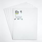
- PERFECT SAMPLES: These 12" x 9" white, styrene panels provide a smooth, warp-free surface for testing up to 5 color samples with paint, stain or other coatings.
- DURABLE MATERIAL: Made of sturdy styrene, these panels can withstand multiple coats and are non-absorbent so colors will stay true.
- CONVENIENT SIZING: At 12" x 9", the panels are just the right size for testing many common paint colors side by side before committing to a full project.
- PACKAGE INCLUDES: This value pack contains 5 white panels, enough for testing several color options on one purchase.
- VERY FLEXIBLE: Mighty Boards do not warp like foam core and you can bend them without breaking.
What color relationship should the blocks use?
Choose the relationship according to the effect you want, not simply according to two colors you happen to like. Dulux describes contrasting shades as the route to maximum impact and complementary colors as a subtler way to create depth. Related hues sit closer together and generally produce the calmest transition.
| Relationship | Visual effect | Best use |
|---|---|---|
| Contrasting | High energy and clear separation | Make a feature wall, highlight an architectural element, or give a room a bold graphic focal point |
| Complementary | Depth with less visual shock than a hard contrast | Add dimension while keeping furnishings and adjacent finishes in control |
| Related hues | Low contrast and cohesive flow | Create a quieter backdrop or zone an area without making the wall dominate |
There is no universal “correct” pairing. Compare each relationship against the room’s fixed finishes and the amount of visual activity already present. If the floor, rug, and artwork are busy, a related or complementary pair may prevent the wall from competing with them. If the room is restrained, a stronger contrast can supply the feature.
How do undertones and warm-versus-cool temperature affect the pairing?
Undertone compatibility is what makes two apparently different colors look deliberate together. Warm families—reds, oranges, and yellows—can read as welcoming, comforting, or energizing. Cool families—blues, greens, and purples—can feel open, breezy, or relaxing, according to Behr’s guidance. The labels are not a substitute for testing: a muted warm color may sit comfortably beside a softened cool color, while two highly saturated colors can fight even when their hue relationship is technically sound.
Quick wins for a faster PC:
Clear out junk files and repair common Windows errorsFree Scan →Scan for outdated or missing drivers - takes under a minuteDriver Scan →Repair Windows errors before they cause bigger problemsFix Now →Keep the contrast controlled
- Compare the proposed blocks beside the floor, trim, and largest piece of furniture before deciding that the contrast works.
- If one block has a strong warm undertone, look for a partner and surrounding finishes that do not make that undertone appear accidental.
- Use repetition to bridge a bold pair: a cushion, artwork detail, or rug can repeat one block color and make the wall feel connected to the room.
- When you want a deliberately balanced warm/cool scheme, judge the pair at its intended wall size and in the room’s actual light rather than relying on color-wheel labels.
Dulux’s advice that contrasting shades deliver maximum impact is a design option, not a requirement. The more contrast you introduce, the more important it becomes to check undertones and repeat at least one color elsewhere.
How do you test colors in changing light?
Paint large sample patches or sample boards and leave them in the room. Both Behr and Sherwin-Williams recommend viewing samples through day and night because the same color can shift noticeably between daylight and artificial light. Small store chips do not show how a color behaves across a broad wall or beside its eventual partner.
A reliable sample routine
- Paint each proposed block color on a large board or on a generously sized wall patch.
- Place the samples beside trim, flooring, furniture, and the other proposed colors. Do not evaluate a sample in isolation.
- View the boards in the brightest morning or afternoon light available, then again under the room’s evening lighting.
- Record which pair remains balanced in the brightest and dimmest conditions. Pay attention to undertones that become more obvious after sunset.
- Move boards to the wall’s final positions if possible; a north-facing section, a shaded corner, and a sunlit section can make one color appear to be several different colors.
Sherwin-Williams summarizes the reason plainly: “Remember that the color you choose may look different at various times of the day and night.” Buy the full amount only after the proposed pair has survived those changes.
Which color-block layout fits the room?
Color blocking can cover a complete accent wall, divide a wall into upper and lower fields, or contain a rectangle or another shape around furniture or art. Decide what the block must do before deciding its dimensions.
Crashes, No Sound, or Screen Glitches?
Random freezes, missing sound and display glitches usually trace back to one bad driver. Find and replace yours safely.Free scan · under a minutePC Slower Than It Used to Be?
A free scan shows the junk files, broken settings and background clutter dragging Windows down - then fixes them in one click.Free scan · Windows 10 & 11Also popular on Amazon

- Practical to use: paint color sample standard colors cards are designed for your different paint needs,color test card paint bulk,paint color samples
- Paint cards: made of plastic and paper that provides accurate colors and reliable results,paint standard samples,water color cards
- Professional: paint color standard sample cards are great for professionals and DIY enthusiasts alike,paint color cards,paint chips samples
- Paint color sample cards: suitable for various such as floor paint, paint hardware, and more,paint color sample cards,paint color cards bulk
- Comprehensive color chart: featuring multi standard colors, great for various ,paint cards,water color paint cards
Full accent wall
Use one wall as the visual anchor when you want a simple, high-impact treatment. The second color can appear on an adjoining plane, in a contained shape, or through furnishings rather than covering the entire room.
Upper-and-lower division
A horizontal division can visually organize a dining area, desk zone, or child’s room. A measured height keeps the line intentional; Sherwin-Williams gives about 7 feet as one example height for a horizontal block, not a universal rule. Adjust the line to the furniture, architecture, and ceiling height, then record the measurement so it can be repeated accurately.
Contained rectangle or custom shape
A rectangle can frame a bed, sofa, desk, or artwork without recoloring the entire wall. More shapes and intersections increase layout and taping work, so use them when the shape has a clear job rather than adding geometry for its own sake.
How does block placement change perceived room proportions?
Placement is a spatial tool as well as a color decision. Lighter colors tend to recede and make a small area feel more open; darker colors advance and make a large area feel more intimate. In a long, narrow room, Sherwin-Williams recommends that darker short walls and lighter long walls can make the room appear wider.
Recommended Free Tools
- To open a compact area: reserve the lighter block for the plane you want to feel farther away or more expansive.
- To make a generous room feel closer: use the darker block where you want a more intimate visual boundary.
- To frame furniture: size the contained shape to the bed, sofa, desk, or artwork, leaving a deliberate margin rather than stopping at an arbitrary point.
- To zone an activity: let the block follow the area’s use—such as a desk or dining setting—while keeping its color relationship consistent with the rest of the room.
Judge the placement from the room’s main entrance and from the seated viewpoints where the wall will actually be seen. A layout that looks balanced straight on can feel off when viewed from a doorway or beside a large piece of furniture.
How do you measure and mark the design?
Clean preparation and measured marks prevent a color block from drifting. First wipe the wall with a damp cloth and remove dust and grease. Let the surface dry before marking.
- Sketch the intended blocks lightly in pencil. Include where each line stops at corners, trim, baseboards, and architectural breaks.
- Use a level for every horizontal or vertical line that needs to read as straight.
- Use a ruler or measuring tape to establish repeatable heights and widths. Write the measurements at several points so you can transfer the line accurately across a broad wall.
- Check the layout from normal viewing positions before applying tape. Confirm that furniture, artwork, outlets, and switches do not create an accidental interruption.
- Mark the edges that will receive tape, then erase or cover stray pencil marks that could show through a light color.
A level line that is mathematically straight but unrelated to the furniture can still look wrong. The final check is visual alignment with the room’s objects, not only the measurement.
Also popular on Amazon

- Professional Paint Color Cards Set: This bulk collection of paint colors cards features 83 standardized shades, perfect for designers and DIYers. The portable paint cards organize easily in your colors book for quick on-site matching
- Paint Chip Samples Collection: Our paint color samples cards display true-to-life hues with precise color reproduction. Use these paint chips samples to confidently select wall colors that match your vision before purchasing gallons
- Multi-Purpose Watercolor Sample Cards: Ideal for classrooms, these paint samples cards serve as both teaching tools and creative. The paper chips bulk set includes primary, secondary and specialty mixed tones
- Comprehensive Color Matching System: With 83 paint color chips covering all major brands, this set solves matching challenges between different lines. The paint chip samples withstand frequent handling in design
- Essential Color Selection Toolkit: Every professional painters needs these paint color sample cards the most reliable way to preview how colors will look in different lighting before committing to large projects
How do you keep the edges straight and stop paint bleeding?
Edge quality depends on a sealed tape edge, controlled application, and removing the tape at the right time. Purdy advises pressing the tape down firmly and sealing the edge where the next color will be applied.
- Protect adjacent surfaces. Apply multi-surface painter’s tape to trim, baseboards, corners, and the pencil-marked edges. Overlap tape joins neatly rather than leaving gaps.
- Burnish the edge. Run a clean finger or suitable smoothing tool along the tape’s paint-side edge, especially over texture or small wall imperfections.
- Cut in first. Use a 2–2.5 inch brush at the taped edges and corners, keeping the paint load controlled so it does not pool against the tape.
- Roll the broad field. Use a roller for the main area and maintain a wet edge so lap marks do not create a second pattern inside the block.
- Let the first section dry before retaping. Sherwin-Williams uses about one hour as an example wait after the first coat; the product label controls the actual recoat time for your paint.
- Retape adjoining sections only on a dry surface. Press the new tape edge down again before applying the neighboring color.
- Remove tape while the final coat is damp or tacky. Pull it back steadily rather than yanking upward. Removing it in this window helps reduce lifting and keeps the boundary crisp, as described by Sherwin-Williams and Purdy.
- Allow the finish to dry fully before resetting the room. Sherwin-Williams gives at least two hours after the second coat in its example; follow the label for actual drying and cure requirements.
If a tiny section bleeds, wait until the paint is dry, then use a small artist’s brush to correct the line with the appropriate block color. Do not keep rubbing a damp edge; that usually spreads the defect.
What supplies are needed?
- Paint sample swatches or sample boards
- Interior wall paint in at least two colors
- Multi-surface painter’s tape
- 2–2.5 inch brush
- Roller, frame, and tray
- Pencil
- Level
- Ruler or measuring tape
- Drop cloth
- Extension pole for tall or broad walls
Use a drop cloth even when the design is confined to one wall. A roller can throw paint beyond the block, and protecting the floor lets you concentrate on maintaining a wet edge and a clean tape line.
Independent reader supportYour contribution helps us test, update, and keep practical guides available for everyone.What are common color-blocking problems and how can you fix them?
The colors look wrong beside the furniture
Return the samples to the room and compare them directly with flooring, upholstery, rugs, artwork, and trim. The issue is often an undertone conflict rather than the basic hue. Choose a partner that repeats an existing room color or shares a more compatible temperature.
The pair is too loud
Move from a high-contrast relationship toward complementary or related hues, or keep the strong color in a smaller contained shape. Repeating one of the colors in a furnishing can also make the contrast feel intentional instead of isolated.
The pair looks flat or indistinct
Increase separation through a stronger contrast or a clearer light-versus-dark difference, then retest at full sample size. If the room already contains many patterns, preserve the calmer relationship and create definition through placement instead.
The line is visibly crooked
Do not trust the ceiling, baseboard, or an older architectural line as a guide. Re-mark with a level, measure at multiple points, and retape only after the first section is dry.
Also popular on Amazon

- Core Color Matching: Paint color sample cards include 83 standard colors to support paint color sample cards, color matching cards for painting, and paint chips standard samples, helping users compare shades before selecting a final finish for floor paint, hardware, and other project needs
- Reliable Reference: Paint samples are made with color matching materials designed to support accurate color comparison, giving painters and DIY users a practical paint and paint color samples reference for selecting tones that fit the project surface and intended look
- Portable Format: Measuring 3.74 x 1.57 x 1.18 in and weighing 3.88 oz, this paint samples set is compact for a toolbox, work bag, or travel use, making it easier to carry color test card paint and check shades on site when planning paint work
- Wide Project Use: Paint sample cards are suitable for floor paint, paint hardware, and related color selection tasks, offering a useful paint chips samples reference for contractors, decorators, and home improvement users working on color coordination across different surfaces
- Simple Set Package: Each package includes 1 set of paint sample cards, giving users a straightforward paint sample standard cards option for daily work, project planning, and quick shade comparison when choosing among paint color cards and paint chips sample cards
Paint lifted when the tape came off
The adjoining coat may not have dried sufficiently, or the tape was removed after the paint had formed a hard film. Follow the label’s recoat guidance, remove tape while the fresh coat is damp or tacky, and make small touch-ups after the surface dries.
The finished wall changed after sunset
That is why large samples must be viewed under both daylight and artificial light. If the relationship fails in the room’s dimmest condition, choose a more stable pair before committing to all the paint.
What’s actually slowing this PC down?
Pick the symptom - the matching free tool is one click away.
How can you make the final decision?
Before buying the full quantity, confirm five things in the actual room:
- The colors sit comfortably beside every permanent finish and major furnishing.
- The relationship—contrasting, complementary, or related—matches the intended energy.
- Warm and cool undertones do not create an accidental clash.
- The lighter and darker placement supports the room’s desired sense of openness or intimacy.
- The measured layout can be taped and painted in a sequence that allows each adjoining section to dry.
Sherwin-Williams’ example palette of Soft Apricot SW 6352, Tradewind SW 6218, and Breezy SW 7616, used with Emerald Interior Acrylic Latex Paint, illustrates how a project guide may present a coordinated set. It is an example, not a prescription: your fixed finishes, light, and intended visual job should determine the final colors.
Frequently Asked Questions
Can a color block continue around an inside corner?
It can, but decide the stopping point before marking the wall. Carrying a block around a corner makes two planes read as one shape; stopping at the corner creates a clearer visual break. Test the choice with sample boards positioned on both planes so the transition works from the room’s main viewpoints.
Should the block align with furniture or artwork?
Alignment is usually more convincing when the block has a visible relationship to the object it frames. Mark the furniture or artwork position first, then size the rectangle or boundary with an intentional margin. Recheck the sightline from the doorway before taping.
How do you touch up a color-block edge without making a ridge?
Wait until the paint is fully dry, then use a small brush with very little paint and feather the correction into the existing color. Keep the brush on the block side of the boundary; repainting both sides can create a raised overlap.
Is a sample board better than painting directly on the wall?
A board is useful when you need to move the test between walls or preserve the existing finish. A wall patch shows the effect of the wall’s actual texture and surrounding light. When possible, use boards for comparison and confirm the finalists with a patch in their intended positions.
Quick Recap

Product prices and availability are accurate as of the date/time indicated and are subject to change. Any price and availability information displayed on Amazon at the time of purchase will apply.

