The Tool Desk
Quick wins for a faster PC:
Repair Windows errors before they cause bigger problemsFix Now →Scan for outdated or missing drivers - takes under a minuteDriver Scan →Clear out junk files and repair common Windows errorsFree Scan →Outbyte PC Repair FREERepair Windows errors before they cause bigger problemsFix Now →Outbyte Driver Updater FREEFix the driver behind crashes, sound loss and screen glitchesFind Drivers →
ThatPainter is reader-supported. When you buy through links on our site, we may earn an affiliate commission. Learn More
Choose a connected palette, not one identical colour everywhere. Start with the finishes that are difficult to change—flooring, cabinets, worktops, tile, brick, fireplaces, rugs and major upholstery—then identify their undertones. Map the colours that can be seen together, account for each room’s orientation and use, and test large painted samples in place under daylight and artificial light. A flow-through neutral, repeated trim colour or carefully reused accent can make a home feel cohesive while allowing bedrooms and other private rooms to have their own character.
The reliable sequence is: fixed elements, palette structure, sightlines, transitions, light, undertones, full-size samples and sheen. Following it prevents the most common mistake in whole-home decorating: choosing attractive colours in isolation that clash when a doorway, hall or open-plan view puts them side by side.
| # | Preview | Product | Price | |
|---|---|---|---|---|
| 1 |
|
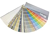
Sherwin Williams Colors collection Deck Complete Paint Colors | $33.00 | Buy on Amazon |
| 2 |
|
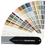
Benjamin Moore Collections Fan Deck | $33.99 | Buy on Amazon |
| 3 |

|
"BENJAMIN MOORE" CLASSIC COLORS FAN DECK [CASE OF 1] | $47.99 | Buy on Amazon |
| 4 |

|
280 Color Paint Sample Cards for Renovation Planning and Walls | $22.89 | Buy on Amazon |
As an Amazon Associate I earn from qualifying purchases.
PC Slower Than It Used to Be?
A free scan shows the junk files, broken settings and background clutter dragging Windows down - then fixes them in one click.Free scan · Windows 10 & 11Crashes, No Sound, or Screen Glitches?
Random freezes, missing sound and display glitches usually trace back to one bad driver. Find and replace yours safely.Free scan · under a minuteDo all rooms need to match?
No. Rooms only need to relate to one another where they are visually connected. Matching every wall can make a home feel flat, while unrelated colours at every doorway create visual stops. Think of the house as one composition with different zones: public rooms and circulation spaces usually benefit from stronger continuity, while a bedroom, study or room behind a closed door can take a more independent direction.
Connection can come from a shared undertone, a common neutral, the same white on trim and doors, repeated wood or metal tones, or an accent colour that appears in more than one place. The aim is a deliberate rhythm rather than identical rooms.
Popular on Amazon
How do I start choosing a whole-home palette?
Begin with an inventory of what will remain. Paint is the flexible layer; permanent finishes and large furnishings set the boundaries it must respect.
List every fixed or expensive-to-replace element
- Flooring, stair treads and fitted carpets
- Kitchen and bathroom cabinets
- Worktops, splashbacks and tile
- Fireplaces, exposed brick and stone
- Large rugs, sofas, curtains and upholstered chairs
- Wood tones, architectural metals and major artwork
Photograph each room in daylight and write down the colours that repeat. A beige floor may lean pink, yellow or green; a grey worktop may have blue or violet in it. Those subtle biases are undertones, and they matter more than the broad label on a colour card. Sherwin-Williams advises using a favourite rug, artwork or fabric as inspiration and checking permanent finishes such as cabinets, tile and brick before selecting paint.
Recommended Free Tools
Separate fixed colours from changeable accessories
Do not let a cushion or seasonal decoration dictate the entire house unless you intend to keep it for years. Give the greatest weight to flooring, cabinets, counters, tile and other costly finishes. Accessories can then supply smaller doses of contrast or a current accent.
What palette structure should I use?
Choose a structure before collecting dozens of swatches. Three colours are a useful starting point: a dominant wall or flow-through colour, a supporting colour and an accent. The proportions do not have to be equal; the dominant colour may cover several connected spaces, while the accent appears in a small room, a niche or furnishings.
| Palette structure | How it works | Best use | Watch for |
|---|---|---|---|
| Monochromatic | Uses lighter, darker or less saturated versions of one colour family. | A calm home where architecture, texture or artwork should lead. | Different samples can reveal different undertones; check them together rather than assuming every “blue” or “beige” is compatible. |
| Analogous | Uses neighbouring colours on the colour wheel, such as blue, blue-green and green. | Rooms that should shift gently from one to the next. | Keep temperature and saturation in a similar range so the transition does not look accidental. |
| Complementary | Pairs colours opposite each other on the colour wheel. | A higher-contrast scheme with a clear focal colour. | Use one side as the dominant colour and the opposite hue in controlled amounts; equal-strength opposites can feel restless. |
| Neutral-led with an accent | Runs a neutral through circulation areas and reserves a stronger colour for selected rooms or details. | Homes with many fixed finishes or an open plan requiring visual calm. | A “neutral” still has an undertone. Compare it with floors, cabinets and a purer reference before committing. |
When two rooms are visible at once, their colours should share either a family relationship or a compatible temperature. A warm clay accent beside a blue-grey wall can work when the transition is intentional and the undertones are controlled; two nearly identical greiges with opposing green and pink undertones usually look less resolved.
How do I map sightlines through the house?
Draw a basic floor plan, then mark what can be seen from the front door, main hall, stairs and each open-plan position. A colour that works on its own may be wrong when it occupies a large portion of the view beside another wall.
Do these 3 things before closing this tab:
1Scan for outdated or missing drivers - takes under a minute2Clear out junk files and repair common Windows errors3Fix the driver behind crashes, sound loss and screen glitchesMark the visual sequence
- Stand at the entrance and note every wall, ceiling plane and doorway visible from that position.
- Repeat the exercise from the end of the main hall, the foot and top of the stairs, and the principal seating area.
- Write the proposed colour beside each visible surface. Include partial walls and slivers seen through openings; they still affect the composition.
- Group rooms that are seen together. Evaluate each group as one scene rather than approving colours room by room.
In an open plan, the simplest options are one colour throughout, gradual shifts within one family, or a coordinated family of shades. Distinct colours can still work if a shared wall, trim colour, flooring tone or repeated accent bridges them. Bedrooms behind doors can be more individual because their colours are not constantly competing in the public sightline.
How can I make transitions between rooms feel intentional?
Use the boundaries in the architecture instead of treating every doorway as a demand for a new colour.
Run a flow-through neutral
A hall, stairwell and connecting spaces can carry one neutral through the house. This creates a visual pause between stronger room colours and makes the palette easier to read from the entrance.
Repeat trim and doors
One consistent trim and door colour can connect rooms even when their walls differ. Keep the same colour on skirting boards, architraves and selected doors where the architecture allows; the repeated line acts as a visual thread.
Also popular on Amazon
- Brand: Benjamin moore
- Container type: Box
- Finish type: Opa
Return an accent
A bold colour can be the main wall colour in one room and reappear as a smaller accent in the next—on a built-in, the back of shelving, a powder-room wall or furnishings. The repetition should be visible enough to feel deliberate but not so extensive that every room becomes an echo.
Use architectural stopping points
End a colour at an inside corner, door frame or other natural break rather than stopping in the middle of an uninterrupted wall. If an open wall must contain two colours, use a planned block or moulding detail so the change looks designed.
How does the direction of light change a paint colour?
Natural light changes both temperature and apparent depth. Judge a colour in the room where it will live and at the times that matter for that room, not only under a shop’s lighting.
| Orientation | Typical effect | Useful check |
|---|---|---|
| North-facing | Often receives cooler, less direct light, which can make cool colours feel sharper or grey colours feel bluer. | Warm undertones can prevent a cold result, but test them because a strong warm pigment may become muddy in low light. |
| South-facing | Usually receives warmer, brighter light for more of the day. | Many families can work; compare samples at the brightest period to ensure pale colours do not become glaring. |
| East-facing | Can be bright and warm in the morning, then flatter and cooler later. | Choose based on when the room is occupied. A balanced neutral can be safer when use is spread across the day. |
| West-facing | Often subdued earlier, then strongly warm in the afternoon and evening. | Check the late-day shift so warm colours do not become overly intense at the time the room is used most. |
Also note window size, nearby buildings, trees, reflective surfaces and the colour of adjacent walls. Artificial bulbs add another layer, so leave samples in place after dark and view them with the lighting normally used in the room.
How do I tell whether a white or neutral is warm or cool?
Compare it; an isolated swatch can hide its undertone. Sue Wadden, director of colour marketing at Sherwin-Williams, explains that a white may look simply white until it is placed beside a pure white, when a green, pink or blue bias becomes visible.
Use a purer reference
Place the candidate next to a very clean white or another known neutral. If the candidate looks creamy, yellow or pink, it is warmer; if it looks blue, violet or slightly grey, it is cooler. The comparison does not make one undertone universally better—the right choice depends on the fixed finishes and the atmosphere you want.
Inspect the darker chips on the strip
Undertones are often easier to see in the middle and darker colours on a fan strip than in the palest chip. If the deeper versions turn green, pink, violet or blue beside your flooring and cabinets, expect that bias to remain in the lightest version, even if it appears nearly white.
Compare against the actual finishes
Hold the sample beside the floor, worktop, tile and cabinet, not only against a white wall. A warm white can make a yellow-beige floor look more yellow; a cool white can emphasise blue in a grey worktop. The goal is a relationship that looks intentional in the room, not a theoretically neutral pigment.
What colours go with my flooring and cabinets?
Start by identifying the dominant undertone and visual weight of those finishes, then choose paint that supports rather than competes with them.
For wood flooring and cabinetry
Look at the wood in daylight and under the room’s lamps. Honey, oak and many red-toned woods often sit comfortably with warm whites, earthy greens, muted blues or related warm neutrals. Ash, pale oak and cooler stains can work with balanced whites, blue-greys and soft greens. These are starting points, not rules: the finish may contain several colours, so compare real samples against it.
Also popular on Amazon
- Very good condition
- Benjamin Moore Classic Colors Fan Deck
- Classic Colors
- Includes the American Classic Colors (AC)
For patterned tile or stone
Pick one quiet colour from the pattern instead of trying to match every fleck. If the surface has a busy mix, a restrained wall colour lets it remain the feature. If the stone is mostly one colour with a noticeable undertone, repeat that undertone in a lighter or less saturated wall shade.
For dark cabinets or worktops
Decide whether you want contrast or enclosure. A light wall can clarify the cabinet outline; a deep, related colour can make the join feel more built-in. Test the choice beside the darkest portion of the finish because reflected light can change how much contrast you perceive.
For existing rugs and upholstery
Use a favourite large textile as a palette source, as Sherwin-Williams recommends. Pull a background neutral for walls, a secondary colour for adjoining rooms and a stronger thread for accents. Avoid matching a tiny motif exactly; repeating its overall temperature and one or two substantial colours is more flexible.
How much contrast should a whole-home palette have?
Contrast is a design decision, not a measure of quality. Low contrast makes connected rooms feel spacious and restful; higher contrast gives architecture and focal rooms more drama.
- Low contrast: choose related lightness and undertones, then add interest through texture, artwork and lighting.
- Moderate contrast: keep a common neutral or trim colour while allowing one room to be noticeably deeper or more saturated.
- High contrast: use a strong light-dark or complementary relationship, but repeat at least one linking element so the change reads as intentional.
Assess contrast from the doorway and across the largest visible planes. A colour that looks modest on a small card can become dominant when applied to a full wall.
How should room use influence colour choice?
Choose the mood and intensity that support the room’s activity, then verify that the colour still belongs to the wider palette. Warm reds, yellows and oranges are commonly read as active or welcoming; blues, greens and neutrals are often used for calm, private or restorative spaces. Dining rooms, entryways and social areas may carry more warmth or saturation, while bedrooms and studies may suit quieter values.
Free tools Windows power users keep installed
One-click scans. No signup required.
Function also determines the important viewing time. A kitchen used before work should be judged in morning light; a lounge used after dinner must work under evening lamps; a child’s room may need to feel comfortable in both. This practical schedule can decide between two otherwise compatible colours.
How do I test paint colours at home?
Large, in-room samples are more dependable than a small shop chip. Sherwin-Williams, Home Depot and other paint guidance recommend sample cans or painted poster board because colour changes with scale, surrounding finishes and light.
- Prepare the surface. Clean it and use enough coats to cover the existing colour. A dark or strongly coloured wall can distort a thin sample.
- Make the sample large. Paint a broad area or a moveable board large enough to judge from normal seating and standing distances. A board lets you compare the same colour on different walls.
- Place more than one sample in a large room. Put samples on walls receiving different amounts of light, including the wall seen from the doorway.
- Keep samples beside fixed finishes. Do not judge a colour in an empty patch away from the floor, cabinets or worktop it must coordinate with.
- View the samples repeatedly. Check morning, midday, late afternoon and evening, with the room’s normal artificial lighting switched on after dark.
- Compare finalists together. Leave the leading options in place at the same time so your eyes can distinguish undertone, depth and contrast without relying on memory.
Moveable sample boards are especially useful when a room is not ready to paint or when you need to carry a colour through several sightlines. Painter’s tape can define test boundaries, but remove it carefully and do not use a narrow taped strip as the only evidence for a whole wall.
Independent reader supportYour contribution helps us test, update, and keep practical guides available for everyone.How does sheen affect a coordinated palette?
Sheen is the amount of light reflected by the surface. It changes perceived depth and can make the same colour look different on walls, trim and cabinets, so finish belongs in the palette decision.
What’s actually slowing this PC down?
Pick the symptom - the matching free tool is one click away.
Also popular on Amazon
- Broad appeal: from professional designers to homeowners, the wall shade comparison card serves as a full spectrum palette and matching tool for diverse home decor palette sheet projects,wall coating reference sheet,residential paint Color chart
- Diverse color options: the 280 wall decoration color card is ideal for matching house coating palette, ensuring the wall tone comparison chart meets every architectural and residential requirement,exterior paint color chart,true color sample sheet
- Compact for portability: the bendable shade color card offers easy transportation and storage, making it the perfect DIY color matching card for decorators and professionals,vivid color display card,wall decoration color card
- Accurate color reproduction: crafted from paper and plastic materials, the indoor wall coating card vividly portrays each tone, providing a true color sample sheet for reliable building renovation chart use,wall coating shade chart,building wall tone Color chart
- Portable convenient: designed as a portable paint palette, this lightweight paint color chart is ideal for decorators and contractors who need paint comparison or DIY color matching card solutions,house paint selection card,house building color card
| Finish | Typical visual effect | Common placement | Decision point |
|---|---|---|---|
| Matte or flat | Low reflection and a softer appearance; helps disguise minor surface irregularities. | Walls and ceilings where a quiet surface is wanted. | Check cleaning needs and wall condition before choosing it in busy areas. |
| Eggshell | Subtle reflection with more wipeability than flat paint. | General walls, depending on the product and room demands. | Can reveal uneven preparation when light rakes across the wall. |
| Satin | More visible reflection and a slightly richer-looking colour. | Walls needing additional durability, and selected woodwork. | Use consistently where adjoining surfaces will be compared. |
| Semi-gloss or high-gloss | Strong reflection that increases highlights and visual contrast. | Trim, doors, cabinets and deliberate accents. | It can emphasise dents, brush marks and fingerprints, so preparation matters. |
Using one colour in different sheens can create quiet separation without adding another hue: a low-sheen wall with a higher-sheen door or trim reads as layered but still connected. Confirm the manufacturer’s specific finish names because sheen levels vary between product lines.
How can I coordinate colours in an open-plan home?
Treat the connected area as one composition first, then assign zones. Identify the largest uninterrupted wall, the surfaces visible from the seating area and the points where a colour change can stop naturally.
- Choose the anchor colour for the most visible or largest wall plane.
- Decide whether the kitchen, dining and living areas need one continuous colour or a gradual shift within the same family.
- Use cabinets, an island, a fireplace or a structural opening as a boundary if a stronger contrast is needed.
- Repeat the trim, door, metal or accent element across zones so the changes are read as part of one plan.
- View all proposed colours from the main entrance and seating positions before buying full quantities.
When sightlines are complicated, a single flow-through neutral often provides the calmest backdrop, with colour introduced through a contained wall, built-in or furnishings. If you prefer distinct zones, keep their undertones compatible and avoid placing two high-saturation colours on adjacent uninterrupted planes.
How should I choose between two plausible palettes?
Score both options against the same practical criteria instead of choosing from a single favourite swatch.
| Criterion | Question to ask | Evidence to inspect |
|---|---|---|
| Sightline continuity | Do colours visible together move smoothly from one space to the next? | Entrance, hall, stair and open-plan viewpoints. |
| Undertone compatibility | Do the walls support the floors, cabinets, tile and furnishings? | Large samples placed beside the fixed finishes. |
| Light performance | Does the palette remain acceptable in morning, afternoon, evening and artificial light? | Samples observed through the room’s actual daily schedule. |
| Mood and contrast | Does the warmth, coolness and drama suit the room’s purpose? | How the colour feels at normal viewing distance, not only on a card. |
| Finish and upkeep | Will the chosen sheen expose defects or make fingerprints prominent? | Wall condition, traffic level and the reflection from windows and lamps. |
A palette that wins four categories and loses one may be easier to live with than a dramatic colour that succeeds only in a carefully controlled corner. If both options remain viable, reserve the stronger one for the room where its mood is most useful and use the quieter option in connecting spaces.
What common mistakes make rooms look disconnected?
- Choosing each room in isolation: review every colour from the doorway and from the rooms that can see it.
- Ignoring undertones: compare candidates with a purer reference and the darker chips on the strip before deciding that two neutrals match.
- Relying on a tiny colour card: use large painted areas or boards and watch them over the day.
- Forgetting artificial light: inspect the final colour with the lamps and bulbs used at night.
- Changing colour at an arbitrary point: stop at an inside corner, opening or other architectural break.
- Using sheen as an afterthought: decide how walls, trim, doors and cabinets will reflect light before the final order.
- Making every room equally strong: allow circulation areas or private rooms to provide visual rest around focal colours.
- Buying all the paint before sampling: settle the palette only after full-scale samples have been observed in place.
What is a repeatable whole-home colour workflow?
Use this checklist whenever you are starting from scratch or revising only part of a house.
- Photograph and list fixed finishes, major furnishings, artwork, metals and wood tones.
- Identify the undertones that recur and note any finish that cannot be changed.
- Choose a palette structure—monochromatic, analogous, complementary or neutral-led with an accent.
- Draw the floor plan and mark colours visible from entrances, halls, stairs and open-plan positions.
- Assign a flow-through neutral, common trim colour or repeated accent where transitions need help.
- Match colour intensity and contrast to each room’s use and the time of day it is occupied.
- Check north, south, east and west exposures, then compare finalists beside the actual fixed finishes.
- Paint large samples or moveable boards with enough coats to cover the old colour.
- Observe samples in daylight and artificial light over the room’s full daily cycle.
- Select sheen for walls, trim, doors, cabinets and ceilings as part of the same scheme.
- Buy the full quantity only after the palette works from the principal sightlines.
Frequently Asked Questions
Should ceilings always be painted white?
No. A white ceiling can maximise brightness, but a very stark white may emphasise warm walls or make a low-light room feel disconnected. A lighter tint of the wall colour, or the same colour in a different sheen, can create a more unified architectural envelope; sample it where ceiling light and wall colour meet.
How can I keep a rented home coordinated without repainting everything?
Treat removable items as the linking layer: rugs, curtains, art, lampshades and upholstery can repeat one accent and one neutral across rooms. Use consistent frames, hardware and textiles to create rhythm, while keeping any permitted paint changes concentrated on a single focal wall or temporary panel.
Can wallpaper and paint share a whole-home palette?
Yes. Pull a quieter background or secondary colour from the wallpaper for nearby painted walls, and check the paper in the room’s actual light before selecting the paint. If the pattern is strong, let adjoining rooms use a restrained neutral and repeat only a small accent elsewhere.
What should I do if a sampled colour looks different on every wall?
First check whether the walls receive different daylight or reflect different floors and furnishings; that variation may be the reason. Move the same sample board around the room and compare it at the times the space is used. If the shifts are too strong, choose a more balanced neutral or a colour with less saturation.
Quick Recap

Product prices and availability are accurate as of the date/time indicated and are subject to change. Any price and availability information displayed on Amazon at the time of purchase will apply.

