Recommended Free Tools
Crashes, No Sound, or Screen Glitches?
Do these 3 things before closing this tab:
1Repair Windows errors before they cause bigger problems2Scan for outdated or missing drivers - takes under a minute3Clear out junk files and repair common Windows errorsFree scan · under a minute
PC Slower Than It Used to Be?
Free scan · Windows 10 & 11
Outdated Drivers Are Slowing You Down
Free scan · exact hardware match
ThatPainter is reader-supported. When you buy through links on our site, we may earn an affiliate commission. Learn More
The right exterior paint color is the one that works with what you cannot easily change, suits the architecture, looks consistent in real daylight, and can withstand your climate. Start by recording the roof, brick, stone, paths, railings, gutters, and established landscaping. Then choose a body color, coordinate the trim, and reserve one or two accents for details that deserve attention. Test large painted samples on several elevations before buying the full quantity, because sunlight, shade, viewing angle, and weather can change a color dramatically. Finally, match the primer and coating system to the substrate and local exposure. The method below turns a subjective choice into a series of checks you can make before committing.
As an Amazon Associate I earn from qualifying purchases.
What should I look at before choosing an exterior color?
Begin with the fixed features of the property. A roof replacement, masonry change, or mature landscape is far more expensive than repainting siding, so these elements should anchor the palette rather than compete with it.
- Roof: Note whether it is black, charcoal, brown, red, weathered gray, or a blended tone. Look for warm or cool undertones, not just the headline color.
- Masonry and stone: Record the colors in brick, block, stone veneer, the foundation, and retaining walls. Mortar may introduce a second undertone.
- Hardscape and metal: Include paths, driveways, railings, gutters, downspouts, light fixtures, and mailbox hardware.
- Landscape: Consider the dominant colors of evergreen foliage, deciduous trees, grasses, and nearby natural terrain. Seasonal changes can alter the setting.
- Existing details: List windows, shutters, porches, columns, balconies, dormers, and decorative trim that will remain.
Compatible undertones make unrelated materials feel intentional. A warm cream siding can bridge a brown roof and red brick; a blue-gray body can connect a charcoal roof with cool stone. Contrast is also valid, but use it deliberately on a feature you want people to notice instead of allowing every fixed element to compete.
Popular on Amazon

- Use for a variety of indoor and outdoor project surfaces including wood, metal, plaster, masonry or unglazed ceramic
- Water-based acrylic formula is low odor, resist chips and provides long-lasting protection
- Covers up to 120 sq ft and dries to touch in 30 minutes for quick project completion
- Semi-gloss finish minimizes surface imperfections, goes on smoothly and provides excellent hide
- Prior to application sand surfaces with 180/200 grit sandpaper, then wash with a degreaser, allow the surface to dry and apply paint
How do architectural style and visual mass affect the color scheme?
Architecture determines how much contrast the facade can carry. Quiet, related hues usually suit a simple massing, while carefully placed contrast can clarify a house with strong projections and trim.
Read the house as a composition
Study the roof shape, number and spacing of windows, porch depth, balconies, gables, dormers, and other projections. A broad, low house may look more balanced when the body and trim are close in value. A tall or highly articulated facade can use a deeper trim or shutter color to separate layers.
Outdated Drivers Are Slowing You Down
One free scan finds every outdated or missing driver and matches the right update for your exact hardware.Free scan · exact hardware matchWindows Errors? Fix Them Before They Spread
Repair common Windows errors and clear accumulated junk for a smoother, more stable PC - no reinstall needed.Free scan · no reinstallUse details as controlled emphasis
Columns, moldings, shutters, brackets, and doors are natural places for stronger contrast. The Vieux Carré Commission’s guidance emphasizes identifying the architectural style, studying its details, and balancing color across the facade. Its warning that “Colors vary in appearance in different light” is especially important for ornate elevations where small value shifts become obvious.
Avoid a top-heavy facade
Large dark areas high on the house can make the roofline feel visually heavy. If the roof is already dark, a very dark upper story and dark shutters may overwhelm the windows. Distribute light and dark areas so the eye moves from the foundation through the body to the roof without one band dominating.
What colors work with my roof, brick, and stone?
Choose the body color only after identifying the undertones in the permanent materials. You can either coordinate those undertones for a unified appearance or introduce a measured complementary contrast.
| Fixed feature | Palette direction | Why it works | Watch for |
|---|---|---|---|
| Red or orange brick | Warm taupe, cream, muted olive, or a restrained blue-gray | These options can repeat a brick undertone or provide controlled contrast. | Very pink beige may exaggerate the brick’s red; intense complementary blue can look disconnected. |
| Brown or weathered wood roof | Warm gray, sand, mushroom, sage, or soft cream | Earth-connected hues link roof and landscape. | A stark blue-white may make the roof appear more orange or muddy. |
| Charcoal or black roof | Cool gray, greige, white, pale blue, or deep green accents | Cool neutrals echo the roof while lighter bodies preserve visual balance. | Using black on body, trim, and shutters can flatten window and porch details. |
| Cool gray stone | Blue-gray, slate, soft white, or neutral greige | Cool or balanced undertones keep the stone integrated. | Yellow-heavy cream can fight the stone’s cool cast. |
| Mixed stone or multicolor masonry | Pull one quiet, mid-value color from the masonry | A single extracted hue prevents the facade from becoming busier than the stone. | Matching the most intense stone color can make the house look saturated. |
These are starting directions, not guarantees. A color card, roof sample, and brick sample should be viewed together outdoors. The same nominal “gray” can read blue, green, beige, or violet depending on adjacent materials and daylight.
The Tool Desk
Outbyte Driver Updater FREEFix the driver behind crashes, sound loss and screen glitchesFind Drivers →Outbyte PC Repair FREEClear out junk files and repair common Windows errorsFree Scan →How many exterior paint colors should a house have?
For most homes, use a body color, a trim color, and one or two accents. More colors are possible, but each additional contrast competes for attention and increases the chance that the facade will look fragmented.
Also popular on Amazon

- Ready to use, pre-mixed door and trim paint offers a fresh new look on interior or exterior metal, wood and fiberglass
- Water-based paint formula emits less odor and withstands fading for a long lasting finish
- Dries to the touch in 45 minutes, up to 3X faster than traditional oil-based paints
- Durable, chip resistant coating provides ultimate protection with modern curb appeal
- Beautiful satin door paint is available in 6 pre-mix color options for the perfect look
Body color
The body covers the largest area, so select it for the roof, masonry, landscape, and local light first. Mid-value colors are often forgiving because they show less extreme shift between sun and shade than very pale or very dark colors.
Trim color
Trim can blend with the body for a calm, contemporary effect or contrast to outline windows, eaves, and porches. On a house with elaborate details, a related trim hue often prevents visual noise; on a plain facade, modest contrast can add definition.
Accent color
Reserve the strongest color for a front door or a selected group of shutters, brackets, or gable details. Repeating the accent in several balanced locations makes it look intentional. Painting every small element a different accent weakens that hierarchy.
How does climate and sun exposure change the best exterior color?
Climate affects both appearance and coating life. Ultraviolet radiation, humidity, repeated rain, salt-laden marine air, and local temperature swings can accelerate fading, chalking, peeling, or mildew growth. Pigment durability, surface preparation, and the primer are as important as the color name.
Hot or high-sun locations
Lighter or solar-reflective surfaces absorb less heat than dark, flat finishes. A Department of Energy figure reported by Fine Homebuilding in 2022 attributes roughly 70% to 90% of solar radiant energy absorption to dark, flat colors; that is a secondary report of DOE guidance, not a guarantee for every coating. On a sun-baked wall, a lighter body can reduce heat gain, while a darker door or shutter supplies contrast without covering the whole facade.
Humid, rainy, or marine environments
Moisture and salt increase the importance of a sound, clean substrate and a coating rated for exterior exposure. Inspect caulk joints, areas that stay shaded, and places where water splashes from the ground. A color that looks perfect on a dry sample still fails if the surface is damp, chalky, or contaminated when painted.
Regional light and landscape
Regional palettes reflect landscape, topography, weather, and cultural history, according to Sherwin-Williams guidance. Compare your candidates with neighboring homes and the colors visible beyond the property line. A high-desert setting, a dense green suburb, and a coastal street can make the same beige appear entirely different.
Quick wins for a faster PC:
Fix the driver behind crashes, sound loss and screen glitchesFind Drivers →Clear out junk files and repair common Windows errorsFree Scan →Scan for outdated or missing drivers - takes under a minuteDriver Scan →Also popular on Amazon

- Flows on smoothly and dries to a tough, durable finish
- Fade and weather resistant
- Ideal for exterior surfaces including wood, masonry, primed metal, weathered steel and aluminum siding
What neighborhood or historic rules should I check?
Verify restrictions before purchasing paint. Homeowners associations may limit approved colors or require an application. Historic districts can regulate body, trim, and accent colors, sometimes requiring review by a commission. Municipal rules may apply to landmarked properties or properties in a designated conservation area.
Take photographs of the house, note the proposed colors and paint manufacturer names, and ask the governing body which elevations and outbuildings are covered. Approval requirements can affect your schedule, so do not order the full coating system until you know whether written permission is needed.
How should I build a restrained palette?
Choose the body first, then test trim and accent colors against it and the fixed materials. Keep the value structure clear: the body establishes the field, trim explains the architecture, and the accent directs the eye.
- Shortlist three body colors. Include one coordinated neutral, one slightly deeper or lighter variation, and one option that provides intentional contrast with the masonry.
- Pair each body with two trim candidates. Test a close-value trim and a contrasting trim so you can see whether the architecture needs calm or definition.
- Select one accent location. Start with the door or a clearly defined detail rather than scattering color across the facade.
- Check the value map. Look at a black-and-white photograph of the elevation. If roof, body, trim, and accents merge into one dark block or break into too many stripes, adjust the values.
- Remove unnecessary colors. If two trim colors perform the same job, keep the one that coordinates with more fixed materials and requires less maintenance.
How do I test an exterior paint color outside?
Paint large samples on more than one elevation and inspect them through changing conditions. Small paper chips cannot show how a color behaves across siding texture, shadow lines, and reflected landscape.
- Prepare sample areas. Clean loose dirt and chalk, lightly scuff glossy spots, and use a removable sample board if the existing finish could affect the reading. Label each sample with the color and date.
- Place samples strategically. Put the same candidate on the front and at least one side or rear elevation. Include the wall that receives the strongest sun and one that remains shaded.
- Paint generous patches. A small square is easily distorted by the surrounding color. Use a patch large enough to include the actual siding or masonry texture and edge it cleanly.
- Observe morning, midday, and late afternoon. Record how the color reads in direct sun, open shade, overcast conditions, and reflected light from pavement or vegetation.
- Check from the street. Step back to the normal viewing distance and photograph the facade. Also inspect close up for undertones, lap marks, and sheen.
- Wait through a weather change. Do not decide immediately after painting. Let the sample dry and view it on a bright day and a cloudy day before narrowing the choice.
BEHR’s exterior guidance advises considering how much light the home receives during the day and warns that sun exposure can make colors look lighter and more intense outdoors. The Vieux Carré Commission makes the same broader point: color is not static, so a sample seen at a paint counter is not the final appearance.
What primer and coating system should I use?
Match the system to the substrate and the condition of the existing finish. Paint alone cannot compensate for peeling, chalking, moisture intrusion, or an incompatible surface.
Prepare the substrate
- Wash away dirt, mildew, salts, and chalk; allow the surface to dry fully.
- Scrape loose paint and feather rough edges so repairs do not telegraph through the new finish.
- Replace failed caulk and repair damaged wood, stucco, or masonry before priming.
- Protect windows, plants, paving, and hardware with painter’s tape and drop cloths.
Prime when the surface needs it
Use an exterior primer on difficult or porous substrates, exposed repairs, glossy areas that have been sanded, and situations where the new color is substantially different from the old one. A tinted primer can improve hiding and reduce the number of finish coats when moving from a very dark color to a light one, or the reverse. Follow the primer and finish manufacturer’s recoat times and temperature limits.
Also popular on Amazon
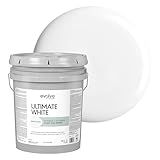
- ALL-IN-ONE PAINT AND PRIMER: Saves time and effort by priming, sealing, and finishing in one step for smooth, efficient coverage
- MULTIPLE SHEENS & SIZES – INTERIOR & EXTERIOR: Ultimate White bright white paint and primer is available in Flat, Eggshell, Satin, and Semi-Gloss sheens for walls, trim, doors, and more. Offered in 1-Gallon and 5-Gallon sizes to suit any interior or exterior painting project.
- SEMI-GLOSS SHEEN – HIGH-IMPACT SHINE: Reflective, durable finish ideal for interior & exterior trim, doors, cabinets, and high-touch areas. Moisture- and stain-resistant for lasting beauty.
- DURABLE & EASY TO CLEAN: Water-based, fast-drying formula delivers a washable finish designed for everyday wear in moisture-prone areas.
- EXCEPTIONAL HIDE & COVERAGE: High-opacity formula delivers brilliant white coverage with fewer coats, even over darker colors.
Gather the right tools
A typical exterior project requires quality brushes, roller covers suited to the siding texture, painter’s tape, drop cloths, extension equipment, and a stable ladder or scaffold. The goal is consistent film thickness; rushing with an undersized roller or worn brush can leave lap marks and uneven sheen that alter color perception.
How should I compare two or more candidate palettes?
Score each palette against the same criteria instead of choosing from a single attractive swatch. A simple written comparison exposes trade-offs that are easy to miss when looking at one color at a time.
| Criterion | Questions to ask | Evidence to collect |
|---|---|---|
| Fixed-material compatibility | Does the body repeat or respectfully contrast with roof, brick, stone, and paths? | Outdoor sample photos beside each permanent material. |
| Architectural fit | Does contrast clarify windows, porches, and projections without making the facade busy? | Daylight photographs and a value check in grayscale. |
| Light behavior | Does the color stay acceptable in sun, shade, cloud, and at different times? | Observations from every tested elevation. |
| Climate and UV exposure | Is the pigment and product appropriate for local sun, humidity, rain, or marine air? | Product technical information and the site’s exposure pattern. |
| Heat-reflectance goal | Would a lighter or more reflective body reduce unwanted heat absorption? | Roof and wall solar exposure, especially on south- or west-facing elevations. |
| Maintenance | Will the chosen value show dirt, chalking, or touch-up differences quickly? | Inspection of shaded, splash-prone, and high-contact areas. |
| Regulatory fit | Is the palette allowed by an HOA, historic district, or municipality? | Written rules or approval confirmation. |
| Attention control | Does contrast point to the door or architectural details rather than every surface? | A street-view photograph with the eye path evaluated. |
What are the most common exterior color mistakes?
Choosing from an indoor chip alone
Store lighting and a small paper surface hide the effects of orientation, texture, and reflected surroundings. Correct this by using large exterior samples and observing them over a full day.
Ignoring undertones
Two neutrals can clash when one is pink-beige and the other is green-gray. Compare candidate cards directly with the roof, brick, and stone rather than judging each in isolation.
Using equal contrast everywhere
If the body, trim, shutters, door, and foundation all have high contrast, the facade loses hierarchy. Keep the strongest contrast for one or two intentional focal points.
What’s actually slowing this PC down?
Pick the symptom - the matching free tool is one click away.
Painting over a failing surface
New color cannot stabilize peeling or damp material. Remove failure, correct the moisture source, prime repairs, and only then apply the finish coats.
Forgetting the strongest-sun wall
A color that looks balanced on a shaded front porch may become lighter and more intense on a west-facing wall. Always include the most exposed elevation in the sample test.
Also popular on Amazon

- Ready to use, pre-mixed door and trim paint offers a fresh new look on interior or exterior metal, wood and fiberglass
- Water-based paint formula emits less odor and withstands fading for a long lasting finish
- Dries to the touch in 45 minutes, up to 3X faster than traditional oil-based paints
- Durable, chip resistant coating provides ultimate protection with modern curb appeal
- Beautiful satin door paint is available in 6 pre-mix color options for the perfect look
Skipping local approval
Buying paint before checking rules can leave you with an unusable color. Confirm requirements at the planning stage, before sampling leads to a final order.
How long should I expect an exterior color to look good?
Longevity depends on the coating, substrate, preparation, exposure, and maintenance rather than color alone. Consumer Reports, writing in 2018, reported that a number of tested exterior paints still looked good for approximately eight to 10 years. Treat that as an approximate observation from those products and conditions, not a warranty for every house. Inspect annually for chalking, fading, cracking, mildew, and failed caulk so small repairs do not become a full repaint.
Free tools Windows power users keep installed
One-click scans. No signup required.
What should I do before buying the full amount of paint?
Use this final decision check after the samples have dried:
- Confirm the body works with the roof, masonry, hardscape, and mature landscaping.
- Confirm the trim clarifies the architecture without creating a striped or top-heavy effect.
- Confirm the accent has a defined location and does not compete with the entry or windows.
- Review samples on every important elevation in sun, shade, cloud, morning, midday, and late afternoon.
- Verify HOA, historic-district, and municipal requirements.
- Choose a primer and exterior finish rated for the substrate and local climate.
- Buy enough material for consistent batches and keep the color formula and leftover paint for future touch-ups.
A disciplined sample-and-compare process takes longer than picking a color card, but it prevents the most expensive mistake: applying an attractive indoor color that fails beside the roof, in the afternoon sun, or on the actual surface of the house.
Frequently Asked Questions
Why does the same exterior color look different on the front and side of my house?
Each elevation receives a different mix of direct sun, open shade, reflected light, and viewing angle. Siding texture and nearby foliage also change the apparent undertone, which is why a color should be painted on more than one side before approval.
Can I use a dark exterior color in a hot, sunny climate?
You can, but dark flat colors absorb substantially more solar radiation than lighter or reflective surfaces. If heat gain is a concern, keep the body lighter and use the dark color on a door, shutters, or another limited detail.
Recommended Free Tools
Should I use a tinted primer when changing from a dark house to a light one?
A tinted exterior primer can improve hiding and help the finish color reach an even appearance with fewer coats. It is especially useful when the new color is substantially different from the existing one, provided the primer is compatible with the substrate and finish.
How can I tell whether my color choice is too busy from the street?
Photograph the house from its normal public viewing distance and reduce the image to grayscale. If every trim piece creates a separate high-contrast stripe, simplify the palette or reserve the strongest value for one focal feature.
What exterior paint life can I realistically plan for?
An approximate eight- to 10-year period was reported by Consumer Reports in 2018 for a number of tested paints that still looked good. Actual performance varies with preparation, product, climate, sun exposure, and ongoing maintenance.
Quick Recap

Product prices and availability are accurate as of the date/time indicated and are subject to change. Any price and availability information displayed on Amazon at the time of purchase will apply.

