Windows Errors? Fix Them Before They Spread
Quick wins for a faster PC:
Scan for outdated or missing drivers - takes under a minuteDriver Scan →Clear out junk files and repair common Windows errorsFree Scan →Outbyte PC Repair · freeRepair common Windows errors and clear accumulated junk for a smoother, more stable PC - no reinstall needed.
Fix My PC Now →ThatPainter is reader-supported. When you buy through links on our site, we may earn an affiliate commission. Learn More
The right kitchen-cabinet color is the one that works with the finishes you cannot easily replace: the countertop, backsplash, flooring, appliances and hardware. Compare those fixed elements first, identify whether their undertones are warm or cool, then test large samples on the cabinets in morning, afternoon and evening light. Choose a light value for an airy, open effect, a deeper value for contrast and visual weight, or a restrained neutral with a stronger island or lower-cabinet color for a two-tone design. Finish the decision by selecting a cabinet-rated satin or semi-gloss enamel and following a careful cleaning, adhesion, priming and curing process.
What is the best paint color for kitchen cabinets?
There is no single best cabinet color for every kitchen. The best choice is a color whose undertone and value agree with the room’s permanent finishes and the atmosphere you want to create. A warm white, beige, greige or muted green usually settles comfortably beside warm stone and wood; a soft gray, blue, green or clean white can support cool stone, stainless steel and gray tile. Light colors tend to make a kitchen feel larger and brighter, while navy, charcoal, deep green and brown add depth and intimacy.
As an Amazon Associate I earn from qualifying purchases.
Make the decision in this order:
- Inventory the countertop, backsplash, flooring, appliances and hardware.
- Determine whether those materials read warm, cool or mixed.
- Choose the mood and visual weight you want.
- Test large samples in the actual kitchen under natural and electric light.
- Select a cabinet enamel and sheen that can withstand cleaning and daily contact.
This sequence prevents a common mistake: choosing a color from a small store chip and discovering that it clashes with the stone or changes dramatically when the kitchen lights are switched on.
How should I start when the kitchen already has fixed finishes?
Begin with the elements that are expensive, difficult or impractical to change. Countertops, backsplash tile, flooring, appliances and hardware establish the color context for the cabinets. Benjamin Moore and Behr both recommend using these finishes as the starting point rather than selecting a cabinet color in isolation.
Popular on Amazon
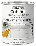
- CABINET TRANSFORMATION: Refresh outdated cabinets, vanities, furniture and trim with rich Pure White color and a smooth semi-gloss finish
- DURABLE PERFORMANCE: Easy-to-clean finish resists dirt and grime while standing up to household chemicals
- SMOOTH APPLICATION: Outstanding flow and leveling help create a beautiful finish with brush, roller, pad applicator or airless sprayer
- FAST PROJECT COMPLETION: Dries to touch in 30 minutes, recoats in 2 hours and is ready for normal use after 24 hours
- INTERIOR CABINET COATING: Ideal for kitchens, bathrooms, laundry rooms and other interior cabinet and trim applications
Make a finish inventory
Photograph each surface in daylight and collect loose samples when possible. Include a piece of countertop or tile, a flooring sample, an appliance finish and the hardware you plan to keep. Look at the materials together, not one at a time. A countertop that appears neutral in a showroom may reveal yellow, pink, green, blue or gray when it is placed beside a white paint chip.
Use the dominant finish as the anchor
If the countertop covers a large visual area, let its undertone lead the first round of samples. Warm stone and wood generally pair naturally with warm whites, beige, greige, muted green and other earthy neutrals. Cool stone, stainless steel and gray tile are useful starting points for blue, green, soft gray or cleaner whites. Mixed kitchens can support a bridge color such as a balanced greige or muted olive, but test it carefully because the surrounding finishes may pull it in different directions.
Recommended Free Tools
Do not ignore small but repeated details
Black or bronze hardware, warm metal fixtures and a colored backsplash can influence the cabinet color even when they occupy less area than the countertop. Hardware does not need to match the cabinets exactly, but the cabinet color should not make the metal look accidentally out of place. Keep the samples of any finish you intend to retain beside the paint boards throughout the selection process.
What undertone works with my countertop?
Choose an undertone that is compatible with the countertop rather than searching for a universally “best” white. Undertones are subtle influences—yellow, pink, red, green, blue or gray—that become obvious when two surfaces sit next to each other. Benjamin Moore specifically recommends noting the countertop undertone and selecting cabinet colors with a similar relationship; Behr likewise advises comparing candidates with the countertop, flooring and tile in the room.
How to identify a warm undertone
Warm surfaces often show cream, tan, beige, yellow, red or brown notes. Hold several white and neutral chips beside the countertop. If a crisp blue-white looks stark or slightly violet while a creamy white settles down, the stone is probably asking for warmth. Warm gray, greige, beige, olive and muted earthy colors are useful second-round samples.
How to identify a cool undertone
Cool surfaces can lean blue, green, violet or neutral gray. Beside them, a yellowed white or beige may look dingy. Test soft gray, blue-gray, blue, green and cleaner white families. Stainless steel and cool gray tile can make a warm cabinet color appear more yellow than it looked on its own.
Free tools Windows power users keep installed
One-click scans. No signup required.
When the countertop is multicolored
Many natural stones contain several undertones. Select one prominent, repeatable color in the surface rather than trying to match every fleck. A subdued cabinet color that echoes one of the stone’s larger background tones usually looks more intentional than a highly saturated color that matches a tiny vein.
Also popular on Amazon

- Includes 30 featured and newest released color card. Sprayed on color to see our colors in your homes lighting for more accurate color choices.
- ALL-IN-ONE Paint - NO Sanding, NO Priming, NO Top Coat Required, Low Luster, Velvet Sheen Finish
- Interior/Exterior - Paint your whole house - Ideal for hard surfaces including walls, doors, cabinets, counters, furniture, metal, glass, ceramics and floor and wall tile
- Durable yet stretches to paint smooth fabrics, vinyl and leather
- Results cannot be guaranteed. Digital screens may not show color accurately. Product search "ALL-IN-ONE PAINT by Heirloom Traditions, Color Confidence Card", for an accurate color choice.
Compare chips side by side, not from memory
Place candidate chips vertically against the countertop and view them from normal standing distance. A white can look pink beside one stone and green beside another. Eliminate colors that create a visible cast on the countertop before considering decorative preferences such as “brightest” or “purest” white.
Should cabinets be lighter or darker than the walls?
Either relationship can work. Lighter cabinets and walls create continuity and can make a compact kitchen feel more open; darker cabinets against lighter walls add definition and visual weight. Decide based on room size, ceiling height, natural light and the amount of contrast you want—not on a universal rule.
| Cabinet-to-wall relationship | Visual effect | Best fit | Watch for |
|---|---|---|---|
| Cabinets close in value to the walls | Quiet, continuous and spacious | Small kitchens, limited daylight or a calm backdrop | Insufficient contrast can flatten door profiles and hardware |
| Cabinets noticeably darker than the walls | Grounded, defined and dramatic | Rooms with adequate light and a desire for architectural emphasis | Deep colors can feel heavy if the room is already dark |
| Cabinets lighter than the walls | Soft contrast with a lifted upper area | Kitchens where the walls carry a stronger color or pattern | A very bright cabinet can expose undertone conflicts in the wall color |
IKEA describes white and light gray as space-opening, while dark gray, black and brown read as elegant and cozy. Sherwin-Williams similarly presents creamy Alabaster as an option for smaller kitchens and deeper colors such as Needlepoint Navy for a more relaxed, grounded effect. These are directional effects, not guarantees: window direction, ceiling height and neighboring finishes can change the result.
What’s actually slowing this PC down?
Pick the symptom - the matching free tool is one click away.
Which cabinet colors create an airy, warm or dramatic mood?
Choose the color family after you understand the fixed finishes. Value controls how visually heavy the cabinets feel; hue and undertone control whether the room feels warm, cool, natural or energetic.
For an airy and open kitchen
Try white, cream or pale gray when you want the room to feel brighter and less enclosed. Light colors reflect more of the available light and can visually recede. Compare several whites because a cool, blue-influenced white and a creamy, yellow-influenced white will behave very differently beside the same countertop.
For a warm and welcoming kitchen
Beige, warm gray, greige, olive and other earthy neutrals bridge wood, stone and metal without demanding a high-contrast scheme. Dulux positions light neutrals as an airy foundation and warm grays as a contemporary, welcoming backdrop. Muted colors are generally easier to coordinate with patterned tile than highly saturated colors.
For a grounded or dramatic kitchen
Navy, charcoal, deep green and brown add depth and make the cabinetry a stronger architectural feature. They can feel relaxed, elegant or cozy, especially when balanced by a lighter countertop, backsplash or wall. Confirm that the room receives enough light and test the color on more than one cabinet wall; dark colors can look substantially different in shadow.
Also popular on Amazon

- Ultra-White Brilliance: Experience the transformative power of Titanium Infusion, an ultra-white hue inspired by the artist’s palette – perfect for a modern, timeless look.
- One-Day Transformation: Redefine your kitchen cabinets in a single day with our brush-and-roll application - no professional help needed.
- All-Inclusive Kit: Each package covers 100 square feet, ideal for the typical kitchen, and includes all the necessary tools for a flawless finish.
- Eco-Friendly & Safe: Enjoy the peace of mind with our low-VOC, water-based formula, ensuring a safer painting experience.
- Effortless Transformation: No stripping or priming required; our paint adheres beautifully to wood, laminate, and metal cabinets with minimal preparation.
For a color-blocked kitchen
Use a restrained neutral on one cabinet zone and a stronger color on another. A lighter upper cabinet with darker lowers or an island creates a “tuxedo kitchen” effect and separates the work surfaces visually. Keep one undertone relationship across both colors so the combination looks deliberate rather than like two unrelated paints.
Can I use two colors on upper and lower cabinets?
Yes. Two colors work best when one acts as the neutral foundation and the second supplies controlled contrast. A common arrangement is lighter uppers with darker lowers or a colored island, but the same principle can be reversed if the room has strong natural light and a lighter visual base elsewhere.
Choose the visual boundary
Decide whether the color change will occur between upper and lower cabinets, between perimeter cabinets and an island, or at another clear architectural break. Aligning the boundary with the countertop or a change in backsplash helps the scheme read as intentional.
Keep the undertones related
A warm white paired with a blue-black can look disconnected if the surrounding stone is beige. Instead, test a warm neutral with an earthy green, a cool gray with a blue or blue-green, or another pair that shares the room’s underlying temperature.
Check the ratio of each color
The color covering the larger area controls the overall mood. Use the smaller area for the stronger statement when you want drama without making the entire kitchen feel dark. Sample both colors together on adjacent boards; a color that works alone may look too intense beside the other cabinet finish.
How do I test cabinet colors in real kitchen lighting?
Use large samples in the actual room before buying paint. Behr recommends viewing cabinet and wall colors together because kitchen lighting can shift undertones during the day. Homes & Gardens also notes that natural light, ceiling height, window direction and surrounding finishes change how a swatch reads.
- Make large sample boards. Use poster board, large paper or peel-and-stick samples rather than a small chip. Large areas reveal undertone and value more reliably.
- Place samples on multiple cabinet walls. Put one in a naturally bright area, one in a shadowed section and one near the backsplash or countertop. A single location can hide how the color behaves elsewhere.
- View the samples at several times. Check morning, afternoon and evening. Record which colors become too yellow, blue, gray or dark as the light changes.
- Switch on the normal kitchen lights. Evaluate the samples with the bulbs you actually use. Artificial light can shift the apparent temperature and brightness.
- View from normal distance. Step back to where you usually stand and look at the whole door, not only the sample surface. Also inspect the color beside hardware, appliances and the countertop.
- Live with the finalists. Leave the boards in place long enough to see them through different weather and lighting conditions. Remove any color that only works at one time of day.
Sherwin-Williams recommends color chips or peel-and-stick samples before committing. Do not judge a color from a website image or a showroom display alone; those conditions cannot reproduce the light and surrounding materials in your kitchen.
Also popular on Amazon
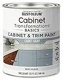
- CABINET TRANSFORMATION: Refresh outdated cabinets, vanities, furniture and trim with rich Cadet Gray color and a smooth semi-gloss finish
- DURABLE PERFORMANCE: Easy-to-clean finish resists dirt and grime while standing up to household chemicals
- SMOOTH APPLICATION: Outstanding flow and leveling help create a beautiful finish with brush, roller, pad applicator or airless sprayer
- FAST PROJECT COMPLETION: Dries to touch in 30 minutes, recoats in 2 hours and is ready for normal use after 24 hours
- INTERIOR CABINET COATING: Ideal for kitchens, bathrooms, laundry rooms and other interior cabinet and trim applications
What sheen is easiest to clean?
Satin and semi-gloss are the practical choices for most working kitchens. They provide a more washable, hard-wearing surface than flat paint without the intense reflection of full gloss. Dulux recommends satin, semi-gloss or gloss for cabinet surfaces, while Sherwin-Williams describes satin as a high-traffic balance, semi-gloss as easy to clean with a subtle shine, and gloss as a durable, reflective option.
Do these 3 things before closing this tab:
1Repair Windows errors before they cause bigger problems2Scan for outdated or missing drivers - takes under a minute3Clear out junk files and repair common Windows errors| Sheen | Strengths | Trade-offs | Where it fits |
|---|---|---|---|
| Satin | Lower reflection, practical cleanability and a forgiving appearance | Less reflective than semi-gloss; may not highlight door details as strongly | Most cabinet doors and drawer fronts when you want a refined finish |
| Semi-gloss | Easy to clean, durable and lightly reflective | Shows more surface irregularity and glare than satin | Busy kitchens and cabinets that need frequent wiping |
| Gloss | Highly durable, bright reflection and strong emphasis on profiles | Reveals dents, brush marks and uneven preparation; can feel visually intense | Modern, deliberately polished schemes with very smooth surfaces |
Sheen can change color perception. A glossy surface reflects windows and fixtures, while satin diffuses more of that light. Compare the same color in the intended sheen on a sample board; do not approve a color in satin and assume it will look identical in gloss.
Independent reader supportYour contribution helps us test, update, and keep practical guides available for everyone.Do I need primer before painting cabinets?
Primer is often necessary when the substrate is glossy, stained, previously painted with an unknown coating or changing substantially in color. It improves adhesion, helps block stains and can make the finish more uniform. The exact need depends on the existing surface and the paint system, so follow the selected product’s instructions.
Prepare the room and label every part
- Remove doors, drawers and hardware.
- Label each door and drawer so it returns to its original position.
- Set parts on a clean, ventilated work surface and protect the surrounding area.
Clean before sanding
Kitchen cabinets accumulate grease and cooking residue. Degrease and clean thoroughly, then allow the surfaces to dry completely. Paint applied over residue can fail even when the color and sheen are correct.
Repair and dull the existing finish
Fill dents, holes and damaged edges, then sand the repairs smooth. Lightly dull glossy coatings or follow the adhesion instructions for the chosen primer. The goal is a clean, sound surface with enough tooth for the next coat, not aggressive sanding that removes useful material.
The Tool Desk
Outbyte Driver Updater FREEScan for outdated or missing drivers - takes under a minuteDriver Scan →Outbyte PC Repair FREEClear out junk files and repair common Windows errorsFree Scan →Test adhesion in an inconspicuous area
Sherwin-Williams recommends testing Extreme Bond Primer before proceeding. Apply the proposed system to a hidden spot, allow it to dry as directed and check whether it remains firmly attached. If adhesion is poor, stop and correct the cleaning, sanding or primer choice before coating the visible doors.
Prime when the surface or color change requires it
Prime over stains, difficult substrates and major color changes when the paint system calls for it. Benjamin Moore describes Fresh Start as a high-hide primer that seals, suppresses stains and improves adhesion. A compatible primer can also reduce the number of finish coats needed for an even result, but it does not replace careful preparation.
Also popular on Amazon

- Includes 30 featured and newest released color card. Sprayed on color to see our colors in your homes lighting for more accurate color choices.
- ALL-IN-ONE Paint - NO Sanding, NO Priming, NO Top Coat Required, Low Luster, Velvet Sheen Finish
- Interior/Exterior - Paint your whole house - Ideal for hard surfaces including walls, doors, cabinets, counters, furniture, metal, glass, ceramics and floor and wall tile
- Durable yet stretches to paint smooth fabrics, vinyl and leather
- Results cannot be guaranteed. Digital screens may not show color accurately. Product search "ALL-IN-ONE PAINT by Heirloom Traditions, Color Confidence Card", for an accurate color choice.
Apply cabinet-rated topcoat
Use a product labeled for cabinets, trim, doors or furniture rather than ordinary flat wall paint. Examples named by manufacturers include Benjamin Moore Advance waterborne alkyd, Sherwin-Williams Emerald Urethane Trim Enamel, Dulux Quick Dry Satinwood and Behr Premium Cabinet, Door & Trim Enamel. Confirm that the product is available in your region and that its primer and topcoat are designed to work together.
Use the right application tools
Sherwin-Williams recommends an angled brush for details and a mini roller for broad, flat areas. Work methodically, maintain a wet edge and avoid overworking paint as it begins to set. A smooth result depends more on preparation, controlled application and adequate drying than on a particular brand of tool.
Apply two finish coats and respect drying times
Dulux recommends two coats. In the Sherwin-Williams workflow, the second coat is applied after roughly 24–48 hours, depending on the product and conditions. Treat those figures as product-specific guidance, not a universal timer: temperature, humidity, ventilation and film thickness affect drying. Sand lightly between coats only when the selected system calls for it.
Reassemble after the stated cure or dry time
Do not reinstall doors and hardware as soon as the surface feels dry. Benjamin Moore advises waiting at least 24 hours in a well-ventilated area before reassembly. Follow the label for the full cure period before subjecting the finish to heavy cleaning or repeated impact.
What are the most common cabinet-color mistakes?
- Choosing from a tiny chip: Small samples hide undertones and do not show how a color behaves across a door. Use large boards instead.
- Ignoring the countertop: A “perfect” white can look pink, yellow or gray beside stone. Compare every finalist directly with the fixed finishes.
- Testing in only one location: Light changes across the room. Place samples on bright and shaded cabinet walls.
- Forgetting artificial light: A color that works in daylight may shift when ceiling fixtures are on. Evaluate it under normal evening lighting.
- Using wall paint: Cabinet doors need a coating formulated for repeated handling and cleaning. Choose a cabinet, trim, door or furniture enamel.
- Skipping adhesion preparation: Grease, gloss and damaged old coatings can cause peeling. Clean, repair, dull and test before painting the visible parts.
- Choosing gloss to hide flaws: Gloss reflects more light and makes dents, brush marks and uneven edges easier to see. Use it only when the surface is exceptionally smooth and the reflective look is intentional.
- Reassembling too soon: A paint film can feel dry while remaining vulnerable to pressure and abrasion. Observe the product’s dry and cure instructions.
How can I make the final choice quickly and confidently?
Use this decision worksheet after the sample period. Eliminate any color that fails a required condition before ranking the survivors by preference.
| Question | If the answer is yes | What to test next |
|---|---|---|
| Does the color share an undertone with the countertop and backsplash? | Keep it in the running. | Compare nearby values in the same temperature family. |
| Does it look acceptable in morning, afternoon and evening light? | Keep it in the running. | Check it beside hardware and appliances. |
| Does its value create the desired openness or depth? | Keep it in the running. | Compare one step lighter and one step darker. |
| Will the chosen sheen support cleaning without unwanted glare? | Keep the color and test it in the intended sheen. | Compare satin and semi-gloss on the same board. |
| Can the existing finish accept the selected primer and enamel? | Proceed to a hidden adhesion test. | Correct cleaning, sanding or primer selection before full application. |
When two colors remain, choose the one that works across the widest range of light and sits most comfortably beside the permanent finishes. A cabinet color should support the kitchen every day, not merely look impressive under one photograph’s lighting.
Frequently Asked Questions
Can I use ordinary wall paint on kitchen cabinets?
It is better to use a coating labeled for cabinets, trim, doors or furniture. Those products are formulated for the handling and cleaning that cabinet doors receive, whereas flat wall paint is not selected for that type of wear.
How should I save the information needed for future touch-ups?
Keep the original can or record the manufacturer, exact color name, sheen and product line together. Store a small labeled sample and any remaining paint in a tightly sealed container so you can identify the finish if a door is damaged later.
Why do two cabinet doors painted the same color look different?
Different door positions can receive different amounts of daylight and reflected light from nearby surfaces. Check that both doors have the same preparation, primer, number of coats and sheen before assuming the color itself is inconsistent.
Is a two-tone cabinet scheme harder to maintain?
Cleaning requirements are determined mainly by the product and sheen, not by whether one or two colors are used. Keep the same compatible enamel system on both colors and label each paint clearly for later repairs.
Crashes, No Sound, or Screen Glitches?
Random freezes, missing sound and display glitches usually trace back to one bad driver. Find and replace yours safely.Free scan · under a minuteWindows Errors? Fix Them Before They Spread
Repair common Windows errors and clear accumulated junk for a smoother, more stable PC - no reinstall needed.Free scan · no reinstallQuick Recap

Product prices and availability are accurate as of the date/time indicated and are subject to change. Any price and availability information displayed on Amazon at the time of purchase will apply.

