Windows Errors? Fix Them Before They Spread
Outbyte PC Repair · freeRepair common Windows errors and clear accumulated junk for a smoother, more stable PC - no reinstall needed.
Fix My PC Now →ThatPainter is reader-supported. When you buy through links on our site, we may earn an affiliate commission. Learn More
Choose a vintage paint color by the undertones and lightness of your existing floor and furniture before you choose an era or a paint-chip name. Warm wood that reads red, orange, or yellow generally sits comfortably with creamy whites, beiges, and earthy colors; cool blue, green, or true-gray undertones usually need cool whites, soft grays, or muted sages. Then set a deliberate value contrast so the floor and furniture remain visible: light walls can open up a room with dark wood, while dark walls make light floors feel dramatic and cozy. Use a rug, artwork, or upholstery as a palette anchor, select a historically coherent color family, and make the final decision only after samples have been viewed on multiple walls through morning, afternoon, evening, and artificial light.
How do you begin choosing a vintage wall color?
Begin with what cannot easily change: flooring, built-ins, tile, fireplaces, cabinetry, large upholstered pieces, and the furniture you intend to keep. A vintage label does not make an unsuitable undertone work. The reliable sequence is undertone, value contrast, palette anchor, period direction, then real-room sampling.
As an Amazon Associate I earn from qualifying purchases.
Quick wins for a faster PC:
Clear out junk files and repair common Windows errorsFree Scan →Scan for outdated or missing drivers - takes under a minuteDriver Scan →- Identify the dominant undertone. Decide whether the floor and largest furnishings read warm (red, orange, or yellow) or cool (blue, green, or true gray).
- Choose a compatible family. Warm finishes usually harmonize with creamy whites, beiges, and earthy tones. Cool finishes tend to pair with cool whites, soft grays, and muted sages.
- Set the lightness relationship. Decide whether the walls should be lighter or darker than the floor so neither surface disappears.
- Find a palette anchor. Pull a secondary color from a rug, artwork, fabric, or upholstery instead of guessing from a paint fan alone.
- Choose a period direction and sample it in place. Historical coherence is useful, but the room’s changing light makes the final decision.
How can you read the undertones in floors and furniture?
Look at the floor and the largest wood or upholstered pieces together in daylight, not under a single warm lamp. Hold a clean white sheet of paper beside the finish; the color cast that appears against the neutral reference is easier to see. A floor that seems brown at first glance may reveal red, orange, yellow, gray, or green when compared with a neutral.
Warm undertones: red, orange, and yellow
Warm undertones are based in red, orange, or yellow. They generally harmonize with creamy whites, beiges, and earthy colors. This does not mean every warm wall must be beige; a muted blue, green, or gray can provide measured contrast when it carries a related undertone rather than a sharp, icy cast.
Popular on Amazon
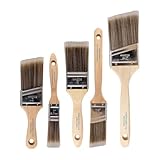
- COMPLETE 5-PIECE BRUSH SET FOR EVERY PAINTING TASK — Includes 1 Inch Flat, 1.5 Inch Angle, 2 Inch Flat, 2 Inch Angle Stubby, and 2.5 Inch Angle brush giving you every size professional painters use daily. Get all 5 for less than the price of a single brush from hardware store brands — professional grade performance at a fraction of the cost. Perfect for walls, trim, cabinets, doors, furniture, and detailed cutting-in work on any project.
- ZERO BRISTLE LOSS — GUARANTEED BY PRECISION ADHESIVE BONDING — Every bristle is locked in place with precision-set adhesive that keeps them in the brush — not in your paint job. The coated steel ferrule provides structural support while the adhesive bond ensures clean performance on every stroke. Premium SRT synthetic filaments load more paint and release it evenly for a smooth streak-free finish on walls, ceilings, and trim. Works with latex, oil-based paint, primer, sealer, and wood stain.
- INCLUDES THE ANGLE STUBBY MOST SETS LEAVE OUT — Professional painters know the 2 Inch Angle Stubby is the go-to brush for tight cabinet interiors, window sashes, inside corners, and detailed trim where standard angle brushes are too long. Combined with the 1.5 and 2.5 inch angle sash brushes you have precision cutting-in covered at every scale — baseboards, crown molding, door casings, and ceiling lines.
- FLAT BRUSHES FOR BROAD SMOOTH COVERAGE ON ANY SURFACE — The 1 and 2 inch flat brushes deliver even coverage on walls, furniture, shelving, doors, fences, decks, and wood surfaces. Ideal for applying primers, stains, varnishes, polyurethane, and specialty coatings. Solid wood handles provide all-day comfort and control for both professional contractors and weekend DIY homeowners tackling interior or exterior painting projects.
- TRUSTED BY PROFESSIONAL PAINTERS AND CONTRACTORS NATIONWIDE — Pro Grade delivers professional-grade results at a price that makes sense for crews who go through brushes on every job. Ideal for property managers, remodeling contractors, apartment turnover crews, maintenance teams, and commercial painting operations. Backed by thousands of verified reviews from working painters. Washable and reusable for multiple projects.
Cool undertones: blue, green, and true gray
Cool undertones include blue, green, and true gray. Cool whites, soft grays, and muted sages are natural partners. A heavily yellow wall beside a blue-gray floor can make both surfaces look more extreme, so compare the actual finishes with the candidate paint before committing.
Mixed wood tones
Mixed species do not need to be forced into one identical color. Coordinate their shared undertone where possible, then use wall value or a rug to create separation. Trying to make every wood species match can produce a less natural result than allowing each piece to retain its character.
Which vintage paint colors work with common wood floors?
The following pairings are starting points, not automatic prescriptions. The named colors are examples associated with the stated floor readings; lighting and surrounding finishes can change how each appears.
| Floor or furniture reading | Wall strategy | Named examples |
|---|---|---|
| Red or orange wood | Stay with compatible warm neutrals, or introduce a muted blue, green, or gray that has a related undertone for controlled contrast. | Sea Salt; Nonchalant White; Panda White |
| Brown or walnut | Provide enough wall-value contrast to keep dark wood legible instead of allowing wall and furniture to merge. | Serenely; Snowfall; Opaline |
| Golden or honey oak | Avoid forcing a competing yellow. Consider a lighter or cooler-leaning counterpoint, then test it because lighting can shift the result. | Windchill; Aged White; Pacific Fog |
| Mixed wood tones | Coordinate undertones and use value or a rug to separate pieces; do not try to make every species identical. | Use the room’s shared undertone as the guide |
Red- and orange-reading floors
Warm neutrals can calm red or orange wood without erasing its depth. If the room needs contrast, a muted color is safer than a highly saturated complementary blue or green. Sea Salt, Nonchalant White, and Panda White are listed as options for red-reading floors; view each beside the actual boards and nearby furniture.
Brown and walnut floors
Dark brown wood needs a visible value relationship. If the wall is almost the same depth, the floor can lose definition and the room may feel heavy. Serenely, Snowfall, and Opaline are listed for brown-reading floors, but their perceived lightness still depends on the room’s exposure and artificial lighting.
Also popular on Amazon

- Great Value Pack Artist Paint Brushes: Soucolor 20 brushes in 10 sizes professional paintbrushes set — no shedding, holds paint well, cleans easily, Acrylic, watercolor, oil, gouache, Halloween pumpkin decoration & face painting, rock painting, ceramics. Fantastic high quality gifts for creative, artistic siblings to share!
- Awesome Set of Paint brushes: Professional paint brushes can cover all of your needs. The multi-purposed brushes are ideal for Watercolor, Oil, Gouache, enamel, Acrylic Painting, Body, Nail, Face Painting, Miniature, Model, Wood, Glass, Cup, Ceramic, Fine work, Art class, Craft Art Painting, DIY Art Crafts etc.
- Soft and long-lasting: The bristles are soft and strong, with nickel metal ferrules and blue wooden handles. After cleaning, the bristles will become soft and fluffy again and will not fall off.
- Easy to clean: it’s very convenient to Wash well in soap and water. Retain shape after drying. the brushes hold up very well. Nice selection to beginners and professionals. Keep them clean and they last a long time.
- Halloween Pumpkin Ceramic Crafts Supplies: A Great painting gift for family, friends, kids, girls, women, student, classmate, teacher. For using in school, travel or used in the home and office.
Golden oak and honey-colored floors
Golden or honey oak already supplies a strong yellow-orange note. Repeating a similarly yellow wall can make the room look overly matched. Windchill, Aged White, and Pacific Fog are listed for golden-yellow or orange floors; sample them because a color that looks balanced in a store can shift noticeably in a room with different daylight.
Do these 3 things before closing this tab:
1Fix the driver behind crashes, sound loss and screen glitches2Clear out junk files and repair common Windows errors3Scan for outdated or missing drivers - takes under a minuteHow much contrast should there be between the walls and the floor?
Use value contrast deliberately. Light walls with dark floors create an open, anchored composition because the floor supplies visual weight while the walls recede. Dark walls with light floors create drama and coziness by reversing that relationship. In a small or dark room, avoid making both the floor and walls dark; the combined low value can reduce the sense of space and hide furniture edges.
When to choose lighter walls
Choose a lighter wall when the floor or major furniture is dark and you want those pieces to remain clearly visible. A light vintage neutral can still feel historical when its undertone and trim relationship fit the period direction. Compare the candidate against the darkest wood in the room, not just an empty section of floor.
When to choose darker walls
A darker wall can make pale flooring feel grounded and can support a cozy, enveloping mood. Check the room’s window exposure and artificial light before using this approach. If the space is already small or dim, keep either the floor or the walls noticeably lighter so the two surfaces do not collapse into one dark field.
How can rugs, art, and upholstery determine the palette?
Existing furnishings are often more trustworthy palette sources than a generic vintage color list. A favorite rug, artwork, or fabric already combines colors that coexist in your room’s light. Treat flooring, cabinetry, tile, fireplaces, upholstery, and other permanent finishes as constraints, then use the movable piece to select a secondary wall or accent color.
Recommended Free Tools
Also popular on Amazon

- 【All sizes of art brushes】: The 10 sizes of multi-functional brushes have various shapes, making the mixing color easier, which is very suitable for artists, students, teenagers, children and painters at all levels. Wonderful Present ideas for friends and family who like painting!
- 【general brush set】: Professional paint brush can meet all your needs. Multifunctional brush is very suitable for watercolor, oil, gouache, acrylic painting, body, nail, face painting, miniature, model, ceramics, arts and crafts painting, etc.
- 【high quality process】: It is designed with anti falling bristles, anti-rust nickel ferrule and solid wood handle. You can use the brush to focus on the painting and always be creative.
- 【easy to maintain】: After using the brush, it is very convenient to clean the brush with warm soapy water and reshape the tip of the brush. Air dry the brush and place it on top of the top for long use.
- 【100% satisfaction guarantee - buy now】1 packs of set brushes, you can also get friendly customer service, any questions feel free to contact us, within 24 hours to help you! There is no risk in buying our paint brush kit.
Use a dominant-and-supporting-color approach
Identify the largest color in the rug or artwork, then note one or two supporting colors that recur in smaller amounts. The wall does not have to copy the dominant color. It can use a quiet neutral that lets the pattern lead, or a muted supporting color that makes the furnishing look intentional.
Repeat accents without making every room identical
For an entire home, keep a quiet base and repeat a few vintage accents from room to room. HGTV Home by Sherwin-Williams suggests beginning with neutral base shades and adding accents such as Refresh, Bunglehouse Blue, or Bosc Pear. Repeating an accent in a pillow, painted cabinet, or artwork frame can connect spaces while allowing each room to respond to its own floor and light.
Which historical period direction should guide the color?
After undertone and value are settled, choose a period family that suits the architecture and furnishings. A period direction narrows the field and helps colors feel coherent, but it should not override a floor that clashes with the proposed undertone.
| Historic family | Color examples named for the collection | How to use the direction |
|---|---|---|
| Colonial Revival (1870s–1900s) | Classical White; Colonial Yellow; Colonial Revival Green Stone | Use the family to establish a historically related base or accent, then check it against wood and trim. |
| Victorian | Acanthus | Use a period reference as a starting point and moderate it with the room’s existing value balance. |
| Arts & Crafts | Examples listed in the collection include Acanthus and earthy directions | Let natural materials and furnishings determine how strong the wall color can be. |
| Jazz Age | Dutch Tile Blue | Use a clear period cue as an accent or focal wall when the surrounding finishes can support its contrast. |
| Streamlined Years | Rosedust | Pair a distinctive period color with a quieter neighboring surface so the room does not become visually noisy. |
| Suburban Modern | Collection examples include the listed historic neutrals and accents | Use the period label to maintain a consistent story while still matching the actual floor undertone. |
Sherwin-Williams describes its historic collection as spanning Colonial Revival, Victorian, Arts & Crafts, Jazz Age, Streamlined Years, and Suburban Modern families. Sue Wadden, Director of Color Marketing at Sherwin-Williams, describes the palettes this way: “Tested by time, every hue of our historically precise palettes has a graceful, nostalgic appeal all its own.” The historical association is a useful organizing tool, not proof that a color will suit every room.
Free tools Windows power users keep installed
One-click scans. No signup required.
How do you balance a strong vintage accent with a livable base?
Start with a quiet base on the largest wall area, then reserve a stronger vintage color for a smaller, intentional surface. This keeps a bold hue from competing with patterned rugs, dark wood, or ornate furniture.
Also popular on Amazon

- Bates paint brushes come in a convenient 6 pieces with 3 flat and 3 angled bristle styles, including (1”, 1.5”, 2”) flat and (1.5”, 2”, 2.5”) angled bristles, perfect for tackling any surface painting or staining job.
- The sturdy natural bristles of each brush are designed to hold more paint, creating a smoother finish with fewer streaks and saving you time on the job.
- The lightweight wooden handles provide extra comfort and ease during long painting processes like walls, trims, cabinets, and doors.
- These versatile brushes are ready-to-use, easy to clean, and can be reused multiple times, making them economical as well as reliable tools for any painting project.
- Bates paint brushes can be used for both oil-based paints as well as latex stains and are ideal for home or commercial projects such as decks, fences or DIY painting jobs.
Use the base on the largest visual plane
A neutral base can be a warm creamy white, beige, soft gray, or another shade whose undertone agrees with the permanent finishes. Check the base against trim, ceiling, and flooring; a neutral that is too cool beside warm oak can look stark, while one that is too yellow beside cool gray can appear muddy.
Choose where the accent earns attention
Use a stronger color on a fireplace wall, built-in, dining room, hallway, or other architectural feature when the room needs a focal point. Repeat a small amount of that color in textiles or art rather than painting every adjoining surface equally strong.
Independent reader supportYour contribution helps us test, update, and keep practical guides available for everyone.How should you sample vintage paint in changing light?
Sample in the actual room, on more than one wall, with the permanent furnishings in place. Sherwin-Williams recommends viewing a wall swatch at different times of day. Benjamin Moore offers an 8-ounce liquid sample that covers approximately 2 square feet with brush application, while its Samplize peel-and-stick sample measures 9 by 14.75 inches, uses real paint, and can be moved between walls.
- Choose a sample format. In the United States, Sherwin-Williams offers 2-by-3-inch chips, 8-by-8-inch peel-and-stick samples, and tinted paint samples. Use a larger painted or peel-and-stick area when you need to judge undertone beside a patterned rug or dark wood.
- Place samples on at least two walls. Include one wall near the floor and another near the main furniture. A single wall can hide how orientation and reflected colors alter the paint.
- Keep the room intact. Leave rugs, upholstery, trim, metals, artwork, and wood furniture in their normal positions. Removing them produces a false impression of the final combination.
- Observe four lighting periods. Check morning, afternoon, evening, and artificial light. Record whether the color becomes warmer, grayer, brighter, or darker rather than relying on one favorable glance.
- Compare adjacent finishes. Look at the sample directly beside floorboards, cabinetry, trim, and the largest upholstered piece. A color that looks attractive alone may expose an unwanted undertone next to a permanent finish.
- Move a peel-and-stick sample if needed. A movable sample lets you compare the same paint on different walls and in different lighting without repainting each test area.
- Decide only after the color works in every important condition. The final choice should maintain undertone harmony and readable value contrast through the room’s full light cycle.
What common problems appear when vintage colors are matched incorrectly?
Most failures come from choosing by the period name or a small chip before evaluating undertone and value. Diagnose the visual symptom, then correct the variable that caused it.
- The floor looks more orange after painting. The wall may be repeating or amplifying the floor’s yellow-orange undertone. Test a quieter neutral or a muted contrasting color with a related undertone.
- Dark furniture disappears. Increase wall-value contrast so the wood is not the same visual depth as the background.
- The room feels cold beside warm wood. Replace an icy white or blue-gray with a creamy white, beige, or earthy neutral, or test a softened muted color.
- A historic color feels too intense. Keep the period color as a smaller accent and use a quiet base on the larger wall area.
- Mixed woods look chaotic. Stop trying to match species exactly. Find the undertone they share and use a rug or value shift to separate the pieces.
- The color works in the store but not at home. Lighting, surrounding finishes, and reflected colors changed the result. Return to multi-wall sampling and observe the full day-and-evening cycle.
What can you confidently conclude about matching vintage colors?
Undertone compatibility comes before the vintage label, and value contrast keeps floors and furniture legible. Rugs, art, and upholstery can supply a dependable palette anchor, while era-based collections help maintain historical coherence. Sampling in the actual room through changing light is the final decision gate.
Also popular on Amazon

- 2 Inch Angled Paint Brush for Precision Cutting-In – Designed for clean, sharp lines around trim, baseboards, ceilings, corners, and detailed edge work. The perfect size for control and coverage.
- Value 3-Pack for Pros & DIY Projects – Includes three professional 2-inch angled sash brushes — ideal for contractors, remodelers, and homeowners tackling multiple rooms or repeat paint jobs.
- Smooth Results on Walls, Trim & Cabinets – Great for interior wall painting, cabinet edges, furniture projects, and trim work where a smooth finish and crisp control matter most.
- Works with Latex Paint, Oil-Based Paint & Stains – Premium synthetic filaments hold more paint, reduce streaks, and provide a clean finish with latex paints, oil coatings, and wood stains.
- Works with Latex Paint, Oil-Based Paint & Stains – Premium synthetic filaments hold more paint, reduce streaks, and provide a clean finish with latex paints, oil coatings, and wood stains.
Published guidance for these combinations is expert and manufacturer-based rather than statistical. There are no independent named statistics establishing a success rate, resale effect, or psychological benefit for matching vintage paint colors to flooring and furniture. Treat the color names and period groupings as informed starting points, then let the tested room—not the label alone—make the decision.
Frequently Asked Questions
Can one vintage color work in rooms with different exposures?
It can, but the same paint may read warmer, cooler, lighter, or darker as orientation and artificial lighting change. Keep a sample in each room and compare it during that room’s own light cycle rather than assuming a color approved in one space will transfer unchanged.
Should trim be selected before or after the wall color?
Permanent trim is part of the color context, so include it when judging samples. A creamy wall can make bright white trim look sharper, while a cool wall can make warm trim look yellow; view the proposed wall beside the existing or planned trim before ordering paint.
Is a peel-and-stick sample better than a liquid tester?
Neither format is universally better. A liquid tester shows the finish brushed on the wall and Benjamin Moore’s 8-ounce sample covers about 2 square feet, while a 9-by-14.75-inch Samplize sample uses real paint and can be moved between walls; choose the format that lets you compare enough surface area in your room.
How can I keep an old house from looking like a theme room?
Use the historic family as a quiet framework rather than applying a period color to every surface. Keep the largest areas restrained, repeat one or two accent colors through furnishings, and let original floors, woodwork, and architecture remain the strongest evidence of the home’s age.
Quick Recap

Product prices and availability are accurate as of the date/time indicated and are subject to change. Any price and availability information displayed on Amazon at the time of purchase will apply.

