Free tools Windows power users keep installed
One-click scans. No signup required.
Quick wins for a faster PC:
Fix the driver behind crashes, sound loss and screen glitchesFind Drivers →Repair Windows errors before they cause bigger problemsFix Now →Scan for outdated or missing drivers - takes under a minuteDriver Scan →ThatPainter is reader-supported. When you buy through links on our site, we may earn an affiliate commission. Learn More
The most reliable way to make several apartments feel related is to share an undertone and a color hierarchy, not to paint every wall the identical color. Choose a warm-neutral direction that agrees with the buildings’ fixed finishes, use one anchor neutral in entries and connecting spaces, keep trim and ceilings coordinated, and vary lightness where each apartment’s daylight requires it. A value ladder, sightline plan and large in-room samples prevent beige, greige and warm white from clashing. Record every approved color, product code and sheen so phased repainting remains consistent.
As an Amazon Associate I earn from qualifying purchases.
What makes several apartments feel like one coherent portfolio?
Consistency comes from relationships that repeat across properties. The eye notices undertones, transitions and recurring finishes before it notices whether every room uses the same paint chip. A portfolio can therefore use several warm neutrals while still feeling intentional.
- One undertone direction: warm neutrals generally lean yellow, red or orange; greige balances gray and beige. Select the direction that agrees with the most common floors, stone, cabinetry and large upholstery.
- One anchor neutral: use a dominant color in entries, halls and other connector spaces. Those areas establish the visual identity as residents move through an apartment.
- A controlled value ladder: reserve lighter values for ceilings, trim and shared walls, then move darker in enclosed rooms or for a deliberate anchor.
- Planned sightlines: colors visible together from a doorway or hall should be close relatives. A bedroom, study or powder room that is visually separated can take more depth or personality.
- Repeated accents: carry one muted accent through textiles, art, hardware or a small painted feature so apartments feel related without looking copied.
Interior designer Kelly Porter, quoted by Houzz, recommends keeping the foyer, hallways and main connector room in the same dominant color. Jennifer Ott, also quoted by Houzz, warns that a different color scheme in every room can look “really wacky.” Applied across apartments, those ideas become a system: repeat the elements that are visible everywhere and vary the elements that are private or light-sensitive.
Popular on Amazon

- Package Includes: This wood panel set contains 4 individually crafted wooden panels, ensuring artists and craft enthusiasts have a substantial base for their creative undertakings. Each piece serves as a blank canvas waiting to be transformed by the imaginative minds of its user.
- Size Information: With size carefully set at 24 x 24 inches / 61 x 61 cm and a thickness of 0.8 inches / 2 cm, these wooden panels provide a substantial surface area for artists to work on, catering to elaborate and detailed artistic visions. The size is thoughtfully chosen to accommodate a wide range of projects, from intricate paintings to decorative crafts.
- Premium Material: Constructed from select pine wood, these unfinished wooden panels stand out for their smooth and even surface, enhanced by the wood's natural grain that adds a unique character to each piece. Users are advised to protect these panels from dampness and prolonged exposure to sunlight to maintain their pristine condition and natural beauty over time.
- Multiple Uses: These wood panels are compatible with various artistic mediums, including but not limited to oil, acrylic, and watercolor paintings. They also provide an excellent foundation for tempera, encaustic art, collage, decoupage, and impasto techniques. Creative individuals can further embellish them with additional elements like dried flowers or clay, making each creation truly one-of-a-kind.
- Wide-Ranging Applications: Beyond their appeal to individual artists, these wood panels are suited for a multitude of scenarios, from enhancing parent-child bonding through DIY projects to serving as unique rewards during the school season. They also double as exquisite decorative pieces, capable of adding a touch of personalization and warmth to weddings, family gatherings, and gallery displays, effortlessly blending artistry with life's cherished moments.
How do I inventory the finishes I cannot change?
Begin with what is already installed. Paint should support fixed materials rather than forcing them to look cooler, yellower or pinker than they are.
- Photograph each apartment in neutral daylight. Capture floors, countertops, backsplashes, cabinetry, stone, major upholstery, metal finishes and window exposures. Take both close photographs and wide shots that show how materials meet.
- Record the dominant repeated finish. If the same oak floor or stone countertop appears in most apartments, treat it as the portfolio’s strongest undertone signal. Note whether it reads golden, pink, red-brown, taupe, gray or nearly neutral.
- Separate fixed and replaceable items. Flooring and cabinets may remain for years; curtains, rugs and artwork can change. Give greater weight to the finishes that will survive multiple repaint cycles.
- Map sightlines. From the entry, stand where a resident would naturally look and list every wall visible at once. Repeat from the main living area and from the top of any corridor. These views determine which colors must be close relatives.
- List lighting conditions. Record window orientation, large obstructions, ceiling fixtures and the bulb color used in each apartment. A sample that works in bright south light may shift noticeably in a dim north-facing room.
This inventory gives you a defensible starting point. When finishes disagree, prioritize the materials that appear most often and occupy the largest visual area, then use samples to confirm the choice in each apartment.
Which warm-neutral undertone should the portfolio share?
Choose the undertone that harmonizes with the fixed finishes, then allow small value adjustments for individual apartments. Sharing an undertone is more robust than imposing one exact color everywhere.
Warm white
A warm white can keep entries and living areas bright while avoiding the stark contrast that a blue-leaning white may create beside creamier stone or wood. Test it carefully in north-facing rooms, where low daylight can make even a restrained warm white appear more colored.
Beige
Beige is useful when floors, cabinetry or upholstery already carry yellow, tan or red-brown notes. A beige that is too saturated can make a small or dim room feel heavy, so use the value ladder and large samples rather than judging a tiny card.
Balanced greige
Greige can bridge warm wood and cooler stone when neither a distinctly yellow beige nor a crisp white works. It still has an undertone; a gray-beige that turns violet or blue beside the flooring will not create a calm connection.
How to resolve a tie
Shortlist three candidates: your leading choice, one slightly warmer and one slightly cooler. Paint all three in the same sheen and compare them against the dominant floor, countertop and upholstery in every apartment. Keep the candidate whose undertone stays acceptable in both the brightest and darkest relevant conditions, not merely the one that looks best under a showroom light.
Where should the anchor neutral go?
Put the anchor neutral in spaces that connect rooms or apartments visually: entries, corridors, foyers, open living areas and walls seen through several doorways. Keeping those surfaces related gives the portfolio a recognizable spine even when bedrooms or studies vary.
Also popular on Amazon

- Heavy-Weight: 8-Ounce Triple Primed Acid Free Surface. Each Panel is pre-primed and ready to be painted on
- Durable Construction: 100% Cotton Canvas Surface - Hand Stretched & Glued Over High Quality MDF Cardboard Backerboards
- Professional Artist Quality: 1/16" Thickness Profile & 8-Ounce Triple Primed with Acid-Free White Gesso
- Versatile: These high quality panels can be used with Acrylic, Oil, Watercolor, Tempera, Gouache, Pouring, Airbrushing & More
- Great For: Students, Classrooms, Professionals, Children, Wine Parties, Birthday Parties & More
The anchor does not have to be the lightest color. It must be the most dependable color across the greatest number of transitions. In one building it may be a warm white; in another, a balanced greige with more body. If a particular apartment has unusually strong light, use a lighter or darker value from the same undertone family rather than switching to a contradictory hue.
Use apartment-specific colors in enclosed rooms where the transition is controlled. A deeper neutral in a bedroom or study can add hierarchy without disrupting the view from the entry. Powder rooms are similarly good places for a more distinct value because their doors limit the sightline.
How do I build an LRV ladder for warm neutrals?
Light Reflectance Value (LRV) is a practical way to keep the palette’s depth intentional. The following ranges are design heuristics, not guarantees; the same nominal LRV can appear different beside different materials and under different bulbs.
PC Slower Than It Used to Be?
A free scan shows the junk files, broken settings and background clutter dragging Windows down - then fixes them in one click.Free scan · Windows 10 & 11Outdated Drivers Are Slowing You Down
One free scan finds every outdated or missing driver and matches the right update for your exact hardware.Free scan · exact hardware match| Role | Starting LRV range | Where to use it | Purpose |
|---|---|---|---|
| Trim and ceilings | 85–90 | Trim, doors and ceilings | Creates a consistent light frame around rooms |
| Main wall neutral | 60–75 | Entries, halls and primary living areas | Provides the shared portfolio base |
| Deeper neutral | 40–55 | Enclosed bedrooms, studies or selected connectors | Adds hierarchy without becoming a dark anchor |
| Dark anchor | Below 25 | Limited built-in, architectural or feature element | Creates contrast in a controlled location |
| Livable wall-neutral band | 55–80 | General wall-color shortlisting | Useful screening range before in-room testing |
Interior design guidance commonly places livable wall neutrals around LRV 55–80. A four- or five-step ladder lets you keep the same undertone while changing depth. Do not assume that a higher LRV always looks better: a very bright wall beside creamy trim can emphasize the trim’s color, while a low-LRV neutral may absorb too much light in a small room.
How should I adjust the palette for different window orientations?
Use orientation as a reason to shift value within the family, not as a reason to abandon the family. Start with the ranges below, then verify them on boards in the actual apartment.
| Condition | Starting wall-neutral range | Useful adjustment | Watch for |
|---|---|---|---|
| North-facing or low-light living room | LRV 65–80 | Test warmer whites or warm greiges | Gray or blue influence that makes the room feel cold |
| Strong south- or west-facing living room | LRV 60–72 | Test stone or slightly cooler greige variants within the chosen undertone | Overly yellow walls during bright afternoon light |
| Bedroom | LRV 50–65 | Use a moderately deeper value for enclosure and restfulness | A low value that closes in a small room |
These are starting ranges from published interior-design guidance, not promises about appearance. Window size, neighboring buildings, reflected flooring and lamp color can move the result substantially. Keep the trim and ceiling relationship stable while adjusting wall value.
How do I plan colors by sightline?
Sketch each apartment as a sequence of views rather than as a list of rooms. If two colors are seen simultaneously, they should share an undertone and sit near one another on the value ladder.
- Mark the entry view. Identify the first wall, corridor and room beyond it. Assign the anchor neutral to the largest connected surfaces.
- Mark the living-area view. Note any kitchen, dining or balcony wall visible from the sofa or main circulation path. Keep those colors within the same warm-neutral family.
- Mark controlled transitions. Bedrooms, studies and powder rooms can move deeper or introduce a muted accent when a door, corner or short hall interrupts the view.
- Check corners, not just doorways. A color that seems compatible head-on may clash where two walls meet or where a wall turns toward a window.
When apartments have different layouts, do not force the same room to use the same color. Assign by visual role: connector, shared living surface, enclosed retreat or accent. This preserves the experience of continuity even when floor plans differ.
Also popular on Amazon
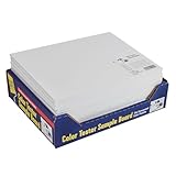
- PAINT COLOR SAMPLE BOARDS - Organize paint colors while exploring and comparing them effortlessly with this 24-pack paint board set. Each tester board features a blank space on the front for paint-out and a label on the back to identify all the details of the particular color you are testing
- VERSATILE & PORTABLE- Designed for convenience, this color keeper for paint swatches is easy to carry with you wherever your next project leads you. It’s the ideal kit board for testing paint colors, whether you’re matching or comparing paint shades with carpets, furniture, fabrics, and more
- FASTER START, FINER FINISH - FoamPRO takes the hassle out of painting with efficient and easy-to-use paint tools and supplies that move the process along. Our products make an easy, clean, and convenient way to paint while simultaneously preserving the amount of paint you use for a smooth and efficient process
- HOUSE PAINTING SUPPLIES, TOOLS & ACCESSORIES - We offer everything from Consumer Painting Tools with many advantages over conventional painting tools. Our professional painting tools include Finish Coater and Finest Finish products with added resiliency and durability. Industrial Coating Applicators feature revolutionary new foam that is resistant and impervious to solvents and harsh materials commonly used in industrial coatings
- QUALITY HOME IMPROVEMENT - FoamPRO was established in 1952 as a manufacturer of foam painting tools, brooms, and mops. Now, we’ve solidified our position as the innovator and leader in the foam painting tool category with products sold nationwide and internationally in paint, hardware stores, and home centers. Everything we sell is still made in our own factory with the highest quality raw materials and quality control standards to ensure you receive only the best, most efficient paint tools!
How much base, secondary and accent color should I use?
A practical starting ratio is 60%–70% base, 25%–30% secondary and 5%–10% accents. Keith Wardlaw of Plus Modern Design, quoted by Houzz in 2023, gives these proportions as a way to keep a palette balanced. Treat them as a planning aid, not a mathematical rule.
- Base: the anchor neutral on the largest connected wall areas, often including entries, halls and main living rooms.
- Secondary: a lighter or deeper member of the same family in bedrooms, studies, selected cabinetry or less-visible walls.
- Accent: a muted olive, clay or slate blue used sparingly through textiles, art, hardware or a small painted element.
Keep the visible palette to about three or four colors at a time. Repeat one accent in each apartment, but vary its exact object or location. A clay cushion in one unit and clay-toned artwork in another can create recognition without making the apartments look staged identically.
How do I test paint samples before buying for every apartment?
Large, movable boards are the safest way to judge warm neutrals. The recommended workflow uses two coats on boards about 24 × 24 inches, checked on three wall conditions and at three times of day.
Do these 3 things before closing this tab:
1Scan for outdated or missing drivers - takes under a minute2Repair Windows errors before they cause bigger problems3Fix the driver behind crashes, sound loss and screen glitches- Prepare the boards. Use primed hardboard or another smooth, portable sample surface. Apply two full coats in the final intended sheen, allowing the first coat to dry according to the paint manufacturer’s instructions.
- Label every candidate. Write the exact color name, product code, sheen and apartment identifier on the back. Keep the warmer, cooler and leading candidates distinguishable.
- Check three wall conditions. Place each board on the window wall, the opposite wall and the darkest corner. Do not rely on a single wall because reflected light changes the reading.
- Check three times of day. Compare morning, mid-afternoon and after dark with the apartment’s actual lamps switched on. Record whether the neutral turns yellow, pink, green, blue or gray.
- Compare fixed finishes. Hold the board beside flooring, trim, worktops, backsplash, upholstery and metal finishes. Look for undertone conflict at the edges, not only at the center of the board.
- Repeat in every distinct light condition. A candidate approved in one apartment should still be checked in units with different orientations, window sizes or neighboring buildings.
- Approve an alternative. If the shared anchor fails in one unusual apartment, select the nearest lighter or darker value with the same undertone and document it as that unit’s approved alternative.
Never buy paint for an entire building from a small paper chip alone. The sample process is especially important for warm whites and greiges, whose perceived color changes with surrounding materials and artificial light.
How do I keep phased repainting consistent?
Create a palette sheet for every apartment and update it whenever a color is approved or changed. Guiffre’s room-by-room guidance recommends recording the color name, number and sheen; adding the details below makes the record more useful for a multi-property operation.
- Paint brand and exact product line
- Color name and product code
- Finish or sheen
- Room and wall role
- Window orientation and notable light conditions
- Nearby flooring, stone, cabinetry and upholstery
- Date tested and date approved
- Approved warmer or cooler alternative, if needed
- Location of the physical sample board or a labeled photograph
Store one physical board or a clearly labeled digital photograph with the record. When a product is discontinued or reformulated, test the replacement beside the retained board rather than assuming the new formula matches the old one. Order touch-up paint by the documented product code and sheen, not by a remembered color name.
Which sheen and paint category fit a warm-neutral system?
Use a sheen that suits the room’s cleaning and wear demands, then keep that choice documented so future touch-ups do not create visible patches. A washable warm-greige interior wall paint in a matte finish, with an approximate LRV of 65–72, is a reasonable category-level starting point for main walls, but the exact brand and apartment conditions still require sampling.
Recommended Free Tools
Coordinated chalk-white trim paint can support the 85–90 LRV trim-and-ceiling band. Undyed linen curtains and other low-color textiles can reinforce the palette without adding a competing undertone. These are categories, not substitutes for checking the actual products against the apartment’s fixed finishes.
Also popular on Amazon

- Gallery Wooden Panel: Falling in Art wood panels set includes 2 packs of wood panels, each panel is 24x24 inches in size and 1 1/2 inch in thickness. Large-size boards provide unlimited painting space for you and allow you to create artwork as you like freely.
- High-quality Material: Falling in Art wood panels are made of solid wood on both sides, sturdy and durable. They will not stretch, flex, or bend easily like traditional canvas frames. The smooth surface and sanded boards with natural textures are ready for painting.
- DIY Decoration: Falling in Art wood panels allows you to make DIY art and craft projects. Add some dry flowers or other pretty items to create a unique artwork; then display these decorated ones at home, wedding, or gallery exhibition. Or they can be used as a great gift for your friends or family.
- Versatile Use: Falling in Art wooden panel suits oil, acrylic, watercolor, collage, wood burning, tempera, and other mixed media, an ideal choice for a beginner in painting or an artist. You can easily take these wooden panels for outdoor sketching without easels.
- From Us: Falling in Art aims to provide tons of premium painting art supplies, brushes, easels and easel sets, canvas panels, and more to satisfy your needs to be an artist. Once you meet issues when using our products, pls feel free to contact us.
For high-contact areas, prioritize the product’s stated cleanability and future availability. A beautiful color that cannot be matched later is a maintenance liability in a phased portfolio.
Independent reader supportYour contribution helps us test, update, and keep practical guides available for everyone.What should I do when two neutral options both seem right?
Score each candidate against the same five decision axes instead of relying on a single room or a personal preference.
| Decision axis | Question to ask | Evidence to record |
|---|---|---|
| Undertone compatibility | Does it agree with wood, stone, cabinetry and upholstery? | Board comparison beside the dominant fixed finishes |
| Light response | Does it remain acceptable in the brightest and darkest conditions? | Morning, afternoon and lamp-lit observations |
| Value/LRV | Is it light enough for shared areas and deep enough for enclosed rooms? | LRV and assigned role on the ladder |
| Sightline relationship | Does it read as a relative of adjacent colors? | Entry and corridor photographs or in-place board checks |
| Maintenance | Can the sheen withstand the room, and is the exact product available? | Product line, sheen and replenishment record |
If the candidates tie, choose the one that works in more connector spaces and reserve the other for an enclosed room. That keeps the portfolio’s most visible surfaces stable while preserving useful variation.
How can I correct a palette that already feels mismatched?
Diagnose the mismatch before repainting everything. Most problems fall into a few recognizable branches.
The walls look yellow beside the floor
Test a less saturated warm neutral or a balanced greige from the same family. Compare boards directly against the floor in both daylight and lamplight; changing bulbs alone may not solve an undertone conflict.
The greige looks blue or violet
Move warmer within the family and check the board beside stone, trim and upholstery. A gray influence that looked balanced in a bright showroom may become conspicuous in a dim apartment.
Adjacent rooms look chopped up
Return the connector surfaces to the anchor neutral and reserve stronger variation for rooms with a door or clear visual break. Recheck the full entry sightline before selecting replacement colors.
The Tool Desk
Outbyte PC Repair FREERepair Windows errors before they cause bigger problemsFix Now →Outbyte Driver Updater FREEScan for outdated or missing drivers - takes under a minuteDriver Scan →The palette feels flat
Keep the undertone constant but add a deeper value in an enclosed room or a restrained muted accent. Increasing the number of unrelated hues usually creates less cohesion, not more depth.
Also popular on Amazon

- 3/4" Studio Depth Panels: Pack of 2 premium artist quality 12" x 24" x 3/4" deep studio depth cradled birch wood paint pouring panel boards. Premium sturdy unprimed smooth birch surface panels that are ready for primer or gesso.
- Alternative to Canvas: Provides a firm smooth painting surface that will not stretch, flex or bend like traditional art canvases. Unfinished wood panels have smooth sanded birch faces with solid wood cradles that ensure strength, so there will be no warping. Easy to hang, as no frames are necessary.
- Ideal for Mixed-Media: 12x24 wood Canvas boards for painting. Wooden Panels are excellent for paint pouring and most art and craft projects, as they can be used with all types of mixed-media including oil, acrylic, watercolor, tempera, encaustic, collage, decoupage, impasto, photos, drawing, laser engraving etc...
- Available in Multiple Wood Panel Size and Depths: Our cradled wood art panel canvases are available in multiple sizes from 4" x 4" up to 48" x 48" and with cradle depths of either 1-1/2" Gallery Panels or 3/4" Studio Panels. Quantity of panels per package also vary from 2 to 5. Our wood panel boards are used by professional artists, as well as the young aspiring artist for creating unique artwork.
- U.S. Art Supply is a national industry leader in Art Supplies. Buy with Confidence: Backed by a trusted brand dedicated to your satisfaction, we ensure a hassle-free experience every time
Touch-ups show as patches
Verify that the replacement uses the same product line, color code and sheen. If the wall has aged or been cleaned repeatedly, test a small area first; document the result and repaint the complete visual section when a spot repair remains visible.
Can three apartments use different wall colors and still belong together?
Yes. Give all three a shared undertone, use the same anchor role in entries and connecting spaces, and keep trim and ceilings in the same value band. Then assign each apartment a wall value suited to its daylight: one may use the lighter end of the family, another the middle, and a darker unit the deeper end in enclosed rooms.
For example, Apartment A with limited north light might use a warmer main neutral near the upper end of the wall range. Apartment B with balanced daylight could use the portfolio’s central value. Apartment C with strong west light might use a slightly deeper or less yellow variant while keeping the same undertone. The example is a planning model; approve the actual colors only after boards are checked in place.
What’s actually slowing this PC down?
Pick the symptom - the matching free tool is one click away.
How do I manage a phased repaint across a building?
- Freeze the system first. Approve the undertone, anchor neutral, trim/ceiling color, value ladder and accent family before scheduling individual units.
- Repaint connector spaces consistently. Entries, corridors and shared sightlines should follow the approved anchor or its documented light-adjusted alternative.
- Use apartment-specific adjustments deliberately. Record why a unit moved lighter or darker, such as orientation or a fixed finish that differs from the majority.
- Keep a wet-edge sample during the job. Compare the applied paint with the approved board in the same light before completing the next room.
- Update the record immediately. Note the batch or product information available on the can, the date, sheen and any observed difference.
- Review transitions after furniture returns. Rugs, curtains and upholstery can change reflected color; verify that the sightline still reads as intended.
A documented system prevents each repainting phase from becoming a new color decision. It also gives contractors and property managers an unambiguous reference when an apartment needs a later repair.
What is the practical formula for a warm-neutral portfolio?
Start with the repeated fixed finish, choose one compatible undertone, and assign an anchor neutral to the spaces that connect. Build a ladder around LRV 85–90 for trim and ceilings, 60–75 for shared walls, 40–55 for deeper rooms and below 25 only for a deliberate dark anchor. Adjust wall value for orientation, keep visible neighbors related, use accents sparingly, and approve every color on large boards under real light. The resulting palette is consistent because its rules repeat, not because every apartment is forced to use one identical paint.
Frequently Asked Questions
Can I use paint from different manufacturers in the same apartment portfolio?
You can, but compare the actual dried samples rather than relying on names such as “warm white” or “greige.” Record the manufacturer, product line, color code and sheen for each approved substitute, and confirm that the replacement remains compatible with the anchor neutral and trim.
How should I handle LED bulbs that change the color?
Evaluate samples with the lamps residents will actually use, including their color temperature and dimming level. If a neutral shifts objectionably at night, choose a nearby value or undertone that remains acceptable in both daylight and the installed lighting instead of judging it only at noon.
Should doors and baseboards always be the same color as the ceiling?
Keeping them in one coordinated light band usually strengthens continuity, but the exact product can vary when surfaces need different durability. What matters is documenting the color relationship and checking door, trim and ceiling samples together in the apartment.
How often should a multi-apartment palette be reviewed?
Review it when a major fixed finish changes, a paint line is reformulated or a building’s lighting is substantially altered. A scheduled review during a planned renovation cycle can catch discontinued products before an urgent touch-up is needed.
Quick Recap


