Recommended Free Tools
Outdated Drivers Are Slowing You Down
Free scan · exact hardware match
PC Slower Than It Used to Be?
Free scan · Windows 10 & 11
Crashes, No Sound, or Screen Glitches?
Free scan · under a minute
ThatPainter is reader-supported. When you buy through links on our site, we may earn an affiliate commission. Learn More
Match an indoor planter to the wall by reading the wall’s undertone and lighting first, then choosing whether the pot should blend, harmonize, or deliberately contrast. A warm beige wall can support cream, clay, or muted green; a blue-gray wall can take cool white, charcoal, or a controlled terracotta accent. Foliage is part of the palette, so variegated leaves usually need a calmer pot. Finally, check the planter’s finish, scale, and drainage—not just its color. The method below helps you make a choice that still looks right in daylight, evening light, and artificial light.
As an Amazon Associate I earn from qualifying purchases.
Do these 3 things before closing this tab:
1Fix the driver behind crashes, sound loss and screen glitches2Clear out junk files and repair common Windows errors3Scan for outdated or missing drivers - takes under a minuteWhat should you check before choosing a planter color?
Start with the wall as it actually appears in the room, not with the paint-name category printed on the tin. “Gray,” “white,” and “beige” can lean warm, cool, green, pink, or violet. Those undertones determine which planter colors look intentional and which look accidentally mismatched.
Read permanent finishes first
List the finishes that will remain in the room: cabinetry, tile, brick, flooring, wood, metal hardware, and upholstery. Their undertones can make a nominally neutral wall read warmer or cooler. A planter that matches the wall but clashes with a nearby orange-toned wood floor will not feel coordinated.
Popular on Amazon
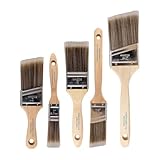
- COMPLETE 5-PIECE BRUSH SET FOR EVERY PAINTING TASK — Includes 1 Inch Flat, 1.5 Inch Angle, 2 Inch Flat, 2 Inch Angle Stubby, and 2.5 Inch Angle brush giving you every size professional painters use daily. Get all 5 for less than the price of a single brush from hardware store brands — professional grade performance at a fraction of the cost. Perfect for walls, trim, cabinets, doors, furniture, and detailed cutting-in work on any project.
- ZERO BRISTLE LOSS — GUARANTEED BY PRECISION ADHESIVE BONDING — Every bristle is locked in place with precision-set adhesive that keeps them in the brush — not in your paint job. The coated steel ferrule provides structural support while the adhesive bond ensures clean performance on every stroke. Premium SRT synthetic filaments load more paint and release it evenly for a smooth streak-free finish on walls, ceilings, and trim. Works with latex, oil-based paint, primer, sealer, and wood stain.
- INCLUDES THE ANGLE STUBBY MOST SETS LEAVE OUT — Professional painters know the 2 Inch Angle Stubby is the go-to brush for tight cabinet interiors, window sashes, inside corners, and detailed trim where standard angle brushes are too long. Combined with the 1.5 and 2.5 inch angle sash brushes you have precision cutting-in covered at every scale — baseboards, crown molding, door casings, and ceiling lines.
- FLAT BRUSHES FOR BROAD SMOOTH COVERAGE ON ANY SURFACE — The 1 and 2 inch flat brushes deliver even coverage on walls, furniture, shelving, doors, fences, decks, and wood surfaces. Ideal for applying primers, stains, varnishes, polyurethane, and specialty coatings. Solid wood handles provide all-day comfort and control for both professional contractors and weekend DIY homeowners tackling interior or exterior painting projects.
- TRUSTED BY PROFESSIONAL PAINTERS AND CONTRACTORS NATIONWIDE — Pro Grade delivers professional-grade results at a price that makes sense for crews who go through brushes on every job. Ideal for property managers, remodeling contractors, apartment turnover crews, maintenance teams, and commercial painting operations. Backed by thousands of verified reviews from working painters. Washable and reusable for multiple projects.
Observe the wall in its real light
Paint changes under daylight, LEDs, incandescent bulbs, and reflected light. Paint a sample or place a large color card on the actual wall and view it in the morning, afternoon, evening, and after the room lights are switched on. Compare the planter material under those same conditions. A glossy glaze reflects the room and may appear lighter than a matte pot in the identical hue.
Separate hue, temperature, and value
- Hue is the color family, such as blue, green, yellow, or red.
- Temperature describes whether a color leans warm, cool, or neutral.
- Value is lightness or darkness; it controls whether the pot recedes or becomes a focal point.
Two colors can share a hue but differ sharply in temperature or value. A warm gray wall and a blue-gray planter may both be called gray, yet the blue cast can make the pot look detached.
Recommended Free Tools
Should a planter match the wall or contrast with it?
Neither approach is universally correct. Match or stay close to the wall for a quiet, architectural display; contrast when the plant and pot are intended to draw attention. The most reliable choices use one clear relationship rather than several competing colors.
Monochromatic: one hue, several values
Use tints, shades, and tones from the wall’s hue family. For example, a pale sage wall can take a deeper sage or gray-green planter. The plant becomes part of a continuous composition, and differences in value keep the pot visible without a loud color jump.
Analogous: neighboring hues
Choose a color next to the wall on the color wheel. Warm beige can move toward cream, clay, or muted yellow; blue-gray can move toward blue-green or cool violet. Neighboring hues generally harmonize while adding more variation than a strict monochromatic scheme.
Complementary: opposite hues
Use an opposite color for a deliberate focal point. A blue-family wall can support a restrained terracotta accent; a warm peach wall can take a controlled blue accent. Complementary pairs are visually energetic, so one accent planter or a small coordinated cluster is usually more composed than repeating the contrast on every pot.
Neutral bridge colors
White, cream, gray, black, tan, brown, and natural green can bridge a strong wall and colorful foliage. A neutral is not automatically bland: its temperature and value still matter. A creamy pot on a cool violet wall reads warmer than a crisp white pot, while charcoal creates stronger contrast than mid-gray.
Also popular on Amazon

- Great Value Pack Artist Paint Brushes: Soucolor 20 brushes in 10 sizes professional paintbrushes set — no shedding, holds paint well, cleans easily, Acrylic, watercolor, oil, gouache, Halloween pumpkin decoration & face painting, rock painting, ceramics. Fantastic high quality gifts for creative, artistic siblings to share!
- Awesome Set of Paint brushes: Professional paint brushes can cover all of your needs. The multi-purposed brushes are ideal for Watercolor, Oil, Gouache, enamel, Acrylic Painting, Body, Nail, Face Painting, Miniature, Model, Wood, Glass, Cup, Ceramic, Fine work, Art class, Craft Art Painting, DIY Art Crafts etc.
- Soft and long-lasting: The bristles are soft and strong, with nickel metal ferrules and blue wooden handles. After cleaning, the bristles will become soft and fluffy again and will not fall off.
- Easy to clean: it’s very convenient to Wash well in soap and water. Retain shape after drying. the brushes hold up very well. Nice selection to beginners and professionals. Keep them clean and they last a long time.
- Halloween Pumpkin Ceramic Crafts Supplies: A Great painting gift for family, friends, kids, girls, women, student, classmate, teacher. For using in school, travel or used in the home and office.
Which planter colors work with warm beige, peach, terracotta, or yellow walls?
Warm walls pair most easily with warm neutrals and softened natural colors. Keep the temperature coherent unless you intentionally want a cool complementary accent.
| Wall family | Planter directions | Effect |
|---|---|---|
| Warm beige | Cream, clay, warm white, muted green | Low-contrast, coordinated display |
| Peach or terracotta | Cream, warm white, muted green, carefully controlled blue | Either a tonal arrangement or a focused complementary accent |
| Yellow | Cream, clay, warm white, muted green, or a restrained blue accent | Maintains warmth while allowing one contrasting focal note |
For a warm beige wall, a cream planter may nearly blend into the background. Add a ribbed profile, a darker rim, or a plant with distinct foliage so the display does not disappear. Clay and terracotta intensify the warm relationship; use them when the room already contains related wood or textile tones.
Which planter colors work with blue, blue-gray, green, or violet walls?
Cool walls support cool neutrals and cool greens, while a warm accent can provide controlled contrast.
| Wall family | Planter directions | Effect |
|---|---|---|
| Blue or blue-gray | Cool white, gray, charcoal, muted green, or warm terracotta | Reinforces the cool palette or creates one warm focal point |
| Green | Cool white, gray, charcoal, muted green, or a restrained terracotta accent | Can feel botanical and layered without introducing many unrelated hues |
| Violet | Cool white, gray, charcoal, muted green, or a carefully controlled warm accent | Balances the cool wall while keeping contrast intentional |
On a dark blue or violet wall, a pale planter improves legibility by separating leaves from the background. Charcoal can look sophisticated but may merge into a dark wall; check the value difference under evening lighting before committing.
How do you choose a planter for a white or gray wall?
Neutral walls broaden the palette, so let the foliage, room mood, and desired contrast decide the pot. The wall no longer dictates a narrow hue family.
Use foliage as the anchor
Green foliage can function as a visual neutral. Against white, nearly any planter hue can become the anchor: clay for warmth, black for graphic contrast, or a muted green for a quieter botanical effect. Against gray, compare the pot to the gray’s undertone; a warm gray often welcomes cream or clay, while a cool gray supports crisp white, charcoal, or blue-green.
Choose the intended mood
- Calm and integrated: use a close gray, cream, muted green, or natural brown.
- Graphic and modern: use black, charcoal, or a high-value white with a simple silhouette.
- Warm and tactile: use clay, terracotta, woven fiber, or natural wood-toned material.
Because a neutral wall offers little color guidance, finish and proportion carry more of the design weight. A plain pot can work when its scale is strong; a small pot may need texture or a clear value contrast to avoid looking incidental.
Also popular on Amazon
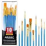
- 【All sizes of art brushes】: The 10 sizes of multi-functional brushes have various shapes, making the mixing color easier, which is very suitable for artists, students, teenagers, children and painters at all levels. Wonderful Present ideas for friends and family who like painting!
- 【general brush set】: Professional paint brush can meet all your needs. Multifunctional brush is very suitable for watercolor, oil, gouache, acrylic painting, body, nail, face painting, miniature, model, ceramics, arts and crafts painting, etc.
- 【high quality process】: It is designed with anti falling bristles, anti-rust nickel ferrule and solid wood handle. You can use the brush to focus on the painting and always be creative.
- 【easy to maintain】: After using the brush, it is very convenient to clean the brush with warm soapy water and reshape the tip of the brush. Air dry the brush and place it on top of the top for long use.
- 【100% satisfaction guarantee - buy now】1 packs of set brushes, you can also get friendly customer service, any questions feel free to contact us, within 24 hours to help you! There is no risk in buying our paint brush kit.
What planter works with a dark or strongly colored wall?
A light neutral or textured planter is the safest starting point. It keeps leaves readable and prevents the display from becoming a dark shape against a dark background.
Use cream, warm white, pale gray, or a natural light material when the wall is deep blue, green, charcoal, or another saturated color. If you want a statement, choose one complementary accent and repeat it sparingly rather than mixing several unrelated bright pots. Texture can supply interest without adding another hue: a fluted, ribbed, woven, or visibly grainy surface catches light against a flat painted wall.
How should variegated or colorful foliage affect the pot choice?
Variegated leaves already contain multiple hues and value shifts, so the pot and wall should usually provide a calm supporting frame. Choose a soft neutral, cream, blush pink, sage, or a pot that repeats one color found in the leaves.
Repeat one leaf color
Look for the least dominant leaf color, not necessarily the brightest. Repeating a pale cream edge or a muted green in the pot creates a link without competing with the main pattern.
Free tools Windows power users keep installed
One-click scans. No signup required.
Let the wall do less
If the foliage is cream-and-green, a strongly colored wall plus a strongly colored pot can create three competing focal points. A quieter wall–pot relationship gives the leaves room to read as the feature.
Use clusters carefully
For a group of colorful plants, keep one shared element—such as a cream base, muted green family, or repeated finish—while varying pot sizes. Contrasting but complementary colors can work in a cluster when the palette is limited and the arrangement has a clear tallest or most prominent plant.
How do finish and texture change a color match?
When wall and planter colors are close, surface treatment prevents the arrangement from looking flat. When colors contrast strongly, a quieter finish can keep the display from becoming visually noisy.
Also popular on Amazon

- Bates paint brushes come in a convenient 6 pieces with 3 flat and 3 angled bristle styles, including (1”, 1.5”, 2”) flat and (1.5”, 2”, 2.5”) angled bristles, perfect for tackling any surface painting or staining job.
- The sturdy natural bristles of each brush are designed to hold more paint, creating a smoother finish with fewer streaks and saving you time on the job.
- The lightweight wooden handles provide extra comfort and ease during long painting processes like walls, trims, cabinets, and doors.
- These versatile brushes are ready-to-use, easy to clean, and can be reused multiple times, making them economical as well as reliable tools for any painting project.
- Bates paint brushes can be used for both oil-based paints as well as latex stains and are ideal for home or commercial projects such as decks, fences or DIY painting jobs.
Match gloss levels deliberately
Matte paint beside a glossy glaze creates a clean distinction even when hue and value are similar. A glossy planter reflects windows and lamps, so its apparent color changes more across the day. Matte or unglazed material appears steadier but may absorb light and read darker.
Quick wins for a faster PC:
Fix the driver behind crashes, sound loss and screen glitchesFind Drivers →Repair Windows errors before they cause bigger problemsFix Now →Use directional texture
Ribbed and fluted pots create vertical or repeating shadows; woven and natural materials add irregular texture; smooth ceramic keeps the shape prominent. Pairing a textured pot with a flat wall is an efficient way to add depth without introducing another color.
Check texture at viewing distance
A fine rib may disappear from across the room, while a deep fluting pattern can become a strong graphic element. Place a sample where the plant will sit and view it from the doorway, seating area, and closest walking path.
How do you compare two good planter options?
When both choices look attractive, compare them on the same six axes instead of relying on a quick impression.
- Hue relationship: Is the pot in the same family, next to the wall’s hue, or opposite it?
- Temperature: Does its warm, cool, or neutral cast support the wall and permanent finishes?
- Value and contrast: Will it disappear, frame the foliage, or become the focal point?
- Finish and texture: Does matte, gloss, ribbing, fluting, weaving, or natural material add useful depth?
- Scale and function: Does it fit the grower pot, leave room for handling, and provide the intended drainage setup?
- Light response: Does it still look right in daylight, evening light, and artificial light?
If one option wins on color but fails on fit or drainage, it is not the better indoor planter. A visually perfect cache pot that cannot accommodate the nursery pot creates a practical problem immediately.
The Tool Desk
Outbyte PC Repair FREEClear out junk files and repair common Windows errorsFree Scan →Outbyte Driver Updater FREEFix the driver behind crashes, sound loss and screen glitchesFind Drivers →How do you size and set up an indoor cache pot?
Keep the plant in its plastic nursery pot and place that pot inside a cache pot without a drainage hole. The cache pot should be 1–2 cm wider and taller than the grower pot, according to Bunnings’ indoor setup guidance.
- Measure the nursery pot’s outside width and total height, including any rim.
- Check the product listing for the cache pot’s internal dimensions, not only its external diameter.
- Confirm that the nursery pot can be lifted out for watering and inspection.
- Verify whether the decorative pot has a drainage hole, a removable plug, or no hole. Do not assume photos show the full arrangement.
- Place the nursery pot inside the cache pot and check that it sits upright without excessive side-to-side movement.
The 1–2 cm allowance is a fit recommendation, not a universal rule for every plant or container shape. Tapered pots, thick rims, and unusually tall nursery pots can reduce usable interior space, so compare the actual measurements before purchase.
Also popular on Amazon

- 2 Inch Angled Paint Brush for Precision Cutting-In – Designed for clean, sharp lines around trim, baseboards, ceilings, corners, and detailed edge work. The perfect size for control and coverage.
- Value 3-Pack for Pros & DIY Projects – Includes three professional 2-inch angled sash brushes — ideal for contractors, remodelers, and homeowners tackling multiple rooms or repeat paint jobs.
- Smooth Results on Walls, Trim & Cabinets – Great for interior wall painting, cabinet edges, furniture projects, and trim work where a smooth finish and crisp control matter most.
- Works with Latex Paint, Oil-Based Paint & Stains – Premium synthetic filaments hold more paint, reduce streaks, and provide a clean finish with latex paints, oil coatings, and wood stains.
- Works with Latex Paint, Oil-Based Paint & Stains – Premium synthetic filaments hold more paint, reduce streaks, and provide a clean finish with latex paints, oil coatings, and wood stains.
What is a reliable step-by-step method for matching the pot to the wall?
Use this sequence whenever you are choosing one planter or coordinating several.
- Photograph the room. Include the wall, floor, permanent finishes, furniture, and the plant’s intended location.
- Identify the wall undertone. Compare the wall in daylight and at night; note whether it appears warm, cool, or neutral.
- Choose the relationship. Decide between monochromatic, analogous, complementary, or neutral-bridge color.
- Account for the foliage. Treat plain green leaves as a quiet anchor and variegated leaves as an existing multicolor element.
- Select a value level. Choose whether the pot should recede, frame the plant, or act as the focal point.
- Add texture if needed. Use matte/gloss contrast, ribbing, fluting, weaving, or natural material when hue contrast is subtle.
- Test the physical fit. Confirm the 1–2 cm cache-pot allowance, internal dimensions, and drainage arrangement.
- Recheck under every light source. View the assembled plant at the times you normally use the room.
What common matching mistakes should you avoid?
- Trusting the paint label: A color name does not reveal undertone. Evaluate the painted wall in its actual light.
- Ignoring permanent finishes: Cabinets, tile, brick, and wood can expose a temperature clash that a wall sample alone hides.
- Matching foliage too literally: A pot that repeats every leaf color can make a variegated plant look busy. Repeat one supporting color instead.
- Using complementary color everywhere: Opposites create energy; too many accents compete for attention.
- Forgetting value: Two compatible hues can still merge if they are equally dark or equally pale.
- Assuming a finish is visually stable: Gloss reflects changing light and surroundings, while matte surfaces can read darker.
- Buying by external size: Thick walls, rims, and tapered interiors can prevent a nursery pot from fitting.
- Overlooking drainage: Decorative containers vary widely. Verify the hole, plug, and removable-pot arrangement before planting.
Which approach is best for a coordinated group of planters?
Choose one shared rule, then vary only one or two other attributes. For example, keep all pots in a cream-to-clay family while changing height and texture, or keep a charcoal finish while varying silhouettes.
What’s actually slowing this PC down?
Pick the symptom - the matching free tool is one click away.
Place the largest or most visually contrasting pot where you want the eye to land. Smaller pots can repeat its color or material so the group reads as one arrangement. If the wall is strong, keep the group’s colors restrained; if the wall is neutral, a limited set of complementary accents can provide structure.
When should you repaint the wall instead of changing the planter?
Change the planter when the wall already works with the room and the problem is a single object that feels disconnected. Consider repainting only when multiple permanent elements, plants, and furnishings all conflict with the wall’s undertone or value.
Test the proposed wall color in place before committing. A wall that looks balanced on a small card can shift across a large surface, and the new backdrop will change how every existing pot and leaf appears. Resolve the wall, lighting, and permanent finishes first; then choose planters from the resulting palette.
Frequently Asked Questions
Can I use black planters with a dark wall?
Yes, but check value and silhouette from the room’s main viewing points. If the pot merges into the wall, use a lighter rim, a glossy or textured surface, or a plant with lighter foliage so the container remains legible.
Crashes, No Sound, or Screen Glitches?
Random freezes, missing sound and display glitches usually trace back to one bad driver. Find and replace yours safely.Free scan · under a minutePC Slower Than It Used to Be?
A free scan shows the junk files, broken settings and background clutter dragging Windows down - then fixes them in one click.Free scan · Windows 10 & 11How can I test a planter color before buying it?
Place a color card, fabric sample, or the actual empty pot beside the wall where the plant will stand. View it at several times of day and with the room’s lights on, because both paint and reflective finishes change with illumination.
Should every planter in one room be the same color?
No. A shared temperature, finish, or repeated accent color is usually enough to connect different pots. Varying height and texture adds interest while the common element keeps the group intentional.
What if my wall looks different on different sides of the room?
Treat each exposure and light source as part of the decision. Position the plant where its pot looks best during the hours you use that area most, or choose a lower-reflectance finish whose appearance changes less than a high-gloss glaze.
Quick Recap

Product prices and availability are accurate as of the date/time indicated and are subject to change. Any price and availability information displayed on Amazon at the time of purchase will apply.

