What’s actually slowing this PC down?
Pick the symptom - the matching free tool is one click away.
ThatPainter is reader-supported. When you buy through links on our site, we may earn an affiliate commission. Learn More
As an Amazon Associate I earn from qualifying purchases.
Use black-and-white photography as wall decor by treating every print as a graphic object rather than as a substitute for a color picture. Choose images whose subject, light, tonal hierarchy, lines and texture remain legible in grayscale; then match the print’s orientation and scale to the wall, edit groups around a clear visual rule, and frame the work with archival materials. A window mat or spacer should keep the photographic surface away from the glazing, while the hanging location should be protected from direct sun, heat, humidity swings and pollutants.
The best display is therefore not simply “a black frame with a black-and-white photo.” It is a controlled relationship between image, paper surface, mat, frame, wall space, viewing distance and conservation conditions. The workflow below shows how to make those decisions without losing the quiet, graphic power that makes monochrome work effective.
Popular on Amazon
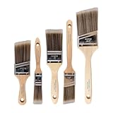
- COMPLETE 5-PIECE BRUSH SET FOR EVERY PAINTING TASK — Includes 1 Inch Flat, 1.5 Inch Angle, 2 Inch Flat, 2 Inch Angle Stubby, and 2.5 Inch Angle brush giving you every size professional painters use daily. Get all 5 for less than the price of a single brush from hardware store brands — professional grade performance at a fraction of the cost. Perfect for walls, trim, cabinets, doors, furniture, and detailed cutting-in work on any project.
- ZERO BRISTLE LOSS — GUARANTEED BY PRECISION ADHESIVE BONDING — Every bristle is locked in place with precision-set adhesive that keeps them in the brush — not in your paint job. The coated steel ferrule provides structural support while the adhesive bond ensures clean performance on every stroke. Premium SRT synthetic filaments load more paint and release it evenly for a smooth streak-free finish on walls, ceilings, and trim. Works with latex, oil-based paint, primer, sealer, and wood stain.
- INCLUDES THE ANGLE STUBBY MOST SETS LEAVE OUT — Professional painters know the 2 Inch Angle Stubby is the go-to brush for tight cabinet interiors, window sashes, inside corners, and detailed trim where standard angle brushes are too long. Combined with the 1.5 and 2.5 inch angle sash brushes you have precision cutting-in covered at every scale — baseboards, crown molding, door casings, and ceiling lines.
- FLAT BRUSHES FOR BROAD SMOOTH COVERAGE ON ANY SURFACE — The 1 and 2 inch flat brushes deliver even coverage on walls, furniture, shelving, doors, fences, decks, and wood surfaces. Ideal for applying primers, stains, varnishes, polyurethane, and specialty coatings. Solid wood handles provide all-day comfort and control for both professional contractors and weekend DIY homeowners tackling interior or exterior painting projects.
- TRUSTED BY PROFESSIONAL PAINTERS AND CONTRACTORS NATIONWIDE — Pro Grade delivers professional-grade results at a price that makes sense for crews who go through brushes on every job. Ideal for property managers, remodeling contractors, apartment turnover crews, maintenance teams, and commercial painting operations. Backed by thousands of verified reviews from working painters. Washable and reusable for multiple projects.
Why does black-and-white photography work so well as wall decor?
Removing color puts the viewer’s attention on structure. Tones of gray, the quality and direction of light, contrast, composition and texture become the visual vocabulary. Jim Preston, chief photographer at the Smithsonian National Air and Space Museum, describes the discipline this way: “I find that shooting black and white photography is all about focusing on the basics—tones of grey, quality of light, contrast, composition and texture.”
That concentration gives monochrome prints a broad range of uses. A quiet portrait can anchor a bedroom, a study or a hallway; architectural lines can bring order to a large blank wall; and a close view of weathered material can add tactile interest without introducing another color into the room. The image should still have a strong subject and a readable tonal hierarchy when seen from the distance at which it will hang.
Black-and-white work is not automatically neutral. A very high-contrast print can feel dramatic and graphic, while a low-contrast image with many middle grays can feel softer and more atmospheric. Decide which effect your room needs before choosing a frame or a wall.
How do I choose a black-and-white photograph for a wall?
Choose for the wall and the viewing distance, not only for how compelling the file or contact sheet looks in your hand. The image needs an immediate visual entry point, enough edge detail to survive reduction, and a background that supports rather than competes with the subject.
Start with a clear focal subject
At wall distance, the eye should find the main subject quickly. Look for a face with readable light, an architectural form with an unmistakable silhouette, or a texture whose pattern remains distinct when the print is smaller than your monitor view. If several areas demand equal attention, the photograph may become restless once surrounded by furniture and other wall elements.
Test the tonal hierarchy
Identify the darkest dark, the lightest light and the middle-gray passages. A successful print does not need the full range from black to white, but its major tonal relationships should be intentional. If the subject merges into its background, changing the frame will not solve the underlying legibility problem.
Use lines and shapes deliberately
LensCulture’s monochrome guidance notes that removing color makes shapes more prominent. Aligned squares and rectangles can feel stable; triangles and converging lines can direct the eye; and repeated shapes can produce a more dynamic rhythm. Before committing to a print, ask whether its dominant line or shape still reads immediately in grayscale.
Check the background
A background that is attractive in a cropped screen view can become a distraction when the photograph is enlarged and placed in a room. A U.S. government photography manual advises matching image size to the picture space, using lines that support the point of interest, and preventing the background from becoming prominent or confusing. Apply that test at the intended print size, not only at the file’s native view.
What size and orientation should a black-and-white print be?
Choose orientation and scale as one decision. A single large print creates an anchor; a group distributes attention and can tell a sequence. Neither is universally better, because the wall’s proportions, nearby furniture and the image’s composition determine what will feel intentional.
Also popular on Amazon

- Great Value Pack Artist Paint Brushes: Soucolor 20 brushes in 10 sizes professional paintbrushes set — no shedding, holds paint well, cleans easily, Acrylic, watercolor, oil, gouache, Halloween pumpkin decoration & face painting, rock painting, ceramics. Fantastic high quality gifts for creative, artistic siblings to share!
- Awesome Set of Paint brushes: Professional paint brushes can cover all of your needs. The multi-purposed brushes are ideal for Watercolor, Oil, Gouache, enamel, Acrylic Painting, Body, Nail, Face Painting, Miniature, Model, Wood, Glass, Cup, Ceramic, Fine work, Art class, Craft Art Painting, DIY Art Crafts etc.
- Soft and long-lasting: The bristles are soft and strong, with nickel metal ferrules and blue wooden handles. After cleaning, the bristles will become soft and fluffy again and will not fall off.
- Easy to clean: it’s very convenient to Wash well in soap and water. Retain shape after drying. the brushes hold up very well. Nice selection to beginners and professionals. Keep them clean and they last a long time.
- Halloween Pumpkin Ceramic Crafts Supplies: A Great painting gift for family, friends, kids, girls, women, student, classmate, teacher. For using in school, travel or used in the home and office.
When a single statement print is best
Use one substantial print when the image has a clear focal point and the wall benefits from visual restraint. A vertical portrait can reinforce a narrow section of wall, while a horizontal architectural or landscape image can settle above a longer piece of furniture. Leave enough surrounding wall for the photograph to read as an object rather than as a fragment squeezed between other items.
When a diptych or triptych works
Two or three related frames can create sequence, movement or a before-and-after rhythm. The photographs might show successive moments, repeated forms or one subject seen from complementary viewpoints. Keep the interval and frame treatment visibly intentional; inconsistent gaps make a sequence look accidental, while identical spacing can make unrelated images feel artificially joined.
When a gallery wall is appropriate
A gallery wall suits several photographs that share an organizing rule. The rule might be a subject family, a similar tonal character, a consistent aspect ratio, a common paper surface or one frame-and-mat treatment. A mixed collection can work, but it still needs one binding principle so the wall reads as a composition rather than as storage.
| Display format | Best use | Editing rule | Common risk |
|---|---|---|---|
| Single statement print | One image with a strong focal point and a wall that needs restraint | Let the photograph carry the composition; keep the surrounding wall calm | The print is too small to anchor the space or too busy for the room |
| Diptych or triptych | Related frames that imply sequence, movement or comparison | Repeat a visible relationship such as subject, viewpoint, tonal range or format | Unequal intervals or unrelated images weaken the sequence |
| Gallery wall | A curated set that benefits from rhythm and variation | Use one binding rule for tone, subject, aspect ratio, surface or framing | The wall becomes a storage grid with no reading order |
How should I edit a gallery wall of black-and-white photos?
Edit the group before you measure hooks. The arrangement should have a reason the viewer can sense even if it is never explained.
Choose the binding rule
Start with one dominant rule and allow smaller variations around it. A “same subject” wall might contain different compositions of a building; a “same tonal character” wall might combine portraits and still lifes that all use deep blacks and restrained highlights. If the frames vary, keep the image treatment or matting consistent. If the photographs vary widely, let a consistent frame and mat establish unity.
Establish a reading order
Decide whether the eye should move left to right, from a large anchor to smaller supporting works, or through a deliberate center-and-periphery structure. Place the image with the clearest focal point where it can begin the reading, then use repeated lines, shapes or tonal accents to guide the eye onward.
The Tool Desk
Outbyte PC Repair FREERepair Windows errors before they cause bigger problemsFix Now →Outbyte Driver Updater FREEScan for outdated or missing drivers - takes under a minuteDriver Scan →Compare the complete objects
Lay out digital or paper mock-ups that include the photograph, crop, mat, frame and surrounding wall. Compare scale, paper or surface, frame consistency, spacing and image order together. An image that looks strongest alone may be the wrong choice if its crop, surface or tonal weight overwhelms the rest of the group.
Keep variation legible
Variation is useful when it creates rhythm: a vertical next to a horizontal, a dense texture next to an open field, or a close crop next to a wider view. Too many changes at once—different surfaces, frame colors, mat tones and image subjects—make the display difficult to read. Decide which element is allowed to vary and keep the others stable.
Which paper or print surface should I use?
Surface changes how highlights and shadows appear, so choose it as part of the image’s design rather than as a last-minute finish. Black-and-white prints may be matte, gloss, lustre or textured, and each surface affects reflected light and perceived detail.
Also popular on Amazon
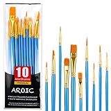
- 【All sizes of art brushes】: The 10 sizes of multi-functional brushes have various shapes, making the mixing color easier, which is very suitable for artists, students, teenagers, children and painters at all levels. Wonderful Present ideas for friends and family who like painting!
- 【general brush set】: Professional paint brush can meet all your needs. Multifunctional brush is very suitable for watercolor, oil, gouache, acrylic painting, body, nail, face painting, miniature, model, ceramics, arts and crafts painting, etc.
- 【high quality process】: It is designed with anti falling bristles, anti-rust nickel ferrule and solid wood handle. You can use the brush to focus on the painting and always be creative.
- 【easy to maintain】: After using the brush, it is very convenient to clean the brush with warm soapy water and reshape the tip of the brush. Air dry the brush and place it on top of the top for long use.
- 【100% satisfaction guarantee - buy now】1 packs of set brushes, you can also get friendly customer service, any questions feel free to contact us, within 24 hours to help you! There is no risk in buying our paint brush kit.
Matte
Matte surfaces usually reduce reflections and can support a quiet, soft presentation. They are useful where lights or windows would otherwise create distracting glare, but very delicate middle-gray detail may appear less luminous than it would on a glossier surface.
PC Slower Than It Used to Be?
A free scan shows the junk files, broken settings and background clutter dragging Windows down - then fixes them in one click.Free scan · Windows 10 & 11Crashes, No Sound, or Screen Glitches?
Random freezes, missing sound and display glitches usually trace back to one bad driver. Find and replace yours safely.Free scan · under a minuteGloss
Gloss can make blacks look deeper and fine detail appear crisp. Its reflective character becomes part of the display, so check the wall under the room’s actual lighting before committing. A beautiful proof can be difficult to read if a window or spotlight reflects directly across it.
Lustre or semi-gloss
Lustre surfaces balance some of the depth of gloss with a less mirror-like reflection. They can be a practical compromise for images that need strong contrast but will hang in a room with variable light.
Textured surfaces
Texture adds a physical dimension and can complement photographs of stone, paper, fabric or weathered surfaces. It also changes the apparent sharpness of fine lines. Keep the finish consistent within a tightly edited group unless a deliberate surface contrast is central to the concept.
Conservation literature treats surface properties as part of a print’s aesthetic value. That means a surface decision is not merely technical: it changes the object the viewer experiences.
Do these 3 things before closing this tab:
1Clear out junk files and repair common Windows errors2Fix the driver behind crashes, sound loss and screen glitches3Repair Windows errors before they cause bigger problemsHow do I frame black-and-white photography safely?
Use a stable backing, archival matting and a spacer or window mat so the photographic surface does not touch the glazing. For important prints, the Canadian Conservation Institute recommends museum-quality matting and backboard, with acid- and lignin-free materials.
Use an acid-free, lignin-free mat and backboard
Ordinary paper products can introduce acids or other compounds that discolor or damage a photograph over time. An acid-free, lignin-free mat and backing create a safer environment and are especially important for valuable, irreplaceable or historically significant prints.
Keep the print off the glass
Hinge the print to a stable board and use a window mat or spacer. The opening gives the photograph breathing room and prevents the emulsion or photographic surface from touching the cover glass. The Canadian Conservation Institute warns that, without a window mat, moisture can cause the print and glass to stick together.
Select glazing with the room in mind
Glass or acrylic protects the print from dust and handling, but either can reflect light. Evaluate the framed sample against the actual wall, nearby windows and lamps. If reflections make the image unreadable, change the lighting or glazing rather than accepting a display that looks good only from one viewing angle.
Recommended Free Tools
Also popular on Amazon

- Bates paint brushes come in a convenient 6 pieces with 3 flat and 3 angled bristle styles, including (1”, 1.5”, 2”) flat and (1.5”, 2”, 2.5”) angled bristles, perfect for tackling any surface painting or staining job.
- The sturdy natural bristles of each brush are designed to hold more paint, creating a smoother finish with fewer streaks and saving you time on the job.
- The lightweight wooden handles provide extra comfort and ease during long painting processes like walls, trims, cabinets, and doors.
- These versatile brushes are ready-to-use, easy to clean, and can be reused multiple times, making them economical as well as reliable tools for any painting project.
- Bates paint brushes can be used for both oil-based paints as well as latex stains and are ideal for home or commercial projects such as decks, fences or DIY painting jobs.
Make the frame serve the photograph
A restrained frame often lets the tonal structure carry the attention, while a heavier frame can intentionally turn a small print into a formal object. Keep the frame treatment consistent across a group unless the contrast is part of the concept. The frame should support the image’s scale and visual weight, not compete with it.
| Framing element | Purpose | What to check |
|---|---|---|
| Window mat or spacer | Separates the photographic surface from the glazing | The opening is clean, the print lies flat and no edge touches the glass |
| Mat board | Creates a visual border and supports safer presentation | Use acid-free, lignin-free material; museum-quality materials suit important prints |
| Backboard | Provides a stable support behind the photograph | It is rigid, clean and compatible with archival framing materials |
| Glazing | Shields the print from dust and handling | Reflections do not obscure the image under actual room lighting |
| Frame | Holds the assembly and establishes visual style | Its weight and finish match the print and the rest of the wall |
Where should I hang black-and-white photographs?
Choose a stable interior location with controlled light and climate. The Canadian Conservation Institute identifies heat, humidity, light, pollutants, framing and improper handling as the major threats to photographic materials.
Avoid prolonged direct sunlight
Direct light can fade or stain photographic materials. A monochrome print may appear durable because it has no color, but the image-forming materials and paper support can still change. If the wall receives strong sun for part of the day, relocate the work, filter the light or use a display plan that limits exposure.
Keep away from heat and moisture
Do not place framed photographs directly above radiators, heating vents or other heat sources. Avoid damp rooms and locations with rapid humidity changes. Moisture can contribute to adhesion between an unmatted print and glazing and can accelerate other forms of deterioration.
Quick wins for a faster PC:
Clear out junk files and repair common Windows errorsFree Scan →Scan for outdated or missing drivers - takes under a minuteDriver Scan →Limit pollutants and handling
Cooking fumes, smoke, dust and other pollutants can enter poorly sealed frames or settle on exposed surfaces. Handle the print by its edges with clean, dry hands, and close the frame carefully so dust is not trapped inside.
Plan the wall around the room
Check the view from the main seating or walking path, not just the spot where you stand while hanging. A glossy surface may be excellent on a shaded wall and unreadable opposite a window. Furniture, trim and door swings also affect the apparent scale of the display.
Independent reader supportYour contribution helps us test, update, and keep practical guides available for everyone.How large should the digital file be for a large print?
Use 300 ppi and at least 3,000 pixels on the longest dimension as a technical reference for photographic documents, then confirm the printer’s native requirements and the intended viewing distance. These figures come from Canadian Heritage Information Network digitization guidance; they are file-quality benchmarks, not a guarantee that every printer or output size uses the same workflow.
Check the crop before enlarging
A file can have enough pixels yet still fail because the crop removes important edge detail or places the subject too close to the frame. Make a print-size proof, inspect fine lines and textures, and confirm that the tonal transitions survive the enlargement.
What’s actually slowing this PC down?
Pick the symptom - the matching free tool is one click away.
Match resolution to viewing distance
A print viewed from across a room does not need the same apparent detail as one examined close up. Use the 300 ppi benchmark as a starting point, then ask the printer how its process handles the chosen paper, dimensions and image file.
Also popular on Amazon

- 2 Inch Angled Paint Brush for Precision Cutting-In – Designed for clean, sharp lines around trim, baseboards, ceilings, corners, and detailed edge work. The perfect size for control and coverage.
- Value 3-Pack for Pros & DIY Projects – Includes three professional 2-inch angled sash brushes — ideal for contractors, remodelers, and homeowners tackling multiple rooms or repeat paint jobs.
- Smooth Results on Walls, Trim & Cabinets – Great for interior wall painting, cabinet edges, furniture projects, and trim work where a smooth finish and crisp control matter most.
- Works with Latex Paint, Oil-Based Paint & Stains – Premium synthetic filaments hold more paint, reduce streaks, and provide a clean finish with latex paints, oil coatings, and wood stains.
- Works with Latex Paint, Oil-Based Paint & Stains – Premium synthetic filaments hold more paint, reduce streaks, and provide a clean finish with latex paints, oil coatings, and wood stains.
Inspect grayscale conversion
Before ordering, review the file on a calibrated or reasonably consistent display and inspect the darkest shadows and brightest highlights. If important detail is already lost on screen, a larger print will not restore it.
What is a practical workflow from image selection to hanging?
Follow the sequence below so creative and conservation decisions support each other rather than forcing expensive changes at the end.
- Define the wall’s job. Decide whether it needs one anchor, a sequence or a curated collection. Note the wall’s orientation, nearby furniture, available width and the light it receives during the day.
- Shortlist images by grayscale structure. Keep photographs with a clear focal point, intentional tonal hierarchy, readable lines or shapes and enough edge detail for the planned size.
- Choose the organizing rule. For multiple works, select subject, tonal character, aspect ratio, surface or frame treatment as the primary connection.
- Mock up the complete display. Compare image scale, crop, mat, frame, surface, spacing and order together. Include the surrounding wall so the arrangement is judged in context.
- Confirm the file. Check the crop, longest-dimension pixel count and tonal detail. Use 300 ppi and 3,000 pixels on the longest dimension as reference points, then follow the printer’s specifications.
- Choose the surface. Decide between matte, gloss, lustre or textured paper according to reflections, desired contrast and consistency with neighboring prints.
- Order archival framing materials. Specify acid-free, lignin-free matting and backing. Add a window mat or spacer so the print cannot touch the glazing.
- Inspect the assembled frame. Check for trapped dust, contact between print and glass, a clean mat opening and a rigid, stable backing.
- Install in a controlled location. Keep the frame away from direct sun, heat, humidity swings and pollutants. Confirm that reflections do not block the image from normal viewing positions.
- Document the display. Keep a record of the image title or file, print surface, framing materials and installation date. This makes future reframing, rotation or conservation decisions easier.
What mistakes make a monochrome wall look unfinished?
- Choosing by subject alone: A meaningful subject still needs readable shape, contrast and tonal separation.
- Mixing too many visual systems: Different crops, surfaces, frame finishes and mat colors can overwhelm the photographs when no binding rule controls them.
- Ignoring reflected light: Gloss or glazing can turn a strong print into a mirror from the room’s main viewpoint.
- Letting the background compete: Busy surroundings inside the image can obscure the focal point, especially after enlargement.
- Mounting directly against glass: Moisture can make the print adhere to the glazing; use a window mat or spacer.
- Using non-archival paper products: Acidic or lignin-containing boards can accelerate discoloration and deterioration.
- Overexposing the work: Direct sun, heat and humidity fluctuations shorten the display’s safe life.
- Ordering without a file check: Pixel dimensions, crop and shadow detail need review before a large print is made.
- Forcing a universal gallery-wall geometry: Sources do not prescribe one arrangement that suits every wall. Let the images, architecture and viewing path determine the structure.
How can I troubleshoot a display after it is installed?
The print looks flat
Check whether the paper surface, room lighting or tonal edit is suppressing contrast. A different surface or a light source that does not reflect directly across the glazing may restore separation, but do not compensate by placing the work in stronger sunlight.
Outdated Drivers Are Slowing You Down
One free scan finds every outdated or missing driver and matches the right update for your exact hardware.Free scan · exact hardware matchPC Slower Than It Used to Be?
A free scan shows the junk files, broken settings and background clutter dragging Windows down - then fixes them in one click.Free scan · Windows 10 & 11The wall feels chaotic
Remove one variable at a time. First examine whether the group shares a binding rule; then check frame and mat consistency, image order and spacing. A smaller, more edited set usually reads more clearly than an assortment that includes every available photograph.
The image is hard to read from across the room
Inspect the subject-to-background separation and the print’s scale. If the dominant shape or line disappears at the intended viewing distance, choose a stronger image or enlarge it only after confirming that the file contains enough detail.
You see fogging or contact near the glazing
Do not press the print back against the glass. Have the frame opened in a clean, dry environment, inspect for moisture and ensure that a window mat or spacer separates the photographic surface from the glazing before rehanging it in a more stable location.
How do I maintain a framed black-and-white photograph?
Dust the frame and glazing gently without opening the package, and keep liquids away from joints and edges. Inspect the wall periodically for new direct sunlight, heat sources, condensation or signs that the frame has shifted. When a print must be moved, support the frame with both hands and avoid touching the image surface.
Quick wins for a faster PC:
Repair Windows errors before they cause bigger problemsFix Now →Fix the driver behind crashes, sound loss and screen glitchesFind Drivers →Clear out junk files and repair common Windows errorsFree Scan →For important or irreplaceable photographs, consult a qualified conservator before cleaning, unframing or changing the mount. Archival framing reduces risk, but it does not make a print immune to light, climate or handling.
Frequently Asked Questions
Can black-and-white photos work in a colorful room?
Yes. Their grayscale palette can provide visual rest in a room with saturated furnishings, but the print’s contrast should relate to the room’s overall visual weight. Use the frame or mat as the bridge rather than adding another competing accent color.
Should every picture in a gallery wall have the same frame?
No. Different frames can work when one stronger rule—such as a shared tonal range, subject or mat treatment—keeps the set coherent. If several elements vary at once, the display is more likely to look accidental.
Is acrylic safer than glass for a photographic print?
Neither glazing choice solves conservation problems by itself. Select the material according to reflection, weight and breakage concerns, while still using archival matting and a spacer to keep the print off the glazing.
How often should I rotate photographs on display?
There is no universal interval because light levels, print materials and the photograph’s importance differ. Rotating work can reduce cumulative exposure, but the safer priority is controlling direct light, heat, humidity and pollutants from the start.
Quick Recap

Product prices and availability are accurate as of the date/time indicated and are subject to change. Any price and availability information displayed on Amazon at the time of purchase will apply.

