Free tools Windows power users keep installed
One-click scans. No signup required.
ThatPainter is reader-supported. When you buy through links on our site, we may earn an affiliate commission. Learn More
Colour palettes forecast for 2026 lean toward nature-linked greens, warm earth tones, browns and softened neutrals, but no single palette is a universal prescription for architecture or interiors. Use the forecasts as inspiration, then choose colours against your site, fixed finishes, room use and actual lighting. Here is what the current sources point to—and a practical way to turn those broad directions into a palette that suits your project.
As an Amazon Associate I earn from qualifying purchases.
What colour palettes are trending for architecture and interiors in 2026?
The clearest recurring direction in the available 2026 forecasts is a connection to nature: greens, earthy browns, khaki and creamy or otherwise softened neutrals. Pale yellow also appears in one trade-association summary, while a calming white offers a notably lighter counterpoint. These are overlapping forecast directions, not a single agreed global palette.
Windows Errors? Fix Them Before They Spread
Repair common Windows errors and clear accumulated junk for a smoother, more stable PC - no reinstall needed.Free scan · no reinstallCrashes, No Sound, or Screen Glitches?
Random freezes, missing sound and display glitches usually trace back to one bad driver. Find and replace yours safely.Free scan · under a minuteRAL’s Trend Report 2026+ presents 15 nuanced colours as a contemporary decision-making aid for design, architecture, industry, crafts and trade. RAL says the palette is relevant to physical and virtual products, collections and spaces. Its broad application makes it useful as a source of direction for architects and designers, but the report should not be read as a list of colours every building or room should use.
Popular on Amazon

- Great Value Paint Brush Set: Soucolor 20 acrylic paint brushes come in 10 different sizes, making them ideal for fine detailing, model painting, rock painting, nail art, face painting, DIY crafts, and general art projects. The varied brush sizes give you better control for both delicate lines and broader color coverage, while the soft bristles deliver smooth, consistent results on acrylic, oil, watercolor, canvas, wood, ceramic, and more.
- Awesome Set of Paint brushes: Professional paint brushes can cover all of your needs. The multi-purposed brushes are ideal for Watercolor, Oil, Gouache, enamel, Acrylic Painting, Body, Nail, Face Painting, Miniature, Model, Wood, Glass, Cup, Ceramic, Fine work, Art class, Craft Art Painting, DIY Art Crafts etc.
- Soft and long-lasting: The bristles are soft and strong, with nickel metal ferrules and blue wooden handles. After cleaning, the bristles will become soft and fluffy again and will not fall off.
- Easy to clean: it’s very convenient to Wash well in soap and water. Retain shape after drying. the brushes hold up very well. Nice selection to beginners and professionals. Keep them clean and they last a long time.
- Perfect for All Painters & Occasions: Suitable for art beginners, hobbyists and professional artists. Great for art class, home creation, travel painting and DIY handmade projects. A practical art gift for students, teachers, family and craft lovers.
The National Kitchen & Bath Association’s summary of companies’ 2026 colour selections describes greens as prominent, with browns, creamy neutrals and pale yellows in supporting roles. It also reports that Pantone selected a calming white. That mix matters: the forecast conversation includes both grounded, earthy shades and quieter light colours.
Individual announcements represent particular organisations’ points of view. Sherwin-Williams, for example, named Universal Khaki SW 6150 its 2026 Color of the Year and describes it as a midtone neutral. That is a manufacturer’s selection, not evidence that khaki is the sole or universally preferred colour for 2026.
How strong is the evidence behind these colour trends?
The sources have different scopes, so their claims are best read side by side rather than treated as interchangeable evidence. RAL offers a colour trend report intended for several design-related fields; Sherwin-Williams announces a paint brand’s Color of the Year; NKBA compiles company selections for a design audience; and Fixr reports responses from surveyed experts about expected interior trends.
Also popular on Amazon
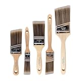
- COMPLETE 5-PIECE BRUSH SET FOR EVERY PAINTING TASK — Includes 1 Inch Flat, 1.5 Inch Angle, 2 Inch Flat, 2 Inch Angle Stubby, and 2.5 Inch Angle brush giving you every size professional painters use daily. Get all 5 for less than the price of a single brush from hardware store brands — professional grade performance at a fraction of the cost. Perfect for walls, trim, cabinets, doors, furniture, and detailed cutting-in work on any project.
- ZERO BRISTLE LOSS — GUARANTEED BY PRECISION ADHESIVE BONDING — Every bristle is locked in place with precision-set adhesive that keeps them in the brush — not in your paint job. The coated steel ferrule provides structural support while the adhesive bond ensures clean performance on every stroke. Premium SRT synthetic filaments load more paint and release it evenly for a smooth streak-free finish on walls, ceilings, and trim. Works with latex, oil-based paint, primer, sealer, and wood stain.
- INCLUDES THE ANGLE STUBBY MOST SETS LEAVE OUT — Professional painters know the 2 Inch Angle Stubby is the go-to brush for tight cabinet interiors, window sashes, inside corners, and detailed trim where standard angle brushes are too long. Combined with the 1.5 and 2.5 inch angle sash brushes you have precision cutting-in covered at every scale — baseboards, crown molding, door casings, and ceiling lines.
- FLAT BRUSHES FOR BROAD SMOOTH COVERAGE ON ANY SURFACE — The 1 and 2 inch flat brushes deliver even coverage on walls, furniture, shelving, doors, fences, decks, and wood surfaces. Ideal for applying primers, stains, varnishes, polyurethane, and specialty coatings. Solid wood handles provide all-day comfort and control for both professional contractors and weekend DIY homeowners tackling interior or exterior painting projects.
- TRUSTED BY PROFESSIONAL PAINTERS AND CONTRACTORS NATIONWIDE — Pro Grade delivers professional-grade results at a price that makes sense for crews who go through brushes on every job. Ideal for property managers, remodeling contractors, apartment turnover crews, maintenance teams, and commercial painting operations. Backed by thousands of verified reviews from working painters. Washable and reusable for multiple projects.
In its 2026 Interior Design and Color Trends Report, Fixr says 66% of surveyed experts selected restorative greens, 59% selected nature-infused neutrals and 56% selected deep browns and khaki as expected interior trends. Those figures are useful evidence of what the report’s respondents anticipated. The excerpt available does not establish the survey’s sample size, so the percentages should not be presented as representative of all designers, consumers or regions.
Likewise, the word “global” should not imply that every country, climate, building type or client will favour the same colours. Forecasts help identify ideas circulating across their respective sources; they do not establish a worldwide consensus, promise future popularity or set building requirements. Treat them as a starting point for a local design decision.
Which colours go well together for a modern home?
The forecasts suggest several useful starting relationships: greens with creamy neutrals, warm browns or khaki with softer neutrals, and pale yellow as a possible supporting colour. They do not prescribe exact pairings, proportions or paint formulas. Test combinations against your home’s materials and light before committing.
Also popular on Amazon
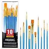
- 【All sizes of art brushes】: The 10 sizes of multi-functional brushes have various shapes, making the mixing color easier, which is very suitable for artists, students, teenagers, children and painters at all levels. Wonderful Present ideas for friends and family who like painting!
- 【general brush set】: Professional paint brush can meet all your needs. Multifunctional brush is very suitable for watercolor, oil, gouache, acrylic painting, body, nail, face painting, miniature, model, ceramics, arts and crafts painting, etc.
- 【high quality process】: It is designed with anti falling bristles, anti-rust nickel ferrule and solid wood handle. You can use the brush to focus on the painting and always be creative.
- 【easy to maintain】: After using the brush, it is very convenient to clean the brush with warm soapy water and reshape the tip of the brush. Air dry the brush and place it on top of the top for long use.
- 【100% satisfaction guarantee - buy now】1 packs of set brushes, you can also get friendly customer service, any questions feel free to contact us, within 24 hours to help you! There is no risk in buying our paint brush kit.
- Grounded green and creamy neutral: A muted green can carry the nature-linked direction, while a creamy neutral provides a lighter companion. This is a forecast-inspired combination, not a required formula.
- Brown or khaki with a softened neutral: NKBA’s summary places browns and creamy neutrals among the supporting directions, and Sherwin-Williams’ Universal Khaki provides one named midtone-neutral example. Consider this route when you want an earth-led palette without assuming every surface needs a saturated colour.
- Earth tones with pale yellow: NKBA also identifies pale yellow as a supporting colour direction. Use it as a candidate accent or secondary tone only if it works with the project’s fixed finishes and intended atmosphere; the source does not specify where or how much to use.
- A lighter, quieter palette: The calming white attributed to Pantone in NKBA’s summary shows that a trend-led scheme need not be built around saturated hues. A white or softened neutral can be a deliberate direction in its own right.
These examples describe relationships among colours named in the forecasts, not specific tested paint schemes. The available sources do not provide a universal ranking for architecture projects, nor do they establish which pairing is best for a particular room. Evaluate candidate colours by temperature (warm or cool), chroma (muted or saturated), relationship to surrounding materials and the atmosphere you want the space to have.
Quick wins for a faster PC:
Scan for outdated or missing drivers - takes under a minuteDriver Scan →Clear out junk files and repair common Windows errorsFree Scan →How do I choose a palette that works with my space?
Start with the conditions that are already part of the project, then use trend directions to broaden your shortlist. A forecast cannot account for your room’s fixed materials, aspect, lighting or purpose; a sample viewed in the actual space can.
- Identify what will stay. Record prominent fixed finishes and materials—such as flooring, masonry, cabinetry or other surfaces that will not be repainted. Compare candidate colours with those elements first. A shade that looks appealing alone may sit awkwardly beside an existing finish.
- Describe the room’s use and intended atmosphere. Decide what the colour scheme needs to support in that space. This helps you choose among a grounded green, an earth-led neutral or a lighter palette instead of choosing a forecast simply because it is current.
- Choose a direction, not a whole-house formula. Shortlist a small number of related options from the broad forecast families: for example, green, warm earth tones, khaki or creamy neutrals. Keep the group coherent by considering warm-versus-cool temperature and muted-versus-saturated chroma. The sources do not specify a fixed number of colours or a required distribution.
- Consider the local landscape and setting. Look at the palette in relation to the place around the building as well as its interiors. Nature-linked colours are a recurring forecast, but the relevant landscape and materials vary by location; a trend report cannot decide that relationship for you.
- Review the actual light. Check shortlisted colours in the intended room under its daylight and artificial lighting. Do not assume that a screen image or a sample seen elsewhere will show how the colour reads in your space.
- Compare physical samples before specifying. Put samples where the colour will be used and view them in context alongside nearby finishes. Sherwin-Williams describes sample formats including chips, peel-and-stick samples and Color to Go paint samples; its guidance presents samples as a way to assess colours in a space. See its paint colour samples information for available formats.
- Make the final choice from the site, not the forecast. If the physical sample does not work with the fixed finishes or the light, revise the shortlist. A forecast is an inspiration source, not a reason to keep a colour that fails the project’s conditions.
What should architects and painters keep in mind when applying a trend?
A forecast is most useful when it informs a design conversation without replacing project-specific judgment. RAL explicitly describes its 15 nuanced colours as a decision-making aid across design and architecture, among other fields; that is a more useful model than treating a trend palette as a specification.
Also popular on Amazon

- 【KIDS PAINT BRUSHES SET】Anezus paint brushes for kids come with 10 pcs paint brushes of 5pcs round paintbrushes and 5 flat paint brushes with colorful handles, good for the young artist to explore their creativity in painting and crafting
- 【HIGH QUALITY PAINT BRUSHES FOR KIDS】These toddler paint brushes made of soft hog bristle, bright colored handles and rust proof ferrules. The bristles are firmly fixed in the kids paint brushes and no shedding. Each children paint brush measure 6 1/4 inches (16cm) in length and ferrules 1/2"(1.3cm) diameter, large enough for the little hand to grip and control
- 【WIDE APPLICATIONS】With combination of round and flat craft paint brushes for kids, work great with washable paint, tempera paint and acrylic paint. Great for arts and craft, rock, leather, gesso and ceramic, or body, nail and face art painting.
- 【EASY TO CLEAN 】After using paint brushes for acrylic, oil or watercolor painting, it’s very convenient to clean them with warm soapy water and reshape the paint brush tips. Keep these craft paint brushes clean and they last a long time.
- 【GREAT GIFT IDEA】Perfect for students, teens, kids, children and painters of all levels. Wonderful gift idea for girls, boys and kids who love painting! These all-purpose paint brushes for kids are ideal for kids' school projects, birthday parties, painting parties, art parties, back to school supplies, classroom decoration and more.
For a new build or renovation, separate the palette’s broad direction from the choice of a particular finish or product. “Nature-linked green” is a trend family, not a complete paint specification. The exact colour still needs to be selected in relation to the surrounding surfaces, intended mood and lighting. The available sources do not provide performance ratings, application instructions or building-code guidance for these forecast colours.
For painters, the practical step is to confirm the selected colour with a physical sample in the intended location before a larger application. For designers and clients, it is to discuss how the colour relates to fixed finishes and the desired atmosphere, rather than relying only on a trend name or screen image. Physical sample tools can help make those discussions more concrete. Sherwin-Williams describes its ColorSnap Fan Deck and colour tools, including desktop or portable kits and removable 4 × 4-inch samples. The same page notes that some professional tools require contact with an account executive, so not every kit should be assumed to be a direct consumer purchase.
Recommended Free Tools
Do not infer more from the forecasts than they support. Fixr’s percentages describe surveyed experts’ expectations, not measured sales or the preferences of every homeowner. NKBA’s account describes company selections, while a paint brand’s Color of the Year is that manufacturer’s named choice. Their convergence on nature-linked tones is a useful signal for inspiration; it is not proof that one palette will suit every architecture project.
Also popular on Amazon
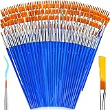
- 【162-Piece Bulk Set | Dual Brush System】Maximize versatility with 81 flat brushes (0.59 inch edge for bold strokes) and 81 round brushes (0.39 inch tips for details) – 3X more tools than standard kits! Pre-sorted in labeled compartments for instant access during painting sessions. Ideal for art classrooms, mural projects, and multi-artist households.
- 【Pro-Grade Durability | Zero Shedding Guarantee】 "Engineered with triple-crimped nylon bristles (43% higher resilience vs. standard) and aerospace aluminum ferrules tested for 10,000+ flex cycles. Lab-verified 0.01% shedding rate even with heavy impasto techniques – outperforms flimsy bristles in budget brushes."
- 【Multi-Scenario Readiness | Event & Daily Use】 Optimized for: Thanksgiving/Christmas face designs classroom projects ceramic decorating fabric printing and model painting; Lightweight plastic handles each reduce hand fatigue during prolonged sessions
- 【Effortless Maintenance | Long-Term Durability】 Clean with warm soapy water in 10 seconds; Reshape tips and air-dry vertically to preserve bristle integrity,After use, air-dry brushes thoroughly and store upright in the provided case to preserve bristle shape. The premium nylon filaments naturally regain their original form after each stroke. For cleaning, simply rinse in warm soapy water and gently reshape bristles with fingertips."
- 【Multiple Application】These acrylic paint brushes can be applied for most occasions,such as:watercolor,oil, gouache paint,face paint, acrylic paint, suitable for Thanks Giving Day, Christimas, Halloween face and body painting, canvas painting, fabric, rock, miniature, model, ceramics, arts and crafts painting, etc.
How can you turn a trend report into a useful shortlist?
A short decision record can prevent a trend name from doing too much work. For each candidate, note the forecast direction it represents, the existing finishes it must work with, the intended atmosphere and how it looks in the actual light. Then compare the physical samples in the intended space.
| Forecast direction | Examples named in the sources | What to check on site |
|---|---|---|
| Nature-linked greens | Restorative greens; green as a prominent 2026 direction | How the specific green relates to local landscape, fixed finishes and the room’s light |
| Warm earth and mineral tones | Browns, deep browns, khaki and Universal Khaki SW 6150 | Whether the warmth and depth suit neighbouring materials and the atmosphere you want |
| Softened neutrals | Nature-infused and creamy neutrals | Whether the chosen neutral reads well alongside the project’s existing surfaces |
| Light counterpoint | Pale yellow and the calming white cited in NKBA’s summary | How the specific light colour appears in both daylight and artificial light |
The table is a way to organise candidates, not a ranking or a specification. A category such as “green” or “neutral” contains many possible colours; the sources do not supply a universal code, finish or placement for each direction. The site conditions and sample review determine whether a particular choice belongs on the final palette.
Frequently Asked Questions
Is Universal Khaki SW 6150 an official 2026 colour selection?
Yes. Sherwin-Williams named Universal Khaki SW 6150 its 2026 Color of the Year and describes it as a midtone neutral. That designation is the paint manufacturer’s selection, not a requirement or a universal industry standard.
Are Fixr’s 2026 colour percentages a survey of homeowners?
The cited figures are described as selections by surveyed experts, not as a homeowner poll. The report excerpt does not establish the sample size, so the percentages should not be generalized to all consumers or design professionals.
Does RAL’s 2026+ report apply only to interior paint?
No. RAL describes its 15-colour report as relevant to design, architecture, industry, crafts and trade, and says its application includes physical and virtual products, collections and spaces. It is broader than an interior paint chart.
Quick Recap


