Windows Errors? Fix Them Before They Spread
Repair common Windows errors and clear accumulated junk for a smoother, more stable PC - no reinstall needed.Free scan · no reinstall
Outdated Drivers Are Slowing You Down
One free scan finds every outdated or missing driver and matches the right update for your exact hardware.Free scan · exact hardware match
ThatPainter is reader-supported. When you buy through links on our site, we may earn an affiliate commission. Learn More
Kitchen cabinet colors work best when they make sense beside the finishes you already have. There is no single right cabinet color or proven ranking of the “best” shades; the ideas below range from white and warm neutral to green, blue, charcoal, and black. Three pairings are published by Benjamin Moore; the remaining combinations are editorial starting points, not manufacturer recommendations. Compare large samples with your countertop, backsplash, floor, walls, and hardware in the kitchen before choosing.
At a glance
These 25 ideas are a palette, not a ranking: the available sources do not establish which cabinet colors are objectively most popular or best. “Best for” describes the look or planning situation each idea may suit, not a guaranteed result.
As an Amazon Associate I earn from qualifying purchases.
| Name | Best for | Key color relationship | Checked |
|---|---|---|---|
| 1. Chantilly Lace OC-65 | Light, crisp schemes | With Revere Pewter HC-172 walls (published pairing) | November 2026 |
| 2. Seapearl OC-19 | Soft off-white schemes | With a warm neutral wall | November 2026 |
| 3. Baby Fawn OC-15 | Warm, understated kitchens | With cream or natural wood | November 2026 |
| 4. Stonington Gray HC-170 | Quiet gray palettes | With white or pale gray walls | November 2026 |
| 5. Hale Navy HC-154 | Deep-color accents | With Glacier White OC-37 walls (published pairing) | November 2026 |
| 6. Kendall Charcoal HC-166 | Strong, dark definition | With a light neutral wall | November 2026 |
| 7. White Dove OC-17 | Classic soft-white cabinets | With Balboa Mist OC-27 walls (published pairing) | November 2026 |
| 8. Aegean Teal 2136-40 | A blue-green focal point | With restrained warm neutrals | November 2026 |
| 9. Char Brown 2137-20 | Deep brown accents | With cream or pale stone | November 2026 |
| 10. Gloucester Sage HC-100 | Muted green palettes | With natural wood or warm white | November 2026 |
| 11. First Light 2102-70 | A light, gentle color note | With white and warm neutrals | November 2026 |
| 12. St. John’s Bay 584 | Blue cabinet schemes | With pale neutral walls | November 2026 |
| 13. Jet Black 2120-10 | High-contrast accents | With white or pale stone | November 2026 |
| 14. Oxford Gray 2128-40 | Deeper gray-blue schemes | With a lighter, quiet neutral | November 2026 |
| 15. October Mist 1495 | A restful sage look | With tonal neutrals or warm white | November 2026 |
| 16. Guilford Green HC-116 | A more distinctive green | With cream or natural wood | November 2026 |
| 17. Honeybee CSP-950 | A sunny color accent | With white and restrained neutrals | November 2026 |
| 18. Hawthorne Yellow HC-4 | Warm, cheerful color | With white or soft gray | November 2026 |
| 19. Ocean Air 2123-50 | A light blue palette | With white and pale stone | November 2026 |
| 20. Beacon Gray 2128-60 | A lighter gray-blue option | With white or a deeper blue accent | November 2026 |
| 21. Cloud Cover OC-25 | Low-key neutral cabinetry | With a deeper gray or wood tone | November 2026 |
| 22. Ballet White OC-9 | White without a stark effect | With natural wood or soft neutrals | November 2026 |
| 23. Oyster Bay SW 6206 | Muted green-blue schemes | With cream or pale stone | November 2026 |
| 24. Naval SW 6224 | A deep navy focal point | With white or light neutral walls | November 2026 |
| 25. Urbane Bronze SW 7048 | Deep, earthy contrast | With warm white or natural wood | November 2026 |
How should I choose a kitchen cabinet color?
Start with the fixed finishes, especially the countertop, then compare color samples in the room. A paint that looks appealing by itself may clash with a countertop’s undertone or change dramatically under your kitchen’s natural and artificial light.
Benjamin Moore’s kitchen cabinet color guidance specifically advises considering countertop undertones. Homes & Gardens likewise recommends testing large samples vertically against countertops, flooring, backsplash, and hardware, and looking at them at different times of day. That is more reliable than choosing from a screen or a small color chip alone.
Popular on Amazon

- Great Value Paint Brush Set: Soucolor 20 acrylic paint brushes come in 10 different sizes, making them ideal for fine detailing, model painting, rock painting, nail art, face painting, DIY crafts, and general art projects. The varied brush sizes give you better control for both delicate lines and broader color coverage, while the soft bristles deliver smooth, consistent results on acrylic, oil, watercolor, canvas, wood, ceramic, and more.
- Awesome Set of Paint brushes: Professional paint brushes can cover all of your needs. The multi-purposed brushes are ideal for Watercolor, Oil, Gouache, enamel, Acrylic Painting, Body, Nail, Face Painting, Miniature, Model, Wood, Glass, Cup, Ceramic, Fine work, Art class, Craft Art Painting, DIY Art Crafts etc.
- Soft and long-lasting: The bristles are soft and strong, with nickel metal ferrules and blue wooden handles. After cleaning, the bristles will become soft and fluffy again and will not fall off.
- Easy to clean: it’s very convenient to Wash well in soap and water. Retain shape after drying. the brushes hold up very well. Nice selection to beginners and professionals. Keep them clean and they last a long time.
- Perfect for All Painters & Occasions: Suitable for art beginners, hobbyists and professional artists. Great for art class, home creation, travel painting and DIY handmade projects. A practical art gift for students, teachers, family and craft lovers.
- Undertone: If the countertop reads warm, begin by comparing warm or balanced cabinet colors; if it reads cool, compare cooler or neutral options. This is a cohesion strategy, not a rule that warm and cool colors can never mix.
- Contrast: Light cabinets against light walls can keep the palette quiet, while a dark island or lower cabinets can add definition. Think about how much contrast you want before settling on a shade.
- Room conditions: Kitchen size, window light, and the color temperature of artificial lighting affect how a sample reads. Check it in both daylight and evening light.
- Materials and details: Compare the sample with the floor, backsplash, worktops, and hardware finish—not just the wall color. A small mismatch can become conspicuous when repeated across a large run of cabinets.
Use large samples on a vertical surface near the cabinets, and view them beside the actual materials. If two candidates look similar on a paint card, the room may reveal that one is too yellow, blue, pink, or gray for the finishes around it.
What’s actually slowing this PC down?
Pick the symptom - the matching free tool is one click away.
Which cabinet colors and paint combinations should I consider?
The 25 ideas below combine manufacturer-listed cabinet colors with practical palette suggestions. Only the three combinations identified as published pairings are specifically recommended by Benjamin Moore; the other pairings are original editorial suggestions to test, not tested or manufacturer-verified formulas.
- Chantilly Lace OC-65: Pair these cabinets with Revere Pewter HC-172 walls for a Benjamin Moore-published combination. It gives the cabinets a light counterpart while the wall color supplies more definition. Check both against your countertop, since even a familiar white can read differently beside warm or cool stone.
- Seapearl OC-19: Try it with a warm neutral wall and natural wood details for a soft, layered palette. This is an editorial suggestion; sample the colors together so the wall does not make the cabinets look unexpectedly gray or yellow.
- Baby Fawn OC-15: Consider a cream wall or wood accents if you want a restrained warm-neutral scheme. Let the countertop determine whether the surrounding neutral should lean warmer or cooler.
- Stonington Gray HC-170: Pair with a lighter gray or white wall for a calm, tonal look. If the room already has cool gray flooring or stone, compare samples carefully to avoid a palette that feels too cold.
- Hale Navy HC-154: Benjamin Moore publishes this cabinet color with Glacier White OC-37 walls. The light-dark contrast gives the navy a clear role; check the white against the backsplash and countertop so the surfaces do not fight each other.
- Kendall Charcoal HC-166: A light neutral wall is an editorial starting point for balancing dark cabinetry. Consider limiting the darkest color to a defined run or island if your fixed finishes are also dark.
- White Dove OC-17: Benjamin Moore’s published pairing is White Dove cabinets with Balboa Mist OC-27 walls. For the exact combination, see the brand’s cabinet color guidance; still compare it with the room’s permanent finishes before committing.
- Aegean Teal 2136-40: Use a warm neutral on the walls as an editorial counterpoint to this named blue-green option. Keep other large surfaces comparatively quiet if you want the cabinets to read as the focal point.
- Char Brown 2137-20: Try cream walls or pale stone nearby for contrast with a deep brown cabinet choice. The suggested pairing is not a published manufacturer formula, so judge it against the actual stone and lighting.
- Gloucester Sage HC-100: Consider warm white walls or natural wood. Homes & Gardens describes gentler two-tone directions such as sage with oak; use that as a palette cue, not as evidence that every sage and oak combination will match.
- First Light 2102-70: A restrained white-and-warm-neutral palette can give this light color room to show. Test a sample beside the countertop: pale colors can be especially affected by nearby colors and light.
- St. John’s Bay 584: Pair with pale neutral walls as an editorial starting point for a blue cabinet scheme. Repeat the blue only in small details if the kitchen already has a strongly patterned backsplash or floor.
- Jet Black 2120-10: White walls or pale stone can create strong contrast. Before choosing black across all cabinets, check the overall balance with the room’s light and other dark finishes.
- Oxford Gray 2128-40: Try a lighter neutral wall to separate the cabinet color from the surrounding surfaces. The color name alone does not establish how it will look in your kitchen, so sample it in place.
- October Mist 1495: Pair with warm white or related quiet neutrals for a tonal green palette. In a 2025 Homes & Gardens feature, designer Melanie Bryant described it as a balanced sage for a soft cottage-feel kitchen, saying it was “not too blue, not too yellow.” That is her design assessment, not a universal color result.
- Guilford Green HC-116: Try cream or natural wood as a counterpoint. If the kitchen has several existing wood tones, compare the sample with each one; the relationship between green and wood can vary with their undertones.
- Honeybee CSP-950: Use white and restrained neutrals around this named yellow option to keep the palette from becoming visually busy. Treat the pairing as a starting point and check the sample against the room’s lighting.
- Hawthorne Yellow HC-4: Consider white or soft gray walls if you want a warm cabinet accent rather than an all-yellow room. Sample a large area before deciding how much cabinetry to paint this color.
- Ocean Air 2123-50: Pair with white and pale stone for a light blue palette. Compare both colors in daylight and after dark; the room’s lighting may shift the apparent balance between blue and neutral.
- Beacon Gray 2128-60: Try white walls, or use a deeper blue as a small accent if you want more contrast. This is an editorial idea, not a published pairing; the countertop should help decide whether the supporting neutral needs to be warmer.
- Cloud Cover OC-25: A deeper gray or wood tone can provide definition alongside these cabinets. If you want a low-contrast room, keep the wall close in value but still sample both together.
- Ballet White OC-9: Consider natural wood or soft neutrals. In the same 2025 Homes & Gardens article, Bryant called it her go-to for clients who want “the classic look of white cabinets but not the starkness.” That attributed opinion can help frame the choice, but a sample is still essential.
- Oyster Bay SW 6206: Cream or pale stone is an editorial pairing idea for this named Sherwin-Williams option. Compare the undertones in your own kitchen rather than relying on a digital palette image.
- Naval SW 6224: A light neutral wall can balance a deep navy cabinet scheme. Sherwin-Williams also lists Naval in its cabinet-color chart; the chart is a palette reference, not a current popularity ranking.
- Urbane Bronze SW 7048: Try warm white walls or natural wood as a counterpoint to this dark, earthy option. Use samples to see whether the result fits your fixed finishes and available light.
What other named cabinet colors are worth sampling?
Paint manufacturers publish broad palettes rather than a single universal shortlist. Benjamin Moore’s cabinet-color pages also name colors such as White Dove OC-17, Chantilly Lace OC-65, October Mist 1495, and Hale Navy HC-154; the full cabinet color page includes additional options such as Seapearl, Baby Fawn, Stonington Gray, and Kendall Charcoal. These are examples, not a ranked list.
Also popular on Amazon
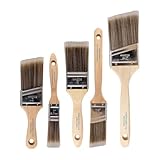
- COMPLETE 5-PIECE BRUSH SET FOR EVERY PAINTING TASK — Includes 1 Inch Flat, 1.5 Inch Angle, 2 Inch Flat, 2 Inch Angle Stubby, and 2.5 Inch Angle brush giving you every size professional painters use daily. Get all 5 for less than the price of a single brush from hardware store brands — professional grade performance at a fraction of the cost. Perfect for walls, trim, cabinets, doors, furniture, and detailed cutting-in work on any project.
- ZERO BRISTLE LOSS — GUARANTEED BY PRECISION ADHESIVE BONDING — Every bristle is locked in place with precision-set adhesive that keeps them in the brush — not in your paint job. The coated steel ferrule provides structural support while the adhesive bond ensures clean performance on every stroke. Premium SRT synthetic filaments load more paint and release it evenly for a smooth streak-free finish on walls, ceilings, and trim. Works with latex, oil-based paint, primer, sealer, and wood stain.
- INCLUDES THE ANGLE STUBBY MOST SETS LEAVE OUT — Professional painters know the 2 Inch Angle Stubby is the go-to brush for tight cabinet interiors, window sashes, inside corners, and detailed trim where standard angle brushes are too long. Combined with the 1.5 and 2.5 inch angle sash brushes you have precision cutting-in covered at every scale — baseboards, crown molding, door casings, and ceiling lines.
- FLAT BRUSHES FOR BROAD SMOOTH COVERAGE ON ANY SURFACE — The 1 and 2 inch flat brushes deliver even coverage on walls, furniture, shelving, doors, fences, decks, and wood surfaces. Ideal for applying primers, stains, varnishes, polyurethane, and specialty coatings. Solid wood handles provide all-day comfort and control for both professional contractors and weekend DIY homeowners tackling interior or exterior painting projects.
- TRUSTED BY PROFESSIONAL PAINTERS AND CONTRACTORS NATIONWIDE — Pro Grade delivers professional-grade results at a price that makes sense for crews who go through brushes on every job. Ideal for property managers, remodeling contractors, apartment turnover crews, maintenance teams, and commercial painting operations. Backed by thousands of verified reviews from working painters. Washable and reusable for multiple projects.
A Sherwin-Williams Industrial Wood chart presents 25 cabinet colors, including Pure White SW 7005, Greek Villa SW 7551, Alabaster SW 7008, Creamy SW 7012, Accessible Beige SW 7036, Repose Gray SW 7015, Agreeable Gray SW 7029, Mindful Gray SW 7016, and Dorian Gray SW 7017. Its greens include Evergreen Fog SW 9130, Green Sprout SW 7728, and Olive Grove SW 7734; its blues include Niebla Azul SW 9137, French Moiré SW 9056, and Gale Force SW 7605. The chart also names Connected Gray SW 6156, Redend Point SW 9081, Reddened Earth SW 6053, Toile Red SW 0006, Morris Room Grey SW 0037, Anonymous SW 7046, and Tricorn Black SW 6258. It is a chart of colors, not evidence that those are the 25 most popular shades or a forecast of current trends. See the Industrial Wood color chart for the source palette.
On its current cabinet-color page, Sherwin-Williams also describes Needlepoint Navy SW 0032 as a deep cool neutral, Whisper SW 9591 and Limewash SW 9589 as warmer or cozier choices, and Alabaster SW 7008 as a bright creamy white option for a smaller kitchen. Those are the manufacturer’s descriptions, not independent findings about how the colors perform in every room. The broad takeaway is useful: white, off-white, warm neutral, gray, green, blue, brown, and black are all viable families to consider.
How do I make a two-tone cabinet scheme work?
Choose a relationship between the two colors—such as gentle tonal contrast or a deliberate light-dark split—and check that it works with the room’s permanent materials. A two-tone scheme is not automatically balanced just because one shade is light and the other is dark.
Also popular on Amazon
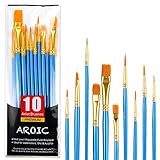
- 【All sizes of art brushes】: The 10 sizes of multi-functional brushes have various shapes, making the mixing color easier, which is very suitable for artists, students, teenagers, children and painters at all levels. Wonderful Present ideas for friends and family who like painting!
- 【general brush set】: Professional paint brush can meet all your needs. Multifunctional brush is very suitable for watercolor, oil, gouache, acrylic painting, body, nail, face painting, miniature, model, ceramics, arts and crafts painting, etc.
- 【high quality process】: It is designed with anti falling bristles, anti-rust nickel ferrule and solid wood handle. You can use the brush to focus on the painting and always be creative.
- 【easy to maintain】: After using the brush, it is very convenient to clean the brush with warm soapy water and reshape the tip of the brush. Air dry the brush and place it on top of the top for long use.
- 【100% satisfaction guarantee - buy now】1 packs of set brushes, you can also get friendly customer service, any questions feel free to contact us, within 24 hours to help you! There is no risk in buying our paint brush kit.
Homes & Gardens offers examples of gentler combinations, including mushroom with cream, sage with oak, walnut with warm white, and navy with pale stone. These are editorial palette examples, not laboratory-tested rules. Use them as prompts: a sage-and-wood direction, for instance, still depends on the undertones of the actual paint, wood, countertop, and floor.
- For a quieter scheme: Keep the two cabinet colors close in warmth or use a natural material, such as oak, to bridge them.
- For more definition: Contrast a darker cabinet run with a pale wall or counter, then check whether the room has enough light for the effect you want.
- For an existing busy finish: Let a strongly patterned counter or backsplash set the limit on how many additional colors and contrasts to introduce.
Sherwin-Williams’ cabinet guidance also groups palette ideas with hardware finishes such as unlacquered brass, polished nickel, aged brass, and oil-rubbed bronze. Hardware is part of the palette: compare the metal with both cabinet colors and fixed finishes before treating it as a final detail.
Independent reader supportYour contribution helps us test, update, and keep practical guides available for everyone.What finish should I use on painted kitchen cabinets?
Sheen affects the appearance as well as the practical finish, so choose it alongside the color and follow the paint maker’s product instructions. Benjamin Moore identifies satin, semi-gloss, and high-gloss as suitable cabinet finishes and describes its Advance Interior paint as providing a durable, furniture-like finish; those are manufacturer claims, not independent test results.
Recommended Free Tools
Also popular on Amazon

- 【KIDS PAINT BRUSHES SET】Anezus paint brushes for kids come with 10 pcs paint brushes of 5pcs round paintbrushes and 5 flat paint brushes with colorful handles, good for the young artist to explore their creativity in painting and crafting
- 【HIGH QUALITY PAINT BRUSHES FOR KIDS】These toddler paint brushes made of soft hog bristle, bright colored handles and rust proof ferrules. The bristles are firmly fixed in the kids paint brushes and no shedding. Each children paint brush measure 6 1/4 inches (16cm) in length and ferrules 1/2"(1.3cm) diameter, large enough for the little hand to grip and control
- 【WIDE APPLICATIONS】With combination of round and flat craft paint brushes for kids, work great with washable paint, tempera paint and acrylic paint. Great for arts and craft, rock, leather, gesso and ceramic, or body, nail and face art painting.
- 【EASY TO CLEAN 】After using paint brushes for acrylic, oil or watercolor painting, it’s very convenient to clean them with warm soapy water and reshape the paint brush tips. Keep these craft paint brushes clean and they last a long time.
- 【GREAT GIFT IDEA】Perfect for students, teens, kids, children and painters of all levels. Wonderful gift idea for girls, boys and kids who love painting! These all-purpose paint brushes for kids are ideal for kids' school projects, birthday parties, painting parties, art parties, back to school supplies, classroom decoration and more.
Cabinet condition and the specific product matter. Before buying paint, confirm that the product is intended for the surface and project, and check its current label or technical instructions for primer compatibility, application, recoat timing, and cure requirements. Do not assume a general drying interval applies to every paint, room temperature, humidity level, or cabinet material.
What are the main steps to repaint kitchen cabinets?
Plan for preparation and drying as well as painting. Manufacturer guidance from both paint companies includes removing hardware and doors or drawers, cleaning, sanding glossy surfaces, priming where appropriate, applying multiple coats, and allowing the finish to dry before reassembly.
- Label and remove: Take off doors, drawers, and hardware; label parts so they return to their original positions. Protect nearby counters and floors.
- Clean and dry: Remove surface grime and residue, then let the cabinets dry completely. Paint applied over contamination or moisture may not adhere as intended.
- Prepare the surface: Sand glossy coatings as directed for the product, and remove dust. Follow the paint and primer instructions for the cabinet’s existing finish and material.
- Prime when required: Use a suitable primer for the surface and coating system. Allow it to dry as directed before painting.
- Apply the paint coats: Benjamin Moore’s project guidance describes applying two coats, with light sanding before the final coat. Sherwin-Williams recommends an angled brush for detailed or recessed areas and a mini roller for flat areas.
- Allow adequate drying: Sherwin-Williams’ how-to guidance gives about 24–48 hours between coats and another 24–48 hours before reinstalling hardware. Treat that as its guidance, not a universal timing guarantee; the product label and room conditions take precedence.
- Reassemble carefully: Wait until the paint is ready for handling under the product’s instructions, then reinstall doors, drawers, and hardware without scraping fresh surfaces.
For the detailed method, consult Benjamin Moore’s cabinet-paint project guidance and Sherwin-Williams’ cabinet painting how-to. Use the current instructions for the paint you actually select, since a project page’s timing should not replace the product label.
Also popular on Amazon
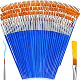
- 【162-Piece Bulk Set | Dual Brush System】Maximize versatility with 81 flat brushes (0.59 inch edge for bold strokes) and 81 round brushes (0.39 inch tips for details) – 3X more tools than standard kits! Pre-sorted in labeled compartments for instant access during painting sessions. Ideal for art classrooms, mural projects, and multi-artist households.
- 【Pro-Grade Durability | Zero Shedding Guarantee】 "Engineered with triple-crimped nylon bristles (43% higher resilience vs. standard) and aerospace aluminum ferrules tested for 10,000+ flex cycles. Lab-verified 0.01% shedding rate even with heavy impasto techniques – outperforms flimsy bristles in budget brushes."
- 【Multi-Scenario Readiness | Event & Daily Use】 Optimized for: Thanksgiving/Christmas face designs classroom projects ceramic decorating fabric printing and model painting; Lightweight plastic handles each reduce hand fatigue during prolonged sessions
- 【Effortless Maintenance | Long-Term Durability】 Clean with warm soapy water in 10 seconds; Reshape tips and air-dry vertically to preserve bristle integrity,After use, air-dry brushes thoroughly and store upright in the provided case to preserve bristle shape. The premium nylon filaments naturally regain their original form after each stroke. For cleaning, simply rinse in warm soapy water and gently reshape bristles with fingertips."
- 【Multiple Application】These acrylic paint brushes can be applied for most occasions,such as:watercolor,oil, gouache paint,face paint, acrylic paint, suitable for Thanks Giving Day, Christimas, Halloween face and body painting, canvas painting, fabric, rock, miniature, model, ceramics, arts and crafts painting, etc.
How were these 25 ideas selected?
The ideas bring together named cabinet colors and explicit pairings in the supplied Benjamin Moore and Sherwin-Williams guidance, plus practical editorial pairings intended to help readers start comparing palettes. The list spans light and dark neutrals, greens, blues, and stronger accent colors. It is not ranked: the sources do not establish a popularity statistic, objective quality score, or universal best cabinet color. The three pairings explicitly attributed to Benjamin Moore are White Dove with Balboa Mist, Revere Pewter walls with Chantilly Lace cabinets, and Glacier White walls with Hale Navy cabinets. All other pairings should be treated as sample-first suggestions.
Recommended Free Tools
Frequently Asked Questions
Should I paint my kitchen cabinets the same color as the walls?
Not necessarily. Matching or closely related colors can make the room feel more continuous, while a different wall value can help define the cabinet runs. Decide based on the contrast you want and compare samples against the countertop and backsplash before settling on either approach.
Can I choose a cabinet color from an online photo?
Use online images to narrow your options, not as a color match. Screens, photography, exposure, and surrounding materials can shift how a shade appears; a physical sample viewed in your own kitchen is a better final check.
Do painted cabinets need to cure after they feel dry?
Dry-to-touch and ready for normal use are not always the same milestone. Follow the specific product’s current instructions for handling and curing, and avoid relying on a generic timeline if the label gives different guidance.
Can I paint over existing kitchen cabinet paint without sanding?
That depends on the existing coating, its condition, and the paint system you plan to use. Benjamin Moore’s guidance calls for sanding glossy coatings; check the chosen product’s preparation instructions and address peeling or damaged areas before repainting.
Quick Recap


