Free tools Windows power users keep installed
One-click scans. No signup required.
What’s actually slowing this PC down?
Pick the symptom - the matching free tool is one click away.
ThatPainter is reader-supported. When you buy through links on our site, we may earn an affiliate commission. Learn More
Yes—if you control the shade, lighting, and amount of coverage. Burnt orange can make a small room feel warm, grounded, and sociable, but a dark or highly saturated version may make the walls seem closer and the room feel enclosed. The safest approach is to test large samples in the actual room, choose a muted earthy orange when light is limited, keep trim and the ceiling light, and start with one wall or an architectural feature if you are unsure.
As an Amazon Associate I earn from qualifying purchases.
Will burnt orange make a small room look smaller?
It can, but the result depends more on value, saturation, and light than on the label “burnt orange.” Sherwin-Williams explains that lighter colors can make a small space feel more open, while darker colors make surfaces appear closer. The same guidance notes that warm shades can make a room feel intimate and cozy. A soft, brown-leaning burnt orange in a bright room may feel enveloping rather than cramped; a deep, vivid orange in a dim room is more likely to feel heavy.
Recommended Free Tools
Burnt orange is a color family, not one fixed formula. A muted terra-cotta, a dark copper, and a pink-orange can produce very different visual distances. Before judging whether orange is suitable, identify the room’s natural-light level, the color of permanent flooring and woodwork, and how much wall area you intend to cover.
Popular on Amazon
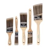
- COMPLETE 5-PIECE BRUSH SET FOR EVERY PAINTING TASK — Includes 1 Inch Flat, 1.5 Inch Angle, 2 Inch Flat, 2 Inch Angle Stubby, and 2.5 Inch Angle brush giving you every size professional painters use daily. Get all 5 for less than the price of a single brush from hardware store brands — professional grade performance at a fraction of the cost. Perfect for walls, trim, cabinets, doors, furniture, and detailed cutting-in work on any project.
- ZERO BRISTLE LOSS — GUARANTEED BY PRECISION ADHESIVE BONDING — Every bristle is locked in place with precision-set adhesive that keeps them in the brush — not in your paint job. The coated steel ferrule provides structural support while the adhesive bond ensures clean performance on every stroke. Premium SRT synthetic filaments load more paint and release it evenly for a smooth streak-free finish on walls, ceilings, and trim. Works with latex, oil-based paint, primer, sealer, and wood stain.
- INCLUDES THE ANGLE STUBBY MOST SETS LEAVE OUT — Professional painters know the 2 Inch Angle Stubby is the go-to brush for tight cabinet interiors, window sashes, inside corners, and detailed trim where standard angle brushes are too long. Combined with the 1.5 and 2.5 inch angle sash brushes you have precision cutting-in covered at every scale — baseboards, crown molding, door casings, and ceiling lines.
- FLAT BRUSHES FOR BROAD SMOOTH COVERAGE ON ANY SURFACE — The 1 and 2 inch flat brushes deliver even coverage on walls, furniture, shelving, doors, fences, decks, and wood surfaces. Ideal for applying primers, stains, varnishes, polyurethane, and specialty coatings. Solid wood handles provide all-day comfort and control for both professional contractors and weekend DIY homeowners tackling interior or exterior painting projects.
- TRUSTED BY PROFESSIONAL PAINTERS AND CONTRACTORS NATIONWIDE — Pro Grade delivers professional-grade results at a price that makes sense for crews who go through brushes on every job. Ideal for property managers, remodeling contractors, apartment turnover crews, maintenance teams, and commercial painting operations. Backed by thousands of verified reviews from working painters. Washable and reusable for multiple projects.
What kind of burnt orange works best in a small room?
Choose the color’s strength as deliberately as its hue. Muted shades contain more gray or brown and are easier to live with across four walls. Brighter or deeper shades create more drama and are usually easier to control on a single wall, niche, door, or other feature.
| Burnt-orange direction | Visual character | Most forgiving use |
|---|---|---|
| Muted, earthy orange | Low-to-moderate saturation with brown or clay undertones; warm without shouting | All four walls, especially when trim and ceiling are light |
| Bold terra-cotta | Stronger pigment and noticeable warmth; creates a focal point quickly | One feature wall, dining nook, entry, or fireplace wall |
| Deep burnt orange | Lower value, so it absorbs more light and makes surfaces feel nearer | Well-lit accent areas or small architectural details |
| Pink-orange | Orange softened with a rosy cast; can feel lighter and more playful | Bedrooms, reading corners, or rooms with soft neutral furnishings |
When comparing chips, ignore the name and look at the actual lightness and saturation. A “burnt orange” that reads almost brown may behave very differently from one that looks like a clear, high-energy orange.
What are the advantages of burnt orange in a small room?
It adds warmth to cold-looking spaces
Rooms with gray flooring, north-facing light, or sparse furnishings can feel stark. Burnt orange introduces a warm visual temperature and can make the space feel more settled without relying on a pale beige wall.
Outdated Drivers Are Slowing You Down
One free scan finds every outdated or missing driver and matches the right update for your exact hardware.Free scan · exact hardware matchPC Slower Than It Used to Be?
A free scan shows the junk files, broken settings and background clutter dragging Windows down - then fixes them in one click.Free scan · Windows 10 & 11It creates intimacy and social energy
Orange is visually active, which can help a breakfast area, snug, studio, or conversation corner feel purposeful rather than anonymous. Los Angeles interior designer Kenneth Brown told Sherwin-Williams, “I am never afraid to use orange in spaces where you want to create social interaction, energy or a lot of spirit.”
It complements natural materials
Wood, leather, woven fibers, warm brown, brass, cream, and gold sit naturally beside an earthy orange. Coordinating the orange’s undertone with existing wood is important: a brown-based orange generally works more smoothly with warm oak, walnut, and leather than a pink or blue-leaning orange would.
Also popular on Amazon

- Great Value Pack Artist Paint Brushes: Soucolor 20 brushes in 10 sizes professional paintbrushes set — no shedding, holds paint well, cleans easily, Acrylic, watercolor, oil, gouache, Halloween pumpkin decoration & face painting, rock painting, ceramics. Fantastic high quality gifts for creative, artistic siblings to share!
- Awesome Set of Paint brushes: Professional paint brushes can cover all of your needs. The multi-purposed brushes are ideal for Watercolor, Oil, Gouache, enamel, Acrylic Painting, Body, Nail, Face Painting, Miniature, Model, Wood, Glass, Cup, Ceramic, Fine work, Art class, Craft Art Painting, DIY Art Crafts etc.
- Soft and long-lasting: The bristles are soft and strong, with nickel metal ferrules and blue wooden handles. After cleaning, the bristles will become soft and fluffy again and will not fall off.
- Easy to clean: it’s very convenient to Wash well in soap and water. Retain shape after drying. the brushes hold up very well. Nice selection to beginners and professionals. Keep them clean and they last a long time.
- Halloween Pumpkin Ceramic Crafts Supplies: A Great painting gift for family, friends, kids, girls, women, student, classmate, teacher. For using in school, travel or used in the home and office.
It can give a small room a focal point
Used behind a bed, desk, banquette, or fireplace, burnt orange adds depth and drama without requiring every surface to carry the strongest color. A focal wall also gives artwork and furniture a clear visual anchor.
What are the drawbacks and limits?
A dark shade can feel enclosing
In a room with little daylight, a deep orange may make the walls appear closer. This is especially noticeable when the ceiling is low, windows are small, or the room already contains dark flooring and furniture.
Do these 3 things before closing this tab:
1Fix the driver behind crashes, sound loss and screen glitches2Clear out junk files and repair common Windows errors3Scan for outdated or missing drivers - takes under a minuteHigh saturation can overpower the room
Strong orange competes for attention with patterned upholstery, colorful art, and busy rugs. If several furnishings are already vivid, a muted wall color or a limited orange accent will usually create better balance.
The color changes during the day
Daylight, incandescent bulbs, and other artificial sources reveal different undertones. An orange that looks restrained in a store can appear pinker, browner, or brighter at home. A paper card is not enough evidence for a full-room decision.
Unsoftened blue can vibrate against orange
Orange and blue are opposites on the color wheel. A highly saturated blue placed directly beside a highly saturated orange can feel visually noisy. Teal, navy, or a softened blue-gray gives contrast with less vibration, particularly when the ceiling and trim remain warm white or cream.
Also popular on Amazon
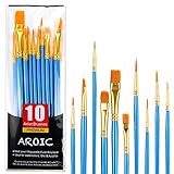
- 【All sizes of art brushes】: The 10 sizes of multi-functional brushes have various shapes, making the mixing color easier, which is very suitable for artists, students, teenagers, children and painters at all levels. Wonderful Present ideas for friends and family who like painting!
- 【general brush set】: Professional paint brush can meet all your needs. Multifunctional brush is very suitable for watercolor, oil, gouache, acrylic painting, body, nail, face painting, miniature, model, ceramics, arts and crafts painting, etc.
- 【high quality process】: It is designed with anti falling bristles, anti-rust nickel ferrule and solid wood handle. You can use the brush to focus on the painting and always be creative.
- 【easy to maintain】: After using the brush, it is very convenient to clean the brush with warm soapy water and reshape the tip of the brush. Air dry the brush and place it on top of the top for long use.
- 【100% satisfaction guarantee - buy now】1 packs of set brushes, you can also get friendly customer service, any questions feel free to contact us, within 24 hours to help you! There is no risk in buying our paint brush kit.
Should you paint all four walls burnt orange?
Four walls can work when the orange is muted, the room receives useful daylight, and the surrounding finishes are comparatively calm. If any of those conditions are uncertain, stage the color so you can evaluate its effect before committing to the entire room.
Windows Errors? Fix Them Before They Spread
Repair common Windows errors and clear accumulated junk for a smoother, more stable PC - no reinstall needed.Free scan · no reinstallOutdated Drivers Are Slowing You Down
One free scan finds every outdated or missing driver and matches the right update for your exact hardware.Free scan · exact hardware match| Coverage choice | Best fit | Trade-off |
|---|---|---|
| Four-wall wash | Muted, earthy orange; light trim and ceiling; coordinated wood and textiles | Most immersive and warm, but hardest to reverse if the color feels heavy |
| Single feature wall | Behind a bed, desk, banquette, fireplace, or media unit | Creates depth and drama while leaving three walls visually open |
| Nook or alcove | Desk recess, reading corner, or dining niche | Defines a function without making the whole room orange |
| Door, shelving, trim, or lower wall | Rooms where you want a trial or a smaller dose | Highly reversible and intentional, but provides less overall warmth |
An accent wall is not a compromise in design terms. It can be the most effective placement when the architectural feature already deserves emphasis or when furnishings need a quiet background elsewhere.
What colors go with burnt orange walls?
Warm white and cream
Warm white or cream lightens the palette and gives the eye a resting place. Use it on trim, the ceiling, adjacent walls, curtains, or larger upholstered pieces when the orange is assertive.
Teal, navy, and blue-gray
Cool contrast prevents an orange room from becoming one-temperature. Teal can support a Mid-century Modern feeling; navy adds weight in a controlled dose; blue-gray is the quietest option. Introduce these colors through a rug, chair, tile, artwork, or small adjoining surface rather than matching a strong orange with an equally intense blue everywhere.
Muted green
Olive, sage, and other softened greens keep the scheme earthy. Their lower saturation allows the orange to remain distinctive without turning the room into a high-contrast color exercise.
What’s actually slowing this PC down?
Pick the symptom - the matching free tool is one click away.
Also popular on Amazon

- Bates paint brushes come in a convenient 6 pieces with 3 flat and 3 angled bristle styles, including (1”, 1.5”, 2”) flat and (1.5”, 2”, 2.5”) angled bristles, perfect for tackling any surface painting or staining job.
- The sturdy natural bristles of each brush are designed to hold more paint, creating a smoother finish with fewer streaks and saving you time on the job.
- The lightweight wooden handles provide extra comfort and ease during long painting processes like walls, trims, cabinets, and doors.
- These versatile brushes are ready-to-use, easy to clean, and can be reused multiple times, making them economical as well as reliable tools for any painting project.
- Bates paint brushes can be used for both oil-based paints as well as latex stains and are ideal for home or commercial projects such as decks, fences or DIY painting jobs.
Brown, wood, brass, and gold
Brown and gold deepen an orange scheme’s richness, while natural wood and leather add texture. Check undertones before buying new pieces: orange with a rosy cast may need cream and softer wood, whereas a brown-based orange can handle walnut, cognac leather, and aged brass.
How do you test burnt-orange paint in your lighting?
Sampling is the most reliable way to resolve the small-room trade-off. Asian Paints recommends testing small patches and living with the shade for several days; Benjamin Moore likewise recommends sampling under the home’s interior lighting.
- Inventory permanent finishes. Look at flooring, countertops, cabinetry, existing wood, upholstery, metal finishes, and adjoining rooms. Note whether they read warm, cool, pink, yellow, or brown.
- Prepare at least two or three large test areas. Include a muted option and a stronger option if you are deciding between coverage levels. Put one patch on the wall that receives the least favorable light, not only beside the brightest window.
- Observe the patches at several times. Check morning, afternoon, and evening, then switch on the room’s actual bulbs. Sherwin-Williams specifically advises viewing a swatch under different lighting conditions and times of day.
- Live with the samples for several days. Notice how the color feels when the room is occupied, furnished, and lit for its normal activities. A quick glance immediately after painting is not a useful verdict.
- View the orange beside the room’s real materials. Move a cushion, rug, artwork, curtain, or metal sample next to the patch. Keep a light neutral nearby to judge whether trim or an adjacent wall will provide enough breathing space.
- Decide coverage only after the color passes. If the shade works on the least-lit wall but feels too forceful elsewhere, use it as an accent rather than buying enough for four walls.
How should the design change with the room’s light?
Bright daylight
Abundant daylight gives you more latitude. A muted full-room wash can feel lively rather than dark, while a bold terra-cotta feature wall can become the room’s main architectural moment. Still compare the sample at night, when artificial light may warm it further.
Mixed or moderate light
Choose a brown-leaning, moderately saturated orange and balance it with cream, warm white, or pale furnishings. If the room contains several dark pieces, limit the orange to one wall or a defined nook.
Dim or artificial-only light
Favor a lighter, muted orange and keep the ceiling, trim, and larger textiles light. A door, alcove, or lower-wall treatment can deliver warmth without reducing the perceived openness of every wall.
Also popular on Amazon

- 2 Inch Angled Paint Brush for Precision Cutting-In – Designed for clean, sharp lines around trim, baseboards, ceilings, corners, and detailed edge work. The perfect size for control and coverage.
- Value 3-Pack for Pros & DIY Projects – Includes three professional 2-inch angled sash brushes — ideal for contractors, remodelers, and homeowners tackling multiple rooms or repeat paint jobs.
- Smooth Results on Walls, Trim & Cabinets – Great for interior wall painting, cabinet edges, furniture projects, and trim work where a smooth finish and crisp control matter most.
- Works with Latex Paint, Oil-Based Paint & Stains – Premium synthetic filaments hold more paint, reduce streaks, and provide a clean finish with latex paints, oil coatings, and wood stains.
- Works with Latex Paint, Oil-Based Paint & Stains – Premium synthetic filaments hold more paint, reduce streaks, and provide a clean finish with latex paints, oil coatings, and wood stains.
Which named shades illustrate the range?
These manufacturer examples show why “burnt orange” covers multiple strengths. They are references for color direction, not a guarantee that a shade will look identical in every room, finish, or region.
| Example | Manufacturer description | Design implication |
|---|---|---|
| Sherwin-Williams Copper Harbor SW 6634 | Muted burnt orange for subtle vibrance | A useful model for restrained warmth and broader coverage |
| Sherwin-Williams Pennywise SW 6349 | Bold terra-cotta suited to a comforting dining room or entryway | More naturally treated as a focal color than a quiet backdrop |
| Asian Paints Orange Peel 7957 | Rich, warm orange with a hint of brown; recommended with beige or cream | Illustrates an earthy orange-and-neutral pairing |
| Benjamin Moore orange range | Includes Terra Mauve 105, Topaz 070, and Fireball Orange 2170-10 | Demonstrates the range from softened orange to much stronger saturation |
What mistakes should you avoid?
- Choosing from a tiny chip alone: small cards hide how a color behaves across a wall and beside your materials.
- Testing only in the brightest spot: the least-lit wall often determines whether the room feels open or enclosed.
- Ignoring undertones: a pink-orange beside yellowed wood or a blue-gray orange beside warm beige can look mismatched even when each color seems attractive alone.
- Making every element equally strong: let the wall, furnishings, or artwork lead; soften the other components with cream, wood, muted green, or restrained blue.
- Assuming “burnt” always means dark: muted, lighter versions can provide the same grounded warmth with less visual weight.
- Painting all four walls before testing commitment: begin with a feature, nook, door, shelving, or lower section when reversibility matters.
Is there scientific proof that burnt orange changes room size or mood?
There is no dated, independent numeric study establishing how much burnt orange changes perceived room size or mood. The available guidance is qualitative design advice from paint manufacturers and an interior designer’s professional observation, so treat the recommendations as visual planning principles rather than measured guarantees.
Frequently Asked Questions
Does burnt orange work in a small bedroom?
Yes, especially as a muted wall behind the bed or as a warm, low-saturation wash with cream bedding and light trim. Test it at night as well as in daylight, because bedroom lighting can make the color appear deeper and more enclosing.
Can burnt orange make a room feel warmer without looking rustic?
Use cleaner-lined furniture, a blue-gray or navy accent, and simple cream textiles to balance the earthy wall. Brass, smooth wood, and one carefully chosen textile repeat the warmth without requiring a rustic theme.
What is the easiest way to reverse a burnt-orange experiment?
Paint a door, alcove, shelving unit, or lower section of wall rather than the full room. These placements create a deliberate color moment and require less repainting if your preference changes.
How do I choose between teal and navy with burnt orange?
Teal gives a livelier, Mid-century-leaning contrast, while navy feels deeper and more formal. In either case, use the cool color in a limited area and select a softened version if the orange is already highly saturated.
Quick Recap

Product prices and availability are accurate as of the date/time indicated and are subject to change. Any price and availability information displayed on Amazon at the time of purchase will apply.
Free tools Windows power users keep installed
One-click scans. No signup required.

