Do these 3 things before closing this tab:
1Fix the driver behind crashes, sound loss and screen glitches2Clear out junk files and repair common Windows errors3Scan for outdated or missing drivers - takes under a minute
ThatPainter is reader-supported. When you buy through links on our site, we may earn an affiliate commission. Learn More
For most U.S. homes, the best white wall color to start with is Benjamin Moore White Dove OC-17. Its soft warmth keeps rooms from looking sterile, while its clean appearance still reads unmistakably white. It works particularly well in traditional, transitional, and contemporary interiors.
White Dove is not a universal winner. It can look creamier in a south-facing room, under warm LED bulbs, or beside yellow-toned wood and flooring. If you prefer a cleaner, brighter look, consider Benjamin Moore Chantilly Lace OC-65. For a whole-home white with relatively little apparent warmth, sample Sherwin-Williams Pure White SW 7005; for a softer, cozier warm white, consider Alabaster SW 7008.
The important distinction is that “best white paint” can mean three different things: the color, the paint formula, or the sheen. This guide separates all three so you can choose a white that suits your lighting, finishes, walls, and cleaning needs—not just a color that looks attractive on a screen.
Recommended Free Tools
The expert-backed shortlist
White Dove is the most defensible all-around recommendation, but the right alternative depends on the room. The table below is a shortlist rather than a catalog of every white available.
#1 Best Overall
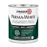
- Self-Priming formula - requires no sanding
- Mold & Mildew-Proof paint film - guaranteed for 5 years
- Resists dirt and moisture on film coating
- Finish is washable and scrubbable with soap and water
- Product contains a mildewcide to prevent the growth of mold and mildew on the paint film only
| Color | Approximate character | Verified LRV | Good starting point for | Watch for |
|---|---|---|---|---|
| Benjamin Moore White Dove OC-17 | Soft, warm-neutral white | 83.16 | Most homes; warm wood; open-plan spaces | Can look creamier or yellower in warm light |
| Sherwin-Williams Pure White SW 7005 | Versatile, relatively neutral bright white | 83.957 | Whole-home use; walls, trim, and ceilings in coordinated interiors | Its slight warmth can show beside cool whites or in golden light |
| Benjamin Moore Simply White OC-117 | Brighter white with a subtle warm bias | 89.52 | Rooms that need more reflected light without a stark look | Can look more yellow beside cream, yellow wood, or warm bulbs |
| Benjamin Moore Chantilly Lace OC-65 | Crisp, clean, high-LRV white | 90.04 | Modern rooms, gallery-like spaces, and warm, sunny exposures | May feel stark in dim or north-facing rooms |
| Sherwin-Williams Alabaster SW 7008 | Soft, cozy, balanced warm white | Not listed here | Natural wood, earthy materials, and comfortable interiors | Not ideal when you want a brilliant, stark white |
| Sherwin-Williams Snowbound SW 7004 | Muted white with a slight gray influence | 82.771 | Modern rooms that can handle a subdued, greige-leaning white | Can look gray in low light |
| Behr Ultra Pure White | Very bright, clean-slate white | 94 | High-contrast contemporary rooms and easy hardware-store availability | Its brightness can emphasize shadows, flaws, and mismatched whites |
| Farrow & Ball Pointing, Wimborne White, or White Tie | Soft, traditional, character-filled whites | Varies | Historic homes and rooms with warm, period materials | Price, availability, and undertone interpretation; sample carefully |
The case for White Dove is based on editorial and designer consensus, not a scientific ranking or verified nationwide sales ranking. The Expert describes it as one of the closest choices to a universally adaptable white, while Young House Love found that it appeared most frequently in a comparison of more than 100 colors across selected expert lists. That is useful evidence of professional agreement, but it does not prove that White Dove is the most popular or best-performing white in every home.
Choose the color before you choose the can
A paint color and a paint product are separate decisions. You might choose White Dove as the color, then have it mixed in a Benjamin Moore product, a different manufacturer’s product, or a locally available formula. The formula affects coverage, leveling, washability, touch-up behavior, and price. The sheen affects reflection and how much wall texture is visible.
For product performance, current Consumer Reports coverage is a separate evidence stream from designer color recommendations. A 2026 summary reported Behr Dynasty as the highest-scoring interior paint in its comparison and identified Behr Ultra and Behr Marquee as strong performers. Behr also presents its interior lines alongside 2026 Consumer Reports ratings. Check the published summary and Consumer Reports’ own paint coverage for the methodology and current rankings before treating an exact score as decisive.
Free tools Windows power users keep installed
One-click scans. No signup required.
In practical terms:
- Best color default: Benjamin Moore White Dove OC-17.
- Best bright-neutral alternative: Sherwin-Williams Pure White SW 7005.
- Best crisp-modern alternative: Benjamin Moore Chantilly Lace OC-65.
- Best product-performance angle: compare a premium formula such as Behr Dynasty separately from the color decision.
What “white” means in paint
Paint labels do not use “white” in one perfectly standardized way. In a room, most whites fall into four practical groups:
- Clean or pure whites: appear to have very little visible undertone and usually create a crisp, contemporary effect. They can still shift with lighting and neighboring colors.
- Warm whites: contain yellow, red, pink, peach, or beige influence. They tend to feel softer and more comfortable.
- Cool whites: lean toward blue, green, gray, or violet. They can look clean and modern but may feel cold or gray in a shadowy room.
- Off-whites: have lower reflectance and may read as cream, ivory, putty, or pale greige rather than a bright architectural white.
These categories are useful shorthand, not a universal technical standard. A white that appears neutral in a brightly lit showroom may reveal a yellow, pink, gray, blue, or green bias on your wall. Lowe’s overview of white paint undertones offers a useful starting framework, but physical sampling is still the final test.
How lighting changes white paint
White is unusually sensitive to its surroundings because it reflects much of the light that reaches it. Window direction, time of day, weather, landscaping, artificial bulbs, flooring, furniture, and adjacent trim can all change its appearance.
North-facing rooms
In the Northern Hemisphere, north-facing windows generally provide cooler, weaker, or more indirect light. Begin by testing warm whites such as White Dove or Alabaster. A subtle red, pink, peach, yellow, or beige influence can counteract the room’s cool cast.
Quick wins for a faster PC:
Repair Windows errors before they cause bigger problemsFix Now →Scan for outdated or missing drivers - takes under a minuteDriver Scan →Be cautious with strongly gray, blue, or green whites in a room that already feels dim. They may look flat, icy, or dirty rather than crisp. If the room is very dark, test the warm white under the actual lamps as well as during the day.
South-facing rooms
South-facing rooms usually receive stronger, warmer light. A warm white can become noticeably creamy or yellow, particularly beside yellow oak, beige flooring, or warm bulbs. Start with a cleaner option such as Chantilly Lace or Pure White if you want the walls to remain crisp.
This is a starting direction, not a rule. Trees, porches, overhangs, neighboring buildings, and window treatments can alter the light enough to reverse the expected result. Homes & Gardens’ guidance on choosing whites that do not look yellow and Benjamin Moore’s own color guidance both emphasize testing the actual room.
East-facing rooms
East-facing rooms can look cooler or bluer in the morning and warmer or more neutral later in the day. Compare your samples in the morning, then again in the afternoon. A white that looks perfect at breakfast may look too warm or too flat by evening.
PC Slower Than It Used to Be?
A free scan shows the junk files, broken settings and background clutter dragging Windows down - then fixes them in one click.Free scan · Windows 10 & 11Outdated Drivers Are Slowing You Down
One free scan finds every outdated or missing driver and matches the right update for your exact hardware.Free scan · exact hardware matchWest-facing rooms
West-facing rooms often receive warmer afternoon and evening light. Test warm whites late in the day; White Dove, Simply White, or Alabaster may become more yellow than expected under that combination of sunlight and warm interior lighting.
Rank #2

- Use for a variety of indoor and outdoor project surfaces including wood, metal, plaster, masonry or unglazed ceramic
- Water-based acrylic formula is low odor, resist chips and provides long-lasting protection
- Covers up to 120 sq ft and dries to touch in 30 minutes for quick project completion
- Semi-gloss finish minimizes surface imperfections, goes on smoothly and provides excellent hide
- Prior to application sand surfaces with 180/200 grit sandpaper, then wash with a degreaser, allow the surface to dry and apply paint
Windowless rooms, basements, and hallways
In a room with no daylight, the bulb is the dominant light source. Test samples under the exact LED or incandescent bulbs you plan to use. A higher-LRV white may help the area reflect more available light, but a very cool white can still feel gray or clinical. A moderately warm white often feels more welcoming.
For a connected hallway or open-plan space, judge the white from every adjoining room. The best white for one exposure may not be the best white for the whole sequence of spaces.
LRV: useful information, not a brightness guarantee
Light Reflectance Value, or LRV, describes the percentage of visible light a color reflects on a scale from 0, theoretical absolute black, to 100, theoretical pure white. In general, a higher-LRV paint reflects more light and a lower-LRV paint absorbs more.
That makes LRV helpful when comparing a very bright white with a softer off-white. It does not, by itself, predict how the paint will look on your walls. Sheen, shadows, bulb temperature, surrounding colors, surface texture, and the size of the painted area all matter. A high-LRV white can look harsh in a room with strong contrast, while a lower-LRV warm white can look brighter and more comfortable in a well-balanced room.
For reference, the manufacturers’ current color pages list these LRV values for the named colors:
- White Dove OC-17: 83.16 (Benjamin Moore)
- Simply White OC-117: 89.52 (Benjamin Moore)
- Chantilly Lace OC-65: 90.04 (Benjamin Moore)
- Pure White SW 7005: 83.957 (Sherwin-Williams)
- Extra White SW 7006: 85.861 (Sherwin-Williams)
- Snowbound SW 7004: 82.771 (Sherwin-Williams)
- Greek Villa SW 7551: 84.223 (Sherwin-Williams)
- Behr Ultra Pure White: 94 (Behr)
Do not treat these numbers as perfectly interchangeable across brands. Manufacturers may use different color systems, formulas, databases, and rounding conventions. Also check the exact color code: Benjamin Moore’s current U.S. page lists White Dove OC-17 at 83.16, while another Benjamin Moore page identifies White Dove PM-19 as an alternate name and lists 85.38. Do not combine those figures or refer to a generic “White Dove LRV” without naming the code and source.
Match the white to your existing materials
The most attractive white is usually the one that makes the room’s permanent finishes look intentional. Place samples directly beside the floor, countertop, backsplash, tile, trim, upholstery, rug, window coverings, and largest pieces of furniture.
- Warm oak, walnut, brass, terracotta, beige stone, or tan textiles: begin with White Dove, Alabaster, or Simply White. A warm-neutral white usually prevents a jarring black-and-white effect.
- Blue-gray stone, cool marble, polished concrete, or chrome: compare Chantilly Lace, Extra White, and other cleaner whites. A yellowish white may look muddy beside these materials.
- Green cabinetry or abundant foliage: compare Alabaster with other warm neutrals. Green surroundings can alter how a white’s yellow or gray components are perceived.
- Dark floors: a warm white often provides a softer transition than a brilliant cool white, unless a deliberately graphic contrast is your goal.
- Creamy upholstery or ivory tile: avoid pairing it casually with a blue-gray white. The cool white may make the existing ivory look more yellow; use the contrast only if it has been tested and intended.
- Existing builder-grade trim: match samples against the actual trim. “Standard white” is not a reliable description of its undertone.
Design coverage from Elle Decor and House & Garden likewise emphasizes coordinating white paint with floors, furniture, stone, architectural details, and the quality of light.
Best white by room condition
| Your situation | Start by sampling | Reason |
|---|---|---|
| Dark or north-facing room | White Dove, Alabaster, then Simply White if more reflectance is needed | Warmth can counteract cool light without automatically making the room yellow |
| Bright, warm, south-facing room | Chantilly Lace or Pure White | Cleaner whites are less likely to become visibly creamy |
| Whole-home repaint | White Dove or Pure White | Both are adaptable starting points across different exposures and decorating styles |
| Modern, high-contrast interior | Chantilly Lace, Extra White, or Behr Ultra Pure White | Higher reflectance and cleaner character support a crisp look |
| Warm wood and earthy materials | White Dove or Alabaster | Soft warmth works with, rather than fights, the existing palette |
| Cool marble, concrete, and metal | Chantilly Lace or another clean white | Reduces the chance that the walls will look yellow beside cool finishes |
| Historic or traditional interior | Farrow & Ball Pointing, Wimborne White, White Tie, or White Dove | Soft, character-filled whites generally suit period details better than brilliant white |
| High-traffic walls | Choose the color first; use a quality eggshell or restrained satin formula | Sheen and product durability matter more than choosing a special “traffic” white |
Which sheen is best for white walls?
There is no single best sheen for every wall. The same color can look very different in matte, eggshell, and satin because higher sheen reflects more directional light.
- Matte: has little reflection and hides minor drywall flaws, patches, texture, and roller variation better. Modern premium matte products may be washable, but cleaning performance varies by formula. Matte is often the best-looking choice for imperfect walls.
- Eggshell: offers modest reflection with a practical balance of cleanability and appearance. It is a strong default for ordinary living rooms, bedrooms, dining rooms, and many family spaces.
- Satin: is generally more washable and durable, making it useful for hallways, kitchens, children’s rooms, and frequently touched walls. Its extra reflection can reveal repairs, ridges, texture, and application marks.
- Semi-gloss: is usually better for trim, doors, bathrooms, and other high-contact surfaces than for broad living-room walls. On large walls it can look reflective and make imperfections conspicuous.
- Flat: is commonly used on ceilings and surfaces where hiding flaws matters most. Traditional flat paint is less resistant to cleaning, although product performance varies.
Sherwin-Williams’ sheen guidance summarizes the trade-off: higher sheens generally clean more easily and resist stains better, while low-sheen finishes conceal imperfections more effectively. Behr’s current Dynasty information similarly describes matte as low-reflective and touch-up-friendly and eggshell as more resistant to dirt and mildew.
Practical default: use a high-quality matte or eggshell on general walls. Choose eggshell or restrained satin when frequent cleaning matters more than hiding surface flaws. Use satin or semi-gloss for trim and doors according to the amount of contrast and durability you want.
How to sample white paint correctly
A small paper chip is not enough evidence for a whole room. White paint changes too much with scale and light. Use this process before buying several gallons:
Rank #3

- Perfect Coverage: The wall paint roller features a high-quality sponge for a seamless finish that perfectly covers cracks, stains, and imperfections with one swipe, white paint ensuring excellent paint adhesion and superior coverage
- Quick-Drying: Our white paint for wall has a quick cure time and dries quickly after even application. No more waiting hours for repairs—after using white touch up paint can get a smooth, ready-to-use surface in one hour later
- Upgraded Formula: Unlike solvent-based paints, our white wall paint uses a water-based paint that's minimal odor and interior wall paint is friendly to family and pet, ensuring peace of mind when refinishing your home
- Easy to Apply: This reusable white trim paint features a removable, washable cover and a comfortable, non-slip handle,two pieces of sandpaper. Interior wall paint easily cleans with soap and water after use, and the roller won't break or warp, saving you money and reducing waste
- Walls and DIY Projects: White paint is suitable for a variety of indoor and outdoor wall and ceiling surfaces. Whether covering graffiti, scratches, or dealing with advertising, the wall paint roller can easily achieve professional-grade repair results with a simple roll
- Reduce the shortlist to three or four colors. Include the leading default and only the alternatives that fit your lighting and materials. Comparing a dozen whites usually creates confusion rather than precision.
- Use physical samples. Digital swatches and room photographs are approximations. Screen brightness, photography, editing, and your device settings can all misrepresent the paint.
- Paint large movable boards. Architectural Digest recommends a sturdy illustration board or foam board at least 3/8 inch thick. Large boards show the color’s overall effect and can be moved between walls.
- Use the intended sheen. If the walls will be eggshell, test eggshell. Do not reject a color based on a glossy sample when the final wall will be matte.
- Paint enough coats for an even dried surface. Follow the product’s label for application and recoat instructions. Judge the cured sample, not wet paint.
- Move each board around the room. Check the brightest wall, darkest wall, wall beside the window, and wall beside the largest finish or furnishing.
- View the samples at different times. Check morning, afternoon, evening, cloudy conditions if possible, and nighttime with the room’s actual lights on.
- Compare against plain white paper. A sheet of ordinary white paper can make yellow, pink, gray, blue, or green undertones easier to see. It is a comparison tool, not a promise that the paper is neutral under every bulb.
- Place samples next to permanent materials. Check the floor, trim, countertop, backsplash, tile, upholstery, rugs, and window treatments.
- Look from across the room. A color can seem attractive at arm’s length and too gray, yellow, or stark when viewed across the full space.
Benjamin Moore and Sherwin-Williams both caution that screen colors may differ from actual paint. Their sample resources, along with Architectural Digest’s sampling guidance and Homes & Gardens’ white-paper comparison, support the same conclusion: buy or make a physical sample before committing.
Walls, trim, doors, and ceilings: use one white or several?
All three approaches below can work.
1. One color in different sheens
Use the same white on walls, trim, doors, and ceiling, changing the sheen to create subtle definition. For example, a matte or eggshell wall beside satin trim can look coordinated without introducing a competing undertone. This is especially effective in open-plan homes where multiple whites might clash.
2. Different whites with the same undertone
Use a slightly brighter or cleaner white on the trim, but keep its warmth or coolness compatible with the wall color. A warmer trim beside a warm wall usually looks intentional; a cool brilliant white beside a warm wall can make the wall look yellow or dirty.
What’s actually slowing this PC down?
Pick the symptom - the matching free tool is one click away.
3. Deliberate contrast
A contrasting trim white can sharpen architectural details, but test it first. White Dove walls with an extremely crisp white trim will not create the same effect as White Dove walls with White Dove trim. The surrounding light and finish may make the difference subtle—or surprisingly strong.
Sherwin-Williams recommends coordinating the trim white’s undertone with the wall color. Young House Love also recommends the same color in different sheens as a useful strategy when walls, ceilings, and trim are all white.
Preparation matters more than the label
A white wall shows uneven coverage, stains, repaired areas, and sheen differences readily. “Paint and primer in one” does not mean that dedicated primer is unnecessary in every situation.
Plan for appropriate preparation when you have:
- new drywall or bare plaster;
- large or repeated patches;
- glossy existing paint that needs deglossing or sanding;
- water, smoke, tannin, grease, or other stains;
- a dramatic change from a deep or saturated color to white;
- mildew, moisture, or an unresolved leak;
- uneven existing sheen; or
- many spot repairs that could flash through the finish.
Clean the surface, repair defects, sand as appropriate, remove dust, and follow the chosen product’s label for primer compatibility, cure times, recoat instructions, and ventilation. Behr specifically notes that new drywall, patched areas, heavy stains, and drastic color changes may still need dedicated primer even when using Dynasty. Its coverage claims and one-coat guarantees also have product- and color-specific limitations; do not assume that a white automatically qualifies. Certain Behr technical materials exclude Ultra Pure White from some one-coat guarantees.
Common white-paint mistakes
- Choosing from a phone screen. Online swatches are useful for narrowing choices, not for approving a whole room.
- Assuming all bright whites are interchangeable. Chantilly Lace, Pure White, and Ultra Pure White have different undertones, LRVs, formulas, and visual behavior.
- Picking only by LRV. A higher number does not automatically mean a more attractive or more comfortable room.
- Pairing warm walls with cool brilliant trim without testing. The wall may suddenly look yellow.
- Using a cool gray or blue white in a dim room. It can exaggerate the room’s existing coldness.
- Using a warm white in intense golden light. It may become creamier than intended.
- Testing only in daylight. Warm LEDs can transform a white after sunset.
- Using satin to disguise damaged walls. Its cleanability comes with extra reflection that can spotlight imperfections.
- Assuming paint-and-primer eliminates all preparation. Stains, bare surfaces, gloss, and major color changes still need appropriate treatment.
- Expecting an exact cross-brand match. A store can often create an approximate match, but different bases and pigments mean the result must be sampled.
- Confusing the best wall color with the best trim color. A white that is comfortable across walls may not provide enough trim contrast—or may be too warm beside another wall white.
- Assuming every small room should be white. White can make a space feel brighter or more expansive, but it cannot increase its physical dimensions. In some dark or intimate rooms, a deeper, coordinated color can feel more enveloping and coherent.
Can another brand match White Dove?
Ask for an approximate match if you need a different product line, but do not assume that a matched White Dove will be indistinguishable from the original. Brands use different bases, pigments, and color systems. Even a close match can shift under your room’s lighting or look different in a new sheen.
Check the exact name and code—such as White Dove OC-17—on the sample and receipt. Do not rely on a color name alone, and do not purchase a whole-room quantity until the mixed paint has been tested on a large board.
A simple decision tree
- Choose the mood. For soft and comfortable, start with White Dove or Alabaster. For relatively neutral, start with Pure White or White Dove. For crisp and bright, start with Chantilly Lace or Ultra Pure White.
- Account for the light. In a cool, shadowy room, begin with warm whites. In an intensely warm, sunny room, begin with cleaner whites.
- Match the materials. Warm wood and beige stone usually favor warm-neutral whites; cool marble, concrete, and chrome often favor cleaner whites.
- Decide how much reflectance you want. Higher LRV can help reflect available light, but it can also increase contrast and expose flaws.
- Choose the sheen based on the wall. Favor matte when hiding imperfections matters; eggshell for a balanced general-purpose wall; satin when cleaning and durability matter more.
- Sample before committing. If the color looks right on only one wall or one time of day, it is not yet the right whole-room choice.
What experts can—and cannot—tell you
Designer roundups are valuable for identifying recurring favorites, but they are not laboratory tests. Manufacturer color experts understand their own palettes and products, but their recommendations are not independent comparative testing. Retailer and editorial lists may reflect professional judgment rather than sales data. Consumer-testing organizations address product performance, not whether a white looks best beside your particular floor.
That is why the strongest recommendation is conditional: use White Dove OC-17 as the first sample for a versatile soft white, then let the room’s light and finishes decide whether it stays in the running.
Frequently Asked Questions
Is Benjamin Moore White Dove a warm or cool white?
White Dove OC-17 is generally considered a soft warm-neutral white. It has enough warmth to avoid a sterile appearance, but it is cleaner than many creamy off-whites. In warm LEDs, strong southern light, or beside yellow wood, it can look noticeably creamier.
Rank #4

- Easy Renovation: Our innovative bottle with a built-in brush makes your renovation projects a breeze. No need to hire professionals, as anyone can use this fast-drying, DIY-friendly product
- Superb Adhesion: This touch up paint adheres to various surfaces like walls, trim, doors, cabinets, blinds, metal, windows, furniture, and appliances, enabling easy repair of scratches, stains, chips, spots, yellowing, and other paint imperfections
- Suitable for Interior and Exterior Use: Whether you need to touch up interior or exterior surfaces, our white paint pen is up to the task. It effectively covers and repairs imperfections on both types of surfaces, giving you a flawless finish
- Application Guidelines: For best results, apply at least two coats with a 2-hour drying time between each, ensuring the previous coat is fully dry
- DIY Color Adjustments: If you desire a custom color, our product allows for easy color mixing. Simply add our water-based paint special color paste to achieve the desired shade and unleash your creativity
Does White Dove look yellow?
It can, but it does not look yellow in every room. Warm bulbs, golden sunlight, yellow-toned flooring, and beige or cream furnishings can emphasize its warmth. Test a large dried sample at night as well as during the day.
Is Simply White brighter than White Dove?
Yes, based on the current listed LRVs: Simply White OC-117 is 89.52 and White Dove OC-17 is 83.16. Simply White may reflect more light, but its subtle warmth can still become apparent beside cream finishes or under warm bulbs.
Is Chantilly Lace too stark for walls?
It can be too stark in a dim or north-facing room, especially next to warm furnishings. In bright, warm light or a modern interior, its clean, high-LRV character may be exactly what you want. Sample it beside the room’s permanent finishes before deciding.
What is the best white for a dark room?
Start with a warm white such as White Dove or Alabaster, then compare Simply White if you want more reflectance. Avoid choosing a strongly blue, green, or gray white solely because it has a high LRV; a cool white can make a shadowy room feel colder.
What is the best white for a south-facing room?
Begin by sampling a cleaner white such as Chantilly Lace or Pure White. Strong southern light can make warm whites look creamier or yellower. The room’s landscaping, window coverings, flooring, and bulbs can change the result, so treat orientation as a starting point rather than a rule.
Should walls and trim be the same white?
They can be. Using one color in different sheens is a dependable coordinated approach, especially in open-plan homes. If you use different whites, match their undertones or test the contrast carefully; cool brilliant trim can make warm walls look yellow.
Is matte or eggshell better for white walls?
Matte hides minor imperfections and reduces glare, while eggshell offers a practical balance of cleanability and subtle reflection. Choose eggshell or satin for frequently cleaned walls if the surface is smooth; choose matte when wall flaws are the greater concern.
Can one paint brand match another brand’s white exactly?
Usually you should expect an approximate match, not a guaranteed identical result. Different brands use different bases and pigments. Test the matched paint in the intended sheen before buying enough for the room.
Do I need primer before painting white?
Possibly. New drywall, bare plaster, patches, stains, glossy paint, major color changes, mildew, moisture problems, and uneven sheen may require dedicated primer. Follow the specific product label; a paint-and-primer claim does not eliminate every primer requirement.
Is white paint a good choice for a small room?
White can make a room appear brighter or more expansive by reflecting light and reducing visual contrast, but it does not change the room’s physical size. In a poorly lit space, the wrong cool white may look dull, and a deeper coordinated color can sometimes create a more enveloping result.
What is the best white for a rental or whole-house repaint?
White Dove and Pure White are sensible starting samples because they work across many decorating styles and exposures. For a rental, also prioritize the available product’s durability, touch-up behavior, price, and exact sheen. Test the existing trim and flooring before committing to a full-home color.
What’s actually slowing this PC down?
Pick the symptom - the matching free tool is one click away.
The Bottom Line
Bottom line: Start with Benjamin Moore White Dove OC-17 if you want one versatile, softly warm white for most walls. Choose Sherwin-Williams Pure White for a more neutral whole-home direction, Chantilly Lace for a crisp modern look, or Alabaster for a softer, cozier room. Then test the finalists on large boards in the actual sheen, beside your finishes, in daylight and under nighttime lighting. That sample—not a universal ranking, digital swatch, or LRV alone—is the most reliable expert for your home.
Quick Recap

Product prices and availability are accurate as of the date/time indicated and are subject to change. Any price and availability information displayed on Amazon at the time of purchase will apply.




