Windows Errors? Fix Them Before They Spread
Quick wins for a faster PC:
Fix the driver behind crashes, sound loss and screen glitchesFind Drivers →Repair Windows errors before they cause bigger problemsFix Now →Scan for outdated or missing drivers - takes under a minuteDriver Scan →Outbyte PC Repair · freeRepair common Windows errors and clear accumulated junk for a smoother, more stable PC - no reinstall needed.
Fix My PC Now →ThatPainter is reader-supported. When you buy through links on our site, we may earn an affiliate commission. Learn More
What colours go with red? Green is red’s traditional complementary colour because it sits opposite red on a conventional colour wheel. That does not make green the only suitable partner: warm and cool neutrals can calm red, while red-orange and orange create a more continuous, analogous palette. The right choice depends on your red’s undertone, the contrast you want, the amount of each colour, and the room’s changing light.
For walls, furniture or accents, choose the palette direction first, then test real paint samples in the room. A colour that looks balanced on a screen can shift noticeably beside flooring, upholstery, daylight and artificial lighting.
As an Amazon Associate I earn from qualifying purchases.
What’s actually slowing this PC down?
Pick the symptom - the matching free tool is one click away.
At a glance
| Name | Best for | Key spec | Checked |
|---|---|---|---|
| Green with red | High-contrast rooms and deliberate accent schemes | Complementary; opposite hues on the colour wheel | November 2026 |
| Warm neutrals | Grounding brick, terracotta and warm reds | Low-contrast support; beige and warm off-white direction | November 2026 |
| Cool neutrals | Restrained schemes and cooler reds | Gray-leaning counterpoint that changes the palette’s temperature | November 2026 |
| Red-orange and orange | Tonal, cohesive and deliberately warm interiors | Analogous; neighbouring hues with less opposition | November 2026 |
What is the complementary colour of red?
On a traditional colour wheel, green is the complementary colour of red. Complementary colours are positioned directly opposite one another; Adobe’s colour-wheel guide uses red and green as the standard example. Benjamin Moore likewise defines complementary colours as “two colors opposite one another on the color wheel” in its warm-and-cool colour guide.
The relationship describes hue, not a rule that both colours must appear in equal areas or at maximum saturation. Vivid red beside vivid green produces very forceful contrast. A softened green, a less saturated red, or green used only in textiles and accessories can preserve the complementary relationship without making the room feel visually loud. Benjamin Moore’s complementary-colour guidance shows that pairings can be bold or muted.
Popular on Amazon

- Great Value Paint Brush Set: Soucolor 20 acrylic paint brushes come in 10 different sizes, making them ideal for fine detailing, model painting, rock painting, nail art, face painting, DIY crafts, and general art projects. The varied brush sizes give you better control for both delicate lines and broader color coverage, while the soft bristles deliver smooth, consistent results on acrylic, oil, watercolor, canvas, wood, ceramic, and more.
- Awesome Set of Paint brushes: Professional paint brushes can cover all of your needs. The multi-purposed brushes are ideal for Watercolor, Oil, Gouache, enamel, Acrylic Painting, Body, Nail, Face Painting, Miniature, Model, Wood, Glass, Cup, Ceramic, Fine work, Art class, Craft Art Painting, DIY Art Crafts etc.
- Soft and long-lasting: The bristles are soft and strong, with nickel metal ferrules and blue wooden handles. After cleaning, the bristles will become soft and fluffy again and will not fall off.
- Easy to clean: it’s very convenient to Wash well in soap and water. Retain shape after drying. the brushes hold up very well. Nice selection to beginners and professionals. Keep them clean and they last a long time.
- Perfect for All Painters & Occasions: Suitable for art beginners, hobbyists and professional artists. Great for art class, home creation, travel painting and DIY handmade projects. A practical art gift for students, teachers, family and craft lovers.
This article concerns placing colours beside one another in a design. It is not a recipe for mixing red and green paint, which produces a different result because pigments absorb and reflect light.
What colours go with red?
Four practical directions cover most interiors: complementary green, warm neutrals, cool neutrals, and analogous red-orange or orange. Compare them on three axes before choosing: contrast, temperature and saturation/proportion.
Quick wins for a faster PC:
Scan for outdated or missing drivers - takes under a minuteDriver Scan →Clear out junk files and repair common Windows errorsFree Scan →| Palette direction | Contrast | Temperature and undertone | Useful applications |
|---|---|---|---|
| Green with red | Strong | Can read balanced when one hue is muted | Accent chairs, cabinetry, artwork, foliage-inspired textiles |
| Warm neutrals | Gentle | Supports warm reds such as brick or terracotta | Walls, rugs, woodwork and large furnishings |
| Cool neutrals | Gentle to moderate | Tempers or sharpens a cooler, blue-leaning red | Gray walls, trim, metal finishes and contemporary furniture |
| Red-orange and orange | Moderate but continuous | Reinforces warmth rather than opposing it | Tonal schemes, kitchens, dining rooms and layered textiles |
There is no universal “best” red companion. The same red may look rich beside a warm beige and harsh beside a cool gray, or vice versa, depending on daylight, finish and surrounding materials.
How does green work with red in an interior?
Green gives red the clearest colour-wheel contrast. Use it when you want each hue to remain noticeable, then control the intensity with value, saturation and area.
Use proportion to prevent visual competition
Making one hue dominant and the other secondary is usually easier to live with than dividing a room into equal blocks of saturated red and green. Red walls with a muted green sofa, for example, create a different emphasis from green walls with a small red chair. Green cushions, curtains or artwork can supply the complementary note without repainting the room.
Mute one or both hues
Olive, sage or gray-green generally creates a quieter relationship than a highly saturated emerald. Likewise, brick, oxblood or dusty red is less forceful than a clear primary red. Benjamin Moore specifically illustrates muted green used with red seating and accents, demonstrating that “complementary” does not require neon-level intensity.
Do these 3 things before closing this tab:
1Clear out junk files and repair common Windows errors2Fix the driver behind crashes, sound loss and screen glitches3Repair Windows errors before they cause bigger problemsAlso popular on Amazon
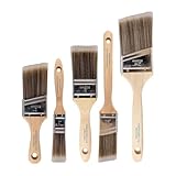
- COMPLETE 5-PIECE BRUSH SET FOR EVERY PAINTING TASK — Includes 1 Inch Flat, 1.5 Inch Angle, 2 Inch Flat, 2 Inch Angle Stubby, and 2.5 Inch Angle brush giving you every size professional painters use daily. Get all 5 for less than the price of a single brush from hardware store brands — professional grade performance at a fraction of the cost. Perfect for walls, trim, cabinets, doors, furniture, and detailed cutting-in work on any project.
- ZERO BRISTLE LOSS — GUARANTEED BY PRECISION ADHESIVE BONDING — Every bristle is locked in place with precision-set adhesive that keeps them in the brush — not in your paint job. The coated steel ferrule provides structural support while the adhesive bond ensures clean performance on every stroke. Premium SRT synthetic filaments load more paint and release it evenly for a smooth streak-free finish on walls, ceilings, and trim. Works with latex, oil-based paint, primer, sealer, and wood stain.
- INCLUDES THE ANGLE STUBBY MOST SETS LEAVE OUT — Professional painters know the 2 Inch Angle Stubby is the go-to brush for tight cabinet interiors, window sashes, inside corners, and detailed trim where standard angle brushes are too long. Combined with the 1.5 and 2.5 inch angle sash brushes you have precision cutting-in covered at every scale — baseboards, crown molding, door casings, and ceiling lines.
- FLAT BRUSHES FOR BROAD SMOOTH COVERAGE ON ANY SURFACE — The 1 and 2 inch flat brushes deliver even coverage on walls, furniture, shelving, doors, fences, decks, and wood surfaces. Ideal for applying primers, stains, varnishes, polyurethane, and specialty coatings. Solid wood handles provide all-day comfort and control for both professional contractors and weekend DIY homeowners tackling interior or exterior painting projects.
- TRUSTED BY PROFESSIONAL PAINTERS AND CONTRACTORS NATIONWIDE — Pro Grade delivers professional-grade results at a price that makes sense for crews who go through brushes on every job. Ideal for property managers, remodeling contractors, apartment turnover crews, maintenance teams, and commercial painting operations. Backed by thousands of verified reviews from working painters. Washable and reusable for multiple projects.
Coordinate the undertones
A yellow-leaning green can sit comfortably with a warm brick red, while a blue-leaning green may make that red appear warmer by comparison. For a blue-based crimson, a cooler green can feel more coherent. Look at both swatches together, not separately, because adjacent colours alter one another’s appearance.
Which warm neutrals pair well with red?
Warm neutrals are the safest starting point when you want red to remain the feature without introducing another strong opposing hue. Beige, oatmeal, cream and warm off-white can ground brick, rust, terracotta and other yellow- or brown-leaning reds.
Benjamin Moore’s red-paint guidance names Coastal Path AF-380 and Bradstreet Beige HC-48 as examples of warm neutrals that can accompany red. These are proprietary paint colours, not universal standards; use the names as reference points for a warm-beige direction rather than as guarantees for every red.
- For red walls: try warm-neutral upholstery, natural timber and a cream or beige ceiling to keep the room from feeling stark.
- For a red sofa or headboard: use a warm neutral on larger wall areas, then repeat the red in small accessories so the furniture feels intentional.
- For terracotta or brick: pair with linen-like off-whites, tan leather and warm wood, checking that the neutral does not turn unexpectedly pink or yellow in your light.
Warm neutrals do not mean every surface must be beige. Blackened metal, stone, greenery and a small amount of cooler material can add definition while the main palette stays grounded.
When should you choose cool neutrals with red?
Choose a cool neutral when you want red to feel more restrained, architectural or crisp, or when the red itself has a blue undertone. Gray, greige with a cool cast and cool off-white can provide a quieter counterpoint than green.
Benjamin Moore lists Revere Pewter HC-172 and Wish AF-680 as examples of cooler neutrals in its red-paint material. As with the warm examples, these codes belong to that manufacturer’s range. Judge the underlying hue in your own room rather than assuming every gray will behave alike.
Also popular on Amazon
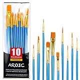
- 【All sizes of art brushes】: The 10 sizes of multi-functional brushes have various shapes, making the mixing color easier, which is very suitable for artists, students, teenagers, children and painters at all levels. Wonderful Present ideas for friends and family who like painting!
- 【general brush set】: Professional paint brush can meet all your needs. Multifunctional brush is very suitable for watercolor, oil, gouache, acrylic painting, body, nail, face painting, miniature, model, ceramics, arts and crafts painting, etc.
- 【high quality process】: It is designed with anti falling bristles, anti-rust nickel ferrule and solid wood handle. You can use the brush to focus on the painting and always be creative.
- 【easy to maintain】: After using the brush, it is very convenient to clean the brush with warm soapy water and reshape the tip of the brush. Air dry the brush and place it on top of the top for long use.
- 【100% satisfaction guarantee - buy now】1 packs of set brushes, you can also get friendly customer service, any questions feel free to contact us, within 24 hours to help you! There is no risk in buying our paint brush kit.
- Cool gray plus clear red: creates a graphic, contemporary contrast; keep the gray from becoming blue if the red is already very cool.
- Cool off-white plus deep red: leaves the red prominent while giving trim and ceilings a clean edge.
- Greige plus burgundy: can soften the transition between red upholstery and stone, concrete or brushed-metal finishes.
Place a large sample beside the actual floor, worktop or fabric. A gray that appears neutral in isolation may reveal green, violet or blue when it sits next to red.
Can red work with red-orange and orange?
Yes. Red, red-orange and orange are neighbouring hues in an analogous scheme. Adobe’s guide to complementary colours contrasts the strong opposition of complementary pairs with the cohesive feel of analogous neighbours.
An analogous palette is useful when you want warmth and continuity rather than maximum contrast. A red wall can move into orange cushions, a red-orange rug and terracotta ceramics. Keep differences in lightness and texture so the colours do not merge into one undifferentiated block.
- Use the clearest red as the anchor and let orange-red accessories provide a gradual transition.
- Introduce a neutral ceiling, floor or large textile to give the eye a resting area.
- Check that all the warm hues suit the room’s existing wood, stone and metal; a cool blue-gray element may look deliberately contrasting or accidentally out of place.
How do you match a red’s undertone?
Start by deciding whether your red reads warm, cool or relatively neutral. Warm reds contain more yellow or orange; cool reds lean toward blue or violet. The companion colour should either share that temperature for a cohesive result or deliberately contrast it.
- Compare the red with a true-looking white. If the red makes the white appear bluish, the red may be warm; if it makes the white appear creamy or yellowish, the red may be cooler. This is only a visual clue, not a laboratory classification.
- Place candidate swatches beside the red. Look for an unwanted muddy cast, sudden brightness or a neutral that appears green, pink or blue.
- Match the surrounding materials. Existing flooring, countertops, timber and upholstery can matter more than the colour wheel relationship.
- Choose finish as well as hue. Gloss reflects more of the room and can intensify contrast; matte surfaces usually distribute colour more softly. The final appearance still depends on the specific paint and surface.
What colours go with red walls?
For red walls, large secondary surfaces should usually be calmer than the red so the room has visual hierarchy. Pick the wall red first, then test trim, ceiling, flooring and major furniture together.
Red living room
Use a muted green armchair or patterned cushions for a complementary accent, or choose warm-neutral seating and a rug for a quieter scheme. Repeat a small amount of the wall red in artwork or accessories rather than matching every object exactly.
Free tools Windows power users keep installed
One-click scans. No signup required.
Also popular on Amazon

- 【KIDS PAINT BRUSHES SET】Anezus paint brushes for kids come with 10 pcs paint brushes of 5pcs round paintbrushes and 5 flat paint brushes with colorful handles, good for the young artist to explore their creativity in painting and crafting
- 【HIGH QUALITY PAINT BRUSHES FOR KIDS】These toddler paint brushes made of soft hog bristle, bright colored handles and rust proof ferrules. The bristles are firmly fixed in the kids paint brushes and no shedding. Each children paint brush measure 6 1/4 inches (16cm) in length and ferrules 1/2"(1.3cm) diameter, large enough for the little hand to grip and control
- 【WIDE APPLICATIONS】With combination of round and flat craft paint brushes for kids, work great with washable paint, tempera paint and acrylic paint. Great for arts and craft, rock, leather, gesso and ceramic, or body, nail and face art painting.
- 【EASY TO CLEAN 】After using paint brushes for acrylic, oil or watercolor painting, it’s very convenient to clean them with warm soapy water and reshape the paint brush tips. Keep these craft paint brushes clean and they last a long time.
- 【GREAT GIFT IDEA】Perfect for students, teens, kids, children and painters of all levels. Wonderful gift idea for girls, boys and kids who love painting! These all-purpose paint brushes for kids are ideal for kids' school projects, birthday parties, painting parties, art parties, back to school supplies, classroom decoration and more.
Red kitchen or dining room
Warm neutrals, natural timber and stone can keep a warm red from becoming theatrical. Orange and red-orange accessories create a tonal direction; cool gray cabinetry or metal can provide a deliberate counterpoint to a cooler red.
Red bedroom
Deep, less saturated red with a warm off-white or gray-leaning neutral can reduce the visual pressure of a full red wall. If using green, keep it muted in bedding, curtains or a single upholstered piece and check it under evening lighting.
Red hallway or small room
Because narrow spaces receive changing light, sample the red on more than one wall. A neutral ceiling and closely related trim can make the colour feel continuous, while a contrasting green door or artwork creates a clear focal point.
How should you test red paint before committing?
Test the actual paint in the actual room; online swatches cannot show how daylight, bulbs and nearby surfaces will change it. Benjamin Moore’s Color Handbook advises painting a board and moving it around the room, and its Canadian Colour Basics handbook similarly recommends watching the colour in different locations throughout the day.
- Buy paint colour samples or prepare paint sample boards. Use a board large enough to judge the colour beside fixed materials; a tiny card can hide undertones.
- Paint the candidate red and its companion colours. Keep swatches separate but adjacent so you can judge the relationship without physically mixing them.
- View several walls and orientations. Check the strongest daylight, indirect daylight and the places lit mainly by artificial bulbs.
- Observe morning, afternoon and evening. Note whether the red becomes brighter, browner, bluer or duller as the light changes.
- Move the board near furniture and finishes. Compare it with flooring, worktops, timber, curtains and the fabrics that will remain in the room.
- Decide only after the full palette is visible. If a complementary green feels too intense, lower its saturation or reduce its area rather than rejecting the colour-wheel relationship outright.
How much red and how much of the companion colour should you use?
Colour proportion controls impact as much as hue. A large field of saturated red dominates more quickly than a small red accent, so the companion can be used in different quantities depending on the effect you want.
- Feature-wall approach: keep adjoining walls and large furniture neutral; use green, orange or repeated red in smaller accents.
- Two-colour room: let one hue occupy the larger surfaces and vary the other’s saturation or value to avoid a flat split.
- Accent-only approach: use red in artwork, doors, lamps or upholstery while the room remains primarily neutral.
- Layered approach: combine a muted version of the companion with a stronger accent, such as sage textiles and one clearer green object beside brick red.
Texture also changes perceived intensity. Velvet, polished paint, rough plaster and woven fabric reflect light differently even when their nominal colour is similar.
Also popular on Amazon
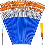
- 【162-Piece Bulk Set | Dual Brush System】Maximize versatility with 81 flat brushes (0.59 inch edge for bold strokes) and 81 round brushes (0.39 inch tips for details) – 3X more tools than standard kits! Pre-sorted in labeled compartments for instant access during painting sessions. Ideal for art classrooms, mural projects, and multi-artist households.
- 【Pro-Grade Durability | Zero Shedding Guarantee】 "Engineered with triple-crimped nylon bristles (43% higher resilience vs. standard) and aerospace aluminum ferrules tested for 10,000+ flex cycles. Lab-verified 0.01% shedding rate even with heavy impasto techniques – outperforms flimsy bristles in budget brushes."
- 【Multi-Scenario Readiness | Event & Daily Use】 Optimized for: Thanksgiving/Christmas face designs classroom projects ceramic decorating fabric printing and model painting; Lightweight plastic handles each reduce hand fatigue during prolonged sessions
- 【Effortless Maintenance | Long-Term Durability】 Clean with warm soapy water in 10 seconds; Reshape tips and air-dry vertically to preserve bristle integrity,After use, air-dry brushes thoroughly and store upright in the provided case to preserve bristle shape. The premium nylon filaments naturally regain their original form after each stroke. For cleaning, simply rinse in warm soapy water and gently reshape bristles with fingertips."
- 【Multiple Application】These acrylic paint brushes can be applied for most occasions,such as:watercolor,oil, gouache paint,face paint, acrylic paint, suitable for Thanks Giving Day, Christimas, Halloween face and body painting, canvas painting, fabric, rock, miniature, model, ceramics, arts and crafts painting, etc.
What mistakes should you avoid when pairing red?
- Assuming the complementary colour must be saturated green. The colour-wheel relationship remains when green is muted or used sparingly.
- Choosing a neutral by name alone. “White,” “gray” and “beige” cover many undertones; inspect a real sample beside the red.
- Ignoring fixed finishes. A floor or countertop can push the red toward orange, violet or brown.
- Testing only under store lighting or on a phone. Room orientation and evening bulbs can produce a different appearance.
- Painting every surface in equal intensity. Use hierarchy, value and proportion to give the eye somewhere to rest.
- Confusing a colour pairing with paint mixing. Red and green look different when layered as design elements than when pigment is physically blended.
How do you choose the right red palette quickly?
Use this decision path when several combinations look plausible:
- Want maximum contrast? Start with green, then mute one hue or reduce its area if the result is too forceful.
- Want the red to be the focus with minimal competition? Choose a warm or cool neutral according to the red’s undertone and the room’s existing finishes.
- Want a warm, continuous scheme? Explore red-orange and orange, adding a neutral surface for relief.
- Unsure about temperature? Compare warm and cool neutral samples beside the red in the room; the better option will usually make the red look intentional rather than unexpectedly pink, blue or muddy.
- Still undecided? Keep the companion colour in movable elements such as cushions, artwork or a painted board until you have observed a full day-and-evening cycle.
Frequently Asked Questions
Does red have more than one complementary colour?
In the traditional hue-based colour wheel, green is red’s complement. Different digital colour models can calculate complements differently, so specify the model when working in software; for ordinary interior paint decisions, the red–green relationship is the conventional reference.
Recommended Free Tools
Can I pair red with blue in a room?
You can, but blue is not red’s traditional complement. Treat the combination as a temperature and contrast decision: a cool blue can sharpen a warm red, while a deep blue and deep red may need a light neutral to prevent the scheme from feeling heavy.
Should trim be white with red walls?
White trim can work, but its undertone matters. Test the actual trim colour beside the red and under the room’s lighting; a warm white, cool white or pale gray will each change the apparent temperature of the wall.
Is a red ceiling a good idea?
A red ceiling can be effective when the room is tall, well lit and intentionally dramatic, but it reflects colour onto walls and furnishings. Sample the ceiling colour on a board held horizontally and check it at night before painting the entire surface.
Quick Recap


