The Tool Desk
Quick wins for a faster PC:
Clear out junk files and repair common Windows errorsFree Scan →Scan for outdated or missing drivers - takes under a minuteDriver Scan →Repair Windows errors before they cause bigger problemsFix Now →Outbyte Driver Updater FREEFix the driver behind crashes, sound loss and screen glitchesFind Drivers →Outbyte PC Repair FREERepair Windows errors before they cause bigger problemsFix Now →
ThatPainter is reader-supported. When you buy through links on our site, we may earn an affiliate commission. Learn More
Blue-green paint ranges from pale aqua to deep teal, so the best choice depends on the room and the effect you want. Designers recommend softer, grayer shades for an airy or understated look, midtones for a balanced color statement, and deeper hues for dramatic walls, cabinetry, or ceilings. These expert picks are useful starting points—not a single, objectively ranked winner.
Designer-recommended blue-green paint colors
The shades below come from designer interviews and editorial roundups, not a shared test or scoring system. Color descriptions and suggested uses are attributed recommendations; the way a paint reads in your home will depend on its light and surroundings.
As an Amazon Associate I earn from qualifying purchases.
Free tools Windows power users keep installed
One-click scans. No signup required.
| Paint color | How it is described | Suggested use |
|---|---|---|
| Sherwin-Williams Sea Salt | Designer Courtney Cole calls it a softer, greener choice; the manufacturer describes it as a muted green with gray undertones. | Traditional or coastal-style rooms where you want a subtle, softened color. |
| Sherwin-Williams Topsail | An airy aqua with green and gray undertones. | Designer Marnie Oursler recommends it as a bathroom accent in a calm, welcoming coastal palette. |
| Benjamin Moore Jack Pine | A gentle green with blue beneath it. Ariel Darmoni of 123 Remodeling says, “Jack Pine is a gentle green with a hint of blue underneath. It feels calm and timeless,” | Living rooms or bedrooms when you want color without an especially bold effect. |
| Sherwin-Williams Studio Blue Green | A rich, dramatic blue-green. Interior designer and certified True Color Expert Leigh Ann Raines says, “For a more bold, moody space, Studio Blue Green is gorgeous,” | A bold, moody room; Raines also suggests carrying the color onto the ceiling. |
| Farrow & Ball Inchyra Blue | Designer Caitlin Murray of Black Lacquer Design says it “perfectly walks the line between blue and green.” Black contributes to its moody, complex character. | A bedroom accent wall or kitchen island. |
| Benjamin Moore Twilight | A jewel-like shade balancing calming blue and invigorating green; it can shift between the two as light changes. | Choose it when you want a deeper color whose blue-green balance can vary through the day. |
| PPG Blue Willow (PPG1145-4) | PPG describes it as a midtone, neutral jade aqua-green with a malachite undertone; listed LRV is 47. | PPG suggests bedrooms, bathrooms, or kitchens, with off-white trim. |
Other examples in the designer roundups include shades suited to dining rooms and libraries, as well as softer choices for bathrooms and coastal settings. Treat any shortlist as a way to narrow the color family, not as a universal ranking.
How to choose the right blue-green for your room
Decide which way the undertone should lean
Blue-green is not one fixed color. Sea Salt is presented as the greener, muted option; Jack Pine as green with blue beneath; and Inchyra Blue as a shade balanced between blue and green. If you want an aqua impression, Topsail is described as airy and carries green and gray undertones. Compare these distinctions against the colors already in the room rather than relying on the name alone.
#1 Best Overall

- Extremely durable interior paint ideal for use on properly prepared interior walls, ceilings or trim composed of new or previously painted drywall, plaster, masonry, wood and metal
- Outstanding scrubbability and washability allows for cleanup without damage, keeping walls looking fresh
- Paint & Primer all-in-one provides excellent hide and coverage (up to 400 sq. ft. per gallon)
- Low VOC / Zero VOC- Colorants added to this basepaint may increase VOC level significantly depending on color choices
- Stir thoroughly and read all surface preparation and application details for best results
Use depth and light as a guide
Light reflectance value (LRV) indicates how much visible light a paint reflects, but it cannot predict the full appearance of a color in a particular room. Sherwin-Williams advises considering LRV for low-light north-facing rooms and basements, and says to look for a paint with an LRV of about 60 or higher in those conditions. Its example, Copen Blue SW 0068, has an LRV of 59. PPG Blue Willow is listed at LRV 47, making it a more midtone point of comparison.
Match the shade to the amount of color you want
A muted green-gray or pale aqua can provide a softer impression; a midtone gives the walls more presence without going as deep; and a rich teal or blue-green makes a stronger statement. The designer recommendations point to different placements accordingly: bathrooms and coastal schemes for softer colors, and accent walls, kitchen islands, ceilings, dining rooms, or libraries for more dramatic choices. Think about whether you want a restrained backdrop or a feature that defines the room.
Rank #2
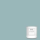
- CHALK PAINT: Adds character and unique, distressed charm to cabinets, dining tables, furniture and more. Little to no surface prep required. Use alone or with KILZ Sealing Wax to create a vintage finish.
- ADVANCED FORMULA: This paint goes on smooth and thick, for excellent hide, and requires very little surface preparation. Depending on the vision you have for the project, simply apply 1 or 2 coats on a clean, dust-free, or lightly sanded surface. Cleans up easily with soap and water.
- MULTIPLE USES: Use to “up-cycle” vintage furniture. Apply to old or new wood, cast stone, concrete, or even metal surfaces. Do not use on horizontal surfaces subject to foot traffic.
- SUPERIOR COVERAGE: This 1 Quart can of KILZ Chalk Style Decorative Paint covers up to 100 square feet per quart with two coats. Dries to the touch in less than an hour, recoat after 2 hours.
- BLUE JUNIPER is a light blue with a heavy gray undertone. Depending on the light source or time of day, it may appear as a rain cloud on the surface.
Consider trim, furnishings, and adjacent colors
Nearby colors can make a blue-green appear greener or bluer. MyDomaine notes that Sleigh Bells can take on either tint depending on surrounding colors, while Composed changes with room light and the palette of furnishings and accessories. PPG recommends off-white trim with Blue Willow. Consider the wall color beside your trim, flooring, cabinetry, and larger pieces of furniture, not in isolation.
Independent reader supportYour contribution helps us test, update, and keep practical guides available for everyone.Sample the color before painting
Check a physical sample in the room where you plan to paint, and view it at different times of day. This helps you see how the shade changes with the room’s light and nearby finishes. PPG offers a free Blue Willow swatch; that offer should not be assumed to apply to the other colors listed here.
Quick Recap
Best Value
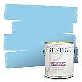
- Ultra premium paint and primer in one
- Ideal for living rooms, family rooms, media rooms, bedrooms, dining rooms and hallways
- Smooth application
- Acrylic latex for easy soap and water clean-up, durable and washable
- Low VOC: less than 5 g/l prior to tinting
Rank #4

- TRUE ALL-IN-ONE PAINT & PRIMER – Skip the extra steps. Evolve Tru Coat combines paint and primer in one, delivering excellent adhesion and coverage on wood, metal, masonry, and concrete with minimal prep.
- ONE COAT, DURABLE FINISH – Engineered for efficiency, this high-performance formula provides up to 100 sq. ft. of coverage per quart with a smooth, long-lasting finish that resists everyday wear.
- INTERIOR & EXTERIOR MULTI-SURFACE USE – Perfect for cabinets, furniture, walls, doors, trim, and more. Designed to perform beautifully on both indoor and outdoor projects.
- 3 VERSATILE SHEENS FOR ANY PROJECT – Matte offers a soft, non-reflective look ideal for walls and low-traffic areas; Satin provides a smooth, subtle sheen that’s great for cabinets and furniture; Semi-Gloss delivers a higher shine and added durability, perfect for trim, doors, and high-use surfaces.
- TRENDING DESIGNER COLORS, QUART SIZE – Available in a curated palette of modern, designer-selected colors. Quart size is perfect for smaller projects, touch-ups, and multi-color applications.
Rank #3

- Extremely durable interior paint ideal for use on properly prepared interior walls, ceilings or trim composed of new or previously painted drywall, plaster, masonry, wood and metal
- Outstanding scrubbability and washability allows for cleanup without damage, keeping walls looking fresh
- Paint & Primer all-in-one provides excellent hide and coverage
- Low VOC / Zero VOC- Colorants added to this basepaint may increase VOC level significantly depending on color choices
- Stir thoroughly and read all surface preparation and application details for best results
Sources
- ELLE Decor, Julia Cancilla, “The 10 Best Blue-Green Paint Colors Designers Can’t Stop Using,” May 19, 2025.
- MyDomaine, Ashley Knierim, “15 Blue Green Paint Colors Designers Use for the Dreamiest Spaces,” updated October 15, 2024.
- Sherwin-Williams, Green Paint Colors | Popular Greens; page checked October 4, 2026.
- PPG Paints, Blue Willow – PPG1145-4 Paint Color; page checked October 4, 2026.

Product prices and availability are accurate as of the date/time indicated and are subject to change. Any price and availability information displayed on Amazon at the time of purchase will apply.




