Recommended Free Tools
Windows Errors? Fix Them Before They Spread
Free scan · no reinstall
Outdated Drivers Are Slowing You Down
Quick wins for a faster PC:
Scan for outdated or missing drivers - takes under a minuteDriver Scan →Clear out junk files and repair common Windows errorsFree Scan →Fix the driver behind crashes, sound loss and screen glitchesFind Drivers →Free scan · exact hardware match
PC Slower Than It Used to Be?
Free scan · Windows 10 & 11
ThatPainter is reader-supported. When you buy through links on our site, we may earn an affiliate commission. Learn More
There is no universally agreed list of exactly six neutral colors. For a practical starting point, this guide covers black, white, gray, beige, brown, and navy. In painting, “neutral” usually describes a color that can work as a versatile foundation alongside other colors—not a fixed technical category shared by every field.
As an Amazon Associate I earn from qualifying purchases.
What’s actually slowing this PC down?
Pick the symptom - the matching free tool is one click away.
What makes a color neutral?
Neutrality depends partly on context. In color theory and design teaching, black, white, and gray are commonly treated as neutrals; brown is included in some classifications. In paint and fashion, the term is often broader: beige, tan, cream, and even navy may be called neutral because they can pair readily with other colors. Sherwin-Williams summarizes that broader approach by noting that “neutrals are more than beige, white and gray” in its neutral paint guidance. This is practical usage, not a universal rule.
The six neutral colors
Black
Black is a dark anchor that creates strong contrast. Use it when you want a deep, defined element in a palette; its effect will depend on how much is used and what colors surround it. Educational design material includes black among neutral colors.
#1 Best Overall

- Set includes 12 multi-surface satin 2 oz acrylic paints
- Highly pigmented color provides superior coverage
- Use on wood, glass, ceramic, metal, terra cotta, canvas, paper, and fabric
- Dishwasher-safe and machine-washable once cured
- Indoor/outdoor
White
White is a light anchor and can help a palette feel brighter. Whites vary in appearance, so compare a candidate with nearby finishes and colors rather than assuming every white will look the same in a room.
Gray
Gray sits between black and white, but it is not necessarily visually “in between” in every setting. Its undertone can make it read cool or warm, and neighboring colors can influence how it appears. Sherwin-Williams’ neutral paint guidance includes a range of grays.
Free tools Windows power users keep installed
One-click scans. No signup required.
Rank #2

- VERSATILE & CONVENIENT SIZE - This multi-surface acrylic paint set includes 8 - 2 oz bottles of craft paint. The colors in the kit include: FolkArt Multi-Surface Vintage White, Parchment, Cool Bisque, Real Brown, Bark Brown, Camel, Coffee Latte, Pueblo
- 3-PIECE WASH BRUSH SET - Use this paint brush set to paint on a variety of surfaces; great for base coating, stroke work, and adding detail to your creations. Set includes Wash 1/2", 3/4", 1"
- BRILLIANT FINISH - Each color in this unique multi-surface acrylic paint set dries to a stunning satin finish for a beautiful, durable finish to all your arts and crafts! This formula is also great for indoor and outdoor projects as well as top-shelf dishwasher safe when cured.
- EXCELLENT COVERAGE - This versatile kit can be used on a variety of surfaces including wood, terra cotta, canvas, glass, fabric, ceramics and more.
- DISHWASHER SAFE – Dishwasher safe formula
Beige
Beige is commonly a warm-leaning neutral, though the exact impression depends on its undertone and surroundings. Paint guidance groups beige with warm neutrals, but individual shades can vary.
Brown
Brown is an earthy neutral in many design and paint palettes. It appears in educational design classifications and paint-color families, making it a practical option when a palette calls for a deeper, earth-toned foundation.
Rank #3

- Flesh Tone Acrylic Paint Set 6 Colors
- Acrylic Paint - 2 oz. bottle
- Lite Mocha, Khaki, Territorial Beige
- Sunkissed Peach, Nutmeg Brown, Burnt Umber
- Non- Toxic , water based acrylic paint
Navy
Navy is best described as a near-neutral in common fashion and design usage, rather than an uncontested technical neutral. It is technically a color, but popular usage treats it as a versatile pairing color alongside traditional neutrals.
How to choose a neutral paint color
Compare a candidate on three useful axes: lightness, undertone, and where you plan to use it. These help explain why a color that looks appealing on a small chip might feel different on a wall.
The Tool Desk
Outbyte PC Repair FREERepair Windows errors before they cause bigger problemsFix Now →Outbyte Driver Updater FREEScan for outdated or missing drivers - takes under a minuteDriver Scan →Rank #4

- MORANDI COLOR PALETTE: This Acrylic Paint Set features 8 soft, muted shades inspired by the tranquil and sophisticated Morandi color theory. Each tone carries a gentle, grayish undertone that creates a sense of harmony, calm, and understated elegance. Highly pigmented and lightfast, the colors dry to a subtle matte finish that embodies modern minimalist aesthetics. Suitable for creating serene artwork, quiet interior accents, and crafts that evoke peace and refined simplicity
- WATER-BASED & QUICK-DRYING: These water-based acrylics offer a smooth, even flow and quick drying time, preventing cracks and ensuring a professional matte surface. Excellent for building soft transitions and delicate layers that reflect the quiet depth of the Morandi palette
- VERSATILE & LIGHTFAST: Designed with strong coverage and lasting color stability, these paints resist yellowing and fading. Their consistent texture works flawlessly on canvas, paper, clay, fabric, and wall surfaces, making them suitable for creating lasting decorative pieces with a muted, modern vibe
- SOPHISTICATED MODERN APPLICATIONS: Suitable for minimalist paintings, Scandinavian-style decor, calming wall art, wedding stationery, pottery accents, soft home accessories, and mindful crafting projects. A cherished collection for artists and designers seeking to incorporate quiet luxury and contemporary elegance into their work
- SAFE & USER-FRIENDLY: Every 0.71 fl oz tube is non-toxic, odorless, and meets EN 71 & ASTM D-4236 safety standards. Easy to clean with soap and water. Safe for teens and adults, and well-suited for serene creative environments at home, in studios, or mindfulness workshops
1. Decide how light or dark it should read
Consider whether the color should brighten the palette, sit in the middle, or create a deep anchor. For paint, light reflectance value is one factor related to how a shade interacts with light; it does not by itself determine how a color will look in your particular room.
2. Identify its undertone
Warm neutrals may have yellow, red, or brown undertones; cool neutrals may have blue, violet, or silver undertones. Those undertones can become more noticeable next to flooring, trim, furnishings, and other paint colors. Sherwin-Williams discusses these warm and cool groupings in its neutral color guide.
Best Value
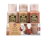
- CONVENIENT SIZE - This terra cotta acrylic paint set includes 6 - 2 oz bottles of textured paint. The colors in this paint set include: FolkArt Terra Cotta Snowbank, Adobe White, Bermuda Sand, Mesa Pink, Pueblo, and Clay Pot
- TEXTURED MATTE FINISH - When dry these versatile neutral colors have a beautiful raw terra cotta textured matte finish - perfect for any home décor project!
- EXCEPTIONAL COVERAGE - Cover a variety of surfaces such as wood, metal, canvas, glass, and so much more with this unique paint in your art supplies
- SIMPLE CLEAN UP - Clean up is easy with FolkArt Terra Cotta Acrylic Paint! Simply clean up while wet with soap and water
- AMERICAN MADE, TRUSTED BRAND - FolkArt Terra Cotta is proudly made in the USA. This paint kit has a water-based, non-toxic formula. FolkArt Acrylic Paint is an artist-quality paint that has a creamy consistency for exceptional blending and shading
3. Judge it in the room where it will be used
Room orientation and lighting affect how paint appears, so a color viewed in a store or on a screen may not look the same at home. Sherwin-Williams explains the role of orientation and light in its neutral paint advice. Check the shade where it will go, at different times and under the lighting you normally use.
4. Test samples before committing
Place a physical sample in the intended room and compare it with fixed features such as flooring, counters, and trim. Sherwin-Williams lists peel-and-stick samples in its whites and neutral colors collection. Sampling makes it easier to judge undertone and light in context before choosing a wall color.
Which neutral should you start with?
Choose according to the job the color needs to do: black for a dark contrast anchor, white for a light one, gray for a middle value, beige or brown for an earthy direction, and navy if you want a color commonly used as a near-neutral. Then narrow the choice by undertone and test the paint in the actual space. No single option is the right neutral for every room or palette.
Quick Recap

Product prices and availability are accurate as of the date/time indicated and are subject to change. Any price and availability information displayed on Amazon at the time of purchase will apply.




